|
|
|
|
|
|
| |
| |
|
|
|
|
| |
| |
|
|
Thomas de Groot wrote:
>
>
> Nice work, Jim. I particularly like the table tops. They look like pieces
> cut out of paintings or photographs (face? Rose?) and the texture suggests a
> certain roughness.
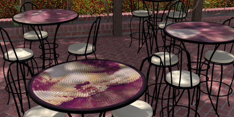
Thanks. The texture is actually individual rounded boxes arrayed in
concentric circles. Each takes its color from an underlying photo using
trace(). So it is a kind of fake mosaic. To automate a more realistic
mosaic, where the pieces loosely follow contours, would be an
interesting accomplishment, but not within my reach I am afraid. The
photos are by a contributor I know over on DeviantArt. The pinkish ones
are of her own lips, closeup.
>
> The legs seem a bit flimsy to me. I would be afraid to find myself sitting
> on the ground beside an interestingly twisted piece of modern sculpture :-)
> Not recommended for overweight persons.
Yes, furniture always gives me problems, especially with proportions.
Wrought iron I think can be very strong, but this may be a bit spindley.
Maybe Wire this thin might be used double or more on the legs. Also
this furniture is probably still quite high vs its footprint. Believe
it or not, I already took the original models and reduced the vertical
scale by 1/3. Here I think I both wanted to show off the table tops and
the bricks so I probably tended towards tall and spindley. I can never
quite believe chair seats are only up to my knee. And I agree these
chairs are more like stools, not really suited to a wide bottom. Maybe
I picture this place with slender young women nibbling on silly little
sandwiches.
http://images.patiofurnitureusa.com/mgen/digimarc.ms?img=master:ALH162.jpg&h=175&w=175
http://images.netshops.com/mgen/digimarc.ms?img=master:MDW322.jpg&h=300&w=300
http://www.holloways.co.uk/garden/wrought/bistro/large/provence01g.jpg
>
> Plants and lighting look ok to me, and the overall color combination is very
> well balanced (the eye of the painter!). Perhaps the wood texture of the
> posts could be finer. It seems a tad to large to me. In addition, where the
> posts reach the ground, there should be some kind of interruption in the
> (very nice) pavement.
Yeah I'll fix the posts. The arbor structure was a single modelled
piece with one wood texture applied. The center of the circular wood
texture (rotated to vertical) is about at the right foreground table.
I'll take a breath then make the posts separate with separately applied
textures. I was just being lazy there, though I might get away sith it.
What *was* I thinking?
>
> Overall, it reminds me of some impressionist paintings
>
Never thought of that, a nice compliment. I love those impressionist
paintings.
Post a reply to this message
|
|
| |
| |
|
|
|
|
| |
| |
|
|
Alain wrote:
>>
> The chairs look OK for me, modeled from a real-life model, as well as
> the tables. I've seen real chairs with iron legs that slender, and some
> that looked even thinner. Prety strong despite a somewhat flimsy look.
Yes I agree, That welded iron stuff really is remarkably strong.
>
> For the posts, I've seen some that are only resting on the ground, and
> not set into holes nor fastened. Typical for a temporary structure.
Yeah, me too, actually I was puzzled as to how this would actually be
constructed. Examples I see with google do often have a little
finishing around the foot though. Probably to cover any bolts or other
fastenings to the masonry base.
Post a reply to this message
|
|
| |
| |
|
|
|
|
| |
| |
|
|
Jeremy M. Praay wrote:
>>
>
>
> Lovely. As others have commented, the table tops are pretty nifty.
Thanks,
>
> You might want to play around with the location of the chairs a bit.
> Something just seems a bit too "perfect" in that regard.
Yes, I will play with that somemore.
>
> It looks like you're using _some_ radiosity, but not nearly enough. Perhaps
> you're going to crank the settings up later. If so, be prepared for some
> slow rendering, as much of the scene is in shadows, but it should really
> come to life with some higher settings. If the deep shadows aren't coming
> out, then you could try allowing more sunlight through the trees, but of
> course that depends on what you're trying to achieve. Also, is your sun
> bright enough?
Yes now that much is set I can afford some overnight renders and try and
improve the richness with the radiosity. Thanks for suggesting that.
The sun value is determined by LightSys. But its *apparent* brightness
has a lot to do with the sharpness of the shadows. With no area light
to area light with a spread of 1% the distance, the shadows look sharp
and deep and the sun bright. In this image the spread of the area light
is 2.5% of the distance to the light. At 10% the distance this image
looks quite dull like it is a cloudy day.
>
> As a side note, it's nice to see such a nice use of some of these wonderful
> tools we have available.
>
>
I absolutely love the tools I have ustilized here.
Post a reply to this message
|
|
| |
| |
|
|
|
|
| |
| |
|
|
"Jim Charter" <jrc### [at] msn com> schreef in bericht
news:48aa3347$1@news.povray.org...
>
> Thanks. The texture is actually individual rounded boxes arrayed in
> concentric circles. Each takes its color from an underlying photo using
> trace(). So it is a kind of fake mosaic. To automate a more realistic
> mosaic, where the pieces loosely follow contours, would be an interesting
> accomplishment, but not within my reach I am afraid. The photos are by a
> contributor I know over on DeviantArt. The pinkish ones are of her own
> lips, closeup.
This is an interesting technique indeed... Hmm, have to think about that!
>
>
http://images.patiofurnitureusa.com/mgen/digimarc.ms?img=master:ALH162.jpg&h=175&w=175
> http://images.netshops.com/mgen/digimarc.ms?img=master:MDW322.jpg&h=300&w=300
> http://www.holloways.co.uk/garden/wrought/bistro/large/provence01g.jpg
Comparing those photographs with your furniture, I believe yours are just a
tiny bit thinner, especially the tables. Note that several chairs have
double wires too. I remember those chairs from my youth in France, where we
had them in the garden. However, I agree with you and Alain that the
material is quite strong by itself, so my comment on this is not entirely
valid. It is more the impression of frailty that concerned me I think.
>
> Yeah I'll fix the posts. The arbor structure was a single modelled piece
> with one wood texture applied. The center of the circular wood texture
> (rotated to vertical) is about at the right foreground table. I'll take a
> breath then make the posts separate with separately applied textures. I
> was just being lazy there, though I might get away sith it. What *was* I
> thinking?
After reading Alain's answer, I agree that the posts can rest on the
pavement, perhaps fixed invisibly by a steel pin. So, no real need to change
that. Now that I think about it, I have seen posts like these, fixed a short
distance above ground (by a metal pin) giving the impression of floating in
the air.
>>
>> Overall, it reminds me of some impressionist paintings
>>
>
> Never thought of that, a nice compliment. I love those impressionist
> paintings.
It may be a combination of things like the palet used, the scene depicted,
Thomas com> schreef in bericht
news:48aa3347$1@news.povray.org...
>
> Thanks. The texture is actually individual rounded boxes arrayed in
> concentric circles. Each takes its color from an underlying photo using
> trace(). So it is a kind of fake mosaic. To automate a more realistic
> mosaic, where the pieces loosely follow contours, would be an interesting
> accomplishment, but not within my reach I am afraid. The photos are by a
> contributor I know over on DeviantArt. The pinkish ones are of her own
> lips, closeup.
This is an interesting technique indeed... Hmm, have to think about that!
>
>
http://images.patiofurnitureusa.com/mgen/digimarc.ms?img=master:ALH162.jpg&h=175&w=175
> http://images.netshops.com/mgen/digimarc.ms?img=master:MDW322.jpg&h=300&w=300
> http://www.holloways.co.uk/garden/wrought/bistro/large/provence01g.jpg
Comparing those photographs with your furniture, I believe yours are just a
tiny bit thinner, especially the tables. Note that several chairs have
double wires too. I remember those chairs from my youth in France, where we
had them in the garden. However, I agree with you and Alain that the
material is quite strong by itself, so my comment on this is not entirely
valid. It is more the impression of frailty that concerned me I think.
>
> Yeah I'll fix the posts. The arbor structure was a single modelled piece
> with one wood texture applied. The center of the circular wood texture
> (rotated to vertical) is about at the right foreground table. I'll take a
> breath then make the posts separate with separately applied textures. I
> was just being lazy there, though I might get away sith it. What *was* I
> thinking?
After reading Alain's answer, I agree that the posts can rest on the
pavement, perhaps fixed invisibly by a steel pin. So, no real need to change
that. Now that I think about it, I have seen posts like these, fixed a short
distance above ground (by a metal pin) giving the impression of floating in
the air.
>>
>> Overall, it reminds me of some impressionist paintings
>>
>
> Never thought of that, a nice compliment. I love those impressionist
> paintings.
It may be a combination of things like the palet used, the scene depicted,
Thomas
Post a reply to this message
|
|
| |
| |
|
|
|
|
| |
| |
|
|
"Jim Charter" <jrc### [at] msncom> schreef in bericht
news:48aa397f$1@news.povray.org...
> The sun value is determined by LightSys. But its *apparent* brightness
> has a lot to do with the sharpness of the shadows. With no area light to
> area light with a spread of 1% the distance, the shadows look sharp and
> deep and the sun bright. In this image the spread of the area light is
> 2.5% of the distance to the light. At 10% the distance this image looks
> quite dull like it is a cloudy day.
In Lightsys, you can play with the luminosity by:
#declare SunLuminosity = 3;
used in the Light_Color(SunColor, SunLuminosity) macro you can use as light
source color.
I am not sure, but possibly you can also influence the luminosity by:
#declare Intensity_Mult = 0.80; // default [.75]
before including CIE_Skylight.
Thomas
Post a reply to this message
|
|
| |
| |
|
|
|
|
| |
| |
|
|
A closer look at the table top
Post a reply to this message
Attachments:
Download '0058.test.jpg' (186 KB)
Preview of image '0058.test.jpg'
|
|
| |
| |
|
|
|
|
| |
| |
|
|
"Jim Charter" <jrc### [at] msncom> schreef in bericht
news:48ad5496@news.povray.org...
>
> A closer look at the table top
>
That shows it very well! The original photograph is nicely deformed this
way.
Thomas
Post a reply to this message
|
|
| |
| |
|
|
|
|
| |
| |
|
|
Jim Charter wrote:
> To automate a more realistic mosaic, where the pieces loosely follow
> contours, would be an interesting accomplishment, but not within my
> reach I am afraid.
I know how I would do it, but it wouldn't be worth it. It would still
look fake. It takes a real-life artist to accomplish something this:
http://www.lilianbroca.com/index.php/mosaics-gallery.php
Your tables look like the Ikea version, which suits a modest Bistro like
this one. The whole scene reminds me of the kind of place I used to see
around Austin: a pizza kitchen with tables left over from when it was a
coffee house and a lucky cat on the counter left over from when it was a
pho shop. These places all seem to have been taken over by corporate
restaurants.
Houston family-owned restaurants are more resistant to corporate
take-over, but Houston doesn't have beautiful scenery or historic
architecture. There is something Romantic about eating a plate of
over-priced, under-portioned, glorified junk-food in a beautiful
setting, at least when you're immature and idealistic. The famous Oasis
(Garth Brooks slipped on down to it) in Austin was nothing more than a
burger joint with a view.
-Shay
Post a reply to this message
|
|
| |
| |
|
|
|
|
| |
| |
|
|
Shay wrote:
>
> I know how I would do it, but it wouldn't be worth it. It would still
> look fake.
Your standards may be too high. I would be interested in your idea.
It takes a real-life artist to accomplish something this:
> http://www.lilianbroca.com/index.php/mosaics-gallery.php
>
No, that level could not be programmed. But cruder result could hold
some charm.
> Your tables look like the Ikea version, which suits a modest Bistro like
> this one.
Yes, it was really about the table-tops. They drove the scene.
The whole scene reminds me of the kind of place I used to see
> around Austin: a pizza kitchen with tables left over from when it was a
> coffee house and a lucky cat on the counter left over from when it was a
> pho shop. These places all seem to have been taken over by corporate
> restaurants.
There was a well-known student, cafe-type, hangout around the University
of Toronto called "Lickin' Chicken" Used to *be* a Lickin Chicken so
they just left the sign there.
>
> Houston family-owned restaurants are more resistant to corporate
> take-over, but Houston doesn't have beautiful scenery or historic
> architecture. There is something Romantic about eating a plate of
> over-priced, under-portioned, glorified junk-food in a beautiful
> setting, at least when you're immature and idealistic. The famous Oasis
> (Garth Brooks slipped on down to it) in Austin was nothing more than a
> burger joint with a view.
>
Well, garden restaurants in the east village here have zero view.
They're built in the charmless backyard/airshafts of tenement buildings,
and shaded with weeds that grew into trees. But we love 'em and pay
$3000/mo for one bedroom closet apartments to be near 'em because this
is New York and gawd knows only New York has the right to call itself
New York.
Post a reply to this message
|
|
| |
| |
|
|
|
|
| |
| |
|
|
Jim Charter wrote:
> Shay wrote:
>
>>
>> I know how I would do it, but it wouldn't be worth it. It would still
>> look fake.
>
>
> Your standards may be too high. I would be interested in your idea.
Nothing revolutionary:
1. "Posterize" the image into an appropriate number of colors
2. Use marching squares to build borders between colored regions
3. Place tiles along the borders
4. Advance the borders and check for intersections
OR.... The slower, easier way
4. March the squares again, this time checking for tiles as well as
color differences.
-Shay
Post a reply to this message
|
|
| |
| |
|
|
|
|
| |
|
|