|
|
|
|
|
|
| |
| |
|
|
|
|
| |
| |
|
|
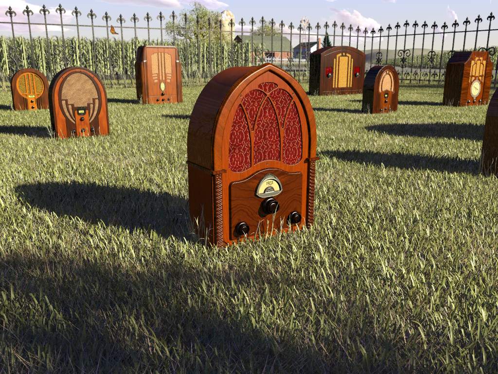
I just can't seem to keep my hands off of my old scenes...
Recently, I had a friend (photographer) mention that I should get some
prints made of some of my scenes (the finished ones) and he was going to
show them to a friend of his who has an art gallery. At that point, I would
have a couple of them framed. Worst case, I spend some money and have more
of my own art-work to hang around the house. Best case, I make a little
money. Either way is acceptable to me.
Anyway, I've never been completely happy with the lighting in the original
Radio Graves, but I ran out of time when I submitted it to the IRTC, plus I
still had a lot to learn back then. So, I changed a few textures slightly,
and turned the "sun" up. I also realized that Gilles' grass (makegrass)
looks a little better when "double illuminate" is used. Additionally, I
used the modified barn from a new picture that I'm working on. I purposely
tried not to make any drastic changes.
Here's the final, final version (for now)... ;-)
--
Jeremy
www.beantoad.com
Post a reply to this message
Attachments:
Download 'RadioGraves20-1024.jpg' (196 KB)
Preview of image 'RadioGraves20-1024.jpg'
|
|
| |
| |
|
|
|
|
| |
| |
|
|
Jeremy M. Praay wrote:
> I just can't seem to keep my hands off of my old scenes...
>
> Recently, I had a friend (photographer) mention that I should get some
> prints made of some of my scenes (the finished ones) and he was going to
> show them to a friend of his who has an art gallery. At that point, I would
> have a couple of them framed. Worst case, I spend some money and have more
> of my own art-work to hang around the house. Best case, I make a little
> money. Either way is acceptable to me.
>
> Anyway, I've never been completely happy with the lighting in the original
> Radio Graves, but I ran out of time when I submitted it to the IRTC, plus I
> still had a lot to learn back then. So, I changed a few textures slightly,
> and turned the "sun" up. I also realized that Gilles' grass (makegrass)
> looks a little better when "double illuminate" is used. Additionally, I
> used the modified barn from a new picture that I'm working on. I purposely
> tried not to make any drastic changes.
>
> Here's the final, final version (for now)... ;-)
Better than ever!
I still find that fence line distracting, but less so with the brighter
sun. Now its only noticable on the right where the shadowed side is
facing the camera.
I'll have to look at the original again, but I think you've made a trade
off on the wood textures with the brighter sunlight. The highlights on
the trim look much better, but the grain isn't as visible on some of the
flat areas.
RG
Post a reply to this message
|
|
| |
| |
|
|
|
|
| |
| |
|
|
"Jeremy M. Praay" <sla### [at] hotmail com> wrote
> I just can't seem to keep my hands off of my old scenes...
>
> Recently, I had a friend (photographer) mention that I should get some
> prints made of some of my scenes (the finished ones) and he was going to
> show them to a friend of his who has an art gallery. At that point, I
would
> have a couple of them framed. Worst case, I spend some money and have
more
> of my own art-work to hang around the house. Best case, I make a little
> money. Either way is acceptable to me.
>
> Anyway, I've never been completely happy with the lighting in the original
> Radio Graves, but I ran out of time when I submitted it to the IRTC, plus
I
> still had a lot to learn back then. So, I changed a few textures
slightly,
> and turned the "sun" up. I also realized that Gilles' grass (makegrass)
> looks a little better when "double illuminate" is used. Additionally, I
> used the modified barn from a new picture that I'm working on. I
purposely
> tried not to make any drastic changes.
>
> Here's the final, final version (for now)... ;-)
Looking very nice but is the shadowy are in front really necessary? I would
prefer to see more of the sky and less of the immediate foreground. Also,
the abrupt cutoff at the sides is a little distracting. IMHO, the overall
framing could be better. All greenery seems to be very similar in color. A
little more variation could help, I think. Finally, a uniform height fence
might look nicer. Of course I might be way out of my league here - I am
still in the reflective sphere on checkered plane stage myself. com> wrote
> I just can't seem to keep my hands off of my old scenes...
>
> Recently, I had a friend (photographer) mention that I should get some
> prints made of some of my scenes (the finished ones) and he was going to
> show them to a friend of his who has an art gallery. At that point, I
would
> have a couple of them framed. Worst case, I spend some money and have
more
> of my own art-work to hang around the house. Best case, I make a little
> money. Either way is acceptable to me.
>
> Anyway, I've never been completely happy with the lighting in the original
> Radio Graves, but I ran out of time when I submitted it to the IRTC, plus
I
> still had a lot to learn back then. So, I changed a few textures
slightly,
> and turned the "sun" up. I also realized that Gilles' grass (makegrass)
> looks a little better when "double illuminate" is used. Additionally, I
> used the modified barn from a new picture that I'm working on. I
purposely
> tried not to make any drastic changes.
>
> Here's the final, final version (for now)... ;-)
Looking very nice but is the shadowy are in front really necessary? I would
prefer to see more of the sky and less of the immediate foreground. Also,
the abrupt cutoff at the sides is a little distracting. IMHO, the overall
framing could be better. All greenery seems to be very similar in color. A
little more variation could help, I think. Finally, a uniform height fence
might look nicer. Of course I might be way out of my league here - I am
still in the reflective sphere on checkered plane stage myself.
Post a reply to this message
|
|
| |
| |
|
|
|
|
| |
| |
|
|
"gonzo" <rgo### [at] lansetcom> wrote in message news:4105c2fb@news.povray.org...
> Jeremy M. Praay wrote:
> > I just can't seem to keep my hands off of my old scenes...
> >
> > Recently, I had a friend (photographer) mention that I should get some
> > prints made of some of my scenes (the finished ones) and he was going to
> > show them to a friend of his who has an art gallery. At that point, I
would
> > have a couple of them framed. Worst case, I spend some money and have
more
> > of my own art-work to hang around the house. Best case, I make a little
> > money. Either way is acceptable to me.
> >
> > Anyway, I've never been completely happy with the lighting in the
original
> > Radio Graves, but I ran out of time when I submitted it to the IRTC,
plus I
> > still had a lot to learn back then. So, I changed a few textures
slightly,
> > and turned the "sun" up. I also realized that Gilles' grass (makegrass)
> > looks a little better when "double illuminate" is used. Additionally, I
> > used the modified barn from a new picture that I'm working on. I
purposely
> > tried not to make any drastic changes.
> >
> > Here's the final, final version (for now)... ;-)
>
> Better than ever!
>
> I still find that fence line distracting, but less so with the brighter
> sun. Now its only noticable on the right where the shadowed side is
> facing the camera.
Perhaps, but I really didn't want to change the scene itself very much,
otherwise I would end up second-guessing myself forever. Mostly, I just
wanted to redo the lighting.
>
> I'll have to look at the original again, but I think you've made a trade
> off on the wood textures with the brighter sunlight. The highlights on
> the trim look much better, but the grain isn't as visible on some of the
> flat areas.
>
Yes, there was somewhat of a trade-off with the wood texture. In fact, that
was one of the things that made me reluctant to try a brighter sun
initially. Even so, I think they still look pretty good. Maybe they could
be better with the brighter sun, but before (the darker image), some flaws
may have been less noticeable.
--
Jeremy
www.beantoad.com
Post a reply to this message
|
|
| |
| |
|
|
|
|
| |
| |
|
|
Very nice, and an improvement although I don't have your earlier posting
nearby.
My idea (that you probably won't implement due to lack of time) would be to
make the radios actually look old. So far they look brand new, except for
their design. Maybe they could even have turned into stone, completely or
half-wise.
But don't get me wrong ... it's a good rendering already!
Regards,
Hugo
Post a reply to this message
|
|
| |
| |
|
|
|
|
| |
| |
|
|
Jeremy M. Praay wrote:
I like the now visible rich colors on the radios. The new lighting puts
more focus on the radios.
-Shay
Post a reply to this message
|
|
| |
| |
|
|
|
|
| |
| |
|
|
"Anonymous" <nob### [at] herecom> wrote in message
news:4106374a$1@news.povray.org...
>
> 8< All greenery seems to be very similar in color. >8
This caught my attention too, but the dry appearance seemed appropriate to
the overall scene. Then I couldn't decide if the corn stalks should be left
dry-looking and the grass greener or just the opposite, if it were changed,
so I didn't say anything until now.
I was trying to think of the style this reminds me of. I know it's like what
I had seen on the covers of a childrens encyclopedia set I once had back in
the 1960's. Really loved the way those were done, same thought here with
this scene. Surreal but nothing actually unreal. They were still-life's,
anyway, of miscellaneous things put together as though collected on a wall
or desk or something. I've forgotten. Not finding anything by 'net search to
show what I mean.
Oh yeah, someone mentioned the fence before, too. I just think it needs a
corner post to break up the fence line.
Bob H.
Post a reply to this message
|
|
| |
| |
|
|
|
|
| |
| |
|
|
Much better. Cheers.
Post a reply to this message
|
|
| |
| |
|
|
|
|
| |
| |
|
|
"gonzo" <rgo### [at] lansetcom> wrote in message
news:4105c2fb@news.povray.org...
> Jeremy M. Praay wrote:
> > Here's the final, final version (for now)... ;-)
>
> Better than ever!
I would agree, apart from the wood textures.
>
> **I still find that fence line distracting**, but less so with the
brighter
> sun. Now its only noticable on the right where the shadowed side is
> facing the camera.
Is it that, or does that fence just not belong in a scene like
this? Would that fence be there in reality, for the type of place it's
in? That's the feeling I get.
~Steve~
> RG
>
Post a reply to this message
|
|
| |
| |
|
|
|
|
| |
| |
|
|
A fun game switching between the original and new versions.
I see the barn door has been opened and a butterfly freed...
The new version really makes the original look like a cloudy
overcast day. For me the only negative is the lower sky/gloss
reflection on the front radio in the brighter image. Maybe a
higher reflectivity on the material would bring that back
stronger, but it might cause other problems.
The two grain towers seem to blend together now that they
are brighter as well. The difference in the sky/clouds is also
interesting.
I've done a lot of printing and dark images often turn out
muted and muddy, so the brighter image will probably
print better.
Post a reply to this message
|
|
| |
| |
|
|
|
|
| |
|
|