|
 |
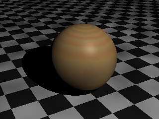
Camera settings are not where realism fails in most images, neither is
radiosity or lighting. I have followed almost every image posted here
and in the IRTC and the one thing that always bothers me is textures. If
you want to improve realism, consider spending time on getting the
phong/specular highlights, the diffuse and ambient settings right. For
example, in your image, you might consider playing around with the
settings to improve the depth shown by the shading, your spheres look
rather flat. This would probably be best remedied by decreasing the
ambient. Also consider increasing the brightness of the highlights in
your textures. Everything else falls into place naturally once you have
the textures looking right. What you have is an excellent start, keep up
the good work.
Charles Krause wrote:
>
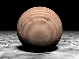
> Just tinkering with photo-realism, wanted to see what people thought as to
> what could be improved.
>
> This image is NOT that exciting for content though :) I'm looking at the
> light/camera settings for maximum realism.
>
> This image uses focal blur of 0.3, an area light, and standard level 5
> radiosity settings.
>
> And this image took 6.5 hours for my P133 :(
>
> [Image]
--
Chris Maryan
mailto:cma### [at] geocities com
***
Will work for cash.
***
Email me if you are interested in donating
to the Chris Maryan needs money fund.
We will also accept donations to the Chris
needs a Pentium III or SGI workstation
fund and the Chris needs a car fund. com
***
Will work for cash.
***
Email me if you are interested in donating
to the Chris Maryan needs money fund.
We will also accept donations to the Chris
needs a Pentium III or SGI workstation
fund and the Chris needs a car fund.
Post a reply to this message
|
|
|
|
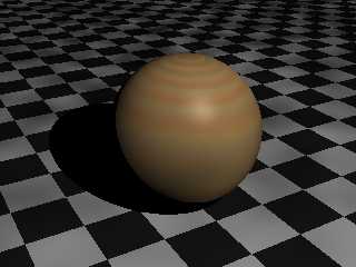
Slight improvement with the brightness. I think your diffuse and
brilliance might be too high, try the default settings of 0.6 and 1.0
respectively, as for ambient, I find the default of 0.1 to be
unrealistically low for typical situations, try 0.2-0.3. One of the
problems seems to be the contrast between the bright and dark parts of
the image, raising the ambient should fix this. In the example below, a
subtle highlight really helps the texture (after all, most wood surfaces
have some degree of polish), look at the specular and roughness
settings.
I fiddled around with something similar and came up with the attached
code. Sorry, jpg, just png, I all my conversion programs seem to be
crashing lately. Mine might be a little too dark. This is the code for
the wood (based on one of the textures in the Moray library, I added the
finish settings):
BTW: Anyone know why the background is patchy in the attached .png? It
seems to happen very often in my images.
#declare _auto_name_no_1_ =
texture // txt_84
{
pigment
{
wood
color_map
{
[ 0.0 rgbft <1.0, 0.85, 0.5, 0.0, 0.0> ]
[ 0.5 rgbft <0.9, 0.7, 0.46, 0.0, 0.0> ]
[ 0.7 rgbft <0.9, 0.7, 0.46, 0.0, 0.0> ]
[ 1.0 rgbft <1.0, 0.85, 0.5, 0.0, 0.0> ]
}
turbulence 0.02
octaves 4
lambda 3.0
ramp_wave
scale 0.175
rotate <2.0, 2.0, 0.0>
}
finish
{
ambient 0.3066
phong_size 0.0
specular 0.155633
roughness 0.014533
}
}
texture // txt_85
{
pigment
{
wood
color_map
{
[ 0.0 rgbft <1.0, 0.45, 0.1, 0.8, 0.0> ]
[ 0.5 rgbft <0.85, 0.65, 0.4, 0.4, 0.0> ]
[ 0.7 rgbft <0.85, 0.65, 0.4, 0.4, 0.0> ]
[ 1.0 rgbft <1.0, 0.45, 0.1, 0.8, 0.0> ]
}
turbulence 0.02
octaves 4
lambda 2.8
ramp_wave
scale <0.2, 0.2, 0.2>
rotate <2.0, 2.0, 0.0>
translate <0.0175, 0.0175, 0.0175>
}
}
--
Chris Maryan
mailto:cma### [at] geocitiescom
***
Will work for cash.
***
Email me if you are interested in donating
to the Chris Maryan needs money fund.
We will also accept donations to the Chris
needs a Pentium III or SGI workstation
fund and the Chris needs a car fund.
Post a reply to this message
Attachments:
Download 'trial_1.png' (37 KB)
Preview of image 'trial_1.png'
|
|
|
|
Chris Maryan wrote:
>
> Camera settings are not where realism fails in most images, neither is
> radiosity or lighting. I have followed almost every image posted here
> and in the IRTC and the one thing that always bothers me is textures. If
I agree with you
> you want to improve realism, consider spending time on getting the
> phong/specular highlights, the diffuse and ambient settings right. For
> example, in your image, you might consider playing around with the
> settings to improve the depth shown by the shading, your spheres look
> rather flat. This would probably be best remedied by decreasing the
> ambient. Also consider increasing the brightness of the highlights in
> your textures. Everything else falls into place naturally once you have
> the textures looking right. What you have is an excellent start, keep up
> the good work.
Don't forget brilliance for a very final touch.
Post a reply to this message
|
|
|
|
Chris Maryan wrote:
>
> The problem has shown up in the past and it does not seem to be
> resticted to .png output. I've attached all of the associated files.
Chris,
I am happy (sad ?) to report that regardless of what I tried I could
not repeat the blotchy pattern that you are seeing when rendering the
same scene. I tried it with the included .ini file, with different
output image file formats, turned radiosity on and off, tried it
with the .ini file and the global settings commented out, several
combinations with and without AA, with the global settings used but
no ini file, and with both the global settings and the .ini file not
used. I basically ran out of possible combinations to try to reproduce
the blotchy appearance but failed at every attempt.
The only thing I can think of that I did try, but failed because
I have an older version, is to render the file while inside Moray
itself. There might be a bug in the way that Moray is working with
Pov as an external rendering process. You did not mention if this
behaviour manifests itself when you render directly within Pov and
have Moray shut down but I suspect you like most Moray users seldom
use Pov as a stand alone program.
I would suggest we get another Moray user to try the .mdl file and
see if they can reproduce the same problem you are seeing. If they
can duplicate the problem it's time to talk to Lutz about how to
correct this abhorrent behaviour you are observing.
You might try to render it directly in Pov to see if the output
is the same. If you can't reproduce it directly in Pov but it comes
back in Moray it is something to get worried about.
--
Ken Tyler
mailto://tylereng@pacbell.net
Post a reply to this message
|
|