|
|
|
|
|
|
| |
| |
|
|
|
|
| |
| |
|
|
On 1-10-2014 15:53, Bald Eagle wrote:
> It's actually a rather odd room from the description, and it
> took me a while to wrap my head around its physical structure and what it
> actually looked like....
>
>> I have some misgivings about the brick walls which do not
>> seem very Victorian to me for indoors.
>
> Right. I wasn't really sure where to go with that, especially since it seemed
> like it _should_ be out of place:
>
> "Miss Loach's house was a mixture of old and new. Formerly it had been
> an unpretentious cottage like the others, but she had added a new wing
> of red brick built in the most approved style of the jerry-builder, and
> looking like the villas in the more modern parts of Rexton. The
Definitely, this is a description oft the /outside/ of the new wing. As
is said later, there is also the contrast with the white-washed old
cottage walls, and the mismatch between the old thatched roof of the
cottage and the tiles of the new wing. So, you can choose some Victorian
wall paper now for the inside :-)
>
>> See also how other camera positions might increase the dramatic effect
>> (cf Citizen Kane).
>
> Hmmm. I'll be the first to admit that I have no skill with, or natural sense
> about how to go about lighting or framing most scenes. I'm sure most of the
> artistic details concerning CK's cinematography were lost on me, so I might have
> to cue it up again and actually observe more rather than just "watch" it.
> My first camera was placed to the right of the passage, since for whatever
> reason I had it in my mind that that's where the door to the room was, and then
> I moved it to give a better view angle for the conservatory which was the only
> other major feature.
Experimentation will get you to what you want. Nothing like experimentation.
>
> I suppose the biggest thing that bothers me is the lack of contrast in the
> image. I actually made an attempt to run PowerStrip and adjust my screen gamma,
> and the desktop is noticeably a bit more "washed out".
Yes, that is something to pay attention to. The scene looks pale as if
there is too much ambient to the textures' finish. You should certainly
consider if you do not need a fade distance and power for the inside
light(s). I suppose there is also sunlight outside?
> Thanks for looking it over and helping me along. This ought to be a good
> opportunity to learn the finer POV skills and discover some new and useful tools
> and methods.
We are here to serve.
>
> I know _you guys_ get it, but it's always amusing when people see what I'm doing
> and say, "WHY are you doing this...?" :)
> ( .. or .. "Why are you: photographing that brick wall / granite block /
> painted wall / textured counter in McDonalds / pebbled ashtray ???"
> "Who are you calling BOZO?"
> "I understood the first sentence of what you said, and then you went of onto
> this solid geometry thing and isosurfaces and surface normals.... and my eyes
> glazed over. You're so pretty.") :D
Lol. Very familiar indeed.
Thomas
Post a reply to this message
|
|
| |
| |
|
|
|
|
| |
| |
|
|
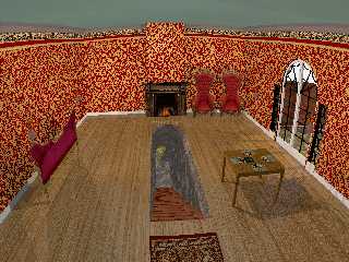
"Bald Eagle" <cre### [at] netscape net> wrote:
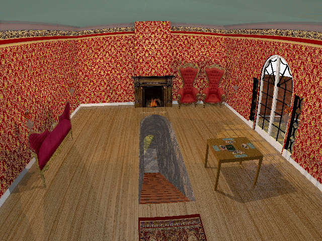
> Here's what I've cobbled together with my limited skills so far.
>
> Looking for comments and criticism, suggestions, inspiration, etc.
> Thanks!
It is a start, other than the obvious 2D elements that you are still to model
the textures of the other parts need a bit of work, the bricks are too linear
also, as has been mentioned don't really fit the rest of the scene/period you
are aiming for. Also, not too sure about the metal work around the patio doors,
I don't think I have ever seen anything like this.
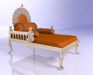
If you want I have an old model of a chair/throne (made way back in about 1998)
it is not exactly what you have but seeing your 2D version reminded me of this
one and I still have the source (although this was before I even knew how to use
macros/while loops in POV so lots of cut and paste was involved so it may be
very difficult to modify).
See image attached.
Look forward to seeing this improve as there is plenty of time still before the
deadline.
Sean net> wrote:
> Here's what I've cobbled together with my limited skills so far.
>
> Looking for comments and criticism, suggestions, inspiration, etc.
> Thanks!
It is a start, other than the obvious 2D elements that you are still to model
the textures of the other parts need a bit of work, the bricks are too linear
also, as has been mentioned don't really fit the rest of the scene/period you
are aiming for. Also, not too sure about the metal work around the patio doors,
I don't think I have ever seen anything like this.
If you want I have an old model of a chair/throne (made way back in about 1998)
it is not exactly what you have but seeing your 2D version reminded me of this
one and I still have the source (although this was before I even knew how to use
macros/while loops in POV so lots of cut and paste was involved so it may be
very difficult to modify).
See image attached.
Look forward to seeing this improve as there is plenty of time still before the
deadline.
Sean
Post a reply to this message
Attachments:
Download 'throne.jpg' (116 KB)
Preview of image 'throne.jpg'
|
|
| |
| |
|
|
|
|
| |
| |
|
|
> Also, not too sure about the metal work around the patio doors,
> I don't think I have ever seen anything like this.
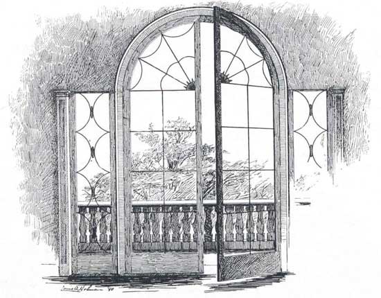
well, not having any real idea what constituted a "conservatory", neither did I,
but I searched around to get an overall idea of what a Victorian conservatory
might look like, and went with the attached design.
> If you want I have an old model of a chair/throne (made way back in about 1998)
> it is not exactly what you have but seeing your 2D version reminded me of this
> one and I still have the source (although this was before I even knew how to use
> macros/while loops in POV so lots of cut and paste was involved so it may be
> very difficult to modify).
Holy smokes. That must have been a really massive investment of time and
brainpower!
I'd be happy to model my own, if the investment in time doesn't outweigh all
else, though I'll need to figure out how to get a nice clean flow to something
so elegantly carved and organic in shape. I might have an easier time doing it
for real with chisels and gouges.
If I'm not AFK due to work IRL, then I'll make a stab at working on constructing
scene elements, experimenting with camera angle and lighting, and enriching my
good-enough-to-get-the-idea textures. :)
Post a reply to this message
Attachments:
Download '945_french_window_in_taylor_house.jpg' (45 KB)
Preview of image '945_french_window_in_taylor_house.jpg'
|
|
| |
| |
|
|
|
|
| |
| |
|
|
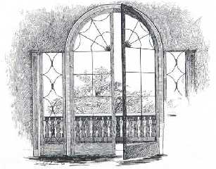
"Bald Eagle" <cre### [at] netscapenet> wrote:
>
> well, not having any real idea what constituted a "conservatory", neither did I,
> but I searched around to get an overall idea of what a Victorian conservatory
> might look like, and went with the attached design.
>
Well, I like the sketch/design and it does look Victorian so I think it might be
the brick wall around it in your image that is making it look out of place.
>
> Holy smokes. That must have been a really massive investment of time and
> brainpower!
Oh yes, back in the days when I had time to spend ages modelling (but not enough
time to RTM and workout how to use loops ;-)
> If I'm not AFK due to work IRL, then I'll make a stab at working on constructing
> scene elements, experimenting with camera angle and lighting, and enriching my
good-enough-to-get-the-idea textures.
:)
Always the problem I have commenting on WIP's, I never am quite sure what part
are more WIP than others ;-)
Sean
Post a reply to this message
|
|
| |
| |
|
|
|
|
| |
| |
|
|
> Well, I like the sketch/design and it does look Victorian so I think it might be
> the brick wall around it in your image that is making it look out of place.
I don't have a firm idea of what Victorian looks like vs Edwardian or
Kardashian.... :)
> Always the problem I have commenting on WIP's, I never am quite sure what part
> are more WIP than others ;-)
It's all up for grabs at this point. Have at it.
Other than the French doors that I'm not up for remodeling right now, and the
basic tunnel, it's all pretty much just a sketch with some texturing.
I'm looking to redo the room in wallpaper as suggested, add curtains, framed
paintings and mirrors, jazz up the fireplace with an ornate hearth and some
brass fireplace tools, do some work on the card table, and then maybe redo the
lighting. I need some plants in the conservatory as well.
I'm not sure I'm happy with the little desk-lamps - I might see if I can do
something ceiling-mounted.
Part of why I wanted to take a stab at this is to learn how to do certain
things, do them better, and do them FASTER. So, other than just the usual
comments and suggestions about the scene and its elements, I'm open and happy to
hear any and all suggestions about how to envision, arrange, and construct a
scene, lay out my SDL for efficient editing and revision, and where I can
benefit by using macros, loops, and interesting "tricks" folks have developed
throughout the years. I'm loving the ability to render only a small section of
the WIP by selecting a box or using the command line options. I haven't really
used Quick Colors, but often find myself rendering at Q5 - though that really
freaks me out sometimes when I forget it's set to that and certain features
(obviously) don't show up or are black). Classic noob stuff. :D
Post a reply to this message
|
|
| |
| |
|
|
|
|
| |
| |
|
|
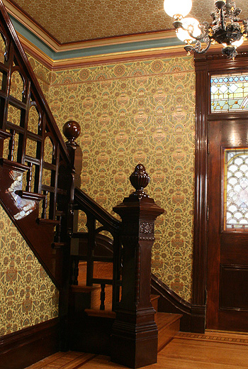
So, I've spent a little while reworking some of this, and the thing that struck
me is how rich the image maps come out, and how dull and lifeless the
eye-dropper tool sampled rgb colors come out when I try to incorporate them into
a color map.
Maybe it's related to my monitor / gamma / contrast (non)issue, maybe I'm doing
something wrong using (rgb_value/255), or maybe it's just an optical effect of
not having any real texturing of the basic pigment.
Whatever's going on, my floor is NOT coming out anywhere close to the rich honey
yellow of the reference photo.
I could use some schooling in this area if anyone has any experience/insights.
See the wood floor I color-sampled compared to the present WIP.
I DID notice that moving the order of the colors around in the color map can
have an interesting effect, though I haven't stumbled upon what I'd like yet.
#declare OakFloor = texture {
pigment {bozo scale <1, 1, 10> color_map {
[0.0 rgb <121/255, 52/255, 13/255> * Tone]
[0.2 rgb <142/255, 73/255, 18/255> * Tone]
[0.4 rgb <184/255, 115/255, 48/255> * Tone]
[0.6 rgb <157/255, 81/255, 23/255> * Tone]
[0.8 rgb <108/255, 45/255, 4/255> * Tone]
[1.0 rgb <156/255, 72/255, 26/255> * Tone]
}
turbulence 0.5
scale <1, 1, 10> * 0.5
rotate y*YRotate
}
Post a reply to this message
Attachments:
Download 'secretpassage6.png' (646 KB)
Preview of image 'secretpassage6.png'
|
|
| |
| |
|
|
|
|
| |
| |
|
|
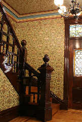
Reference:
Post a reply to this message
Attachments:
Download 'centennial_foyer.jpg' (137 KB)
Preview of image 'centennial_foyer.jpg'
|
|
| |
| |
|
|
|
|
| |
| |
|
|
At first glance, I would say that - as is - the /colour/ of the floor is
oak-like, although a light one. However, I think you should do a couple
of things:
1) break up the floor in individual boards. In this wip, boards are
simulated by scaling the texture to the extreme but that is not
wood-like. In the thread 'Silentium - final' I uploaded an older image
of mine (De Dulle Griet) where you can see different wood textures,
particularly the floor which is a macro originally by Dan Hentschel
which I adapted to my own needs. If you are interested, I can put it in
p.b.s-f.
2) use a wood pattern properly scaled and rotated. Now, you will soon
discover that moiree effects will appear when applied to the floor. You
will need to play with the texture's scale and/or the colour contrasts
until they disappear.
3) if you want a more honey-coloured floor I suppose you should add more
'yellow' to your texture ;-) I shall look at your texture but be
patient: I am rendering a final version of Silentium and that is taking
most of my resources for the reminder of the week.
Thomas
Post a reply to this message
|
|
| |
| |
|
|
|
|
| |
| |
|
|
On 8-10-2014 20:53, Bald Eagle wrote:
> Whatever's going on, my floor is NOT coming out anywhere close to the rich honey
> yellow of the reference photo.
Try this. I believe it comes closer to what you want:
#local Tone = <1.2, 1.2, 0.3>;
#declare OakFloor =
texture {
pigment {
wood
color_map {
[0.0 srgb <121, 52, 13>/255 * Tone]
[0.2 srgb <142, 73, 18>/255 * Tone]
[0.4 srgb <184, 115, 48>/255 * Tone]
[0.6 srgb <157, 81, 23>/255 * Tone]
[0.8 srgb <108, 45, 4>/255 * Tone]
[1.0 srgb <156, 72, 26>/255 * Tone]
}
warp {turbulence <0.6, 0.1, 0.1>}
scale <1, 1, 10>*0.5
scale 0.3
rotate 1*x
rotate y*10
}
}
You could also experiment with the following texture by Nicolas Rougier,
which is an excellent wood texture:
//============= NR_Wood (2003) =============
#declare NR_wood_grain =
pigment {
wood
warp {cylindrical orientation y dist_exp 1}
warp {turbulence 1.25}
scale <.5,30,1>
warp {turbulence .25}
scale <1,10,1>
warp {
black_hole <0, 0.5, 0>, 1
falloff 2
strength 1.5
repeat 7
turbulence 2
inverse
}
}
#declare NR_wood_normal =
function {
pigment {
wood
warp {cylindrical orientation y dist_exp 1}
warp {turbulence 1.25}
scale <.5,30,1>
warp {turbulence .25}
scale <1,5,1>
color_map {[0 rgb <0,0,0>] [1 rgb <1,1,1>]}
}
}
#declare NR_woodmap =
color_map {
[0.00 srgb <0.949, 0.792, 0.514 >]
[0.30 srgb <0.855, 0.651, 0.376 >]
[0.60 srgb <0.831, 0.596, 0.275 >]
[0.90 srgb <0.620, 0.447, 0.204 >]
}
#declare NR_Wood =
texture {
pigment {NR_wood_grain
color_map {NR_woodmap}
ramp_wave
}
normal {
function {NR_wood_normal(x,y,z).grey*0.5
}
}
finish {diffuse 0.6 specular 0.1 roughness 0.005}
}
Thomas
Post a reply to this message
|
|
| |
| |
|
|
|
|
| |
| |
|
|
> "Bald Eagle" <cre### [at] netscapenet> wrote:
>>
>> well, not having any real idea what constituted a "conservatory", neither did I,
>> but I searched around to get an overall idea of what a Victorian conservatory
>> might look like, and went with the attached design.
>>
>
> Well, I like the sketch/design and it does look Victorian so I think it might be
> the brick wall around it in your image that is making it look out of place.
>
>>
>> Holy smokes. That must have been a really massive investment of time and
>> brainpower!
>
> Oh yes, back in the days when I had time to spend ages modelling (but not enough
> time to RTM and workout how to use loops ;-)
>
>> If I'm not AFK due to work IRL, then I'll make a stab at working on constructing
>> scene elements, experimenting with camera angle and lighting, and enriching my
good-enough-to-get-the-idea textures.
> :)
>
> Always the problem I have commenting on WIP's, I never am quite sure what part
> are more WIP than others ;-)
>
> Sean
>
>
>
As you made that trone way back in 1998, i'm not sure that loops where
possible at that time. Early 3.0 or late 2.x versions.
Post a reply to this message
|
|
| |
| |
|
|
|
|
| |
|
|