|
 |
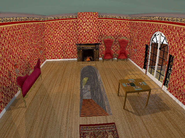
So, I've spent a little while reworking some of this, and the thing that struck
me is how rich the image maps come out, and how dull and lifeless the
eye-dropper tool sampled rgb colors come out when I try to incorporate them into
a color map.
Maybe it's related to my monitor / gamma / contrast (non)issue, maybe I'm doing
something wrong using (rgb_value/255), or maybe it's just an optical effect of
not having any real texturing of the basic pigment.
Whatever's going on, my floor is NOT coming out anywhere close to the rich honey
yellow of the reference photo.
I could use some schooling in this area if anyone has any experience/insights.
See the wood floor I color-sampled compared to the present WIP.
I DID notice that moving the order of the colors around in the color map can
have an interesting effect, though I haven't stumbled upon what I'd like yet.
#declare OakFloor = texture {
pigment {bozo scale <1, 1, 10> color_map {
[0.0 rgb <121/255, 52/255, 13/255> * Tone]
[0.2 rgb <142/255, 73/255, 18/255> * Tone]
[0.4 rgb <184/255, 115/255, 48/255> * Tone]
[0.6 rgb <157/255, 81/255, 23/255> * Tone]
[0.8 rgb <108/255, 45/255, 4/255> * Tone]
[1.0 rgb <156/255, 72/255, 26/255> * Tone]
}
turbulence 0.5
scale <1, 1, 10> * 0.5
rotate y*YRotate
}
Post a reply to this message
Attachments:
Download 'secretpassage6.png' (646 KB)
Preview of image 'secretpassage6.png'
|
|