|
|
|
|
|
|
| |
| |
|
|
|
|
| |
| |
|
|
"Ross" <rli### [at] everestkc net> wrote:
> Like others have said, this is a lot better. I think the metal on the
> faucett needs to be darker though, with little diffuse (0.2?) and sharper
> highlights.
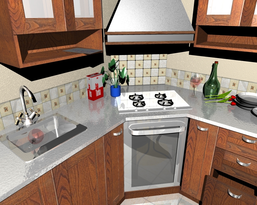
I'm working just now. How is this scene? net> wrote:
> Like others have said, this is a lot better. I think the metal on the
> faucett needs to be darker though, with little diffuse (0.2?) and sharper
> highlights.
I'm working just now. How is this scene?
Post a reply to this message
Attachments:
Download 'kitchen6.jpg' (607 KB)
Preview of image 'kitchen6.jpg'

|
|
| |
| |
|
|
|
|
| |
| |
|
|
"Ross" <rli### [at] everestkcnet> wrote:
> Like others have said, this is a lot better. I think the metal on the
> faucett needs to be darker though, with little diffuse (0.2?) and sharper
> highlights.
I tested that scene with fog (Range 1000).
Post a reply to this message
Attachments:
Download 'kitchen7.jpg' (513 KB)
Preview of image 'kitchen7.jpg'
|
|
| |
| |
|
|
|
|
| |
| |
|
|
Hasan3 wrote:
> "Ross" <rli### [at] everestkcnet> wrote:
>
>>Like others have said, this is a lot better. I think the metal on the
>>faucett needs to be darker though, with little diffuse (0.2?) and sharper
>>highlights.
>
>
>
> I tested that scene with fog (Range 1000).
>
>
> ------------------------------------------------------------------------
>
Some of the Hilights in the second image seem way too bright, (see the
cabinet door by the window.) Also there's still too much reflection in
the sink texture and the floor.
I wouln't recommend using fog, but rather an athmospheric media.
(Although this can be tricky.)
As to the change of texture on the counter, I was rather fond of the
marble counter top, but I still think that the counter top should be cut
away around the stove. (From a purely practical standpoint, you'd have a
very difficult time replacing it if something went wrong.
Also, the heat from the range is going to stunt that plant.
The glass texture on the wine gobblet is a little ghostly. It's
difficult to tell it's even there.
If you're making your own textures.
Regards,
A.D.B.
Post a reply to this message
|
|
| |
| |
|
|
|
|
| |
| |
|
|
Anthony D. Baye nous apporta ses lumieres en ce 2005-08-26 20:55:
> Hasan3 wrote:
>
>> "Ross" <rli### [at] everestkcnet> wrote:
>>
>>> Like others have said, this is a lot better. I think the metal on the
>>> faucett needs to be darker though, with little diffuse (0.2?) and
>>> sharper
>>> highlights.
>>
>>
>>
>>
>> I tested that scene with fog (Range 1000).
>>
>>
>> ------------------------------------------------------------------------
>>
>
> Some of the Hilights in the second image seem way too bright, (see the
> cabinet door by the window.) Also there's still too much reflection in
> the sink texture and the floor.
>
> I wouln't recommend using fog, but rather an athmospheric media.
> (Although this can be tricky.)
>
> As to the change of texture on the counter, I was rather fond of the
> marble counter top, but I still think that the counter top should be cut
> away around the stove. (From a purely practical standpoint, you'd have a
> very difficult time replacing it if something went wrong.
>
> Also, the heat from the range is going to stunt that plant.
>
> The glass texture on the wine gobblet is a little ghostly. It's
> difficult to tell it's even there.
>
> If you're making your own textures.
>
> Regards,
>
> A.D.B.
You can have separate oven, mounted under the counter, and a 4 burners heating plate
mounted on the
counter. In that case, there is NO gap around the oven, and it would explain why the
heating plate
is whider than the oven.
Alain
Post a reply to this message
|
|
| |
| |
|
|
|
|
| |
| |
|
|
Anthony D. Baye wrote:
> Some of the Hilights in the second image seem way too bright, (see the
> cabinet door by the window.) Also there's still too much reflection in
> the sink texture and the floor.
The floor is very reflective but I'd be inclined to believe glassy
marble tiles *could* be that reflective. The sink looks like mirrored
chrome.
> As to the change of texture on the counter, I was rather fond of the
> marble counter top, but I still think that the counter top should be cut
> away around the stove. (From a purely practical standpoint, you'd have a
> very difficult time replacing it if something went wrong.
I'm afraid Antony that I've go to go with Alain here - in most new
kitchens in my part of the world you have fitted ovens with separate
hobs (burners). This way you can choose which oven you get with which
hob and you can put the oven at worktop height if you wish. You also
don't get the gap around the hob which is just waiting for food to fall
down it, and it can be about 2/3 of the price of a free standing unit.
Alternatively people go for a freestanding stainless steel range cooker
with 5 or 6 burners.
from a very quick google image search for gas hob.
http://www.house-sa.com/Shelley%20Beach/Gas-hob_fridge.jpg
Post a reply to this message
|
|
| |
| |
|
|
|
|
| |
| |
|
|
Hasan3 wrote:
> "Ross" <rli### [at] everestkcnet> wrote:
>
>>Like others have said, this is a lot better. I think the metal on the
>>faucett needs to be darker though, with little diffuse (0.2?) and sharper
>>highlights.
>
>
> I'm working just now. How is this scene?
Very pretty, I see you've been playing with normals, I like the worktop
texture.
The wine glass might be improved by adding refraction as it does look
like a ghost at the moment, and the water in the sink is not believable.
Also your wood texture is very good but is let down by the fact that
every cupboard has the same wood grain pattern.
I'd also be inclined to agree that the white parts of the cupboards are
rather more reflective than I'd expect. I'm also not sure how long a
mirrored chrome sink would stay unscratched, but I like it and I like
it's clean simple shape.
These are only minor points in a frighteningly detailed and well
modelled scene.
Post a reply to this message
|
|
| |
| |
|
|
|
|
| |
| |
|
|
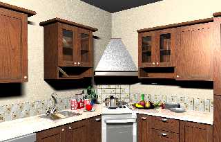
Sory, I was not aswered you. Because my English is very terrible. But I was
very pleased your criticisms and suggestions. You are very wonderful
peaples. Because, you are attaching ipportance to the human. Actually, I'm
not a 3d designer, I'm programmer. This working is a 3d drawing of my CAD
editor. And I prefered the Povray Engine for the render. So I tested
extensive example with the Povray. I think that I succeeded a little with
your help. After this I must complete the editor povray export feature.
Best Regards, thanks all.
Post a reply to this message
Attachments:
Download 'mutfak10.jpg' (686 KB)
Preview of image 'mutfak10.jpg'
|
|
| |
| |
|
|
|
|
| |
| |
|
|
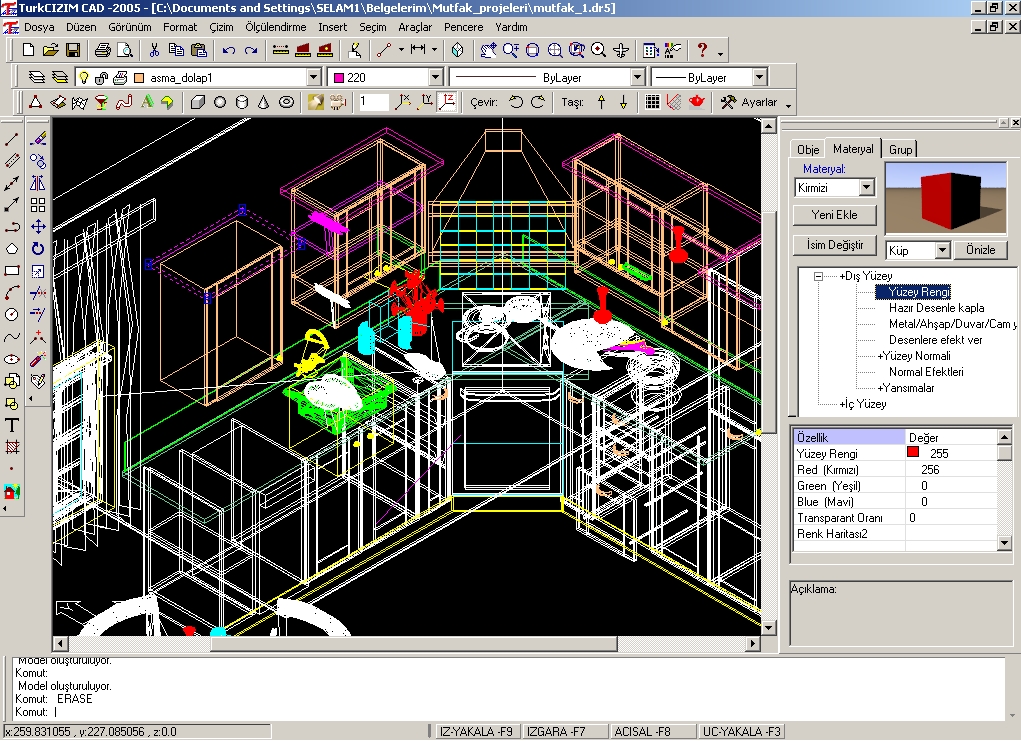
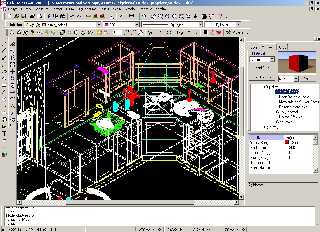
My editor is TurkCIZIM CAD. This program is Turkish, Englis version will be
soon.
www.turkcizim.com
The wireframe view of the Kitchen in the CAD editor :
Post a reply to this message
Attachments:
Download 'editor.jpg' (486 KB)
Preview of image 'editor.jpg'
|
|
| |
| |
|
|
|
|
| |
| |
|
|
Hasan3 wrote:
> Sory, I was not aswered you. Because my English is very terrible.
It is not bad at all and it will improve as long as you practice, so it
can never be an excuse not to write ;) .
> But I was
> very pleased your criticisms and suggestions. You are very wonderful
> peaples. Because, you are attaching ipportance to the human. Actually, I'm
> not a 3d designer, I'm programmer. This working is a 3d drawing of my CAD
> editor. And I prefered the Povray Engine for the render. So I tested
> extensive example with the Povray. I think that I succeeded a little with
> your help. After this I must complete the editor povray export feature.
>
> Best Regards, thanks all.
>
>
>
>
> ------------------------------------------------------------------------
>
Very nice work.
Point that could do with a little attention:
The extractor (the thing over the cooking thing, I had to
consult my dictonary too) disapears in a strange way into the walls.
For some reason it is not symmetrical an I can not find an explanation
why. Texture on it is very good, and so are your wood textures, only
you might make sure that they don' repeat on every cabinet.
Post a reply to this message
|
|
| |
| |
|
|
|
|
| |
| |
|
|
andrel wrote:
> ...
> The extractor (the thing over the cooking thing, I had to
> consult my dictonary too) disapears in a strange way into the walls.
In American English it would be called an exhaust hood, or simply a hood.
But I agree, it would more likely have a vertical flue going into the
ceiling. OTOH, I suppose it could be built with the duct work behind
the walls, but more commonly it would be ducted into the ceiling.
Of course, I'm no architect, (I'm no cook either, I'm a stranger in a
kitchen), so what do *I* know... ;-)
-=- Larry -=-
Post a reply to this message
|
|
| |
| |
|
|
|
|
| |