|
 |
Hi,
What are you showing?
Can you give us a explanation about the symbols?
Thanks,
Oleguer
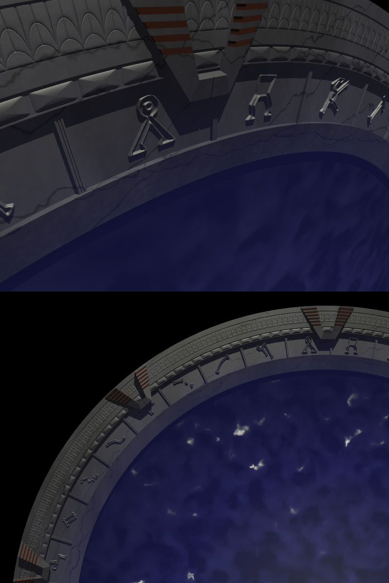
>> Ok, so I'm Sci-Fi fan. Here's a WIP of the stargate. I still have some
>> work to do on the chevrons, but I'd like to get some advice on making it
>> look more "real". I'm using layered textures, but it seems like there's
>> something missing. Maybe it's the lighting? Any suggestions are
>> appreciated. (BTW, the water looks cool animated).
>>
>> Mike
>
> My thoughts for whats they're worth.
>
> The "Fracture" lines or cracks , need to be tightened up, thay appear to
> be smudgey. If this cracking is from aging then I think they need to be
> stronger, sharper edges and a stronger-darker color.
>
> I cent see if the top image using area_lights but is doesn't look light
> it. Sticking in high definition area_light(s) is a good way of increasing
> the realism.
>
> Another lighting tip, is to have secondary lighting . It rare that there
> is a single light source in real life. The secondary lights should be
> weaker than you main source but still able to cast shadows.
>
> It might benefit from using slightly differnt textures on the differn't
> parts of the structure. You often find that what is accurate to life,
> does not actually look right in a picture.
>
> --
> #####-----#####-----#####
> POV Tips and Hints at ...
> http://povman.blogspot.com/
>
>
Post a reply to this message
|
|
|
|
"Roman Reiner" <lim### [at] gmx de> wrote:
> Good modeling! How did you make those symbols? font object with stargate
> font or hand modeled?
Thanks! I started with a font object, but it didn't look right. So, I used
POVRay to make a b/w image for each glyph, then blurred it a bit and made a
height field with each one.
> work on the textures is definitely recommendable. it just looks to... hmm
> procedual? i think when one is able to recognize the pattern used (agate
> right? ;)) then the textures need work.
>
> Regards Roman
Well, it is a _bit_ more complex than that, but all the layers I made didn't
seem to help much. See below for the code, and maybe you can give me some
suggestions?
> POVMAN wrote:
>
>The "Fracture" lines or cracks , need to be tightened up, thay appear to be
>smudgey. If this cracking is from aging then I think they need to be
>stronger, sharper edges and a stronger-darker color.
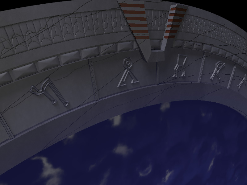
Ok, I tried to fix that.
>I cent see if the top image using area_lights but is doesn't look light it.
>Sticking in high definition area_light(s) is a good way of increasing the
>realism.
>
>Another lighting tip, is to have secondary lighting . It rare that there is
>a single light source in real life. The secondary lights should be weaker
>than you main source but still able to cast shadows.
I added area lights and a secondary light. I think it helped a lot!
Here's the texture code. It's supposed to be some kind of stone. Any
suggestions?
#declare base =
texture {
pigment {
granite
color_map {
[0.3 color rgbt <0.20, 0.20, 0.25, 0.0> ]
[0.80 color rgbt <0.15, 0.15, 0.2, 0.0> ]
[1.00 color rgbt <0.30, 0.30, 0.35, 0.0> ]
}
frequency 6
rotate <0, 10, 0>
turbulence <0.05, 0.05, 0.05>
octaves 6
omega 0.7
lambda 2
}
#if (radiosity_on)
finish{
ambient 0.0
diffuse 0.4
roughness 1/1
}
#else
finish{ ambient 0.05
diffuse 0.6
specular 0.1 // shiny
roughness 1/100
}
#end
}
#declare overlay =
texture {
pigment {
granite
color_map {
[0.0 color rgbt <0.1, 0.1, 0.12, 0.1> ]
[0.3 color rgbt <0.1, 0.1, 0.12, 0.2> ]
[0.60 color rgbt <0.15, 0.15, 0.2, 0.2> ]
[1.00 color rgbt <0.15, 0.15, 0.2, 0.1> ]
}
frequency 1
}
scale <15,35,15>
#if (radiosity_on)
finish{
ambient 0.0
diffuse 0.4
roughness 1/1
}
#else
finish{ ambient 0.05
diffuse 0.6
specular 0.1 // shiny
roughness 1/1000
}
#end
}
#declare overlay2 =
texture {
pigment {
granite
color_map {
[0.0 color rgbt <0.01, 0.01, 0.02, 0.4> ]
[0.3 color rgbt <0.01, 0.01, 0.02, 0.1> ]
[0.60 color rgbt <0.05, 0.05, 0.08, 0.2> ]
[0.80 color rgbt <0.05, 0.05, 0.08, 0.5> ]
[1.00 color rgbt <0.05, 0.05, 0.08, 0.1> ]
}
frequency 1
}
scale <15,35,15>
#if (radiosity_on)
finish{
ambient 0.0
diffuse 0.4
roughness 1/1
}
#else
finish{ ambient 0.05
diffuse 0.6
specular 0.1 // shiny
roughness 1/100
}
#end
}
#declare line =
texture {
pigment
{wood
turbulence 0.03
color_map
{[0.0, 0.01 color Black transmit 0.0 color Black transmit 0.2]
[0.01 color Clear]
}
}
#if (radiosity_on)
finish{
ambient 0.0
diffuse 0.4
roughness 1/1
}
#else
finish{ ambient 0.05
diffuse 0.6
specular 0.1 // shiny
roughness 1/10
}
#end
}
#declare tex =
texture{base scale <0.6, 0.6, 0.6>}
texture{overlay2 scale 0.05*<0.5, 0.3, 0.5>}
texture{overlay scale <0.5, 0.5, 0.5> normal {wrinkles 0.1 scale 0.1 }}
texture{line scale 0.5*<1, 2, 1.4> rotate <15, 65, -30>}
texture{line scale 0.6*<1, 2, 1.4> rotate <10, 45, 30>} de> wrote:
> Good modeling! How did you make those symbols? font object with stargate
> font or hand modeled?
Thanks! I started with a font object, but it didn't look right. So, I used
POVRay to make a b/w image for each glyph, then blurred it a bit and made a
height field with each one.
> work on the textures is definitely recommendable. it just looks to... hmm
> procedual? i think when one is able to recognize the pattern used (agate
> right? ;)) then the textures need work.
>
> Regards Roman
Well, it is a _bit_ more complex than that, but all the layers I made didn't
seem to help much. See below for the code, and maybe you can give me some
suggestions?
> POVMAN wrote:
>
>The "Fracture" lines or cracks , need to be tightened up, thay appear to be
>smudgey. If this cracking is from aging then I think they need to be
>stronger, sharper edges and a stronger-darker color.
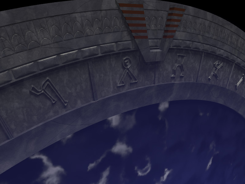
Ok, I tried to fix that.
>I cent see if the top image using area_lights but is doesn't look light it.
>Sticking in high definition area_light(s) is a good way of increasing the
>realism.
>
>Another lighting tip, is to have secondary lighting . It rare that there is
>a single light source in real life. The secondary lights should be weaker
>than you main source but still able to cast shadows.
I added area lights and a secondary light. I think it helped a lot!
Here's the texture code. It's supposed to be some kind of stone. Any
suggestions?
#declare base =
texture {
pigment {
granite
color_map {
[0.3 color rgbt <0.20, 0.20, 0.25, 0.0> ]
[0.80 color rgbt <0.15, 0.15, 0.2, 0.0> ]
[1.00 color rgbt <0.30, 0.30, 0.35, 0.0> ]
}
frequency 6
rotate <0, 10, 0>
turbulence <0.05, 0.05, 0.05>
octaves 6
omega 0.7
lambda 2
}
#if (radiosity_on)
finish{
ambient 0.0
diffuse 0.4
roughness 1/1
}
#else
finish{ ambient 0.05
diffuse 0.6
specular 0.1 // shiny
roughness 1/100
}
#end
}
#declare overlay =
texture {
pigment {
granite
color_map {
[0.0 color rgbt <0.1, 0.1, 0.12, 0.1> ]
[0.3 color rgbt <0.1, 0.1, 0.12, 0.2> ]
[0.60 color rgbt <0.15, 0.15, 0.2, 0.2> ]
[1.00 color rgbt <0.15, 0.15, 0.2, 0.1> ]
}
frequency 1
}
scale <15,35,15>
#if (radiosity_on)
finish{
ambient 0.0
diffuse 0.4
roughness 1/1
}
#else
finish{ ambient 0.05
diffuse 0.6
specular 0.1 // shiny
roughness 1/1000
}
#end
}
#declare overlay2 =
texture {
pigment {
granite
color_map {
[0.0 color rgbt <0.01, 0.01, 0.02, 0.4> ]
[0.3 color rgbt <0.01, 0.01, 0.02, 0.1> ]
[0.60 color rgbt <0.05, 0.05, 0.08, 0.2> ]
[0.80 color rgbt <0.05, 0.05, 0.08, 0.5> ]
[1.00 color rgbt <0.05, 0.05, 0.08, 0.1> ]
}
frequency 1
}
scale <15,35,15>
#if (radiosity_on)
finish{
ambient 0.0
diffuse 0.4
roughness 1/1
}
#else
finish{ ambient 0.05
diffuse 0.6
specular 0.1 // shiny
roughness 1/100
}
#end
}
#declare line =
texture {
pigment
{wood
turbulence 0.03
color_map
{[0.0, 0.01 color Black transmit 0.0 color Black transmit 0.2]
[0.01 color Clear]
}
}
#if (radiosity_on)
finish{
ambient 0.0
diffuse 0.4
roughness 1/1
}
#else
finish{ ambient 0.05
diffuse 0.6
specular 0.1 // shiny
roughness 1/10
}
#end
}
#declare tex =
texture{base scale <0.6, 0.6, 0.6>}
texture{overlay2 scale 0.05*<0.5, 0.3, 0.5>}
texture{overlay scale <0.5, 0.5, 0.5> normal {wrinkles 0.1 scale 0.1 }}
texture{line scale 0.5*<1, 2, 1.4> rotate <15, 65, -30>}
texture{line scale 0.6*<1, 2, 1.4> rotate <10, 45, 30>}
Post a reply to this message
Attachments:
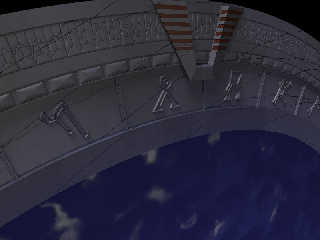
Download 'stargate_03.jpg' (94 KB)
Preview of image 'stargate_03.jpg'
|
|