|
|
|
|
|
|
| |
| |
|
|
|
|
| |
| |
|
|
Christoph Hormann wrote:
> Mike Raiford wrote:
>
>>
>> From the top of the bush, down it looks like a photo. The *only*
>> giveaway is the clouds.
>
>
> What's wrong with the clouds? Surely they are not perfect but i don't
> really see something wrong in particular about them. When i look out of
> the window right now i see clouds quite similar in coloring - more dense
> than in the image though.
To me, they look a bit too "soft", more painted on, than real clouds. Of
course, I've been on a quest for perfect media clouds for quite a while,
now, and I can never seem to get there.
> Maybe they should be more and smaller - they are really quite large
> compared to the terrain.
Smaller might work. It's worth an experiment, at least.
> Christoph
>
--
~Mike
Things! Billions of them!
Post a reply to this message
|
|
| |
| |
|
|
|
|
| |
| |
|
|
Mike Raiford wrote:
>
> To me, they look a bit too "soft", more painted on, than real clouds. Of
> course, I've been on a quest for perfect media clouds for quite a while,
> now, and I can never seem to get there.
I think i know what you mean - it's difficult to generate these type of
clouds that has very sharp edges without looking too 'solid'. But also
note that a typical cloud in sunlight is *very* bright on the sunlit
side - quite difficult to capture in an image like this.
Christoph
--
POV-Ray tutorials, include files, Sim-POV,
HCR-Edit and more: http://www.tu-bs.de/~y0013390/
Last updated 03 May. 2005 _____./\/^>_*_<^\/\.______
Post a reply to this message
|
|
| |
| |
|
|
|
|
| |
| |
|
|
Christoph Hormann wrote:
>
> Yet another rework of a LOTW scene.
>
> Also the first serious render i did on my new computer, less than two
> days for ~7000x5000.
>
> Some post processing (removal of cloud artefacts, filtering and scaling).
>
> See:
>
> http://www.tu-bs.de/%7Ey0013390/lotw2/data/lotw_scene_038_09.html
>
> for the basis.
>
> I am not yet satisfied with the background mountains (they don't seem
> very realistic) so i consider changing them.
>
> Christoph
>
>
> ------------------------------------------------------------------------
>
As usual with your work, what I am most stuck by is the color and the
composition. Those hard, dry tans and olives you favour, accented by
some blue,... gorgeous. And the desaturation gives crispness to the the
black shadows. And then the way the landscape threads into the
distance, curving around a bush which obstructs our view, after first
presenting us with the shaded relief of the water in the
foreground,...very pleasing. I also enjoy the careful placement of
grass tufts in the foreground such that they seem to be a produce of its
vagaries.
Some find the clouds a problem. Not sure myself. Changing the scaling,
as someone mentioned,...seemed to make sense. If anything I find them a
bit pat. They are gorgeous btw, cg masterful, but they seem to have
arranged themselves perfectly for the "shot". Odd since I think you are
using random numbers for placement in these landscapes?
Your use of noisy iso's to simulate rock is, of course, amazing, but I
assume that once you have a usable formula, it is simply a matter of
refinements. (I have been using, with out the slightess understanding
of how it works, your code for warping planks in isowood.inc)
So, it would seem, the background range is just an area you haven't
tweaked yet. Yes, mountains can look like that. But cg noise patterns
look like that even more. Seems like a product of two patterns like
Jaime uses would be the thing. But I feel quite ridiculous making
suggestions.
Post a reply to this message
|
|
| |
| |
|
|
|
|
| |
| |
|
|
Foreground is especially impressive.
The clouds might not be typical of such an arid environment at mid day, but
they look OK to me. Perhaps some very faint streaky high altitude clouds
would help the realism?
Can you offer a little detail on your new computer? Knowing you are one of
the best POVers I am curious about it.
Bill
Christoph Hormann <chr### [at] gmx de> wrote:
> Yet another rework of a LOTW scene. de> wrote:
> Yet another rework of a LOTW scene.
Post a reply to this message
|
|
| |
| |
|
|
|
|
| |
| |
|
|
Christoph Hormann wrote:
>
> Yet another rework of a LOTW scene.
>
Stunning. Before you become too critical about the background
mountains, they remind me of Agathla Peak, back in my old stomping
grounds on the Navajo Nation:
http://www.lapahie.com/Pictures/Agathla_Peak_Fm_Church_Rock.jpg
I believe that the texture might be a bit different, since these are
eroded remnants of volcanoes (if I recall correctly), but the geometry
is similar.
Anyway, I should echo Jim Charter's comments, especially:
"I feel quite ridiculous making suggestions."
Fantastic, Christoph!
Dave Matthews
Post a reply to this message
|
|
| |
| |
|
|
|
|
| |
| |
|
|
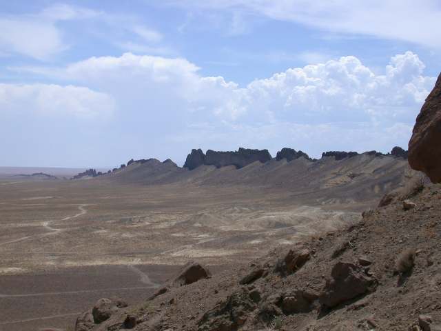
Wonderful picture!
Some comments: The clouds are not a problem for me. They would be unusual in
the desert
but often there are clouds in the desert, see photos taken in the southwest of
USA
I attached for comparison. The moutain on the far left doesn't seem realistic
to me, and seems a bit too faded out. (On the other hand, Shiprock New Mexico
looks a
bit like that mountain, and it doesn't look real when you see it in person!).
It
would be very unusual to see a clear water stream like that in the desert. Much
more
likely: a dry stream-bed, or brown water, or turbulent water. But you did such
a nice
job on that water I wouldn't change it. One other thing that bothers me a bit is
the
trees on the horizon on the mountains on the right. They seem too numerous for
such
bare rocky mountains, and perhaps too big.
But don't change it too much. In my opinion composition is just as important,
if not
more important, than realism.
--
Jim Buddenhagen
Post a reply to this message
Attachments:
Download 'dscn7066.jpg' (27 KB)
Download 'dscn6643.jpg' (22 KB)
Download 'dscn7073.jpg' (26 KB)
Preview of image 'dscn7066.jpg'

Preview of image 'dscn6643.jpg'
Preview of image 'dscn7073.jpg'

|
|
| |
| |
|
|
|
|
| |
| |
|
|
>> Yes, the mountains on the left side look a little too "CG", but
>> maybe you get them like that IRL?
>
> They need to be rougher in the steep parts.
How about some focal blur? If you focussed on that large-ish plant in the
centre, then applied just enough to make sure the mountains were slightly
out of focus, that should make it look even more like a photo, and it would
save you having to put too much detail into the background...
Post a reply to this message
|
|
| |
| |
|
|
|
|
| |
| |
|
|
I think the problem with the clouds is that in real life they are almost
ideal scale-free objects, which is almost ideal for p*ssing off POV media
users... ;) I've never tried modelling a cloud like this, but I'd try
using several warp{turbulence} statements at various scales, with only a
little turbulence at each level. I know that using higher turbulence
settings makes for a nicely detailed 'misty' look, so maybe this could be
used subtly without destroying the overall distribution of the media. I
might have a go actually...
Excellent image by the way. :)
L
-
Post a reply to this message
|
|
| |
| |
|
|
|
|
| |
| |
|
|
Jim Charter wrote:
>>
> As usual with your work, what I am most stuck by is the color and the
> composition. Those hard, dry tans and olives you favour, accented by
> some blue,... gorgeous. And the desaturation gives crispness to the the
> black shadows. And then the way the landscape threads into the
> distance, curving around a bush which obstructs our view, after first
> presenting us with the shaded relief of the water in the
> foreground,...very pleasing. I also enjoy the careful placement of
> grass tufts in the foreground such that they seem to be a produce of its
> vagaries.
I hope you are aware that placement of bushes and grass is random - i
merely select a version of randomness i find most appealing (you can of
course argue that this is not so much different from actually placing
things manually).
> Your use of noisy iso's to simulate rock is, of course, amazing, but I
> assume that once you have a usable formula, it is simply a matter of
> refinements. (I have been using, with out the slightess understanding
> of how it works, your code for warping planks in isowood.inc)
The code for the original version can be found on the mentioned page -
feel free to play with it (but of course it is hardly commented so
somewhat difficult to use). What i changed for the geometry is mostly a
more detained fine stucture in the foreground.
Christoph
--
POV-Ray tutorials, include files, Sim-POV,
HCR-Edit and more: http://www.tu-bs.de/~y0013390/
Last updated 03 May. 2005 _____./\/^>_*_<^\/\.______
Post a reply to this message
|
|
| |
| |
|
|
|
|
| |
| |
|
|
William Pokorny wrote:
>
> Can you offer a little detail on your new computer? Knowing you are one of
> the best POVers I am curious about it.
Heh. ;-)
It's an Athlon 64 3500+ with 2 GB RAM. This scene does not really stess
it (uses only about 750MB). Runs the benchmark in about 1300 seconds
with an optimized compile.
Christoph
--
POV-Ray tutorials, include files, Sim-POV,
HCR-Edit and more: http://www.tu-bs.de/~y0013390/
Last updated 03 May. 2005 _____./\/^>_*_<^\/\.______
Post a reply to this message
|
|
| |
| |
|
|
|
|
| |
|
|