|
|
|
|
|
|
| |
| |
|
|
|
|
| |
| |
|
|
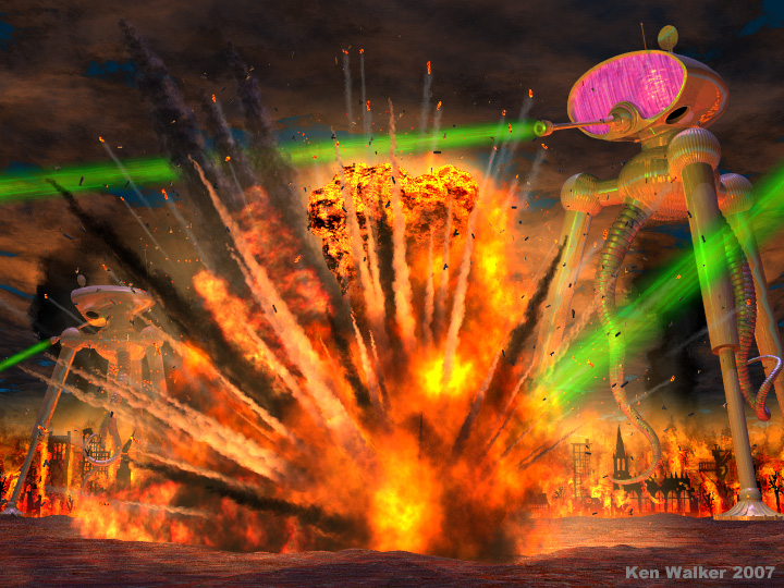
I've been working on this scene for a *long* time--far too long to admit to.
:-) Endlessly tweaking 10^3 + 1 details, most of which visually interact.
But I've been looking at it too long, so it's time to post a version, to
get some feedback.
H.G. Wells's WAR OF THE WORLDS has always been a favorite of mine, in all
its forms--novel, films, comic books--especially the CLASSICS ILLUSTRATED
comic from the 1950's (drawn by Lou Cameron.) I think the artist perfectly
captured the essence of Wells's description of the Martian war machines
(adding a bit of sleek 50's "futurism" to them as well.) So I tried to come
up with a single image that would pay homage to the comic art, AND depict
the Machines' awesome destructive firepower and ruthless nature, in their
relentless goal of eradicating humankind!
Trying to copy comic book art in 3D is an exercise in compromise. I found
that the various depictions of the Machines changed--sometimes
radically--from panel to panel in the comic. Artistic license, of course;
but that meant coming up a with SINGLE overall shape that would look
"correct" and true-to-form from any angle. Not easy! Especially the head
(basically an sPatch bicubic-patch model, with some CSG.) Just tweaking
*that* took ages. And I added a few details overall, that the artist
forgot. ;-)
Both Machines are the same model--a separate .inc file-- and the code is set
up to allow easy rotation and movement of various parts...which turned out
to be VERY useful for getting the Machine and its green ray positioned
*just so* in relation to the other scene elements.
The tentacles are spline shapes, with sPatch "sections" placed and scaled
smaller toward the tips (with some code to keep the sections correctly
butted up against each other.)
The explosion started out, long ago, as ALL media...hundreds of individual
media-filled spheres--which was taking forever-and-a-day to render. Had to
switch to a different scheme (and to my faster PC!) Much less media now;
lots of textured spheres instead, for the various smoke trails. And simple
textured boxes for the little smoke "tendrils" under the flying embers.
No gravity effect yet; that's probably obvious. :-( I have some
gravity/decellearation equations ready to go, but incorporating them into
the smoke-trail code would take a re-write (I didn't plan for that when I
wrote the trail code, unfortunately.) I *could* say that the explosion is
at the "moment of detonation," before gravity and air resistance have had a
chance to show themselves. ;-)
Oh, and I must have examined 200+ seed values, to find the few that looked
good for the various random elements in the scene (of which there are
many.)
The scene still needs *something*, but I'm not sure what. Some objects on
the ground are much-needed, but I don't want them to hide the
background--which presents a conundrum.
Any critiques and suggestions welcome.
Ken W.
Post a reply to this message
Attachments:
Download 'warofworldswip1.jpg' (230 KB)
Preview of image 'warofworldswip1.jpg'
|
|
| |
| |
|
|
|
|
| |
| |
|
|
Pretty sweet! I like the explosion & heat rays. Maybe substitute red for
the magenta on the war machines? My opinion -- magenta doesn't look scary
enough :)
--
Dan
GoofyGraffix.com
Post a reply to this message
|
|
| |
| |
|
|
|
|
| |
| |
|
|
Kenneth wrote:
> I've been working on this scene for a *long* time--far too long to admit to.
> :-) Endlessly tweaking 10^3 + 1 details, most of which visually interact.
> But I've been looking at it too long, so it's time to post a version, to
> get some feedback.
And it shows. Fantastic work. :-)
> The explosion started out, long ago, as ALL media...hundreds of individual
> media-filled spheres--which was taking forever-and-a-day to render. Had to
> switch to a different scheme (and to my faster PC!) Much less media now;
> lots of textured spheres instead, for the various smoke trails. And simple
> textured boxes for the little smoke "tendrils" under the flying embers.
It looks Hollywood worthy. The fires in the background are beautifully
done, too.
> No gravity effect yet; that's probably obvious. :-( I have some
> gravity/decellearation equations ready to go, but incorporating them into
> the smoke-trail code would take a re-write (I didn't plan for that when I
> wrote the trail code, unfortunately.) I *could* say that the explosion is
> at the "moment of detonation," before gravity and air resistance have had a
> chance to show themselves. ;-)
It looks fine as it is, but I'm sure it would look even better with
parabolic trajectories.
You are planning on posting some code when it's finished, right? ;-)
> The scene still needs *something*, but I'm not sure what.
The lighting on the tops of the machines seems awkward--the background
machine in particular feels slightly "pasted in". There's blue light
shining down from the sky, but *in* the sky all I see is black clouds.
It feels like the machines would "fit" better if that light source were
toned down or eliminated.
It would also be nice if the shot landing in the foreground came from a
machine that were on the screen. It wouldn't be a problem, but you
really made it the focal point of the image.
> Some objects on
> the ground are much-needed, but I don't want them to hide the
> background--which presents a conundrum.
I didn't notice a problem until you brought it up. :-) The image does
"work" as it is, especially if you're going for an oh-so-slightly campy
feel. Otherwise, maybe some low-lying rubble would work?
--
William Tracy
+-+-+-+-+-+-+-+-+-+-+-+-+-+-+-+-+-+-+-+-+-+
|a|f|i|s|h|i|o|n|a|d|o|@|g|m|a|i|l|.|c|o|m|
+-+-+-+-+-+-+-+-+-+-+-+-+-+-+-+-+-+-+-+-+-+
+-+-+-+-+-+-+-+-+-+-+-+-+-+-+-+-+-+-+
|w|t|r|a|c|y|@|c|a|l|p|o|l|y|.|e|d|u|
+-+-+-+-+-+-+-+-+-+-+-+-+-+-+-+-+-+-+
You know you've been raytracing too long when you know the teapot bezier
patches by heart.
Post a reply to this message
|
|
| |
| |
|
|
|
|
| |
| |
|
|
Kenneth,
It is an awesome picture, really, and you absolutely captured the 50's mood.
Yes, that 'gravity'thing seems a bit disturbing and unatural, but could be
put under the head "artist's licence" :-)
I think that what is missing, are a pair of small figures running in the
foreground. Preferably one male, one female of course, again in the mood of
the 50's pulp.
Very well done!!
Thomas
"Kenneth" <kdw### [at] earthlink net> schreef in bericht
news:web.465638506c22a2c93c5caeed0@news.povray.org...
> I've been working on this scene for a *long* time--far too long to admit
> to.
> :-) Endlessly tweaking 10^3 + 1 details, most of which visually interact.
> But I've been looking at it too long, so it's time to post a version, to
> get some feedback.
>
> H.G. Wells's WAR OF THE WORLDS has always been a favorite of mine, in all
> its forms--novel, films, comic books--especially the CLASSICS ILLUSTRATED
> comic from the 1950's (drawn by Lou Cameron.) I think the artist
> perfectly
> captured the essence of Wells's description of the Martian war machines
> (adding a bit of sleek 50's "futurism" to them as well.) So I tried to
> come
> up with a single image that would pay homage to the comic art, AND depict
> the Machines' awesome destructive firepower and ruthless nature, in their
> relentless goal of eradicating humankind!
>
> Trying to copy comic book art in 3D is an exercise in compromise. I found
> that the various depictions of the Machines changed--sometimes
> radically--from panel to panel in the comic. Artistic license, of course;
> but that meant coming up a with SINGLE overall shape that would look
> "correct" and true-to-form from any angle. Not easy! Especially the head
> (basically an sPatch bicubic-patch model, with some CSG.) Just tweaking
> *that* took ages. And I added a few details overall, that the artist
> forgot. ;-)
>
> Both Machines are the same model--a separate .inc file-- and the code is
> set
> up to allow easy rotation and movement of various parts...which turned out
> to be VERY useful for getting the Machine and its green ray positioned
> *just so* in relation to the other scene elements.
>
> The tentacles are spline shapes, with sPatch "sections" placed and scaled
> smaller toward the tips (with some code to keep the sections correctly
> butted up against each other.)
>
> The explosion started out, long ago, as ALL media...hundreds of
> individual
> media-filled spheres--which was taking forever-and-a-day to render. Had to
> switch to a different scheme (and to my faster PC!) Much less media now;
> lots of textured spheres instead, for the various smoke trails. And simple
> textured boxes for the little smoke "tendrils" under the flying embers.
>
> No gravity effect yet; that's probably obvious. :-( I have some
> gravity/decellearation equations ready to go, but incorporating them into
> the smoke-trail code would take a re-write (I didn't plan for that when I
> wrote the trail code, unfortunately.) I *could* say that the explosion is
> at the "moment of detonation," before gravity and air resistance have had
> a
> chance to show themselves. ;-)
>
> Oh, and I must have examined 200+ seed values, to find the few that looked
> good for the various random elements in the scene (of which there are
> many.)
>
> The scene still needs *something*, but I'm not sure what. Some objects on
> the ground are much-needed, but I don't want them to hide the
> background--which presents a conundrum.
>
> Any critiques and suggestions welcome.
>
> Ken W.
> net> schreef in bericht
news:web.465638506c22a2c93c5caeed0@news.povray.org...
> I've been working on this scene for a *long* time--far too long to admit
> to.
> :-) Endlessly tweaking 10^3 + 1 details, most of which visually interact.
> But I've been looking at it too long, so it's time to post a version, to
> get some feedback.
>
> H.G. Wells's WAR OF THE WORLDS has always been a favorite of mine, in all
> its forms--novel, films, comic books--especially the CLASSICS ILLUSTRATED
> comic from the 1950's (drawn by Lou Cameron.) I think the artist
> perfectly
> captured the essence of Wells's description of the Martian war machines
> (adding a bit of sleek 50's "futurism" to them as well.) So I tried to
> come
> up with a single image that would pay homage to the comic art, AND depict
> the Machines' awesome destructive firepower and ruthless nature, in their
> relentless goal of eradicating humankind!
>
> Trying to copy comic book art in 3D is an exercise in compromise. I found
> that the various depictions of the Machines changed--sometimes
> radically--from panel to panel in the comic. Artistic license, of course;
> but that meant coming up a with SINGLE overall shape that would look
> "correct" and true-to-form from any angle. Not easy! Especially the head
> (basically an sPatch bicubic-patch model, with some CSG.) Just tweaking
> *that* took ages. And I added a few details overall, that the artist
> forgot. ;-)
>
> Both Machines are the same model--a separate .inc file-- and the code is
> set
> up to allow easy rotation and movement of various parts...which turned out
> to be VERY useful for getting the Machine and its green ray positioned
> *just so* in relation to the other scene elements.
>
> The tentacles are spline shapes, with sPatch "sections" placed and scaled
> smaller toward the tips (with some code to keep the sections correctly
> butted up against each other.)
>
> The explosion started out, long ago, as ALL media...hundreds of
> individual
> media-filled spheres--which was taking forever-and-a-day to render. Had to
> switch to a different scheme (and to my faster PC!) Much less media now;
> lots of textured spheres instead, for the various smoke trails. And simple
> textured boxes for the little smoke "tendrils" under the flying embers.
>
> No gravity effect yet; that's probably obvious. :-( I have some
> gravity/decellearation equations ready to go, but incorporating them into
> the smoke-trail code would take a re-write (I didn't plan for that when I
> wrote the trail code, unfortunately.) I *could* say that the explosion is
> at the "moment of detonation," before gravity and air resistance have had
> a
> chance to show themselves. ;-)
>
> Oh, and I must have examined 200+ seed values, to find the few that looked
> good for the various random elements in the scene (of which there are
> many.)
>
> The scene still needs *something*, but I'm not sure what. Some objects on
> the ground are much-needed, but I don't want them to hide the
> background--which presents a conundrum.
>
> Any critiques and suggestions welcome.
>
> Ken W.
>
Post a reply to this message
|
|
| |
| |
|
|
|
|
| |
| |
|
|
Is it only made with POV? fantastic!!! I love fire at the background, it
would be great if you explain how to get that awesome effect!!!.
I read that book long ago and made me think of drawing something in pov. But
I thougth of tripods as "jointed" machines and something more dirty, like
old machines, more like 19th century trains. But it is true that your
sketch is more like a 1950 comic cover. Great job
Post a reply to this message
|
|
| |
| |
|
|
|
|
| |
| |
|
|
Not that I've done an exhaustive survey... but that is hands down the best
explosion I've seen done using POV-Ray.
And definitely keep the magenta glass in the tripods. That with the green
lasers adds a lot to the comic book style effect. You've done a great job
harmonizing all the different elements, very impressive. The only
constructive criticism I have is that the ground looks a little funny, kind
of grainy and a bit too bright. Great job though, love it.
Post a reply to this message
|
|
| |
| |
|
|
|
|
| |
| |
|
|
Amazing! The time and effort you've put into this shows through in its sheer
quality. The colours are great, vibrant 50s pulp bursts from the image, and
I agree, keep the magenta tripod 'eyes'! The reason the tripod in the
distance on the left looks a little weirdly lit is because it's standing
right over the fires, am I right? If so, keep it as it is, leisurely
examination will reveal this to the attentive viewer.
And that explosion! A superb piece of work. By all means make the smoke and
flame trails parabolic, but not too curved, the explosion does look 'young'
enough that the straight paths look fine. I think keeping them straight
would make it look more violent and destructive, too.
I honestly have nothing more to suggest... it looks as finished a piece of
work as I've ever seen :-)
Bill
Post a reply to this message
|
|
| |
| |
|
|
|
|
| |
| |
|
|
Am Thu, 24 May 2007 21:13:52 -0400 schrieb Kenneth:
>
> Both Machines are the same model--a separate .inc file-- and the code is
> set up to allow easy rotation and movement of various parts...which turned
> out to be VERY useful for getting the Machine and its green ray positioned
> *just so* in relation to the other scene elements.
>
> The tentacles are spline shapes, with sPatch "sections" placed and scaled
> smaller toward the tips (with some code to keep the sections correctly
> butted up against each other.)
>
> The explosion started out, long ago, as ALL media...hundreds of
> individual media-filled spheres--which was taking forever-and-a-day to
> render. Had to switch to a different scheme (and to my faster PC!) Much
> less media now; lots of textured spheres instead, for the various smoke
> trails. And simple textured boxes for the little smoke "tendrils" under
> the flying embers.
>
This is an impressive work with an unique style. It's pretty much perfect
in that sense. I think the explosion is fine this way. What especially
caught my eye were the nice highlights on the war machines and the
background with those black silhouettes.
>
> The scene still needs *something*, but I'm not sure what. Some objects on
> the ground are much-needed, but I don't want them to hide the
> background--which presents a conundrum.
>
I think its the abrupt border between the burning buildings and the
ground. Perhaps some small rocks in the foreground or some fragments from
the explosion flying towards the camera would also help.
Lukas
Post a reply to this message
|
|
| |
| |
|
|
|
|
| |
| |
|
|
"Kenneth" <kdw### [at] earthlinknet> wrote:
> Any critiques and suggestions welcome.
>
> Ken W.
realistic. It looks like hydrocarbons flaring off. The burning town is so
Stephen
Post a reply to this message
|
|
| |
| |
|
|
|
|
| |
| |
|
|
"Dan Byers" <nomail@nomail> wrote:
> Pretty sweet! I like the explosion & heat rays. Maybe substitute red for
> the magenta on the war machines? My opinion -- magenta doesn't look scary
> enough :)
>
Thanks to everone for the feedback so far! It's just what I need.
The magenta faceplace is my *intepretation/guess* of the comic art; it's
hard to tell exactly what the artist had in mind there. The faceplace is
reflective--and somewhat magenta in color--but also looks kind of
mysterious and weird, as if to represent some kind of otherworldly, exotic
*stuff.* I thought about reddening it a bit, but didn't want to COMPLETELY
overwhelm the scene with reds and oranges. I'll take a more critical look
at it, though.
KW
Post a reply to this message
|
|
| |
| |
|
|
|
|
| |
|
|