|
|
|
|
|
|
| |
| |
|
|
|
|
| |
| |
|
|
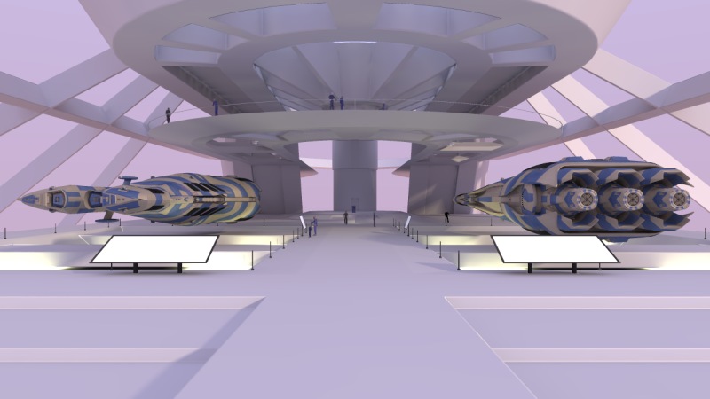
This image was rendered with radiosity in two passes. There's an area light
behind the camera, well off to the right and up (to cast some soft
shadows). The light sources for radiosity are the sky, some yellow panels
below the floor (they're responsible for the yellow shine on the underside
of the exhibits) and a blue panel in the ceiling (you can see a bit of that
panel).
Antialiasing used was method 1 with threshold 0.0 (anything more and those
white lines on sharp features become more obvious and abundant).
What would be the best way to improve the lighting now? It's quite flat, but
I want to keep a "daylight" look to it. Getting rid of those radiosity
artefacts in the corners might be nice, but not if it involves
substantially increasing render time (this already took about 15 hours, due
mainly to radiosity). Radiosity settings used were:
First pass:
pretrace_start .08
pretrace_end .001
count 600
error_bound { .05 adaptive 1.5, 20 }
adaptive 2
recursion_limit 2
minimum_reuse 0.01
save_file "tvo.rad"
Second pass:
pretrace_start 1
pretrace_end 1
always_sample off
error_bound { .25 adaptive 1.5, 20 }
recursion_limit 2
minimum_reuse 0.01
brightness 0.75
load_file "tvo.rad"
I think these are based on some settings posted a while back in these
groups. The geometry is mesh-based. There is a larger version of the image
available here:
http://www.zubenelgenubi.34sp.com/temp/tvo_lrg.jpg
(1280x960, about 130kB)
Post a reply to this message
Attachments:
Download 'tvo.jpg' (64 KB)
Preview of image 'tvo.jpg'

|
|
| |
| |
|
|
|
|
| |
| |
|
|
"Tom York" <alp### [at] zubenelgenubi 34spcom> wrote in message
news:web.42dd47f484a1d8a2e0d101b60@news.povray.org...
> This image was rendered with radiosity in two passes. There's an area
light
> behind the camera, well off to the right and up (to cast some soft
> shadows). The light sources for radiosity are the sky, some yellow panels
> below the floor (they're responsible for the yellow shine on the underside
> of the exhibits) and a blue panel in the ceiling (you can see a bit of
that
> panel).
>
> Antialiasing used was method 1 with threshold 0.0 (anything more and those
> white lines on sharp features become more obvious and abundant).
>
> What would be the best way to improve the lighting now? It's quite flat,
but
> I want to keep a "daylight" look to it. Getting rid of those radiosity
> artefacts in the corners might be nice, but not if it involves
> substantially increasing render time (this already took about 15 hours,
due
> mainly to radiosity). Radiosity settings used were:
>
I don't know the best way, but I think a very strong bright light comming
through the top on one side, like a sun at 2 o'clock, could help give some
starker contrast. nice scene, you really achieved a sense of scale.
-r 34spcom> wrote in message
news:web.42dd47f484a1d8a2e0d101b60@news.povray.org...
> This image was rendered with radiosity in two passes. There's an area
light
> behind the camera, well off to the right and up (to cast some soft
> shadows). The light sources for radiosity are the sky, some yellow panels
> below the floor (they're responsible for the yellow shine on the underside
> of the exhibits) and a blue panel in the ceiling (you can see a bit of
that
> panel).
>
> Antialiasing used was method 1 with threshold 0.0 (anything more and those
> white lines on sharp features become more obvious and abundant).
>
> What would be the best way to improve the lighting now? It's quite flat,
but
> I want to keep a "daylight" look to it. Getting rid of those radiosity
> artefacts in the corners might be nice, but not if it involves
> substantially increasing render time (this already took about 15 hours,
due
> mainly to radiosity). Radiosity settings used were:
>
I don't know the best way, but I think a very strong bright light comming
through the top on one side, like a sun at 2 o'clock, could help give some
starker contrast. nice scene, you really achieved a sense of scale.
-r
Post a reply to this message
|
|
| |
| |
|
|
|
|
| |
| |
|
|
Nice image, I think you are right that it is too light intense which makes
the image look a bit flat, especially the two white panels in front of the
ships, they almost look 2D have you used a high ambient setting for those
or rgb values > 1? I assume you are using ambient value of zero and light
fading I find this helps to add realism to the lighting. Still it is a very
good image I like the way you have shown the scale with the people (are
they blobs?)
Sean
Post a reply to this message
|
|
| |
| |
|
|
|
|
| |
| |
|
|
"s.day" <s.d### [at] uelacuk> wrote:
> Nice image, I think you are right that it is too light intense which makes
> the image look a bit flat, especially the two white panels in front of the
> ships, they almost look 2D have you used a high ambient setting for those
> or rgb values > 1?
>
ditto - maybe use a lower rgb, e.g. 0.6 and a rough normal to reduce the
flatness. Also a chamber that size would have a visible atmosphere. I would
use a little ambient fog to soften things further away and give a sense of
distance.
Post a reply to this message
|
|
| |
| |
|
|
|
|
| |
| |
|
|
I have to say it looks good to me! Has a nice clean almost air-brushed
feel that distinguishes it from other images.
Though if you want the lighting to look more interesting, at the cost of
looking more conventional, maybe stick a highlight light in there, i.e.
one behind all the objects at a shallow angle so it adds some
rim-lighting, particularly effective if you have some specular on the
objects.
But I'd say just work on the details of the scene, I like the lighting.
Tek
Tom York wrote:
> This image was rendered with radiosity in two passes. There's an area light
> behind the camera, well off to the right and up (to cast some soft
> shadows). The light sources for radiosity are the sky, some yellow panels
> below the floor (they're responsible for the yellow shine on the underside
> of the exhibits) and a blue panel in the ceiling (you can see a bit of that
> panel).
>
> Antialiasing used was method 1 with threshold 0.0 (anything more and those
> white lines on sharp features become more obvious and abundant).
>
> What would be the best way to improve the lighting now? It's quite flat, but
> I want to keep a "daylight" look to it. Getting rid of those radiosity
> artefacts in the corners might be nice, but not if it involves
> substantially increasing render time (this already took about 15 hours, due
> mainly to radiosity). Radiosity settings used were:
>
> First pass:
> pretrace_start .08
> pretrace_end .001
> count 600
> error_bound { .05 adaptive 1.5, 20 }
> adaptive 2
> recursion_limit 2
> minimum_reuse 0.01
> save_file "tvo.rad"
>
> Second pass:
> pretrace_start 1
> pretrace_end 1
> always_sample off
> error_bound { .25 adaptive 1.5, 20 }
> recursion_limit 2
> minimum_reuse 0.01
> brightness 0.75
> load_file "tvo.rad"
>
> I think these are based on some settings posted a while back in these
> groups. The geometry is mesh-based. There is a larger version of the image
> available here:
>
> http://www.zubenelgenubi.34sp.com/temp/tvo_lrg.jpg
>
> (1280x960, about 130kB)
>
>
> ------------------------------------------------------------------------
>
Post a reply to this message
|
|
| |
| |
|
|
|
|
| |
| |
|
|
Tom York nous apporta ses lumieres en ce 2005-07-19 14:35:
> This image was rendered with radiosity in two passes. There's an area light
> behind the camera, well off to the right and up (to cast some soft
> shadows). The light sources for radiosity are the sky, some yellow panels
> below the floor (they're responsible for the yellow shine on the underside
> of the exhibits) and a blue panel in the ceiling (you can see a bit of that
> panel).
>
> Antialiasing used was method 1 with threshold 0.0 (anything more and those
> white lines on sharp features become more obvious and abundant).
Have you tyied method 2?
>
> What would be the best way to improve the lighting now? It's quite flat, but
> I want to keep a "daylight" look to it. Getting rid of those radiosity
> artefacts in the corners might be nice, but not if it involves
> substantially increasing render time (this already took about 15 hours, due
> mainly to radiosity). Radiosity settings used were:
>
To help reduce the artefacts you can try using 1 or 2 more pretrace steps, it can help
somewhat. Try
pretrace_end 0.000625 or 0.0003125
Increasing count normaly help, but I'm not sure that it can realy help in this case.
Using a smaller low_error_factor than the default (0.5) may help in some case. It only
affect the
last pretrace step.
The artefacts are mainly related to your yellow pannels, maybe some tweaking in there
finish,
pigment or dimentions and placing could help. Some suggestions:
- make the pits deeper and lower the panels.
- make the pannels a bit smaller than the pits. or enlarge them to make them larger
than the pits.
- a little lower ambient with a higher saturation for the yellow pannels.
- make the yellow pannels transparent and put some weak yellow area_light spot_light
under them.
To Joanne Simpson, if the air is very clean and dry, there can be no notable fog at
all. In a
futuristic space museum this would be the case: you cut on cleaning and get rid of
corrosion.
Alain
Post a reply to this message
|
|
| |
| |
|
|
|
|
| |
| |
|
|
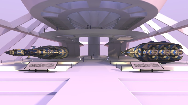
New go, but to get it I altered assumed_gamma from 1.0 to 2.2 (my
display_gamma is correct for my monitor at 2.2). With assumed_gamma 1.0
(which I know is the "correct" setting) it seems quite difficult to avoid a
bright, flat lit image for some scenes (including this one). There is a
larger version at
http://www.zubenelgenubi.34sp.com/temp/tvo2_lrg.jpg
(1280x960, 150k)
"Ross" <rli### [at] everestkcnet> wrote:
> I don't know the best way, but I think a very strong bright light comming
> through the top on one side, like a sun at 2 o'clock, could help give some
> starker contrast. nice scene, you really achieved a sense of scale.
I've added another area light "high". Thanks for this suggestion, I think it
improved the shadows a lot!
Post a reply to this message
Attachments:
Download 'tvo2.jpg' (72 KB)
Preview of image 'tvo2.jpg'
|
|
| |
| |
|
|
|
|
| |
| |
|
|
"s.day" <s.d### [at] uelacuk> wrote:
> Nice image, I think you are right that it is too light intense which makes
> the image look a bit flat, especially the two white panels in front of the
> ships, they almost look 2D have you used a high ambient setting for those
> or rgb values > 1? I assume you are using ambient value of zero and light
> fading I find this helps to add realism to the lighting. Still it is a very
> good image I like the way you have shown the scale with the people (are
> they blobs?)
Yes, for those panels I used a large ambient value to make them cast light
in the radiosity step - completely pointless as I realise now, because
there's very little geometry facing them. I should have dialed it down in
the second pass but didn't. I've now fixed that. Not too sure about light
fading - I think the "unreal" flavour in the first image is mainly
contributed by the extreme flatness of the radiosity, and I don't want to
weaken the (area_light) sun too much.
The people are meshes of about 700 hundred polygons each. I've tried to keep
them back from the camera, but I wanted something to add scale and break
the symmetry a bit.
Post a reply to this message
|
|
| |
| |
|
|
|
|
| |
| |
|
|
"Joanne Simpson" <cor### [at] onewhiteravencom> wrote:
> ditto - maybe use a lower rgb, e.g. 0.6 and a rough normal to reduce the
> flatness. Also a chamber that size would have a visible atmosphere. I would
> use a little ambient fog to soften things further away and give a sense of
> distance.
Yes, I've reduced the ambient, but those panels still need work. I've added
a little fog to see how it runs in the newer image, but I think I
underestimated the amount needed to get good depth cueing. I'll turn it up
in the next attempt.
Post a reply to this message
|
|
| |
| |
|
|
|
|
| |
| |
|
|
Tek <tek### [at] evilsuperbraincom> wrote:
> I have to say it looks good to me! Has a nice clean almost air-brushed
> feel that distinguishes it from other images.
>
> Though if you want the lighting to look more interesting, at the cost of
> looking more conventional, maybe stick a highlight light in there, i.e.
> one behind all the objects at a shallow angle so it adds some
> rim-lighting, particularly effective if you have some specular on the
> objects.
>
> But I'd say just work on the details of the scene, I like the lighting.
Thanks! I haven't given up on the airbrushed look, and I might well do two
versions. I really imagined this scene more as a kind of architect's line
drawing or sketch, but it seems to have taken on a life of its own.
Post a reply to this message
|
|
| |
| |
|
|
|
|
| |