 |
|
|
|
|
|
| |
| |
|
|
|
|
| |
| |
|
|
(re-post, previous was canceled because it didnt have all attachments)
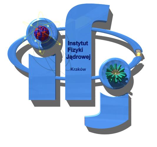
A logo for scientist organisation.
What type of organization - I quess it's quite obvious by looking on logo,
isn't it?
Image n.o. 0) on www (ifj_org.gif) is the oryginal logo (and I'm making a
new version of it).
Image n.o. 1) is very simple and I think I will use it to create small
32x32 icons (for www).
Other images do have more details, they dont have yet nice shadows and are
darker because radiosity calculations and area lights are quite slow, but
newer version is rendering just now.
All versions (also in PNG format)
http://62.233.182.161:8844/ifj.edu.pl/wip-logo/
http://62.233.182.161/ifj.edu.pl/wip-logo/
(btw, do both links above work for You?)
Any sugestions, critics are wellcomed (more = better) I'm doing it as
another Pov JOB?
P.S. (wow, my third serious job thanks to POV RAY, I'm definetly going to
buy thoes POV-RAY-key-rings, I hope shipping to Polland will not take half
of my salary ;)
--
http://www.raf256.com/3d/
Rafal Maj 'Raf256', home page - http://www.raf256.com/me/
Computer Graphics
Post a reply to this message
Attachments:
Download 'ifj_logo_a_miles004.jpg' (24 KB)
Download 'ifj_logo_a_minor003.jpg' (12 KB)
Download 'ifj_org.png' (7 KB)
Preview of image 'ifj_logo_a_miles004.jpg'

Preview of image 'ifj_logo_a_minor003.jpg'

Preview of image 'ifj_org.png'

|
|
| |
| |
|
|
|
|
| |
| |
|
|
Rafal 'Raf256' Maj wrote:
<snip:technical />
> Any sugestions, critics are wellcomed (more = better) I'm doing it as
> another Pov JOB?
<snip />
Very cool! Another shadowless light-source from the opposite direction
might add depth (I sound like a broken-record about these light-sources,
don't I?)
--
Respectfully,
Dan P
http://<broken link>
Post a reply to this message
|
|
| |
| |
|
|
|
|
| |
| |
|
|
dan### [at] yahoo com news:4074d33b$1@news.povray.org
> Very cool! Another shadowless light-source from the opposite direction
> might add depth (I sound like a broken-record about these light-sources,
> don't I?)
Hmm.. on opposing direction (bacground) is plane, with not only have high
dispersion (+radiosit in scene) but also has additional ambient (working as
a "glow" when using with radiosity) so it in fact is a gigant shadowless
light.
I have variable to controll depth of logo ("IFJ" letters) but I like it to
be shallow, You think that deep could be better? Maybe I give it a try...
--
http://www.raf256.com/3d/
Rafal Maj 'Raf256', home page - http://www.raf256.com/me/
Computer Graphics com news:4074d33b$1@news.povray.org
> Very cool! Another shadowless light-source from the opposite direction
> might add depth (I sound like a broken-record about these light-sources,
> don't I?)
Hmm.. on opposing direction (bacground) is plane, with not only have high
dispersion (+radiosit in scene) but also has additional ambient (working as
a "glow" when using with radiosity) so it in fact is a gigant shadowless
light.
I have variable to controll depth of logo ("IFJ" letters) but I like it to
be shallow, You think that deep could be better? Maybe I give it a try...
--
http://www.raf256.com/3d/
Rafal Maj 'Raf256', home page - http://www.raf256.com/me/
Computer Graphics
Post a reply to this message
|
|
| |
| |
|
|
|
|
| |
| |
|
|
Hmm... I really don't want to be rude but in my opinion the original logo is
the best. I appreciate your work and invention but this time the simplest
solution is the best one. Logo must be so simple that you can get idea of
what it is in one second. Original idea is very good but making a 3d-scene
from it does not help. Maybe changing the color of the electrons to red
without making them "3d" would be enough? Also this text "Instytut Fizyki
of whole logo. It is too small and looks poor. Anyway it will be not
readable if you put the logo on a firm-paper in size e.g. 3x3cm. Maybe
putting the text below the logo and forming a regular block from it would be
a good idea? Also the shape of the letters is not very good. It should
correspond with the shape of the logo - I thing they sould be more "bold"
and "flat" - scaled down in y-direction.
I'm sorry for this criticism - but I belive this can help a bit.
Post a reply to this message
|
|
| |
| |
|
|
|
|
| |
| |
|
|
I like this a lot. My only suggestion would be to tweak the '3D' effect of the big
ring so that it appears to pass in front of the 'f' on its lower
transition. It should also pass in front of the body of the 'i'. These changes would
make it appear to be a circle around the central 'f' instead of
a flat oval.
Nice picture.
Post a reply to this message
|
|
| |
| |
|
|
|
|
| |
| |
|
|
I must agree with Przemek - I too find the original logo the best.
To explain my criticism, let me first describe the distinction between
what I call a logo, and what I call the "presentation of a logo". The
thing is - the same basic logo can be presented in many different
versions. It's described here:
http://athlon1700/misc/povraylogo/logoinfo/
And you can see the distinction in action here:
http://athlon1700/misc/povraylogo/logodisplay/
Now, when I look at your modified logo, then in its basic form, it is
very similar to the original. However, it is downgraded in a few
respects:
In the original logo, the ring is thicker at the bottom than on the top,
giving it a sense of 3d, even though it is 2d. This is lost in your
version. In the original, the bottom ball seems to be moving in a
direction, because its tail extends from it to the right only and not to
the left, where there is empty space. This sense of movement is lost in
your version too, as the ring is connected to the ball on both sides.
The shape of the middle f is different in your version too, but I don't
have any preference there - the original and your version look equally
good to me there.
Now, what you seem to have spend the most time on is not the logo
itself, but the presentation of the logo - that is, the extra details
and effects that are not part of the actual logo. By this I mean the
small text, and the atom representation etc. The shadows and radiosity
etc. are also just part of the presentation.
I would suggest to drop all the extra jazz and small details, and focus
on the core logo. Actually the core logo has a cool feature that you
haven't taken advantage of. As I said, the bottom ball (of the j) looks
like it's moving, and the two balls could be perceived as some kind of
particles, or planets or something like that, which are in orbit. That
look to be the idea in the original logo. But you seem to have ignored
this "feature" of the logo. Why not enhance it instead and take
advantage of it? That would be my advise.
Best regards,
Rune
--
3D images and anims, include files, tutorials and more:
rune|vision: http://runevision.com **updated Mar 9**
POV-Ray Ring: http://webring.povray.co.uk
Post a reply to this message
|
|
| |
| |
|
|
|
|
| |
| |
|
|
run### [at] runevisioncom news:4076cb45$1@news.povray.org
> http://athlon1700/misc/povraylogo/logoinfo/
404
> Now, what you seem to have spend the most time on is not the logo
> itself, but the presentation of the logo - that is, the extra details
> and effects that are not part of the actual logo. By this I mean the
> small text, and the atom representation etc. The shadows and radiosity
> etc. are also just part of the presentation.
yes. As for the logo, the oryginal logo is not an official logo (so I do
not have to realy base on it, oryginal logo just has "IFJ" letters usualy
in blue color).
My idea was to put some "attributes" that will be recoginez as nuclear-
phisics thing in two balls (and btw ring symbolize a cyclotrone).
Maybe such detailed version could be better for some larger poster?
Meanwhile I post-processed logo to give it more "logo" look, what do You
think about this effect (attachment) ?
Hmm I quess I could also go back to oryginal conception, two balls
"circuling around center" - like electrons, but then I think logo will not
be so obvious, this atom in upper-left is very clear symbol imho.
I thing I will give a try to 3 versions,
1) more detailed - i.e. central "I" will have some windows-like effect so
it will look kind of like a skycraper / office bulding, for big-poster
version maybe.
2) less detailed - I will remove the outer yellow orbits from top-left
atom, and I will put a simple Helium atom in lower-roght in exchange for
detector, since detector is not so symobolic.
3) old - just two balls, maybe with some symbol that they are orbiting
around "IFJ", and the main torus would be more 3D (not parralel to screen)
Good that Pov have scripts, this will safe me a lots of work :)
Btw, part scene-files are in p.b.s-f for bug-tracing (read p.beta-test)
--
http://www.raf256.com/3d/
Rafal Maj 'Raf256', home page - http://www.raf256.com/me/
Computer Graphics
Post a reply to this message
|
|
| |
| |
|
|
|
|
| |
| |
|
|
spa### [at] raf256com news:Xns94C6BF4492CDBraf256com@203.29.75.35
ofcourse... attachment.
The posterize version of IFJ logo.
--
http://www.raf256.com/3d/
Rafal Maj 'Raf256', home page - http://www.raf256.com/me/
Computer Graphics
Post a reply to this message
Attachments:
Download 'ifj_logo_a.v040.post02d.jpg' (48 KB)
Preview of image 'ifj_logo_a.v040.post02d.jpg'

|
|
| |
| |
|
|
|
|
| |
| |
|
|
Rafal 'Raf256' Maj wrote:
> Rune wrote:
>> http://athlon1700/misc/povraylogo/logoinfo/
>
> 404
Extremely silly of me - I used the address for my local mirror of my
site. Here's the right ones:
http://runevision.com/misc/povraylogo/logoinfo/
And
http://runevision.com/misc/povraylogo/logodisplay/
> My idea was to put some "attributes" that will be recoginez as
> nuclear- phisics thing in two balls (and btw ring symbolize a
> cyclotrone).
>
> Maybe such detailed version could be better for some larger poster?
Yes, but then it's not a logo, it's just some image with a logo in it
amongst other things.
> Meanwhile I post-processed logo to give it more "logo" look, what
> do You think about this effect (attachment) ?
I still don't think it's a logo. It's more like an image which has
the logo, plus some extra details in it. A real logo is more simple.
> Hmm I quess I could also go back to oryginal conception, two balls
> "circuling around center" - like electrons
That's my suggestion.
> but then I think logo will not be so obvious, this atom in upper-left
> is very clear symbol imho.
Yes, but if you include that small-scale atom, then it's not a logo
anymore IMHO. Logos don't have small details like that.
Rune
--
3D images and anims, include files, tutorials and more:
rune|vision: http://runevision.com **updated Mar 9**
POV-Ray Ring: http://webring.povray.co.uk
Post a reply to this message
|
|
| |
| |
|
|
|
|
| |
| |
|
|
Among other things, Rune wrote:
> To explain my criticism, let me first describe the distinction between
> what I call a logo, and what I call the "presentation of a logo". The
> thing is - the same basic logo can be presented in many different
> versions.
I think I agree with Rune. Why don't you (Rafal) concentrate on making a
cool "presentation" of the logo? Don't try to replicate the 2D logo, but
create a scene which could be "the scene the 2D logo is based on", if you
know what I mean. Make some cool 3D letters (not just extruded), do real
things (atoms or whatever) for the dots on "i" and "j", create a "real"
orbit around the letters.
Taking the liberty to link to Rune's site:
This is the logo (by the way, I really like it...):
http://runevision.com/misc/povraylogo/logodisplay/logo01b.gif
This is what I think you should be doing:
http://runevision.com/misc/povraylogo/logodisplay/logo01e.jpg
--
light_source{9+9*x,1}camera{orthographic look_at(1-y)/4angle 30location
9/4-z*4}light_source{-9*z,1}union{box{.9-z.1+x clipped_by{plane{2+y-4*x
0}}}box{z-y-.1.1+z}box{-.1.1+x}box{.1z-.1}pigment{rgb<.8.2,1>}}//Jellby
Post a reply to this message
|
|
| |
| |
|
|
|
|
| |
|
|


