 |
|
|
|
|
|
| |
| |
|
|
|
|
| |
| |
|
|
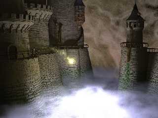
Well, here we go again. I think I've improved the stone nicely, but what do I
know. What do others think?
Geoff
Post a reply to this message
Attachments:
Download 'abyss010411.jpg' (110 KB)
Preview of image 'abyss010411.jpg'
|
|
| |
| |
|
|
|
|
| |
| |
|
|
Geoff Wedig wrote:
>
> Well, here we go again. I think I've improved the stone nicely, but what do I
> know. What do others think?
>
> Geoff
>
> ------------------------------------------------------------------------
> [Image]
I like the way you got rid of the seam in the stones. Clever.
It appears that there's some sort of electr[on]ic equipment in the tower
on the right. If so, it should have a few blinking leds and maybe the
glow of an old green CRT tube. I also think there should be a few
windows on the castle. It must stink in there! (Unless of course, it
stinks more out there!!)
--
Francois Labreque | It is by caffeine alone I set my mind in motion, it
flabreque | is by the beans of Java that thoughts acquire speed,
@ | the hands acquire shaking, the shaking becomes a
videotron.ca | warning, it is by caffeine alone I set my mind in
| motion.
- Stolen from Badger's .sig file
Post a reply to this message
|
|
| |
| |
|
|
|
|
| |
| |
|
|
"Geoff Wedig" <wed### [at] darwin cwruedu> wrote in message
news:3AD### [at] darwincwruedu...
> Well, here we go again. I think I've improved the stone nicely, but what
do I
> know. What do others think?
Well, I think you are done. And I really like the satellite dish. cwruedu> wrote in message
news:3AD### [at] darwincwruedu...
> Well, here we go again. I think I've improved the stone nicely, but what
do I
> know. What do others think?
Well, I think you are done. And I really like the satellite dish.
Post a reply to this message
|
|
| |
| |
|
|
|
|
| |
| |
|
|
Francois Labreque <fla### [at] videotronca> wrote:
> Geoff Wedig wrote:
>>
>> Well, here we go again. I think I've improved the stone nicely, but what do I
>> know. What do others think?
>>
>> Geoff
>>
>> ------------------------------------------------------------------------
>> [Image]
> I like the way you got rid of the seam in the stones. Clever.
Thanks. I wanted to put in a viewing platform anyway, so...
> It appears that there's some sort of electr[on]ic equipment in the tower
> on the right. If so, it should have a few blinking leds and maybe the
> glow of an old green CRT tube. I also think there should be a few
> windows on the castle. It must stink in there! (Unless of course, it
> stinks more out there!!)
The CRT idea is a good one. Might be hard to orient (the windows are small,
after all)
I've tried windows in the walls, but didn't like them much. It is a
Fortress, after all, and windows weaken the defensiveness. Still, maybe
some arrowslits in-between the supports for the crennelations might be ok.
Have to think about how to do it though. :/
Geoff
Post a reply to this message
|
|
| |
| |
|
|
|
|
| |
| |
|
|
This looks wonderful.
A couple of points, mostly IMHO.
There's a small red/gold/brown thing on the largest of the towers on the
left - what is it?
I'm not mad on the grainyness of the bg or the glow, but very much IMHO
Are the bricks isos? If so, could the individual bricks have a rougher
surface and/or more rounded corners - they seem a bit flat.
Post a reply to this message
|
|
| |
| |
|
|
|
|
| |
| |
|
|
Tom Melly <tom### [at] tomandlucouk> wrote:
> This looks wonderful.
> A couple of points, mostly IMHO.
> There's a small red/gold/brown thing on the largest of the towers on the
> left - what is it?
A control panel of some sort. Not sure what it is, myself.
> I'm not mad on the grainyness of the bg or the glow, but very much IMHO
I'm not sure I like the bg either. I've been playing with some other
things.
> Are the bricks isos? If so, could the individual bricks have a rougher
> surface and/or more rounded corners - they seem a bit flat.
Yeah, they are. When they had more rounded corners, the shadows were a
little dark, so I pulled them back a bit. On the other hand, the lines
between bricks is disappearing on the tower further back, so maybe too far.
Adding a surface iso to them blows my memory straight out the window. There
are around 13000 of the bloody things, and adding an additional complexity
really makes things go crazy.
Geoff
Post a reply to this message
|
|
| |
| |
|
|
|
|
| |
| |
|
|
BEST PARTS:
Bricks are great.
Castle design has no obvious pov shapes incorporated into it.
Satelite dish adds a lot of interest.
Shingle silhouettes on the roof are ten times better than some lazy
texture.
Castle looks massive.
Picture is overall very bad @ss.
POSSIBLE IMPROVEMENTS:
I think the moss looks a lot better on the right side than the left.
I think that the background is the weakest elemwnt in the picture,
perhaps a lighter mist with some dead trees, a fortified stone gate, or even
a few bright stars visible through it would look better.
It think the castle would appear even larger if the steam on the bottom
were lightened as well, and more of the castle walls were allowed to show
through it. The dense, bright media could be placed below the range of the
camera to provide adequate light for the picture.
-Shay
Geoff Wedig <wed### [at] darwincwruedu> wrote in message
news:3AD### [at] darwincwruedu...
> Well, here we go again. I think I've improved the stone nicely, but what
do I
> know. What do others think?
>
> Geoff
>
>
----------------------------------------------------------------------------
----
Post a reply to this message
|
|
| |
| |
|
|
|
|
| |
| |
|
|
Shay <sah### [at] simcopartscom> wrote:
> BEST PARTS:
> Bricks are great.
> Castle design has no obvious pov shapes incorporated into it.
> Satelite dish adds a lot of interest.
> Shingle silhouettes on the roof are ten times better than some lazy
> texture.
> Castle looks massive.
> Picture is overall very bad @ss.
Thanks for the positive comments. It's obvious you looked fairly closely
(the shingles are difficult to see, dark as it is)
> POSSIBLE IMPROVEMENTS:
> I think the moss looks a lot better on the right side than the left.
Well, it's the same stuff, code wise, unless you mean the stuff under the
spout. To some extent that is supposed to look healthier.
> I think that the background is the weakest elemwnt in the picture,
> perhaps a lighter mist with some dead trees, a fortified stone gate, or even
> a few bright stars visible through it would look better.
Trying some things. Thinking about adding a moon, perhaps, with the mist
floowing both in front and behind it.
> It think the castle would appear even larger if the steam on the bottom
> were lightened as well, and more of the castle walls were allowed to show
> through it. The dense, bright media could be placed below the range of the
> camera to provide adequate light for the picture.
The lit portion is fairly important to the concept, so I wouldn't want to
move it off frame. I could lower it, so that more castle shows down deeper,
but that would require extensive revision of the code, since while it's
supposed to look like it plunges a long way, it doesn't actually go much
further than the current mist. I'll have to think about that before doing
anything.
Geoff
Post a reply to this message
|
|
| |
| |
|
|
|
|
| |
| |
|
|
Allright, not to kick a dead horse, but back to the moss.
I'm just guessing, but in an environment like that I believe that moss would
appear the way it does under the outcropping on the right hand side. I can't
see why with so much moisture present the moss would be concentrated only in
the seams of the bricks. Also, as moss collected in the seams and dripped
down, the drips would not evaporate or soak into the already wet stones. So,
the moss on the face of the bricks would appear over the entire brick and
not just towards the top. I think that the moss would be more realistic if
it were very thick where the vapor was thick, and concentrated in the seams
with drips all the way to the bottom of each brick only as you went to the
thinnest parts of the mist. Just my opinion.
-Shay
Geoff Wedig <wed### [at] darwinepbicwruedu> wrote in message
news:3ad59760@news.povray.org...
> Shay <sah### [at] simcopartscom> wrote:
>
> > BEST PARTS:
> > Bricks are great.
> > Castle design has no obvious pov shapes incorporated into it.
> > Satelite dish adds a lot of interest.
> > Shingle silhouettes on the roof are ten times better than some lazy
> > texture.
> > Castle looks massive.
> > Picture is overall very bad @ss.
>
> Thanks for the positive comments. It's obvious you looked fairly closely
> (the shingles are difficult to see, dark as it is)
>
> > POSSIBLE IMPROVEMENTS:
> > I think the moss looks a lot better on the right side than the left.
>
> Well, it's the same stuff, code wise, unless you mean the stuff under the
> spout. To some extent that is supposed to look healthier.
>
> > I think that the background is the weakest elemwnt in the picture,
> > perhaps a lighter mist with some dead trees, a fortified stone gate, or
even
> > a few bright stars visible through it would look better.
>
> Trying some things. Thinking about adding a moon, perhaps, with the mist
> floowing both in front and behind it.
>
> > It think the castle would appear even larger if the steam on the
bottom
> > were lightened as well, and more of the castle walls were allowed to
show
> > through it. The dense, bright media could be placed below the range of
the
> > camera to provide adequate light for the picture.
>
> The lit portion is fairly important to the concept, so I wouldn't want to
> move it off frame. I could lower it, so that more castle shows down
deeper,
> but that would require extensive revision of the code, since while it's
> supposed to look like it plunges a long way, it doesn't actually go much
> further than the current mist. I'll have to think about that before doing
> anything.
>
> Geoff
Post a reply to this message
|
|
| |
| |
|
|
|
|
| |
|
|


