 |
|
|
|
|
|
| |
| |
|
|
|
|
| |
| |
|
|
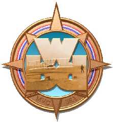
I have attached my first attempt at raytracing and would appreciate any
suggestions that you might have. It's not finished yet as there are a few
obvious fixes to make. I need to move the ends of the red, white and blue
rings back so they aren't so close to the big "WBD" and I need to adjust the
MVC and BSA lettering on the bottom. I will also be adding some lettering
around the outside of the logo once I figure out how. :-)
This logo will be replacing a logo I did in PSP 6. The old logo can be seen
at www.wbd-bsa.org. I would like to make the new logo as realistic as
possible. The scene was modeled in Moray except for the beveled "WBD",
which was done using Elefont and then imported into Moray as a UDO. I am
using 6 point lights to illuminate the scene, but only I have only 2 of them
casting shadows because otherwise the "casting" texture on the logo gets
completely washed out. Please be brutally honest with your opinions and
suggestions - you won't hurt my feelings!
Thanks,
Cris
Post a reply to this message
Attachments:
Download 'wbd_logo_12.jpg' (66 KB)
Preview of image 'wbd_logo_12.jpg'
|
|
| |
| |
|
|
|
|
| |
| |
|
|
I think it looks great!
As for letters around the outside of the image, try something along these
lines...
#declare W=
text{
ttf "timrom.ttf" "W" .2, 0
pigment { Red }
// Translate the letter so it centers as close as you can to <0,0,0>
translate<-.5,-.25,0>
}
#declare R=
text{
ttf "timrom.ttf" "r" .2, 0
pigment { Red }
// Translate the letter so it centers as close as you can to <0,0,0>
translate<-.5,-.25,0>
}
// Then translate the letter object and rotate into place
object { W translate y*3 rotate z*-45 }
object { R translate y*3 rotate z*-40 }
etc....
This should give you what you are looking for....
Regards,
C.J. - POV User
www.crosswinds.net/~povstudy
Cris Williams <wil### [at] udri udaytonedu> wrote in message
news:39e5e9cd@news.povray.org...
> I have attached my first attempt at raytracing and would appreciate any
> suggestions that you might have. It's not finished yet as there are a few
> obvious fixes to make. I need to move the ends of the red, white and blue
> rings back so they aren't so close to the big "WBD" and I need to adjust
the
> MVC and BSA lettering on the bottom. I will also be adding some lettering
> around the outside of the logo once I figure out how. :-)
>
> This logo will be replacing a logo I did in PSP 6. The old logo can be
seen
> at www.wbd-bsa.org. I would like to make the new logo as realistic as
> possible. The scene was modeled in Moray except for the beveled "WBD",
> which was done using Elefont and then imported into Moray as a UDO. I am
> using 6 point lights to illuminate the scene, but only I have only 2 of
them
> casting shadows because otherwise the "casting" texture on the logo gets
> completely washed out. Please be brutally honest with your opinions and
> suggestions - you won't hurt my feelings!
>
> Thanks,
>
> Cris
>
>
> udaytonedu> wrote in message
news:39e5e9cd@news.povray.org...
> I have attached my first attempt at raytracing and would appreciate any
> suggestions that you might have. It's not finished yet as there are a few
> obvious fixes to make. I need to move the ends of the red, white and blue
> rings back so they aren't so close to the big "WBD" and I need to adjust
the
> MVC and BSA lettering on the bottom. I will also be adding some lettering
> around the outside of the logo once I figure out how. :-)
>
> This logo will be replacing a logo I did in PSP 6. The old logo can be
seen
> at www.wbd-bsa.org. I would like to make the new logo as realistic as
> possible. The scene was modeled in Moray except for the beveled "WBD",
> which was done using Elefont and then imported into Moray as a UDO. I am
> using 6 point lights to illuminate the scene, but only I have only 2 of
them
> casting shadows because otherwise the "casting" texture on the logo gets
> completely washed out. Please be brutally honest with your opinions and
> suggestions - you won't hurt my feelings!
>
> Thanks,
>
> Cris
>
>
>
Post a reply to this message
|
|
| |
| |
|
|
|
|
| |
| |
|
|
Actually I will have the string "Wright Brothers District" following a circular
path around the outside of the image the same way as the old logo at
www.wbd-bsa.org was done. I plan to have the word "District" follow a circular
path, too.
Cris
(BTW - Although I run the web site for the Boy Scouts Wright Brothers District,
I don't get paid to do it, I was volunteered!) ;-)
"C.J." wrote:
> I think it looks great!
> As for letters around the outside of the image, try something along these
> lines...
>
> #declare W=
> text{
> ttf "timrom.ttf" "W" .2, 0
> pigment { Red }
> // Translate the letter so it centers as close as you can to <0,0,0>
> translate<-.5,-.25,0>
> }
>
> #declare R=
> text{
> ttf "timrom.ttf" "r" .2, 0
> pigment { Red }
> // Translate the letter so it centers as close as you can to <0,0,0>
> translate<-.5,-.25,0>
> }
>
> // Then translate the letter object and rotate into place
> object { W translate y*3 rotate z*-45 }
> object { R translate y*3 rotate z*-40 }
>
> etc....
>
> This should give you what you are looking for....
>
> Regards,
> C.J. - POV User
> www.crosswinds.net/~povstudy
>
> Cris Williams <wil### [at] udriudaytonedu> wrote in message
> news:39e5e9cd@news.povray.org...
> > I have attached my first attempt at raytracing and would appreciate any
> > suggestions that you might have. It's not finished yet as there are a few
> > obvious fixes to make. I need to move the ends of the red, white and blue
> > rings back so they aren't so close to the big "WBD" and I need to adjust
> the
> > MVC and BSA lettering on the bottom. I will also be adding some lettering
> > around the outside of the logo once I figure out how. :-)
> >
> > This logo will be replacing a logo I did in PSP 6. The old logo can be
> seen
> > at www.wbd-bsa.org. I would like to make the new logo as realistic as
> > possible. The scene was modeled in Moray except for the beveled "WBD",
> > which was done using Elefont and then imported into Moray as a UDO. I am
> > using 6 point lights to illuminate the scene, but only I have only 2 of
> them
> > casting shadows because otherwise the "casting" texture on the logo gets
> > completely washed out. Please be brutally honest with your opinions and
> > suggestions - you won't hurt my feelings!
> >
> > Thanks,
> >
> > Cris
> >
> >
> >
Post a reply to this message
|
|
| |
| |
|
|
|
|
| |
| |
|
|
On Thu, 12 Oct 2000 12:41:13 -0400, Cris Williams wrote...
> I have attached my first attempt at raytracing and would appreciate any
> suggestions that you might have. It's not finished yet as there are a few
> obvious fixes to make. I need to move the ends of the red, white and blue
> rings back so they aren't so close to the big "WBD" and I need to adjust the
> MVC and BSA lettering on the bottom. I will also be adding some lettering
> around the outside of the logo once I figure out how. :-)
I was thinking about the lettering thing, and rather than creating each
group of three letters as a string, try creating one placeholder letter,
and using Edit->Duplicate and the orbit and rotate options to get the
lettering truly concentric.
I don't think that made much sense, did it? <sigh> I know what I mean,
and I could do it in about 5 minutes (time for fiddling and tweaking of
settings.). The only drawback could be that it may render slower for
using 6 text objects rather than 2 (I could be wrong about that though)
(Oh, and Followup set to moray.win)
> This logo will be replacing a logo I did in PSP 6. The old logo can be seen
> at www.wbd-bsa.org. I would like to make the new logo as realistic as
> possible. The scene was modeled in Moray except for the beveled "WBD",
> which was done using Elefont and then imported into Moray as a UDO. I am
> using 6 point lights to illuminate the scene, but only I have only 2 of them
> casting shadows because otherwise the "casting" texture on the logo gets
> completely washed out. Please be brutally honest with your opinions and
> suggestions - you won't hurt my feelings!
Well, since I do my mail offline, I haven't had a chance to look at the
site you mentioned, but I like it, it's simple and clean. And I like
simple and clean :)
Bye for now,
Jamie.
Post a reply to this message
|
|
| |
| |
|
|
|
|
| |
| |
|
|
It looks good, although i don't believe it's your first Povray pict (sorry :-)
I would probably change the lighting, because there are steps in the shadows
because of the 2 point lights casting shadows. You could try to use just one
light source and make it an area light for soft shadows.
I don't really understand what you need the additional 4 shadowless light
sources for (please explain).
Christoph
--
Christoph Hormann <chr### [at] gmxde>
Homepage: http://www.schunter.etc.tu-bs.de/~chris/
Post a reply to this message
|
|
| |
| |
|
|
|
|
| |
| |
|
|
Thank you! But it really is the first one.
The multiple light sources grew out of my total inexperience with using light
sources and my efforts to get highlights and shadows in the right places without
obscurring the normal. I am definitely not happy with the lighting yet. I
especially don't like the way the shadow from the "WBD" falls on the SW compass
point and the lack of contrast in that area. I used some shadowless lights
because all of the shadows were making the surfaces too "busy" looking. If you
look closely you'll notice the smaller disk with the blue gradiant doesn't cast a
shadow either.
Cris
Christoph Hormann wrote:
> It looks good, although i don't believe it's your first Povray pict (sorry :-)
>
> I would probably change the lighting, because there are steps in the shadows
> because of the 2 point lights casting shadows. You could try to use just one
> light source and make it an area light for soft shadows.
>
> I don't really understand what you need the additional 4 shadowless light
> sources for (please explain).
>
> Christoph
>
> --
> Christoph Hormann <chr### [at] gmxde>
> Homepage: http://www.schunter.etc.tu-bs.de/~chris/
Post a reply to this message
|
|
| |
| |
|
|
|
|
| |
| |
|
|
Cris Williams wrote:
>
> Thank you! But it really is the first one.
>
> The multiple light sources grew out of my total inexperience with using light
> sources and my efforts to get highlights and shadows in the right places without
> obscurring the normal.
You can do quite a lot about specular highlights with changing roughness, same
for diffuse and brilliance.
Christoph
--
Christoph Hormann <chr### [at] gmxde>
Homepage: http://www.schunter.etc.tu-bs.de/~chris/
Post a reply to this message
|
|
| |
| |
|
|
|
|
| |
| |
|
|
I like it a lot - very nice
some problem with the BSA at the bottom ... the veritcal bar in the B is
barely visible.
"Cris Williams" <wil### [at] udriudaytonedu> wrote in message
news:39e5e9cd@news.povray.org...
> I have attached my first attempt at raytracing and would appreciate any
> suggestions that you might have. It's not finished yet as there are a few
> obvious fixes to make. I need to move the ends of the red, white and blue
> rings back so they aren't so close to the big "WBD" and I need to adjust
the
> MVC and BSA lettering on the bottom. I will also be adding some lettering
> around the outside of the logo once I figure out how. :-)
>
> This logo will be replacing a logo I did in PSP 6. The old logo can be
seen
> at www.wbd-bsa.org. I would like to make the new logo as realistic as
> possible. The scene was modeled in Moray except for the beveled "WBD",
> which was done using Elefont and then imported into Moray as a UDO. I am
> using 6 point lights to illuminate the scene, but only I have only 2 of
them
> casting shadows because otherwise the "casting" texture on the logo gets
> completely washed out. Please be brutally honest with your opinions and
> suggestions - you won't hurt my feelings!
>
> Thanks,
>
> Cris
>
>
>
Post a reply to this message
|
|
| |
| |
|
|
|
|
| |
| |
|
|
That's really nice work for a first render. Welcome aboard.
--
Cheers
Steve email mailto:ste### [at] zeroppsuklinuxnet
%HAV-A-NICEDAY Error not enough coffee 0 pps.
web http://www.zeropps.uklinux.net/
or http://start.at/zero-pps
1:33am up 2 days, 2:59, 2 users, load average: 1.31, 1.87, 1.70
Post a reply to this message
|
|
| |
| |
|
|
|
|
| |
| |
|
|
Cris,
The example I gave will give you a circular path. When you get to spelling
district, translate it by a negative Y.
Regards,
C.J.
Cris Williams <wor### [at] netscapenet> wrote in message
news:39E60235.4A1F22B0@netscape.net...
> Actually I will have the string "Wright Brothers District" following a
circular
> path around the outside of the image the same way as the old logo at
> www.wbd-bsa.org was done. I plan to have the word "District" follow a
circular
> path, too.
>
> Cris
>
> (BTW - Although I run the web site for the Boy Scouts Wright Brothers
District,
> I don't get paid to do it, I was volunteered!) ;-)
>
> "C.J." wrote:
>
> > I think it looks great!
> > As for letters around the outside of the image, try something along
these
> > lines...
> >
> > #declare W=
> > text{
> > ttf "timrom.ttf" "W" .2, 0
> > pigment { Red }
> > // Translate the letter so it centers as close as you can to <0,0,0>
> > translate<-.5,-.25,0>
> > }
> >
> > #declare R=
> > text{
> > ttf "timrom.ttf" "r" .2, 0
> > pigment { Red }
> > // Translate the letter so it centers as close as you can to <0,0,0>
> > translate<-.5,-.25,0>
> > }
> >
> > // Then translate the letter object and rotate into place
> > object { W translate y*3 rotate z*-45 }
> > object { R translate y*3 rotate z*-40 }
> >
> > etc....
> >
> > This should give you what you are looking for....
> >
> > Regards,
> > C.J. - POV User
> > www.crosswinds.net/~povstudy
> >
> > Cris Williams <wil### [at] udriudaytonedu> wrote in message
> > news:39e5e9cd@news.povray.org...
> > > I have attached my first attempt at raytracing and would appreciate
any
> > > suggestions that you might have. It's not finished yet as there are a
few
> > > obvious fixes to make. I need to move the ends of the red, white and
blue
> > > rings back so they aren't so close to the big "WBD" and I need to
adjust
> > the
> > > MVC and BSA lettering on the bottom. I will also be adding some
lettering
> > > around the outside of the logo once I figure out how. :-)
> > >
> > > This logo will be replacing a logo I did in PSP 6. The old logo can
be
> > seen
> > > at www.wbd-bsa.org. I would like to make the new logo as realistic as
> > > possible. The scene was modeled in Moray except for the beveled
"WBD",
> > > which was done using Elefont and then imported into Moray as a UDO. I
am
> > > using 6 point lights to illuminate the scene, but only I have only 2
of
> > them
> > > casting shadows because otherwise the "casting" texture on the logo
gets
> > > completely washed out. Please be brutally honest with your opinions
and
> > > suggestions - you won't hurt my feelings!
> > >
> > > Thanks,
> > >
> > > Cris
> > >
> > >
> > >
>
Post a reply to this message
|
|
| |
| |
|
|
|
|
| |
|
|

