|
|
|
|
|
|
| |
| |
|
|
|
|
| |
| |
|
|
Hi!
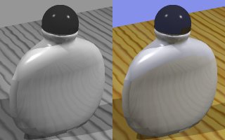
As an addition to the thread going on in povray.general this is an example
of B/W rendering directly from POV-Ray using the HF_Gray_16 flag and output
to PNG format.
The image was rendered twice, once with and once without the flag, it was
then loaded into Paint Shop Pro where the only post-processing was:
- Resizing,
- Glueing together the two images into one
- Conversion to JPEG
Johannes.
Post a reply to this message
Attachments:
Download 'perfume.jpg' (11 KB)
Preview of image 'perfume.jpg'
|
|
| |
| |
|
|
|
|
| |
| |
|
|
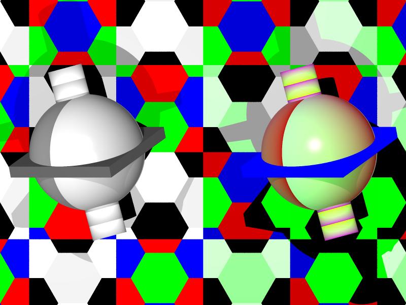
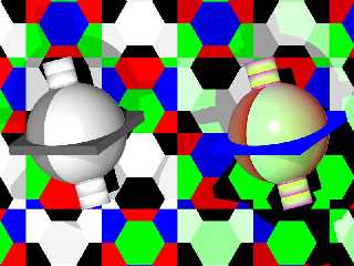
Well, Spider I spent the afternoon working on a BW render in pov as well. Her is
what I came up with..
Notice the coloured background, it's not that beautiful, and if you wish to see
something useful, use a plain white, or a hexgon with rgb 0, rgb 1, rgb 0.5,
this will give a good colour contrast marking. But since I didn't want any
doubts I did it like this.
Well, technique :
A macro to convert a vector to a colour, either a full rgb or a BW value. a
macro to create one scene copy. Declare start values for the colours(vectors)
then create a colours from this with the vector->colur macro, and move into
place.
redo with both BW and RGB colours. a checker/hexagon background, to show it is
all in colour.
To prevent the light from interfering, there is a hollow plane in the middle, a
diffuse 0, rgb 0 and so on. it's not very visible.
Source in .text.scenefiles
if you convert this image to grayscale, you will find a slight difference
between the two sides, I think this is from gamma correction, but I'm not
certain.
Ken, sorry If I did your work.
(Yes, there are a coloured light, there are faded textures and all in here.. )
--
//Spider
( spi### [at] bahnhof se ) [ http://www.bahnhof.se/~spider/ ]
#declare life = rand(seed(42))*sqrt(-1); se ) [ http://www.bahnhof.se/~spider/ ]
#declare life = rand(seed(42))*sqrt(-1);
Post a reply to this message
Attachments:
Download 'clbw1.jpg' (52 KB)
Preview of image 'clbw1.jpg'
|
|
| |
| |
|
|
|
|
| |
| |
|
|
That's quite something there Spider, the blue perimeter box is markedly
different from one image to the other. And I see other differences too,
like the red shadow and it seems the yellow/magenta gradient doesn't
convert to light and dark gray or it's just a visual perception thing.
Have you done a grayscale image conversion to compare?
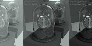
Like the perfume bottle too, Johannes. Very fitting in B&W. I'm tempted
to tease about the sky color being also the bottle color perhaps if a
person didn't know about the color picture.
I wanted to show a gamma related picture as well as the black and white.
The b&w method is by way of hf_gray_16 output into a png. My
Display_Gamma is always 2.2, except when doing the center image I
removed it from Povray.ini and restarted POV to be sure it reset.
Picture was originally 24-bit color png and image_mapped using only
ambient 1 finish without any lights.
Now my thoughts on it...
The leftmost image is a washed out low-contrast mess. The middle one is
what I would normally see if I don't adjust any gamma up or down. And
the one at right is darker than I would usually ever do, except that in
this instance I was trying for a high-contrast, glossy-photo look, while
at the same time trying to show the better side of gamma correction,
imho.
The increased global ambient_light helped to brighten parts while the
larger gamma number darkened it overall.
Here's the lights used in the original image:
light_source { -60*z color Sunshi_*.8 //Sunshi_ is rgb <0.99, 0.98,
0.97>
//area_light <9,0,0>,<0,9,0>,3,3
rotate <22.5,-67.5,0>}
light_source { -60*z color W40*.8 //W40 is rgb 0.4
//area_light <9,0,0>,<0,9,0>,3,3
rotate <15,30,0>}
light_source { -60*z color rgb<.1,.125,.15> rotate <-1,-20,0>}
Together these are less than the rgb 1.5 total I use most often.
--
omniVERSE: beyond the universe
http://members.aol.com/inversez/POVring.htm
mailto:inv### [at] aolcom?PoV
Post a reply to this message
Attachments:
Download '3gammas0.jpg' (46 KB)
Preview of image '3gammas0.jpg'
|
|
| |
| |
|
|
|
|
| |
| |
|
|
Bob Hughes wrote:
>
> That's quite something there Spider, the blue perimeter box is markedly
> different from one image to the other. And I see other differences too,
> like the red shadow and it seems the yellow/magenta gradient doesn't
> convert to light and dark gray or it's just a visual perception thing.
Actually, it shouldn't be the exact dark, but I think it may be changed inside
the formula. This is the one I found, so this is the one I use.
> Have you done a grayscale image conversion to compare?
I did one, but anyone can do and see the difference, it doesn't change much, if
you want me to post it I will.
> Like the perfume bottle too, Johannes. Very fitting in B&W. I'm tempted
> to tease about the sky color being also the bottle color perhaps if a
> person didn't know about the color picture.
hehe
> I wanted to show a gamma related picture as well as the black and white.
> The b&w method is by way of hf_gray_16 output into a png. My
> Display_Gamma is always 2.2, except when doing the center image I
> removed it from Povray.ini and restarted POV to be sure it reset.
> Picture was originally 24-bit color png and image_mapped using only
> ambient 1 finish without any lights.
> Now my thoughts on it...
> The leftmost image is a washed out low-contrast mess. The middle one is
> what I would normally see if I don't adjust any gamma up or down. And
> the one at right is darker than I would usually ever do, except that in
> this instance I was trying for a high-contrast, glossy-photo look, while
> at the same time trying to show the better side of gamma correction,
> imho.
> The increased global ambient_light helped to brighten parts while the
> larger gamma number darkened it overall.
> Here's the lights used in the original image:
Yes, there is a difference beteween gamma, and the same difference is seen when
I convert my Greyscale in PSP5 to grayscale.. (now ain't that something...)
--
//Spider
( spi### [at] bahnhofse ) [ http://www.bahnhof.se/~spider/ ]
#declare life = rand(seed(42))*sqrt(-1);
Post a reply to this message
|
|
| |
| |
|
|
|
|
| |
| |
|
|
Maybe it's because I'm tired, but I have no idea what you or anyone else
has said in this thread, but these picture are cool. :)
Ansel Adams would be proud (wiping tear from eye)
-Mike
Bob Hughes wrote:
>
> That's quite something there Spider, the blue perimeter box is markedly
> different from one image to the other. And I see other differences too,
> like the red shadow and it seems the yellow/magenta gradient doesn't
> convert to light and dark gray or it's just a visual perception thing.
> Have you done a grayscale image conversion to compare?
> Like the perfume bottle too, Johannes. Very fitting in B&W. I'm tempted
> to tease about the sky color being also the bottle color perhaps if a
> person didn't know about the color picture.
> I wanted to show a gamma related picture as well as the black and white.
> The b&w method is by way of hf_gray_16 output into a png. My
> Display_Gamma is always 2.2, except when doing the center image I
> removed it from Povray.ini and restarted POV to be sure it reset.
> Picture was originally 24-bit color png and image_mapped using only
> ambient 1 finish without any lights.
> Now my thoughts on it...
> The leftmost image is a washed out low-contrast mess. The middle one is
> what I would normally see if I don't adjust any gamma up or down. And
> the one at right is darker than I would usually ever do, except that in
> this instance I was trying for a high-contrast, glossy-photo look, while
> at the same time trying to show the better side of gamma correction,
> imho.
> The increased global ambient_light helped to brighten parts while the
> larger gamma number darkened it overall.
> Here's the lights used in the original image:
>
> light_source { -60*z color Sunshi_*.8 //Sunshi_ is rgb <0.99, 0.98,
> 0.97>
> //area_light <9,0,0>,<0,9,0>,3,3
> rotate <22.5,-67.5,0>}
> light_source { -60*z color W40*.8 //W40 is rgb 0.4
> //area_light <9,0,0>,<0,9,0>,3,3
> rotate <15,30,0>}
> light_source { -60*z color rgb<.1,.125,.15> rotate <-1,-20,0>}
>
> Together these are less than the rgb 1.5 total I use most often.
>
> --
> omniVERSE: beyond the universe
> http://members.aol.com/inversez/POVring.htm
> mailto:inv### [at] aolcom?PoV
>
> ------------------------------------------------------------------------
> [Image]
Post a reply to this message
|
|
| |
| |
|
|
|
|
| |
| |
|
|
I converted your image to grayscale using Micrografx Picture Publisher
and it really shows the changes from one to the other. The "red shadow"
I mentioned before, I think this is actually a reddish hemisphere
instead, it obviously loses the dark to light shading it had in the
color image in your example. When the whole thing is converted via P.P.
it remains shaded properly as expected. And that color image with the
all-blue box at the spheres equator is a puzzle to me. It has no
shading, then in the macro-converted grayscale it does?! Strange. That's
what I was pointing out before.
So you think there are other conversion formulas possible? I see you
used the one in the POV-Ray DOC under hf_gray_16 output. Wonder why this
wouldn't already be right?
Spider wrote:
>
> > Have you done a grayscale image conversion to compare?
>
> I did one, but anyone can (too) and see the difference, it doesn't change much,
> if you want me to post it I will.
>
> Yes, there is a difference between gamma, and the same difference is seen when
> I convert my Greyscale in PSP5 to grayscale.. (now ain't that something...)
>
>
> --
> //Spider
> ( spi### [at] bahnhofse ) [ http://www.bahnhof.se/~spider/ ]
> #declare life = rand(seed(42))*sqrt(-1);
--
omniVERSE: beyond the universe
http://members.aol.com/inversez/POVring.htm
mailto:inv### [at] aolcom?PoV
Post a reply to this message
|
|
| |
| |
|
|
|
|
| |
| |
|
|
Ansel Adams I'm not. Thanks just the same, but you probably are a
sentimental fool is all ;) j/k!
This thing all started because of a simple "How to..." on Black&White
pictures without post-processing. And is now not a simple thing at all,
thanks to the many and varied opinions.
Perhaps you will have rested up by now and will add to the flurry of
responses in povray.general about it, or here (as if there isn't enough
postings in this group!).
Mike wrote:
>
> Maybe it's because I'm tired, but I have no idea what you or anyone else
> has said in this thread, but these picture are cool. :)
>
> Ansel Adams would be proud (wiping tear from eye)
>
> -Mike
>
> Bob Hughes wrote:
> >
> > That's quite something there Spider, the blue perimeter box is markedly
> > different from one image to the other. And I see other differences too,
> > like the red shadow and it seems the yellow/magenta gradient doesn't
> > convert to light and dark gray or it's just a visual perception thing.
> > Have you done a grayscale image conversion to compare?
> > Like the perfume bottle too, Johannes. Very fitting in B&W. I'm tempted
> > to tease about the sky color being also the bottle color perhaps if a
> > person didn't know about the color picture.
> > I wanted to show a gamma related picture as well as the black and white.
> > The b&w method is by way of hf_gray_16 output into a png. My
> > Display_Gamma is always 2.2, except when doing the center image I
> > removed it from Povray.ini and restarted POV to be sure it reset.
> > Picture was originally 24-bit color png and image_mapped using only
> > ambient 1 finish without any lights.
> > Now my thoughts on it...
> > The leftmost image is a washed out low-contrast mess. The middle one is
> > what I would normally see if I don't adjust any gamma up or down. And
> > the one at right is darker than I would usually ever do, except that in
> > this instance I was trying for a high-contrast, glossy-photo look, while
> > at the same time trying to show the better side of gamma correction,
> > imho.
> > The increased global ambient_light helped to brighten parts while the
> > larger gamma number darkened it overall.
> > Here's the lights used in the original image:
> >
> > light_source { -60*z color Sunshi_*.8 //Sunshi_ is rgb <0.99, 0.98,
> > 0.97>
> > //area_light <9,0,0>,<0,9,0>,3,3
> > rotate <22.5,-67.5,0>}
> > light_source { -60*z color W40*.8 //W40 is rgb 0.4
> > //area_light <9,0,0>,<0,9,0>,3,3
> > rotate <15,30,0>}
> > light_source { -60*z color rgb<.1,.125,.15> rotate <-1,-20,0>}
> >
> > Together these are less than the rgb 1.5 total I use most often.
> >
> > --
> > omniVERSE: beyond the universe
> > http://members.aol.com/inversez/POVring.htm
> > mailto:inv### [at] aolcom?PoV
> >
> > ------------------------------------------------------------------------
> > [Image]
--
omniVERSE: beyond the universe
http://members.aol.com/inversez/POVring.htm
mailto:inv### [at] aolcom?PoV
Post a reply to this message
|
|
| |
| |
|
|
|
|
| |
| |
|
|
Bob Hughes wrote:
>
> I converted your image to grayscale using Micrografx Picture Publisher
> and it really shows the changes from one to the other. The "red shadow"
> I mentioned before, I think this is actually a reddish hemisphere
> instead, it obviously loses the dark to light shading it had in the
> color image in your example. When the whole thing is converted via P.P.
> it remains shaded properly as expected. And that color image with the
> all-blue box at the spheres equator is a puzzle to me. It has no
> shading, then in the macro-converted grayscale it does?! Strange. That's
> what I was pointing out before.
Yes, I know it's not perfect, but I think it's fairly good, esp. if there is no
original.. I don't have the time to tweak it here, you could if you like, but
noone is forcing you. :-)
(see below for the shading question.)
> So you think there are other conversion formulas possible? I see you
> used the one in the POV-Ray DOC under hf_gray_16 output. Wonder why this
> wouldn't already be right?
I think it's because there is no gamma-correction done on that. I think the
gamma is based on the colour of the image, no? and that is the difference.
--
//Spider
( spi### [at] bahnhofse ) [ http://www.bahnhof.se/~spider/ ]
#declare life = rand(seed(42))*sqrt(-1);
Post a reply to this message
|
|
| |
| |
|
|
|
|
| |
| |
|
|
The problem you're all running into is with the coloured lights... They WILL
not convert, no matter what you do, because coloured lights cause the
diffuse and specular areas of objects to have different exposures.
The problem is not with gamma.
Try this for me, place a shiny yellow sphere in a scene with a red light on
the left side, a green light at the camera and a blue light on the right
side.
Because of the coloured lights, you can't simulate the picture using the
"converted pigments" method. The colour version when converted to greyscale
is nothing like the "converted pigments" version because the colour
version's lights affect the exposure of the surface of the sphere, where the
converted pigments method doesn't because all the lights are really just
intensities of white.
See?
--
Lance.
---
For the latest 3D Studio MAX plug-ins, images and much more, go to:
The Zone - http://come.to/the.zone
Spider wrote in message <36EC07D4.48E05A0B@bahnhof.se>...
>
>
>Bob Hughes wrote:
>>
>> I converted your image to grayscale using Micrografx Picture Publisher
>> and it really shows the changes from one to the other. The "red shadow"
>> I mentioned before, I think this is actually a reddish hemisphere
>> instead, it obviously loses the dark to light shading it had in the
>> color image in your example. When the whole thing is converted via P.P.
>> it remains shaded properly as expected. And that color image with the
>> all-blue box at the spheres equator is a puzzle to me. It has no
>> shading, then in the macro-converted grayscale it does?! Strange. That's
>> what I was pointing out before.
>
>Yes, I know it's not perfect, but I think it's fairly good, esp. if there
is no
>original.. I don't have the time to tweak it here, you could if you like,
but
>noone is forcing you. :-)
>(see below for the shading question.)
>
>> So you think there are other conversion formulas possible? I see you
>> used the one in the POV-Ray DOC under hf_gray_16 output. Wonder why this
>> wouldn't already be right?
>
>I think it's because there is no gamma-correction done on that. I think the
>gamma is based on the colour of the image, no? and that is the difference.
>
>
>--
>//Spider
>( spi### [at] bahnhofse ) [ http://www.bahnhof.se/~spider/ ]
>#declare life = rand(seed(42))*sqrt(-1);
Post a reply to this message
|
|
| |
| |
|
|
|
|
| |
| |
|
|
Lance Birch wrote:
> The problem you're all running into is with the coloured lights... They WILL
> not convert, no matter what you do, because coloured lights cause the
> diffuse and specular areas of objects to have different exposures.
yeye, I've stated that sometime ago..
> The problem is not with gamma.
I know, this was just a test to see what happened.
> Try this for me, place a shiny yellow sphere in a scene with a red light on
> the left side, a green light at the camera and a blue light on the right
> side.
Isn't the green light I use enough? you see the lack of a shadow...
> Because of the coloured lights, you can't simulate the picture using the
> "converted pigments" method. The colour version when converted to greyscale
> is nothing like the "converted pigments" version because the colour
> version's lights affect the exposure of the surface of the sphere, where the
> converted pigments method doesn't because all the lights are really just
> intensities of white.
Yes.
> See?
no, I'm blind all of sudden :-)
--
//Spider
[ spi### [at] bahnhofse ]-[ http://www.bahnhof.se/~spider/ ]
What I can do and what I could do, I just don't know anymore
"Marian"
By: "Sisters Of Mercy"
Post a reply to this message
|
|
| |
| |
|
|
|
|
| |
|
|