|
|
|
|
|
|
| |
| |
|
|
|
|
| |
| |
|
|
"Rune" <new### [at] runevision com> wrote:
>
> It seems more logical that the front figure has the same scaling as the
> rest, instead of looking much taller. Focal blur is also nice.
>
> However, the overall composition in the image was better before IMHO. I've
> attached an image showing the nice lines and balance in the old version.
>
> Rune
> --
> http://runevision.com
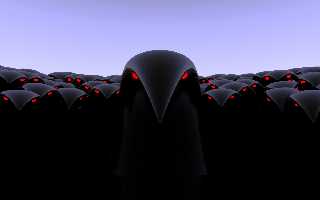
I see what you mean, and I actually agree with you. The main problem with
the first image is that a number of the figures are intersecting quite
significantly (particularly two on the left in the back row). It doesn't
look to bad at 640x480, but it was a bit jarring at desktop resolutions.
I'll have another crack at keeping the same composition but removing the
intersecting figures (made more difficult because I used random numbers to
perturb the figures position form their starting point on concentric
circles).
Thanks for the feedback by the way, I often feel the biggest challenge is to
see the forest for the trees. com> wrote:
>
> It seems more logical that the front figure has the same scaling as the
> rest, instead of looking much taller. Focal blur is also nice.
>
> However, the overall composition in the image was better before IMHO. I've
> attached an image showing the nice lines and balance in the old version.
>
> Rune
> --
> http://runevision.com
I see what you mean, and I actually agree with you. The main problem with
the first image is that a number of the figures are intersecting quite
significantly (particularly two on the left in the back row). It doesn't
look to bad at 640x480, but it was a bit jarring at desktop resolutions.
I'll have another crack at keeping the same composition but removing the
intersecting figures (made more difficult because I used random numbers to
perturb the figures position form their starting point on concentric
circles).
Thanks for the feedback by the way, I often feel the biggest challenge is to
see the forest for the trees.
Post a reply to this message
|
|
| |
| |
|
|
|
|
| |
| |
|
|
scam wrote:
> ...
> There were a couple of issues in the first version I uploaded so here's
> another one.
>
I dunno... I like the first version better. It seems more menacing to
me, (if that's the mood you're after, of course).
-=- Larry -=-
Post a reply to this message
|
|
| |
| |
|
|
|
|
| |
| |
|
|
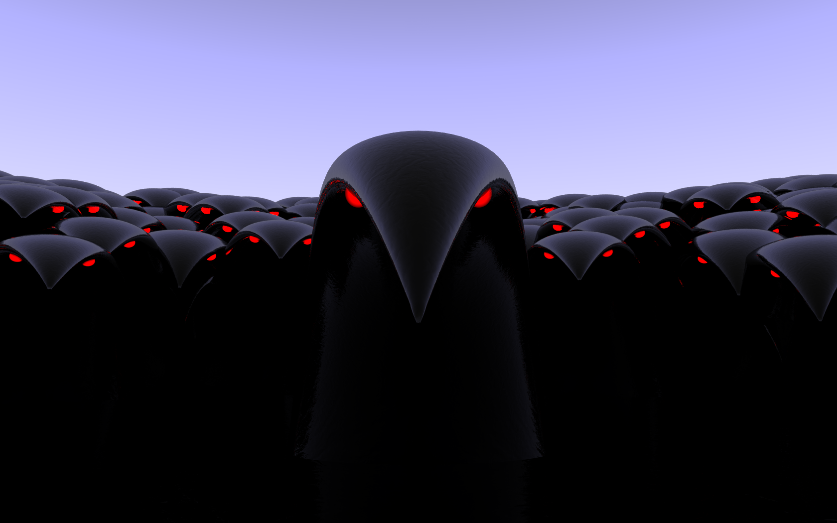
I think too that the first image was better and more menacing. Two things to
illustrate this: (1) several rows in the back where the eyes are not
visible, which gives the impression of a multitude pressing in towards the
center; (2) that one 'bird', third row on the right, just a bit higher than
the others: this increases the impression of eagerness and impatience to get
at the 'victim'.
I am not sure about the focal blur. This focusses the attention upon the
central figure, but I would prefer a more diffuse dread.
Thomas
Post a reply to this message
|
|
| |
| |
|
|
|
|
| |
| |
|
|
"Thomas de Groot" <t.d### [at] internlDOTnet> schreef in bericht
news:46d67966@news.povray.org...
>
> I think too that the first image was better and more menacing. Two things
> to illustrate this: (1) several rows in the back where the eyes are not
> visible, which gives the impression of a multitude pressing in towards the
> center; (2) that one 'bird', third row on the right, just a bit higher
> than the others: this increases the impression of eagerness and impatience
> to get at the 'victim'.
Maybe confusing, but I was speaking here about the first image.
Thomas
Post a reply to this message
|
|
| |
| |
|
|
|
|
| |
| |
|
|
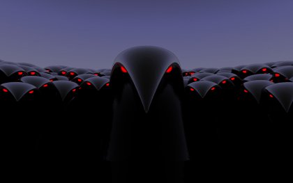
Thanks again everyone for the feedback, much appreciated. I went back to the
original image and tweaked the bits that were bothering me (removed some
obvious intersections, shifted a few other figures around for aesthetic
reasons), so essentially it's the same image I originally posted but now it
works better at high resolutions.
"Thomas de Groot" <t.d### [at] internlDOTnet> wrote:
> I am not sure about the focal blur. This focusses the attention upon the
> central figure, but I would prefer a more diffuse dread.
>
> Thomas
I toned the focal blur down quite a bit, so that the texture on the figures
in the back row had just faded out. I find CG images with no simulated
distortions from either a virtual human eye or a virtual lens are fatiguing
to look at. Just enough focal blur so that the viewer isn't necessarily
aware of it never hurts an image I feel.
Anyway here's the final version in high resolution. Now it's time to work a
flower theme back in...
Post a reply to this message
Attachments:
Download 'petal0.23.png' (451 KB)
Preview of image 'petal0.23.png'
|
|
| |
| |
|
|
|
|
| |
| |
|
|
scam wrote:
> Anyway here's the final version in high resolution. Now it's time to
> work a flower theme back in...
It looks really nice now!
One thing I noticed, which is present in all the versions, is the oddly
bright sky in contrast with the extremely dark figures. It's almost
http://www.ludimaginary.net/blogamoi/img_local/empire_lumiere.jpg
I tried to make the sky darker, just to see what it looks like (attached).
The bright sky has its own charm though and I realize it's probably needed
for the reflections if you don't want to cheat by using no_image flags and
such.
Rune
--
http://runevision.com
Post a reply to this message
Attachments:
Download 'petal0.23_darksky.jpg' (9 KB)
Preview of image 'petal0.23_darksky.jpg'
|
|
| |
| |
|
|
|
|
| |
| |
|
|
"Rune" <new### [at] runevisioncom> wrote:
> It looks really nice now!
>
> One thing I noticed, which is present in all the versions, is the oddly
> bright sky in contrast with the extremely dark figures. It's almost
> http://www.ludimaginary.net/blogamoi/img_local/empire_lumiere.jpg
>
> I tried to make the sky darker, just to see what it looks like (attached).
> The bright sky has its own charm though and I realize it's probably needed
> for the reflections if you don't want to cheat by using no_image flags and
> such.
>
> Rune
> --
> http://runevision.com
Thanks Rune, especially for the constructuve criticism.
Interesting to see the image with ths sky darkened. Probably the more
realistic way to represent the sky considering how dark the rest of the
scene is, however I quite like the way the figures seem to suck the light
from the scene. Kind of like that black space ship in The Hitch Hikers
Guide to the Galaxy books.
Anyway I'm now thinking about the composition of the flower scene. Something
like a close up of a sunflower head featuring the figures in the foreground,
with an entire field of such flowers in the back ground. I think a nice blue
sky will work well there as well.
Post a reply to this message
|
|
| |
| |
|
|
|
|
| |
| |
|
|
Yeah!! Creepy!!
Thomas
Post a reply to this message
|
|
| |
| |
|
|
|
|
| |
| |
|
|
scam wrote:
> Just messing around as usual. I started out making a petal for a flower, but
> saw something more interesting in my test scene.
>
>
> ------------------------------------------------------------------------
>
"Just messing around?"
I spend hours in museums marvelling at the efficient form in ancient
animal carvings etc.,... then along you come with this...
just beautiful, and kudos for recognizing what you had, once you had it.
Post a reply to this message
|
|
| |
| |
|
|
|
|
| |
| |
|
|
"scam" <sca### [at] mailusydeduau> wrote:
> Just messing around as usual. I started out making a petal for a flower, but
> saw something more interesting in my test scene.
Happy feet meets 28 weeks later. xD
Post a reply to this message
|
|
| |
| |
|
|
|
|
| |