|
|
|
|
|
|
| |
| |
|
|
|
|
| |
| |
|
|
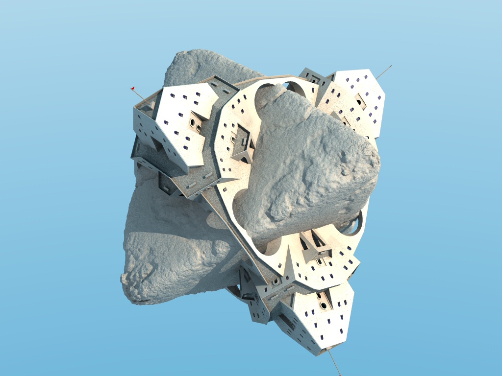
An update on my Escher print interpretation.
I was clearly lying in the previous post, I wasn't happy with the building
geometry at all! It's a bit better now. I've made the whole thing bigger,
put loads of windows and doorframes and detail guff like that, added
flagpoles, textured the floor a bit better (not that you can tell at this
resolution) and just generally tidied up. I expect my careful wall
texturing is completely invisible at this zoom factor - if anyone can make
it out I'd be interested in your comments. It's a kind of patchy, speckled
surface such as might be seen on concrete from a distance.
I'm almost happy with the boulder.
Still to do: some people for the verandahs, trees and bushes for the
boulder, maybe some rock strata for the boulder? Not sure if that would
work. Must investigate. I also think I'm a too bit close and wide-angle -
there's too much perspective on the nearside vertices. I need to move the
camera back a little.
I've done bushes and trees, I just haven't written a macro to place them
yet. Discovered the trace() function last week - genius! I got a bit bogged
down with the trees - I know there are some very good tree macros out
there, but I like to do it all myself if I can. :)
Anyway, comments....?
Bill
Post a reply to this message
Attachments:
Download 'planetoid2.jpg' (169 KB)
Preview of image 'planetoid2.jpg'
|
|
| |
| |
|
|
|
|
| |
| |
|
|
Bill Pragnell wrote:
> An update on my Escher print interpretation.
>
> I was clearly lying in the previous post, I wasn't happy with the building
> geometry at all! It's a bit better now. I've made the whole thing bigger,
> put loads of windows and doorframes and detail guff like that, added
> flagpoles, textured the floor a bit better (not that you can tell at this
> resolution) and just generally tidied up. I expect my careful wall
> texturing is completely invisible at this zoom factor - if anyone can make
> it out I'd be interested in your comments. It's a kind of patchy, speckled
> surface such as might be seen on concrete from a distance.
>
> I'm almost happy with the boulder.
>
> Still to do: some people for the verandahs, trees and bushes for the
> boulder, maybe some rock strata for the boulder? Not sure if that would
> work. Must investigate. I also think I'm a too bit close and wide-angle -
> there's too much perspective on the nearside vertices. I need to move the
> camera back a little.
>
> I've done bushes and trees, I just haven't written a macro to place them
> yet. Discovered the trace() function last week - genius! I got a bit bogged
> down with the trees - I know there are some very good tree macros out
> there, but I like to do it all myself if I can. :)
>
> Anyway, comments....?
>
> Bill
>
>
> ------------------------------------------------------------------------
>
Beautiful and ingenious! About the wall texture it seems to be a matter
of the scale you mention and the high diffuse. The texture on the
terraces and walkways is beautiful, especially how it gets grungy toward
the edges but its tonal similarity to the boulder bothers me a bit. Not
sure if I like that or not. My tendency is to think you would get more
out of the image if the walkways stood out more as a pattern against the
shape of the boulder.
Post a reply to this message
|
|
| |
| |
|
|
|
|
| |
| |
|
|
Bill Pragnell wrote:
> Still to do: some people for the verandahs, trees and bushes for the
> boulder, maybe some rock strata for the boulder? Not sure if that would
> work. Must investigate. I also think I'm a too bit close and wide-angle -
> there's too much perspective on the nearside vertices. I need to move the
> camera back a little.
Of course it's your image, and only you know where you want to go with
it, but I'm not sure if vegetation would improve it, at least not too
much. Some people would probably be good, though. As for the
perspective, I think you could also get a good effect from doing the
opposite -- move the camera closer and increase the view angle.
/ martin
Post a reply to this message
|
|
| |
| |
|
|
|
|
| |
| |
|
|
I really liked the plaster of paris look it had a while ago.
;^)
I kinda agree with what Jim said about the rock and floor textures being
similar here in this one and that maybe a distinct difference might be
better for it.
My first impression of this update was of a sort of disjointing of the rock
and building, so I suppose those will only become more unique unto
themselves as you make further changes to each. For that reason I'm thinking
you might need to join them physically in some manner, such as dirtying up
the building and bridge bases. Possibly working in a certain vegetation
boundary, too. But right now it's simply the starkness of lines where the
intersecting objects meet that makes me see it as disconcerting, it might
not be so obvious later on. I'm just pointing it out now if you aren't
thinking of this yet. I can see a mild coloration change at the rock's
surface but it didn't help keep me from seeing this scene as two individual
parts glued together.
Hopefully food for thought, anyway. I think it's going well.
Bob Hughes
Post a reply to this message
|
|
| |
| |
|
|
|
|
| |
| |
|
|
Hi Bill!
"Bill Pragnell" <bil### [at] hotmail com> wrote:
> An update on my Escher print interpretation.
Glad to see the results of your work on this one! Here are my random
thoughts on its current appearance, i mean them as constructive criticism
and as encouragement.
I love the overall appearance, the boulder is very good, so is the level of
detail in the building. Some nice additions, the flagpoles, among others.
The walls texture looks good, otoh the lighting is a bit too strong
overall. I'd make the outer walls thicker maybe, right now they still have
a "cardboard" feel... The ground atop the buildings and bridges is a1. I
must confess i prefered the previous geometry for the bridges, one single
arch leaping above the boulder's edge. It enhanced the feeling that the
boulder's surface is a forbidden area - which it must be, since there are
no doors leading to it... In this respect, i would definitely NOT add
vegetation to the boulder... but you could try potted plants along with
people on the terraces. This would definitely enhance the contrast between
a hostile boulder and a man built life environment. In this respect, i'd
try darkening the boulder too.
Last (but not least), i like the zoom and perspective as it is. I believe
that a closer zoom with slight distortions on the edges gives a better
sense of landscape. Ok, i know i pushed this idea rather far in my "babel
tower"... :)
It's sure getting more and more interesting, please keep up the good work!!!
JYR com> wrote:
> An update on my Escher print interpretation.
Glad to see the results of your work on this one! Here are my random
thoughts on its current appearance, i mean them as constructive criticism
and as encouragement.
I love the overall appearance, the boulder is very good, so is the level of
detail in the building. Some nice additions, the flagpoles, among others.
The walls texture looks good, otoh the lighting is a bit too strong
overall. I'd make the outer walls thicker maybe, right now they still have
a "cardboard" feel... The ground atop the buildings and bridges is a1. I
must confess i prefered the previous geometry for the bridges, one single
arch leaping above the boulder's edge. It enhanced the feeling that the
boulder's surface is a forbidden area - which it must be, since there are
no doors leading to it... In this respect, i would definitely NOT add
vegetation to the boulder... but you could try potted plants along with
people on the terraces. This would definitely enhance the contrast between
a hostile boulder and a man built life environment. In this respect, i'd
try darkening the boulder too.
Last (but not least), i like the zoom and perspective as it is. I believe
that a closer zoom with slight distortions on the edges gives a better
sense of landscape. Ok, i know i pushed this idea rather far in my "babel
tower"... :)
It's sure getting more and more interesting, please keep up the good work!!!
JYR
Post a reply to this message
|
|
| |
| |
|
|
|
|
| |
| |
|
|
"Bob Hughes" <bob### [at] charternet> wrote:
> but it didn't help keep me from seeing this scene as two individual
> parts glued together.
I, for one, suggest that this is exactly what this picture is about. A
double planetoid, two constructs of the same overall shape and size sharing
the same location in space, with implied competition, but not necessarily
interaction. Our idea of civilisation leads us to see buildings erected by
man on a boulder. But, you may see this as an independant human construct,
something akin to an orbital station, with a stone-like structure that grew
from its center, like a volcano that'd have suddenly erupted in the middle
of a field. This picture is a snapshot of a state of equilibrium between
both, thus the lack of visible interaction, just a stark line.
But, this is only my interpretation of this work ;)
JYR
Post a reply to this message
|
|
| |
| |
|
|
|
|
| |
| |
|
|
Nice; I like it a lot.
I think closer and wider angle is better, more 'sci-fi', and gives the
feeling of a large object. And have you thought about the background? A
huge asteroid field and a big planet maybe? With black background and
starfield...
Good luck
H
Post a reply to this message
|
|
| |
| |
|
|
|
|
| |
| |
|
|
"Bill Pragnell" <bil### [at] hotmailcom> wrote in message
news:web.42a57429e57fa8b4731f01d10@news.povray.org...
> An update on my Escher print interpretation.
>
> I was clearly lying in the previous post, I wasn't happy with the building
> geometry at all! It's a bit better now. I've made the whole thing bigger,
> put loads of windows and doorframes and detail guff like that, added
> flagpoles, textured the floor a bit better (not that you can tell at this
> resolution) and just generally tidied up. I expect my careful wall
> texturing is completely invisible at this zoom factor - if anyone can make
> it out I'd be interested in your comments. It's a kind of patchy, speckled
> surface such as might be seen on concrete from a distance.
>
> I'm almost happy with the boulder.
>
> Still to do: some people for the verandahs, trees and bushes for the
> boulder, maybe some rock strata for the boulder? Not sure if that would
> work. Must investigate. I also think I'm a too bit close and wide-angle -
> there's too much perspective on the nearside vertices. I need to move the
> camera back a little.
Bill,
The rock looks sedimentary with its parallel striations. Sandstone rather
than quartz or granite.
You can just about see the grains of sand in the composite.
This leaves an issue of scale - it looks no bigger than a rock or a
boulder - so the structures look doll's house scale at biggest. Perhaps they
have tiny ant-sized inhabitants? However if the habitations are human scale,
the coarse structure needs to become the detail. e.g.
http://www.tc.umn.edu/~dasg0007/picture%20gallery/northshore/ns10.htm
btw nice symmetry wrt two elements
DLM
Post a reply to this message
|
|
| |
| |
|
|
|
|
| |
| |
|
|
Martin Magnusson wrote:
> Of course it's your image, and only you know where you want to go with
> it, but I'm not sure if vegetation would improve it, at least not too
> much.
I would second that.
Bonsai
--
<--------------------------->
___ __ __ _ ___ ___ _
| _ ) \ \( ) _) _ )( )
| _ \() |\ \ |\ \/ _ \| |
|___/__/_)\__)___)/ \_)_)
www.b0n541.net
<--------------------------->
Post a reply to this message
|
|
| |
| |
|
|
|
|
| |
| |
|
|
Jim Charter <jrc### [at] msncom> wrote:
> The texture on the
> terraces and walkways is beautiful, especially how it gets grungy toward
> the edges but its tonal similarity to the boulder bothers me a bit. Not
> sure if I like that or not. My tendency is to think you would get more
> out of the image if the walkways stood out more as a pattern against the
> shape of the boulder.
The 'grunginess' towards the edges is not deliberate - I think it's a
radiosity artefact. But as you say, it looks good! I think a different
colour for the flooring is definitely a good idea. It's on my list...
Bill
Post a reply to this message
|
|
| |
| |
|
|
|
|
| |