|
|
|
|
|
|
| |
| |
|
|
|
|
| |
| |
|
|
Hi All,
Continuing to work on my Venice image, slowly making
progress. Something not quite right about this building,
but I can't put my finger on it; I'm too close to be objective
any more.
http://home.hiwaay.net/~slone/wip.html
I sharpened and brightened this image so the details are
clearer; the final image will be higher resolution and early
morning light.
Some may notice the top floor is modeled after a building in
Verona, the Loggia del Consiglio.
Any suggestions or criticism would be greatly appreciated!
Thanks,
Mark Slone
Post a reply to this message
|
|
| |
| |
|
|
|
|
| |
| |
|
|
Hi there!
I'd say the top floor is designed completely different than the rest, and it
sticks out (to me at least). The others are more rectangular, geometric,
whereas the top floor is curvy, lots of ornaments, even colored walls! That
may be what you can find somewhere, but to me this looks strange. And for
images, you either need to create a true photorealistic look, or you need to
dive into styles and doing some things over the top to not only underline
that the Art is CG, but also, that you're creating your own world of
artistry and style in an image.
If you're going for the first, then the image has too much CG quality to it,
and then it sticks out, if you're going for the latter, I'm missing the
context of the remaining image to judge appropriately.
But that's just my 2 cents, whereas your own oppinion, as the artist, is
worth much more. :-)
--
"Tim Nikias v2.0"
Homepage: <http://www.nolights.de>
Post a reply to this message
|
|
| |
| |
|
|
|
|
| |
| |
|
|
Very impressive! It has an unique mood.
There is something in your perspective settings what makes this scene looks
a little bit unreal and flat, like it was an old painting. Camera view is
perpendicular to the front facade so it is "one point perspectivce" which
was formerly commonly used. First impression is that something is wrong
with the shape of the wall more the building on the right has its own
direction and a different more perceptible perspective. I like this effect
very much, although if you want to make this image more "real" you may
consider to turm the camera a little bit left or right.
Przemek
Post a reply to this message
|
|
| |
| |
|
|
|
|
| |
| |
|
|
I've just looked at your image once again and still wonder how have you
managed to make this perspective? One direction is parallel to the view
while the second, perpendicular direction has its meeting point far on the
right. So are the two directions not really perpendicular (and the building
is based on a parallelogram) or have you rendered only a small peripheral
fragment of the whole camera view? I'm just wondering.
Przemek
Post a reply to this message
|
|
| |
| |
|
|
|
|
| |
| |
|
|
Przemek Loesch wrote:
> I've just looked at your image once again and still wonder how have you
> managed to make this perspective? One direction is parallel to the view
> while the second, perpendicular direction has its meeting point far on the
> right. So are the two directions not really perpendicular (and the building
> is based on a parallelogram) or have you rendered only a small peripheral
> fragment of the whole camera view? I'm just wondering.
Thats right. The entire image is at the end of this page:
http://home.hiwaay.net/~slone/venice.html
He just referred us to a detail of the image.
--
Maurice
Post a reply to this message
|
|
| |
| |
|
|
|
|
| |
| |
|
|
"Maurice" <cel### [at] nospam hotmailcom> wrote in message
news:420268ee@news.povray.org...
> Thats right. The entire image is at the end of this page:
> http://home.hiwaay.net/~slone/venice.html
That's going to be a beautiful image. Inspiring.
~Steve~
> Maurice hotmailcom> wrote in message
news:420268ee@news.povray.org...
> Thats right. The entire image is at the end of this page:
> http://home.hiwaay.net/~slone/venice.html
That's going to be a beautiful image. Inspiring.
~Steve~
> Maurice
Post a reply to this message
|
|
| |
| |
|
|
|
|
| |
| |
|
|
Renderdog wrote:
Haven't seen that project in a while. Very nice. The building is
excellent. No more breaks. Get this done.
-Shay
Post a reply to this message
|
|
| |
| |
|
|
|
|
| |
| |
|
|
Are you using the angle or direction perameter? It looks to me like you are
using a tight angle at a great distance (i.e. looking through binoculars)
which gives that foreshortened look. If you slide back about 3-4 feet and
close one eye, the perspective is correct. Given, however, that you want it
to look good much closer, you want to mess about with your camera settings.
Nicely modelled, though.
-S
5TF!
Post a reply to this message
|
|
| |
| |
|
|
|
|
| |
| |
|
|
Tim Nikias wrote:
> I'd say the top floor is designed completely different than the rest, and it
> sticks out (to me at least). The others are more rectangular, geometric,
> whereas the top floor is curvy, lots of ornaments, even colored walls! That
> may be what you can find somewhere, but to me this looks strange. And for
> images, you either need to create a true photorealistic look, or you need to
> dive into styles and doing some things over the top to not only underline
> that the Art is CG, but also, that you're creating your own world of
> artistry and style in an image.
>
> If you're going for the first, then the image has too much CG quality to it,
> and then it sticks out, if you're going for the latter, I'm missing the
> context of the remaining image to judge appropriately.
>
> But that's just my 2 cents, whereas your own oppinion, as the artist, is
> worth much more. :-)
Thanks for taking the time to help, Tim. I have to agree the top
floor sticks out. I attempted to reduce the difference by adding
quoins to the lower floors and using a gradual color gradient to
the gray first floor.
While there are many buildings in Venice that have a jarring
discontinuity, either from decay or remodeling, its not the
effect I'm going for. I'm comfortable with the top floor alone
having frescoes, but maybe the third floor needs something
to ease the transition? Suggestions appreciated!
The overall "look and feel" I'm going for it to duplicate the look
of a genre of painting called "European Street Scenes," and I've
tuned the textures and lighting for a print on canvas, shooting
for a romantic, painting type feeling. I'm going for a more ideal
vision of reality, to support the image's theme that all of Venice
is a gallery, which the girl in the picture is missing.
Not to say I've achieved my goals, and I really do appreciate
any criticism anyone can offer. I realize it's difficult to offer
negative comments as you don't know how they'll be taken,
but I will take them in the best light, as I know the people here
only mean to help.
This shows the rest of the image, so far...
http://home.hiwaay.net/~slone/venice_html/Venice1024.jpg
Post a reply to this message
|
|
| |
| |
|
|
|
|
| |
| |
|
|
"Przemek Loesch" <nomail@nomail> wrote:
> Very impressive! It has an unique mood.
> There is something in your perspective settings what makes this scene looks
> a little bit unreal and flat, like it was an old painting. Camera view is
> perpendicular to the front facade so it is "one point perspectivce" which
> was formerly commonly used. First impression is that something is wrong
> with the shape of the wall more the building on the right has its own
> direction and a different more perceptible perspective. I like this effect
> very much, although if you want to make this image more "real" you may
> consider to turm the camera a little bit left or right.
Hi Przemek,
Thanks for you comments. The perspective *is* rather extreme,
and I'm still debating whether to stick with the 1-point or go
to a 2-point perspective.
European Street Scene paintings are often very flat, static images
with no people in them. They use an almost, but not quite,
orthographic perpective. In attempting to emulate that look, and
by using the bridge on the right as the center point, objects to
the left become distorted. Whether they're distorted enough to
cause a problem is the question.
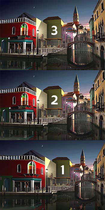
I've generated different versions of the image, included here.
"3" is the normal 3-point perspective. The problem here is the
buildings appear to be leaning in, as they become smaller in the
vertical distance.
"2" is the most commonly used perspective for buildings, it
looks much more natural, though the buildings can look top-heavy.
In "1", objects become smaller in only one axis, the axis into
the screen. This produces a static image (fewer diagonals) and
makes objects facing us appear perfectly square (unless they
have depth, then they are distorted).
I've made adjustments to try to minimize the effect, but it may
still be a distraction.
Another problem with my image is the girl is located on the
far left. Going to a 2-point perspective will move her closer
to the edge. One possible solution would be to place the focal
point closer to the center of the image, and rotate the right
side of the image so we're still looking at the bridge head-on.
Post a reply to this message
Attachments:
Download '321.jpg' (76 KB)
Preview of image '321.jpg'
|
|
| |
| |
|
|
|
|
| |
|
|