|
 |
Just some general comments at this stage.
Op 15-4-2021 om 16:27 schreef Ive:
> Comments, well, truth is my first reaction was just to demand that you
> remove my nom du guerre from this include file as I consider it an
> personal insult to appear within some context that is not even wrong.
> To quote W. Pauli in his native language "Das ist noch nicht einmal
> falsch." Pronounced in his dialect from Vienna.
>
I would sincerely regret such a move. I do not really understand a rigid
orthodox stand about this matter, from a user's point of view. I have
always assumed that providing some liberty of choice should be given;
what does it matter which version a user chooses for his scene because
he/she finds it more appealing or "correct" for his/her personal context?
However, these are my personal views, whatever they are worth. I am also
interested in the comments on this by others beside myself.
> I also need to step in for Daniel Meklenburg (aka Code Warrior) the
> original author of the granites who's intention was to provide some
> realistic colored granites for POV-Ray. And he did it very well for the
> time, and yes I did check it out by installing POV-Ray version 3.0 and
> did render it there.
> None of your 3 versions does even remotely look like the original granites.
See my rapid comment in my earlier post.
> And no, providing 3 versions has nothing to do with artistic freedem
> or freedom of choice when all 3 versions look completely dull compared
> to the original.
Dull... in what manner? I fail to understand.
>
> Well, for old times sake, I did create a scene file that shows a
> framework how this has to be done, added numerous notes and comments as
> to how and why.
>
My sincere thanks for providing the scene file in particular. I have not
looked at it in detail yet, but I shall return to it and comment where
necessary later on.
> And for artistic freedom, I'm all for it and might add a small addition
> to this framework that will allow you to change a dark green granite to
> some bright pink marble - and in addition will do some *really* useful
> thing called blackpoint compensation, addressing the issue that (most)
> contemporary monitors are unable to display *black* while good old CRT's
> had no problem with this.
>
All right.
> Attached is the scene file and two example render showing Code Warrior's
> North American Pink granite polished and frozen.
>
Thank you indeed! Much appreciated. I am all for a good discussion even
if we do not necessarily agree on all points.
Cheers!
--
Thomas
Post a reply to this message
|
|
|
|
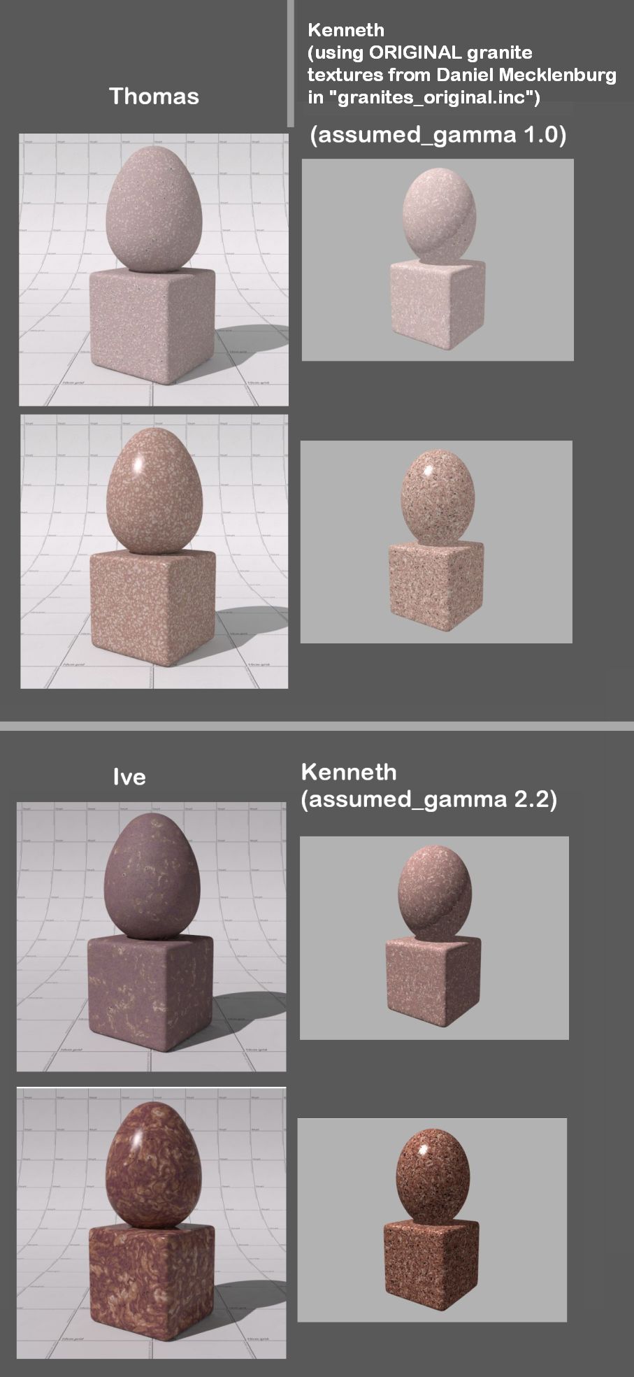
The radical visual differences between the granites of Thomas vs. Ive reminded
me of something I used to do years ago in older versions of POV-ray: running my
scenes in a gamma 2.2 environment (instead of the always-recommended 1.0)--
simply as a way to get 'rgb colors' to appear the way that I thought they
should. This was before I understood the technical details of 'linear' lighting
and rendering (which is another topic, of course.)
So, using the two *original* 1996 Daniel Mecklenburg textures from the
"granites_original.inc" file that Thomas included in his zip files, I decided to
run them in v3.7-- while *switching* between assumed_gamma 1.0 and
assumed_gamma 2.2. [To be specific, I'm running a v3.8xx 'experimental build' in
Windows, that piggybacks on v3.7, but using "#version 3.7" in my test scene.]
Disregarding my own scene's lack of radiosity and a different light_source
setup... not to mention the vast differences that have accrued in POV-ray itself
since 1996...the respective gamma results are quite interesting!
At the time of Daniel's code creation, there was no 'assumed_gamma' keyword,
AFAIU-- just something like Display_Gamma or File_Gamma in an .INI file. (That's
probably what I used-- and with a 2.2 value instead of 1.0.)
The results of my test here indicate that the Thomas/Ive visual differences
might simply be the result of the gamma environment Daniel M was using at the
time. If it was indeed a 2.2-gamma environment-- possibly like my own old way
of doing things-- then Ive's version would seem to be more 'correct' (as regards
Daniel's original intent?); if Daniel used a gamma of 1.0 instead, then Thomas's
looks correct.
Just some food for thought.
I make no judgement as to which of the versions of 'North American Pink granite'
has the correct 'visual' look-- I'll leave that to the granite experts ;-)
-------- Kenneth test code ------
global_settings{assumed_gamma 1.0} // change to 2.2
#default{finish{ambient .07 emission 0 diffuse .8}}
camera {
perspective
location <0, 2.1, -6.9>
look_at <0, 1, 0>
right x*image_width/image_height
angle 58
}
light_source {
0*x
color rgb .3
translate <-20, 40, -20>
}
light_source {
0*x
color rgb .7
translate <-20, 40, -20>
}
// NAPPol : North American Pink polished
// NAPFro : North American Pink frosted
//----ORIGINAL texture code from Daniel Mecklenberg, used below
#declare PolishFinish =
finish { ambient 0.5 phong 0.9 phong_size 80 brilliance 1.5 }
//----ORIGINAL texture code from Daniel Mecklenberg ----
// [KENNETH note: a material wrapper is apparently not
// needed for this 2-part texture]
#declare NAPPol =
texture {
pigment {
granite
turbulence 0.8
color_map {
[ 0.000, 0.500 color rgb < 97/255, 51/255, 63/255 >
color rgb < 178/255, 118/255, 86/255 > ]
[ 0.500, 1.000 color rgb < 172/255, 129/255, 116/255 >
color rgb < 235/255, 215/255, 205/255 > ]
}
}
finish { PolishFinish }
}
texture {
pigment {
granite
turbulence 0.8
color_map {
[ 0.000, 0.600 color rgbf < 1.00, 1.00, 1.00, 1.00 >
color rgbf < 1.00, 1.00, 1.00, 1.00 > ]
[ 0.600, 1.000 color rgbf < 0.10, 0.08, 0.08, 0.50 >
color rgbf < 0.05, 0.04, 0.04, 0.00 > ]
}
scale 0.5
translate < 20, 20, 20 >
rotate < 30, 30, 30 >
}
finish { PolishFinish }
}
//-----------
//----ORIGINAL texture code from Daniel Mecklenberg ----
#declare NAPFro =
texture {
pigment {
granite
turbulence 0.8
color_map {
[ 0.000, 0.500 color rgb < 147/255, 111/255, 123/255 >
color rgb < 162/255, 129/255, 116/255 > ]
[ 0.500, 0.720 color rgb < 172/255, 129/255, 116/255 >
color rgb < 245/255, 220/255, 215/255 > ]
[ 0.720, 1.000 color rgb < 70/255, 70/255, 70/255 >
color rgb < 50/255, 50/255, 50/255 > ]
}
}
finish { diffuse 1.0 crand 0.25 ambient 0.5 }
normal { bumps 0.1 scale 0.2 }
}
//------------------
background{srgb .7}
union{
superellipsoid{<.1,.1> rotate 35*y}
sphere{0,1 scale <1,1.3,1> translate 2.2*y}
texture{NAPPol scale .3} //--- OR use NapFro ---
}
Post a reply to this message
Attachments:
Download 'granite gamma comparisons.jpg' (144 KB)
Preview of image 'granite gamma comparisons.jpg'
|
|
|
|
Op 15/04/2021 om 22:03 schreef Kenneth:
[snip]>
> I make no judgement as to which of the versions of 'North American Pink granite'
> has the correct 'visual' look-- I'll leave that to the granite experts ;-)
>
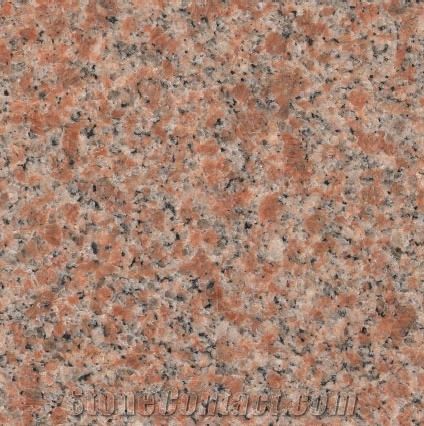
It the case of the granites I sincerely wonder if the gamma issue is an
issue at all (not to be discarded like that of course but...).
Attached is a Real World photograph of North American Pink. No scale is
provided but, in general, the largest grains in granites do not exceed
10-15mm [Bates & Jackson (1987): Glossary of Geology, 3rd Ed.].
Imo, this granite hue closely resembles the assume_gamma 1.0 render and
much less the assumed_gamma 2.2 one. However, there are innumerable
variations in hue and sizes, so who can say he is in the right and who
in the wrong? It becomes almost trivial. Except for the /scale/ of the
texture, where I strongly feel that a 'Real World correct' render should
be provided to the users.
I have come to the conclusion that granites21.inc is /based on/
granites.inc by Daniel Mecklenberg and not an exact reproduction of his
code. If we want those, we need to render the original file separately,
with the initial conditions like Ive and you have done.
--
Thomas
Post a reply to this message
Attachments:
Download 'north american pink.jpg' (49 KB)
Preview of image 'north american pink.jpg'
|
|
|
|
Thomas de Groot <tho### [at] degroot org> wrote:
>
> I have come to the conclusion that granites21.inc is /based on/
> granites.inc by Daniel Mecklenberg and not an exact reproduction of his
> code. If we want those, we need to render the original file separately,
> with the initial conditions like Ive and you have done.
>
Yes, I agree. And in my personal opinion, the gamma 1.0 'look' is most likely
what was intended, more or less-- based on my trust of your own knowledge of
granites, and also the original comments by Daniel M, who seemed to know about
the subject himself. It would surprise me if he did run his textures with a
2.2-gamma and accepted the result-- because I would assume that "North American
Pink granite" is a well-known and 'standard' type of rock, agreed on by
geologists. Not like 'political viewpoints', ha. org> wrote:
>
> I have come to the conclusion that granites21.inc is /based on/
> granites.inc by Daniel Mecklenberg and not an exact reproduction of his
> code. If we want those, we need to render the original file separately,
> with the initial conditions like Ive and you have done.
>
Yes, I agree. And in my personal opinion, the gamma 1.0 'look' is most likely
what was intended, more or less-- based on my trust of your own knowledge of
granites, and also the original comments by Daniel M, who seemed to know about
the subject himself. It would surprise me if he did run his textures with a
2.2-gamma and accepted the result-- because I would assume that "North American
Pink granite" is a well-known and 'standard' type of rock, agreed on by
geologists. Not like 'political viewpoints', ha.
Post a reply to this message
|
|