 |
|
|
|
|
|
| |
| |
|
|
|
|
| |
| |
|
|
On 8-8-2013 13:11, clipka wrote:
> Two more versions. I'm not sure which lighting setup I like better - but
> I do know that I'd really love to have MCPov's "render until I'm ok with
> the noise" mode of operation right now... and/or faster SSLT, for that
> matter.
>
I would prefer the first (0925) maybe with a tiny bit more fill-in on
the right. The other one is a bit too flat to me. Also, I am not too
sure about the dof in that case. Too extreme for my taste.
Thomas
Post a reply to this message
|
|
| |
| |
|
|
|
|
| |
| |
|
|
clipka <ano### [at] anonymous org> wrote:
> Subsurface scattering would probably not be necessary for a human
> character, but being a half-elf I might want her skin to have some
> surrealistic translucency, so I'll give that a try.
Are you kidding?
To me, skin is the only thing that really *needs* subsurface scattering,
especially on the face, which is one of the targets the human eye has been most
used and adjusted to scrutinize on earth under various lighting conditions.
Very nice procedural iris, considering it is an even more demanding challenge in
that respect. Do you mind if I use this Iris texture for the sample texture on
the blender to POV exporter WIKI? or if I have to adapt it as a basis for that.
Faster SSS would be more than awsome, actually a grail for attracting animation
focused users along with motion blur. org> wrote:
> Subsurface scattering would probably not be necessary for a human
> character, but being a half-elf I might want her skin to have some
> surrealistic translucency, so I'll give that a try.
Are you kidding?
To me, skin is the only thing that really *needs* subsurface scattering,
especially on the face, which is one of the targets the human eye has been most
used and adjusted to scrutinize on earth under various lighting conditions.
Very nice procedural iris, considering it is an even more demanding challenge in
that respect. Do you mind if I use this Iris texture for the sample texture on
the blender to POV exporter WIKI? or if I have to adapt it as a basis for that.
Faster SSS would be more than awsome, actually a grail for attracting animation
focused users along with motion blur.
Post a reply to this message
|
|
| |
| |
|
|
|
|
| |
| |
|
|
>> Subsurface scattering would probably not be necessary for a human
>> character, but being a half-elf I might want her skin to have some
>> surrealistic translucency, so I'll give that a try.
>
> Are you kidding?
> To me, skin is the only thing that really *needs* subsurface scattering,
I remember reading a good article in GPU gems:
http://http.developer.nvidia.com/GPUGems3/gpugems3_ch14.html
Post a reply to this message
|
|
| |
| |
|
|
|
|
| |
| |
|
|
Am 08.08.2013 13:38, schrieb Thomas de Groot:
> On 8-8-2013 13:11, clipka wrote:
>> Two more versions. I'm not sure which lighting setup I like better - but
>> I do know that I'd really love to have MCPov's "render until I'm ok with
>> the noise" mode of operation right now... and/or faster SSLT, for that
>> matter.
>>
> I would prefer the first (0925) maybe with a tiny bit more fill-in on
> the right. The other one is a bit too flat to me.
Surprisingly enough, the first one uses a HDR light probe of an overcast
sky (albeit in a park with some trees around, so there is /some/
uniformity to the illumination), while the latter one uses a light probe
of a clear sky. (I suspect the creator of the probe didn't include a
shot with a short enough exposure time to capture the true brightness of
the sun; I'll try again with an added light.)
> Also, I am not too
> sure about the dof in that case. Too extreme for my taste.
I guess you're right. Then again, the acceptable dof might also depend
on how detailed the background is.
Post a reply to this message
|
|
| |
| |
|
|
|
|
| |
| |
|
|
clipka <ano### [at] anonymousorg> wrote:
> Two more versions. I'm not sure which lighting setup I like better ...
The darker one (2013-08-07 0925), definitely.
Post a reply to this message
|
|
| |
| |
|
|
|
|
| |
| |
|
|
On 8-8-2013 16:15, clipka wrote:
> Am 08.08.2013 13:38, schrieb Thomas de Groot:
>> Also, I am not too
>> sure about the dof in that case. Too extreme for my taste.
>
> I guess you're right. Then again, the acceptable dof might also depend
> on how detailed the background is.
>
It is mostly the out-of-focus part of the figure itself that I question.
With a more detailed background, I would prefer the figure to be sharp
front to back, or maybe only a little out of focus in the farthest part.
Thomas
Post a reply to this message
|
|
| |
| |
|
|
|
|
| |
| |
|
|
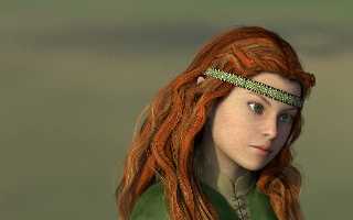
Am 08.08.2013 13:38, schrieb Thomas de Groot:
> I would prefer the first (0925) maybe with a tiny bit more fill-in on
> the right. The other one is a bit too flat to me. Also, I am not too
> sure about the dof in that case. Too extreme for my taste.
This one better?
Post a reply to this message
Attachments:
Download 'young_half_elf_woman_pov_scene 2013-08-08 2151.png' (793 KB)
Preview of image 'young_half_elf_woman_pov_scene 2013-08-08 2151.png'
|
|
| |
| |
|
|
|
|
| |
| |
|
|
Am 09.08.2013 22:01, schrieb clipka:
> Am 08.08.2013 13:38, schrieb Thomas de Groot:
>
>> I would prefer the first (0925) maybe with a tiny bit more fill-in on
>> the right. The other one is a bit too flat to me. Also, I am not too
>> sure about the dof in that case. Too extreme for my taste.
>
> This one better?
(BTW, yes, I know the illumination is too greenish.)
Post a reply to this message
|
|
| |
| |
|
|
|
|
| |
| |
|
|
On 9-8-2013 22:01, clipka wrote:
> Am 08.08.2013 13:38, schrieb Thomas de Groot:
>
>> I would prefer the first (0925) maybe with a tiny bit more fill-in on
>> the right. The other one is a bit too flat to me. Also, I am not too
>> sure about the dof in that case. Too extreme for my taste.
>
> This one better?
>
Yes, I love this one. To answer your second message, the 'greenish'
illumination has a real function here I believe. It enhances the red hear.
As for me, this would be final.
Thomas
Post a reply to this message
|
|
| |
| |
|
|
|
|
| |
| |
|
|
On 09/08/2013 9:01 PM, clipka wrote:
> This one better?
It’s one of those images that are worth looking at, as you would look
deeply into a painting.
The hair bothers me but she is Elvin so she doesn’t follow the rules. ;-)
The eyebrows need reddened to match hair, though.
--
Regards
Stephen
Post a reply to this message
|
|
| |
| |
|
|
|
|
| |


