|
|
|
|
|
|
| |
| |
|
|
|
|
| |
| |
|
|
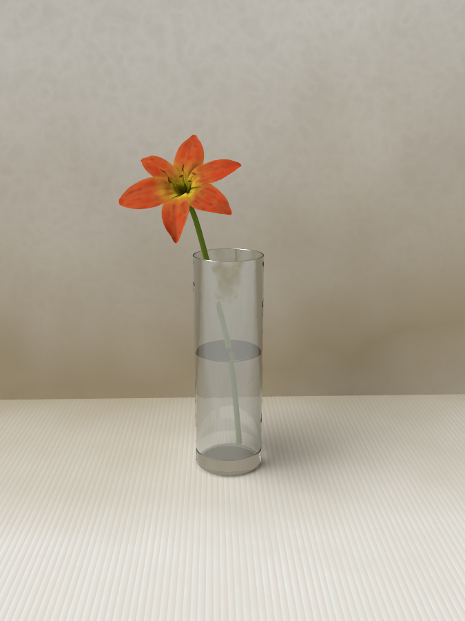
OK, my first attempt at a non-csg object (obviously only the flower which was
modelled and painted using sculptris).
The stem is a sphere_sweep and the vase was just quickly added so is nothing
special.
Any advice on making the flower more realistic would be great.
Sean
Post a reply to this message
Attachments:
Download 'flower_1.png' (410 KB)
Preview of image 'flower_1.png'

|
|
| |
| |
|
|
|
|
| |
| |
|
|
The flower looks pretty good to me! Maybe a little bit of phong highlighting
would help (unless the flower is supposed to be one of those non-glossy,
micro-fuzzy kind of things.) The scene is very pretty--peaceful and Zen-like.
I'm curious why the flower stem seems to disappear in one section; a trick of
the vase's IOR?
I haven't played around with Sculptris in awhile, but it's a great app (I have
one of the betas from more than a year ago--time to update it.)
Post a reply to this message
|
|
| |
| |
|
|
|
|
| |
| |
|
|
On 19-4-2013 21:24, s.day wrote:
> OK, my first attempt at a non-csg object (obviously only the flower which was
> modelled and painted using sculptris).
>
> The stem is a sphere_sweep and the vase was just quickly added so is nothing
> special.
>
> Any advice on making the flower more realistic would be great.
>
> Sean
>
Same comments as Kenneth. I think the flower looks well, at least at
this resolution.
I rediscovered Sculptris a while ago. Its drawback (for me) is its
strong ties with Zbrush. Too expensive. In obj format the textures seem
not to be exported. A pity.
Thomas
Post a reply to this message
|
|
| |
| |
|
|
|
|
| |
| |
|
|
Thomas de Groot <tho### [at] degroot org> wrote:
> On 19-4-2013 21:24, s.day wrote:
> > OK, my first attempt at a non-csg object (obviously only the flower which was
> > modelled and painted using sculptris).
> >
> > The stem is a sphere_sweep and the vase was just quickly added so is nothing
> > special.
> >
> > Any advice on making the flower more realistic would be great.
> >
> > Sean
> >
>
> Same comments as Kenneth. I think the flower looks well, at least at
> this resolution.
>
> I rediscovered Sculptris a while ago. Its drawback (for me) is its
> strong ties with Zbrush. Too expensive. In obj format the textures seem
> not to be exported. A pity.
>
> Thomas
Hi Thomas,
In the version I have (alpha 6) you just have to export the textures separately
as an image and if required bump map. At first glance I did not think it could
export them but it is under the advanced options.
Sean org> wrote:
> On 19-4-2013 21:24, s.day wrote:
> > OK, my first attempt at a non-csg object (obviously only the flower which was
> > modelled and painted using sculptris).
> >
> > The stem is a sphere_sweep and the vase was just quickly added so is nothing
> > special.
> >
> > Any advice on making the flower more realistic would be great.
> >
> > Sean
> >
>
> Same comments as Kenneth. I think the flower looks well, at least at
> this resolution.
>
> I rediscovered Sculptris a while ago. Its drawback (for me) is its
> strong ties with Zbrush. Too expensive. In obj format the textures seem
> not to be exported. A pity.
>
> Thomas
Hi Thomas,
In the version I have (alpha 6) you just have to export the textures separately
as an image and if required bump map. At first glance I did not think it could
export them but it is under the advanced options.
Sean
Post a reply to this message
|
|
| |
| |
|
|
|
|
| |
| |
|
|
"Kenneth" <kdw### [at] gmailcom> wrote:
> The flower looks pretty good to me! Maybe a little bit of phong highlighting
> would help (unless the flower is supposed to be one of those non-glossy,
> micro-fuzzy kind of things.) The scene is very pretty--peaceful and Zen-like.
>
> I'm curious why the flower stem seems to disappear in one section; a trick of
> the vase's IOR?
>
> I haven't played around with Sculptris in awhile, but it's a great app (I have
> one of the betas from more than a year ago--time to update it.)
I am playing with the settings, seems to go from too dull to too plastic, will
try using phong as I have been using specular maybe that will be the solution..
This render had a bump map on the vase, I think that could be the reason
(including the ior). I was mainly interested in the flower so did not think too
much about the vase.
Sean
Post a reply to this message
|
|
| |
| |
|
|
|
|
| |
| |
|
|
> "Kenneth" <kdw### [at] gmailcom> wrote:
>> The flower looks pretty good to me! Maybe a little bit of phong highlighting
>> would help (unless the flower is supposed to be one of those non-glossy,
>> micro-fuzzy kind of things.) The scene is very pretty--peaceful and Zen-like.
>>
>> I'm curious why the flower stem seems to disappear in one section; a trick of
>> the vase's IOR?
>>
>> I haven't played around with Sculptris in awhile, but it's a great app (I have
>> one of the betas from more than a year ago--time to update it.)
>
> I am playing with the settings, seems to go from too dull to too plastic, will
> try using phong as I have been using specular maybe that will be the solution..
>
> This render had a bump map on the vase, I think that could be the reason
> (including the ior). I was mainly interested in the flower so did not think too
> much about the vase.
>
> Sean
>
You can try changing the brilliance a bit up or down.
With specular, roughness is very important. Make is small to get tight
highlights and larger to broaden them. Usualy in the 0.000001 to 1
range.You should also play with the specular value itself. In this case,
you are probably beter to keep it low, like from 0.2 to 0.5.
If you try phong, phong_size is usualy larger than 10. Larger values
make the highlight tighter.
Here again, you should keep the phong value relatively small in a range
similar to that proposed for specular.
With both specular and phong it's easy to get results that are to dull
or to shiny. You can use both. In this case, make their values smaller
still as the effects will add.
Render using version 3.7 and try adding albedo for diffuse, specular and
phong when using a brilliance value different than 1. It can make a big
difference.
Don't make brilliance under 0.5 or it will tend to look cartoony, at
least for me.
I don't think that a brilliance larger than 1.2, at most, would be OK
for a flower. I'd try something in the 0.8 to 1.1 range.
Alain
Post a reply to this message
|
|
| |
| |
|
|
|
|
| |
| |
|
|
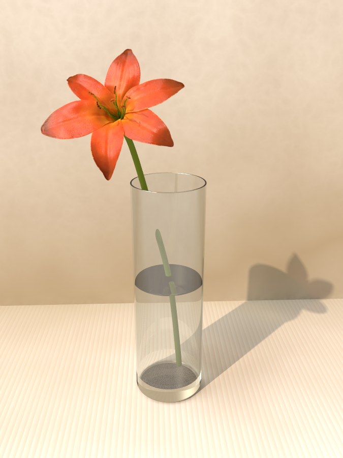
I forgot to mention a suggestion: The color patterns on many kinds of flower
petals seem to 'curve' towards the tip of the petal (like a focal point) rather
than being 'linear' all the way out. Perhaps your paintings already have that to
a degree, but the effect could use a bit more exaggeration IMO.
Not all petals look that way, of course, but that's the general recollection I
have of colorful flowers.
Post a reply to this message
|
|
| |
| |
|
|
|
|
| |
| |
|
|
On 23-4-2013 18:25, s.day wrote:
> In the version I have (alpha 6) you just have to export the textures separately
> as an image and if required bump map. At first glance I did not think it could
> export them but it is under the advanced options.
That is the version I have too. Thanks for the info; I had not yet
discovered that.
Thomas
Post a reply to this message
|
|
| |
| |
|
|
|
|
| |
| |
|
|
Kenneth wrote:
> I forgot to mention a suggestion: The color patterns on many kinds of flower
> petals seem to 'curve' towards the tip of the petal (like a focal point) rather
> than being 'linear' all the way out. Perhaps your paintings already have that to
> a degree, but the effect could use a bit more exaggeration IMO.
>
> Not all petals look that way, of course, but that's the general recollection I
> have of colorful flowers.
>
>
>
Yes, I did add a slight darkening towards the tip of each petal but it
did not show up as much when exported from sculptris. I am finding that
the colours viewed in sculptris do not look at all similar when
exported/rendered. I think it is something to do with the material
settings in sculptris.
I have increased this effect (maybe a bit too much though) and adjusted
the specular setting using albedo this time. The colours are quite
different with this one but I think I prefer it so far.
Post a reply to this message
Attachments:
Download 'flower_hdr.png' (426 KB)
Preview of image 'flower_hdr.png'
|
|
| |
| |
|
|
|
|
| |
| |
|
|
Kenneth wrote:
> The flower looks pretty good to me! Maybe a little bit of phong highlighting
> would help (unless the flower is supposed to be one of those non-glossy,
> micro-fuzzy kind of things.) The scene is very pretty--peaceful and Zen-like.
>
> I'm curious why the flower stem seems to disappear in one section; a trick of
> the vase's IOR?
>
> I haven't played around with Sculptris in awhile, but it's a great app (I have
> one of the betas from more than a year ago--time to update it.)
>
>
>
It would appear that the stem disappearing is completely down to the
IOR. I removed the normal and it still disappears. It looked very odd so
I rendered the scene from above and confirmed the stem is indeed in the
vase as expected..
Sean
Post a reply to this message
|
|
| |
| |
|
|
|
|
| |