 |
 |
|
 |
|
 |
|  |
|  |
|
 |
|
 |
|  |
|  |
|
 |
Features:
- New, simpler API.
- Smoothing built-in.
- New example objects
- Uses much tighter bounding boxes on some objects)
- Automatically determines grid size
- Stores parameters in a text ".prox" file alongside the DF3 file
Cheers,
Edouard.
Post a reply to this message
Attachments:
Download 'df3-prox-options-095.jpg' (361 KB)
Preview of image 'df3-prox-options-095.jpg'
|
 |
|  |
|  |
|
 |
|
 |
|  |
|  |
|
 |
"Edouard" <pov### [at] edouard info> wrote:
> Features:
> - New, simpler API.
> - Smoothing built-in.
> - New example objects
> - Uses much tighter bounding boxes on some objects)
> - Automatically determines grid size
> - Stores parameters in a text ".prox" file alongside the DF3 file
>
> Cheers,
> Edouard.
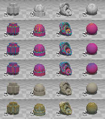
Row 1: Debug option to show the grid (voxel) size.
Row 2: False color pattern
Row 3: False color pattern with smoothing turned on
Row 4: False color pattern with added noise and slope
Row 5: Stone pattern (incl. chips towards the outer edges)
Row 6: Brass with patina pattern
Cheers,
Edouard. info> wrote:
> Features:
> - New, simpler API.
> - Smoothing built-in.
> - New example objects
> - Uses much tighter bounding boxes on some objects)
> - Automatically determines grid size
> - Stores parameters in a text ".prox" file alongside the DF3 file
>
> Cheers,
> Edouard.
Row 1: Debug option to show the grid (voxel) size.
Row 2: False color pattern
Row 3: False color pattern with smoothing turned on
Row 4: False color pattern with added noise and slope
Row 5: Stone pattern (incl. chips towards the outer edges)
Row 6: Brass with patina pattern
Cheers,
Edouard.
Post a reply to this message
|
 |
|  |
|  |
|
 |
|
 |
|  |
|  |
|
 |
wonderful! *_*
Post a reply to this message
|
 |
|  |
|  |
|
 |
|
 |
|  |
|  |
|
 |
web.4aa83e6a37d8ab92c83e2c410@news.povray.org...
Waw I'll have to find some time and play with it now :-)
Marc
Post a reply to this message
|
 |
|  |
|  |
|
 |
From: Thomas de Groot
Subject: Re: DF3 Proximity Pattern - 0.95 Released
Date: 10 Sep 2009 07:39:35
Message: <4aa8e577@news.povray.org>
|
|
 |
|  |
|  |
|
 |
Right!
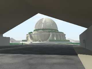
Result of use of latest version. The building is showing a much smoother
texture now (no noise is used here). I added some more features to the
building. The smoke seems to originate *beside* the altar but is not. It
starts horizontally before going upwards. I assume there is a bug in the
wind effect of the smokegen macro (Mikael Carneholm) or the mistake is mine
:-)
For the wall-and-gate, I have to experiment further. Nothing really
stricking is showing here so some tuning might be in order.
Thomas
Post a reply to this message
Attachments:
Download 'boullee_cenotaphe_adapted_14.jpg' (105 KB)
Preview of image 'boullee_cenotaphe_adapted_14.jpg'
|
 |
|  |
|  |
|
 |
|
 |
|  |
|  |
|
 |
"Thomas de Groot" <tDOTdegroot@interDOTnlANOTHERDOTnet> wrote:
> Right!
>
> Result of use of latest version. The building is showing a much smoother
> texture now (no noise is used here). I added some more features to the
> building. The smoke seems to originate *beside* the altar but is not. It
> starts horizontally before going upwards. I assume there is a bug in the
> wind effect of the smokegen macro (Mikael Carneholm) or the mistake is mine
> :-)
>
> For the wall-and-gate, I have to experiment further. Nothing really
> stricking is showing here so some tuning might be in order.
>
> Thomas
Looking good!
Please tell me if there are any changes you would like in the macros - I'd like
it if the macros were something people could actually use with as little effort
as possible.
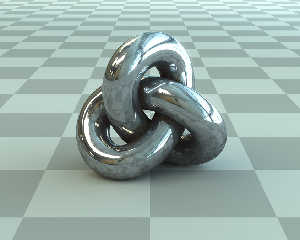
And here's another texture - steel with some scratching on the outside, and rust
on the inside.
Cheers,
Edouard.
Post a reply to this message
Attachments:
Download 'prox_steel_trefoil.jpg' (80 KB)
Preview of image 'prox_steel_trefoil.jpg'
|
 |
|  |
|  |
|
 |
From: Thomas de Groot
Subject: Re: DF3 Proximity Pattern - 0.95 Released
Date: 10 Sep 2009 10:58:04
Message: <4aa913fc@news.povray.org>
|
|
 |
|  |
|  |
|
 |
"Edouard" <pov### [at] edouard info> schreef in bericht
news:web.4aa90e66d49c2f41c83e2c410@news.povray.org...
>
> Looking good!
Yes, I think so too. The macro is very easy to use now. Got a version here
now with noise which is even better, at least for the cenotaph. Used
add_noise and pattern smoothing for the cenotaph; only add_noise for the
gate.
>
> Please tell me if there are any changes you would like in the macros - I'd
> like
> it if the macros were something people could actually use with as little
> effort
> as possible.
I think the only thing which could use some automation is the noise,
especially the slope/altitude code which should be scaled to the size of the
object. The other scales are more or less intuitive I think, as they can
reflect the taste of the user. Not sure though, I want to experiment a bit
with that.
>
> And here's another texture - steel with some scratching on the outside,
> and rust
> on the inside.
Yes, nice one too!
Thomas info> schreef in bericht
news:web.4aa90e66d49c2f41c83e2c410@news.povray.org...
>
> Looking good!
Yes, I think so too. The macro is very easy to use now. Got a version here
now with noise which is even better, at least for the cenotaph. Used
add_noise and pattern smoothing for the cenotaph; only add_noise for the
gate.
>
> Please tell me if there are any changes you would like in the macros - I'd
> like
> it if the macros were something people could actually use with as little
> effort
> as possible.
I think the only thing which could use some automation is the noise,
especially the slope/altitude code which should be scaled to the size of the
object. The other scales are more or less intuitive I think, as they can
reflect the taste of the user. Not sure though, I want to experiment a bit
with that.
>
> And here's another texture - steel with some scratching on the outside,
> and rust
> on the inside.
Yes, nice one too!
Thomas
Post a reply to this message
Attachments:
Download 'boullee_cenotaphe_adapted_14.jpg' (105 KB)
Preview of image 'boullee_cenotaphe_adapted_14.jpg'
|
 |
|  |
|  |
|
 |
|
 |
|  |
|  |
|
 |
>Edouard on date 10/09/2009 16:34 wrote:
> "Thomas de Groot" <tDOTdegroot@interDOTnlANOTHERDOTnet> wrote:
>> Right!
>>
>> Result of use of latest version. The building is showing a much smoother
>> texture now (no noise is used here). I added some more features to the
>> building. The smoke seems to originate *beside* the altar but is not. It
>> starts horizontally before going upwards. I assume there is a bug in the
>> wind effect of the smokegen macro (Mikael Carneholm) or the mistake is mine
>> :-)
>>
>> For the wall-and-gate, I have to experiment further. Nothing really
>> stricking is showing here so some tuning might be in order.
>>
>> Thomas
>
> Looking good!
>
> Please tell me if there are any changes you would like in the macros - I'd like
> it if the macros were something people could actually use with as little effort
> as possible.
>
> And here's another texture - steel with some scratching on the outside, and rust
> on the inside.
>
> Cheers,
> Edouard.
>
>
> ------------------------------------------------------------------------
>
Wow, very persuasive!
;-)
Paolo
Post a reply to this message
|
 |
|  |
|  |
|
 |
|
 |
|  |
|  |
|
 |
Thomas de Groot wrote:
> Yes, I think so too. The macro is very easy to use now. Got a version here
> now with noise which is even better, at least for the cenotaph. Used
> add_noise and pattern smoothing for the cenotaph; only add_noise for the
> gate.
I would be interested in seeing a panoramic version of the scene, using
PanoSalado or something.
-Mike
Post a reply to this message
|
 |
|  |
|  |
|
 |
|
 |
|  |
|  |
|
 |
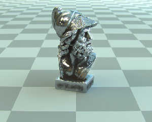
> And here's another texture - steel with some scratching on the outside, and rust
> on the inside.
Last one - the Ajax mesh with a steel proximity texture, and some
post-processing in Photoshop.
Cheers,
Edouard.
Post a reply to this message
Attachments:
Download 'steel_ajax_office_probe.jpg' (96 KB)
Preview of image 'steel_ajax_office_probe.jpg'
|
 |
|  |
|  |
|
 |
|
 |
|  |


![]()