|
|
|
|
|
|
| |
| |
|
|
|
|
| |
| |
|
|
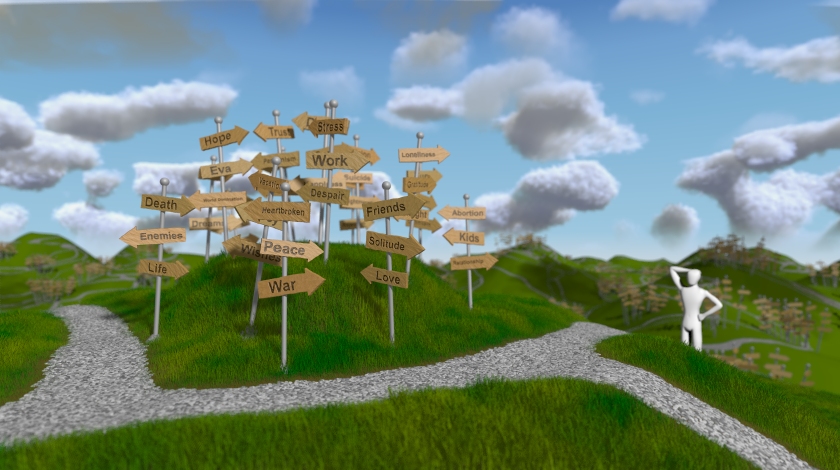
So, after quite some time, another update on the image.
I've worked some more on the clouds and colors of the sky, on the figure
(there were lots of iterations on the figure I didn't post here) and a
little on the blur.
I'm not sure yet if I want to call it final, so I want to put it to rest
for a few days and experiment, like exchanging the sky to something
completely abstract and non-realistic, or switching some colors around
(not a daytime-sky, but rather dawn or such, perhaps).
Anyways, I figured some input might be nice, as always, I don't mind
criticism or suggestions, I just always retain the right to decide if I
want to follow them or not. ;-)
Regards,
Tim
--
aka "Tim Nikias"
Homepage: <http://www.nolights.de>
Post a reply to this message
Attachments:
Download 'lostguy_27.jpg' (234 KB)
Preview of image 'lostguy_27.jpg'

|
|
| |
| |
|
|
|
|
| |
| |
|
|
Tim Nikias wrote:
> So, after quite some time, another update on the image.
Hey Tim,
It all looks really nice! The lighting is great, and the atmosphere
feels good. Overall, the hills never get higher or lower to give the
poor guy any reference to location.
"Am I close yet" would be the appropriate question to ask for a person
is this situation. For you, the answer to that question should be a
resounding "yes". Give yourself a pat on the back, because it's time for
you to move on to a new project. This one is finished :)
Sam
Post a reply to this message
|
|
| |
| |
|
|
|
|
| |
| |
|
|
Tim Nikias <JUS### [at] gmx netWARE> wrote:
> So, after quite some time, another update on the image.
I must admit that I have not seen the earlier versions, but I like this one.
Were you going for a semi-cartoon look? I think it works very well as a nice
blend.
One small nitpick (sorry!) - I think one of the signs should read
"Heartbreak" rather than "Heartbroken", just to be consistent with all the
others.
Also I don't see "Debt" anywhere! Or is that it hiding behind "Stress"? ;-)
If you plan on making additions to this scene at a later date I could
suggest maybe a signpost and just the bottom tip of a sign (words not
visible) in the extreme foreground - maybe way over on the right edge (so
as not to obscure the man). I think it would complement the signs way off
in the distance nicely, and add to the 'magnitude' of this man's
helplessness.
Well please don't take these as criticisms because they were not intended
that way. I love this image, the atmosphere and the composition; plus the
subject is something I think we can all relate to.
Great work!
-- sooperFoX
a.k.a. Chris
>
> I've worked some more on the clouds and colors of the sky, on the figure
> (there were lots of iterations on the figure I didn't post here) and a
> little on the blur.
>
> I'm not sure yet if I want to call it final, so I want to put it to rest
> for a few days and experiment, like exchanging the sky to something
> completely abstract and non-realistic, or switching some colors around
> (not a daytime-sky, but rather dawn or such, perhaps).
>
> Anyways, I figured some input might be nice, as always, I don't mind
> criticism or suggestions, I just always retain the right to decide if I
> want to follow them or not. ;-)
>
> Regards,
> Tim
>
> --
> aka "Tim Nikias"
> Homepage: <http://www.nolights.de> netWARE> wrote:
> So, after quite some time, another update on the image.
I must admit that I have not seen the earlier versions, but I like this one.
Were you going for a semi-cartoon look? I think it works very well as a nice
blend.
One small nitpick (sorry!) - I think one of the signs should read
"Heartbreak" rather than "Heartbroken", just to be consistent with all the
others.
Also I don't see "Debt" anywhere! Or is that it hiding behind "Stress"? ;-)
If you plan on making additions to this scene at a later date I could
suggest maybe a signpost and just the bottom tip of a sign (words not
visible) in the extreme foreground - maybe way over on the right edge (so
as not to obscure the man). I think it would complement the signs way off
in the distance nicely, and add to the 'magnitude' of this man's
helplessness.
Well please don't take these as criticisms because they were not intended
that way. I love this image, the atmosphere and the composition; plus the
subject is something I think we can all relate to.
Great work!
-- sooperFoX
a.k.a. Chris
>
> I've worked some more on the clouds and colors of the sky, on the figure
> (there were lots of iterations on the figure I didn't post here) and a
> little on the blur.
>
> I'm not sure yet if I want to call it final, so I want to put it to rest
> for a few days and experiment, like exchanging the sky to something
> completely abstract and non-realistic, or switching some colors around
> (not a daytime-sky, but rather dawn or such, perhaps).
>
> Anyways, I figured some input might be nice, as always, I don't mind
> criticism or suggestions, I just always retain the right to decide if I
> want to follow them or not. ;-)
>
> Regards,
> Tim
>
> --
> aka "Tim Nikias"
> Homepage: <http://www.nolights.de>
Post a reply to this message
|
|
| |
| |
|
|
|
|
| |
| |
|
|
"Tim Nikias" <JUS### [at] gmxnetWARE> wrote in message
news:46fce599@news.povray.org...
> So, after quite some time, another update on the image.
>
> I've worked some more on the clouds and colors of the sky, on the figure
> (there were lots of iterations on the figure I didn't post here) and a
> little on the blur.
>
> I'm not sure yet if I want to call it final, so I want to put it to rest
> for a few days and experiment, like exchanging the sky to something
> completely abstract and non-realistic, or switching some colors around
> (not a daytime-sky, but rather dawn or such, perhaps).
>
> Anyways, I figured some input might be nice, as always, I don't mind
> criticism or suggestions, I just always retain the right to decide if I
> want to follow them or not. ;-)
>
> Regards,
> Tim
>
> --
> aka "Tim Nikias"
> Homepage: <http://www.nolights.de>
>
Nice. Is that a bunny I see in the clouds there? And a boxing glove? And a
...
The cloudscape is a canvas for the imagination.
DLM
Post a reply to this message
|
|
| |
| |
|
|
|
|
| |
| |
|
|
"dlm" <me### [at] addressinvalid> schreef in bericht
news:47023a69$1@news.povray.org...
>
> Nice. Is that a bunny I see in the clouds there? And a boxing glove? And a
> ...
> The cloudscape is a canvas for the imagination.
Yes! And a doggy, and a tapir, and...
Thomas
Post a reply to this message
|
|
| |
| |
|
|
|
|
| |
| |
|
|
>> Nice. Is that a bunny I see in the clouds there? And a boxing glove? And
>> a
>> ...
>> The cloudscape is a canvas for the imagination.
>
>
> Yes! And a doggy, and a tapir, and...
8)
Post a reply to this message
|
|
| |
| |
|
|
|
|
| |
| |
|
|
The clouds are possibly too regular in their fluffiness (is that a word?),
but that's one mighty fine pic! Great job.
Post a reply to this message
|
|
| |
| |
|
|
|
|
| |
| |
|
|
Tim Nikias <JUS### [at] gmxnetWARE> wrote:
> So, after quite some time, another update on the image.
>
This is a landscape that I would actually like to visit! It's a really
compelling image, very original and well-executed. It looks like a fantasy
painting come to life. The lighting and the blurred background give it a
"real but fantastic" quality. I wouldn't change a thing (...*except*
perhaps the featureless white figure...my only suggestion. He's a bit stiff
compared to all the rounded, sensual forms in the image.)
Ken W.
Post a reply to this message
|
|
| |
| |
|
|
|
|
| |
| |
|
|
Samuel Benge wrote:
> It all looks really nice! The lighting is great, and the atmosphere
> feels good. Overall, the hills never get higher or lower to give the
> poor guy any reference to location.
Thanks, thats a good interpretation of the scenery. :-)
> "Am I close yet" would be the appropriate question to ask for a person
> is this situation. For you, the answer to that question should be a
> resounding "yes". Give yourself a pat on the back, because it's time for
> you to move on to a new project. This one is finished :)
Yeah, considering calling it finished, too. I still want to make a last
couple of experiments, but I guess this'll remain the final version.
Maybe I'll go ahead and create a few variations (in lighting, for
example, or background)...
Regards,
Tim
--
aka "Tim Nikias"
Homepage: <http://www.nolights.de>
Post a reply to this message
|
|
| |
| |
|
|
|
|
| |
| |
|
|
sooperFoX wrote:
> I must admit that I have not seen the earlier versions, but I like this one.
> Were you going for a semi-cartoon look? I think it works very well as a nice
> blend.
Yup, semi-cartoon, half-realistic, this mix-style has many names. ;-)
> One small nitpick (sorry!) - I think one of the signs should read
> "Heartbreak" rather than "Heartbroken", just to be consistent with all the
> others.
Hm, that's if the signs are just leading somewhere. Maybe they're also
signs leading you when you are in a certain situation? (Just giving fuel
to thought... ;-)
> Also I don't see "Debt" anywhere! Or is that it hiding behind "Stress"? ;-)
Ooooh, there are a couple ones hiding behind the others, which is a
shame, really. Overall, 50 different things and only a couple dozen are
really readable.
> If you plan on making additions to this scene at a later date I could
> suggest maybe a signpost and just the bottom tip of a sign (words not
> visible) in the extreme foreground - maybe way over on the right edge (so
> as not to obscure the man). I think it would complement the signs way off
> in the distance nicely, and add to the 'magnitude' of this man's
> helplessness.
> Well please don't take these as criticisms because they were not intended
> that way. I love this image, the atmosphere and the composition; plus the
> subject is something I think we can all relate to.
No, don't worry, constructive criticism is okay! Suggestions, different
points of view, that's what I try to get when I post things here in the
newsgroups where people can comment. It's still up to me if I want to
implement a suggestion or not, I don't feel obliged to obey. ;-)
> Great work!
Thank you!
Regards,
Tim
--
aka "Tim Nikias"
Homepage: <http://www.nolights.de>
Post a reply to this message
|
|
| |
| |
|
|
|
|
| |
|
|