|
|
|
|
|
|
| |
| |
|
|
|
|
| |
| |
|
|
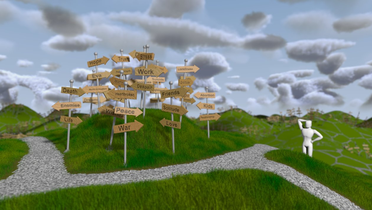
Hm. I wanted to refine the figure-model on my new MacBook Pro, which I
intended to buy today. But Apple has shipping troubles currently and I
have to wait till the store gets a new shipment... No idea when that'll
be. So I didn't work on the model yet, but still wanted to share the
latest change on the background.
It's just a simple heightfield with a green/gray pigment-mapped crackle
texture to texture-fake paths on the distant hills. The signs are
"light" version of the ones in the foreground, just randomly bunched and
placed on the background heightfield.
Note that the background (sky and background mountains) are rendered in
a seperate scene and the resulting image is just placed behind the
foreground.
One thing to keep in mind on that technique: The background image is a
certain distance to the focal-plane, so I have to adjust it's position
if I want more or less blurring (and scale it slightly larger than the
viewing area, or blurred rays will miss it and I get a sky-colored edge
around the background where it isn't obscured by the foreground).
The advantage to rendering the background seperately: I can render it at
half the resolution with good antialiasing settings, because after the
blurring I wouldn't retain all that detail anyways. Thus I save
rendering time double-fold: smaller resolution & no complicated
100-samples-per-pixel focal-blurred media.
I'll work on the figure-model tomorrow or sometime this week. On my
desktop PC. Running Windows. Not a new Mac. *sigh*
Regards,
Tim
--
aka "Tim Nikias"
Homepage: <http://www.nolights.de>
Post a reply to this message
Attachments:
Download 'lostguy_18.jpg' (131 KB)
Preview of image 'lostguy_18.jpg'

|
|
| |
| |
|
|
|
|
| |
| |
|
|
This is looking really cool. Kind of surreal cartoonish. I like the roads
going all over the place.
-tgq
Post a reply to this message
|
|
| |
| |
|
|
|
|
| |
| |
|
|
Heh, when I read the description before viewing the image, I thought to
myself "Oh no, this might ruin the image, which were perfect in its
simplicity before..." However, when seeing it, I actually really like the
background hills, very much to my own surprise! It is really well executed
and adds to the feel the image already had.
The only thing that bothers me is the paths in the background. They follow
too obviously a crackle pattern. Well, that's not the problem actually. The
problem is that they don't look natural, and I think this would have been my
impression no matter if I had known the crackle pattern or not. The paths
are too dense and they don't look like they have evolved naturally but like
somebody painted them onto the hills. I don't know if there is any pattern
that will make them look natural or if you'll have to hand paint them as
well, like the paths in the foreground.
Other than that, it's perfect!
Rune
--
http://runevision.com
Post a reply to this message
|
|
| |
| |
|
|
|
|
| |
| |
|
|
Trevor G Quayle wrote:
> This is looking really cool. Kind of surreal cartoonish. I like the roads
> going all over the place.
Good, cartoonish/non-real is what I am aiming for. :-)
Regards,
Tim
--
aka "Tim Nikias"
Homepage: <http://www.nolights.de>
Post a reply to this message
|
|
| |
| |
|
|
|
|
| |
| |
|
|
Rune wrote:
> Heh, when I read the description before viewing the image, I thought to
> myself "Oh no, this might ruin the image, which were perfect in its
> simplicity before..." However, when seeing it, I actually really like the
> background hills, very much to my own surprise! It is really well executed
> and adds to the feel the image already had.
Same thought here. I was wondering if a background would add or distract
to the foreground scenerey, which is why I kept it so simple: not too
much detail to *really* distract, but enough to show that this sign-mess
isn't just a single thing, but a recurring point in life. I've been
thinking about a title as well, and "Decisions" seems nice so far. Maybe
need an adjective to narrow it down, but once I find a title, I'm
probably also finished with the image. That's how it often goes when on
an experimental route with an image and idea.
> The only thing that bothers me is the paths in the background. They follow
> too obviously a crackle pattern. Well, that's not the problem actually. The
> problem is that they don't look natural, and I think this would have been my
> impression no matter if I had known the crackle pattern or not. The paths
> are too dense and they don't look like they have evolved naturally but like
> somebody painted them onto the hills. I don't know if there is any pattern
> that will make them look natural or if you'll have to hand paint them as
> well, like the paths in the foreground.
>
> Other than that, it's perfect!
Thanks! I was wondering about the paths, too. I added some turbulence on
top to break up the straight lines, but it's obviously not enough. I'll
experiment some more on the texturing side before I take serious steps
in attempting to procedurally/scriptly generate paths.
I'm not 100% satisfied with the background signs yet either, so if I end
up writing a script, maybe I can implement placement of the
signs-bushels as well...
Regards,
Tim
--
aka "Tim Nikias"
Homepage: <http://www.nolights.de>
Post a reply to this message
|
|
| |
| |
|
|
|
|
| |
| |
|
|
Tim Nikias wrote:
> Thanks! I was wondering about the paths, too. I added some turbulence on
> top to break up the straight lines, but it's obviously not enough.
I think it's more that paths naturally follow where someone wants to
walk. Random paths are going to be "wrong" no matter how you perturb
them, because paths by their nature aren't random.
Paths leading from cluster-of-signs to cluster-of-signs would make
sense, altho obviously harder to do.
--
Darren New / San Diego, CA, USA (PST)
The primary use of XML is as a technique
to avoid documenting your interchange formats.
Post a reply to this message
|
|
| |
| |
|
|
|
|
| |
| |
|
|
I really like it. The background massively improves the image, to my mind.
And, especially for a hand-modelled figure, that poor lost guy looks
particularly good. As to the paths looking too much like crackle, have you
tried an agate pattern? The middle of the color map (0.45-0.55 or whatever)
can look nice and stringy without the cell-structure that crackle produces.
It might not work, but could be worth a look!
Am jealous of your impending MacBook Pro. The screens on those machines are
phenomenal - I'm sure this is the main reason for their relative expense.
Bill
Post a reply to this message
|
|
| |
| |
|
|
|
|
| |
| |
|
|
Bill Pragnell wrote:
> I really like it. The background massively improves the image, to my mind.
> And, especially for a hand-modelled figure, that poor lost guy looks
> particularly good. As to the paths looking too much like crackle, have you
> tried an agate pattern? The middle of the color map (0.45-0.55 or whatever)
> can look nice and stringy without the cell-structure that crackle produces.
> It might not work, but could be worth a look!
Thanks for the suggestions, I'll try it!
> Am jealous of your impending MacBook Pro. The screens on those machines are
> phenomenal - I'm sure this is the main reason for their relative expense.
Hm, I did compare Laptops of similiar categories, and Macs aren't that
expensive in comparison. What I do know though, is that a Mac will
simply *run* unless something really is broken. And that's something I'd
like a Laptop to have. Though I'm mostly annoyed how often I have to
dabble at my Desktop PC when I update drivers and things go haywire,
it's okay because I figure that *I* make the hardware choices, and maybe
not the best ones, and how can you *really* expect things to work 100%
unless you
a) do it completely yourself (aka Linux or such) or
b) its designed and cared for by a company (aka Apple).
And since I'm becoming a multimedia programmer, a Mac was a sensible
idea to enhance my capabilities and experience with different systems.
You never know what you might end up with, once I'm done and search for
a job. :-)
Regards,
Tim
--
aka "Tim Nikias"
Homepage: <http://www.nolights.de>
Post a reply to this message
|
|
| |
| |
|
|
|
|
| |
| |
|
|
This picture has come a long way from where it began!
This is an excellent image. I've not posted here for a long time because
I've been busy with graphic design, and this is the kind of image for which
people pay money to put in magazines, advertisements etc. The image so
excellently describes the idea of confusion and the burden of making life
decisions in an attractive, cartoonish style. The background hills with the
fluffy clouds give it a very good feel.
If you wanted to try and get your art work in some publications, put that
mac to work rendering it in high resolution and see what you can get from a
stock illustration site.
The only thing I would suggest would be to change the color balance, either
to cool colors to give a cold and somewhat fearful feeling (perhaps by
adding a purplish fill light), or to warmer colors to give a more
optimistic feel (by brightening up the sun and shifting it to yellow/orange
a bit).
-- Kirk
Post a reply to this message
|
|
| |
| |
|
|
|
|
| |
| |
|
|
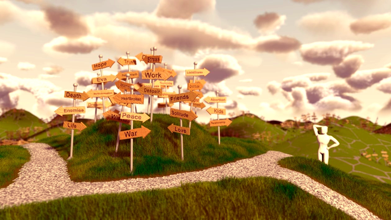
I just did some quick color-adjustments, adjusting the highlights to more
yellow and the shadows to more purple, and got this. Just my suggestion.
-- Kirk
Post a reply to this message
Attachments:
Download 'lostguy_18c.jpg' (406 KB)
Preview of image 'lostguy_18c.jpg'
|
|
| |
| |
|
|
|
|
| |
|
|