|
|
|
|
|
|
| |
| |
|
|
|
|
| |
| |
|
|
Spock wrote:
> These are all beautiful images and an interesting concept. Thanks for
> posting.
Glad to. :)
> I've seen some very nice photograph frames that use clear glass as the
> mat. This allows the wall color to show through, and might be a good
> choice here too. Do you think the technology exists to print onto a
> transparent background?
Hmm, possibly? But I doubt it's a viable option for my wallet... :/
Also, I don't personally think that it's necessary good to aliminate the
difference between the background color and the color of the wall.
Rune
--
http://runevision.com
Post a reply to this message
|
|
| |
| |
|
|
|
|
| |
| |
|
|
Rune wrote:
> andrel wrote:
>> BTW how much time would it take to paint your background and the wall
>> e.g. mint green in the full room image (with different textures so
>> there is a small difference in color)?
>
> I'm not sure what you mean. I can easily make a preview with any color for
> the image backgrounds and any color for the wall if you give me some color
> vectors (it's easier than me having to guess what color you mean). I'm not
> sure what you mean about "different textures so there is a small difference
> in color".
Your wall may be plaster or something like that, the printed images will
be on much smoother paper even glossy and possibly with a layer of glass
in front. So even if you use exactly the same color the percepted color
will be slightly different. Well you know that of course, you use POV ;)
You already did a white background for a white wall and my question was
simply if you could easily change the color of the wall in your room
scene to match the image background just to see what that would look
like in a more real situation. Just out of curiosity.
BTW I didn't see your 'khaki' background before I posted, otherwise I
would have suggested a khaki wall in stead.
Post a reply to this message
|
|
| |
| |
|
|
From: Tim Attwood
Subject: Re: Metal & Flowers WIP? 5 - with new colors!
Date: 20 Aug 2007 18:45:11
Message: <46ca1977@news.povray.org>
|
|
|
| |
| |
|
|
> I have yet to investigate the printing process for the posters for myself.
> I plan to have them made locally (by which I mean in this country), but
> after that I plan to put the designs on Zazzle. I also don't know the
> printing process on Zazzle...
You might consider doing a poster of all the images in a single sheet,
which means you would have two background colors to pick.
Post a reply to this message
|
|
| |
| |
|
|
|
|
| |
| |
|
|
Tim Attwood wrote:
>> I have yet to investigate the printing process for the posters for
>> myself. I plan to have them made locally (by which I mean in this
>> country), but after that I plan to put the designs on Zazzle. I also
>> don't know the printing process on Zazzle...
>
> You might consider doing a poster of all the images in a single sheet,
> which means you would have two background colors to pick.
Nah, I don't like the idea of a poster depicting some posters on a wall...
Rune
--
http://runevision.com
Post a reply to this message
|
|
| |
| |
|
|
|
|
| |
| |
|
|
Rune wrote:
> Those two seem to be the preferences of many, and I must say that they are
> the most hamonious. However, I've decided that I prefer for myself the
> slightly more "playful" and "fresh" feel that the teal version evokes in me.
> My original intention was for the flowers to not only be in harmony with the
> rest of the image, but also be rather bold and almost vulgar in intensity.
> The white version has this. The khaki and blue versions make the whole image
> a bit more calm in my opinion (and in the green version the background sort
> of competes with the flowers for attention), while the teak somehow
> preserves the boldness and "attitude", though in a way that enhances the
> flowers rather than competing with them.
>
Yeah I think that's about right, the teal with the green cast moves
closer to the red/green axis. So it adds tension and removes some of
the sweet even perfumy harmony with the blue. But as it moves into
direct opposition with the red it also eats some of the red's saturation
but as youy say, it's a tradeoff that has your personal preference.
Post a reply to this message
|
|
| |
| |
|
|
|
|
| |
| |
|
|
Just to add my 2p - Blue for me with Teal a very close second. I like the
white also, but less so. Black is _ok_ buy you don't see the shadows - which
defeats the point a little?
Khaki works colour-sie but seems a little boring compared to the others. I
find the green overpowering.
Whatever you go with, I think they're all great.
the answer is probably "awful" but what do they look like with solid colours
but different in each "frame"?
"Rune" <new### [at] runevision com> wrote in message
news:46c7a10d@news.povray.org...
> Okay, so I've finally gotten all the details to a level where I'm
> satisfied with it. (You wouldn't believe how many tweaks I've made since
> the last version I posted, that probably no one else than me even
> notices...) Making test-prints with my printer have made me aware of
> issues with things than don't work as well on print as on the screen,
> because nuances in colors and luminance is lost once printed. To deal with
> that, contrast of certain textures have been enhanced, which looks better
> on the screen too as a bonus.
>
> Anyway, I've splitted the image into several layers, and once the
> background layer was separate, it suddenly got temptingly easy to play
> around with it... In my head the background was always just white, but
> after having seen some of the possible alternatives, I'm suddenly not sure
> I prefer white anymore. I don't know which version I want to have printed!
>
> What to do, what to do...
>
> What do you think?
>
> Teaser image is attached, the full versions can be seen here (in png
> format, so the page is slightly heavy):
> http://runevision.com/3d/metalandflowers/
>
> BTW, the blue, teal and green color is carefully selected. Colors with red
> in don't work well so shades of red, yellow, and violet are out. Also,
> light colors don't work well (except completely white), nor almost black
> or gray ones (except completely black). I also tried some linear gradient
> with color to white and color to black. At first it looks really sweet,
> but after looking at it for a little white it begins to just look cheap.
> Compromises don't work here. Just one strong color.
>
> Rune
> --
> http://runevision.com
>
> com> wrote in message
news:46c7a10d@news.povray.org...
> Okay, so I've finally gotten all the details to a level where I'm
> satisfied with it. (You wouldn't believe how many tweaks I've made since
> the last version I posted, that probably no one else than me even
> notices...) Making test-prints with my printer have made me aware of
> issues with things than don't work as well on print as on the screen,
> because nuances in colors and luminance is lost once printed. To deal with
> that, contrast of certain textures have been enhanced, which looks better
> on the screen too as a bonus.
>
> Anyway, I've splitted the image into several layers, and once the
> background layer was separate, it suddenly got temptingly easy to play
> around with it... In my head the background was always just white, but
> after having seen some of the possible alternatives, I'm suddenly not sure
> I prefer white anymore. I don't know which version I want to have printed!
>
> What to do, what to do...
>
> What do you think?
>
> Teaser image is attached, the full versions can be seen here (in png
> format, so the page is slightly heavy):
> http://runevision.com/3d/metalandflowers/
>
> BTW, the blue, teal and green color is carefully selected. Colors with red
> in don't work well so shades of red, yellow, and violet are out. Also,
> light colors don't work well (except completely white), nor almost black
> or gray ones (except completely black). I also tried some linear gradient
> with color to white and color to black. At first it looks really sweet,
> but after looking at it for a little white it begins to just look cheap.
> Compromises don't work here. Just one strong color.
>
> Rune
> --
> http://runevision.com
>
>
Post a reply to this message
|
|
| |
| |
|
|
|
|
| |
| |
|
|
Simon nous apporta ses lumieres en ce 2007/08/21 17:21:
> Just to add my 2p - Blue for me with Teal a very close second. I like the
> white also, but less so. Black is _ok_ buy you don't see the shadows - which
> defeats the point a little?
>
> Khaki works colour-sie but seems a little boring compared to the others. I
> find the green overpowering.
>
> Whatever you go with, I think they're all great.
>
> the answer is probably "awful" but what do they look like with solid colours
> but different in each "frame"?
Could be nice, but you'll loose a sense of unity. May be OK in some setings, or
as a way to show every available colours in one go, if you don't have enough
place to have a sample of each colour.
>
> "Rune" <new### [at] runevisioncom> wrote in message
> news:46c7a10d@news.povray.org...
>> Okay, so I've finally gotten all the details to a level where I'm
>> satisfied with it. (You wouldn't believe how many tweaks I've made since
>> the last version I posted, that probably no one else than me even
>> notices...) Making test-prints with my printer have made me aware of
>> issues with things than don't work as well on print as on the screen,
>> because nuances in colors and luminance is lost once printed. To deal with
>> that, contrast of certain textures have been enhanced, which looks better
>> on the screen too as a bonus.
>>
>> Anyway, I've splitted the image into several layers, and once the
>> background layer was separate, it suddenly got temptingly easy to play
>> around with it... In my head the background was always just white, but
>> after having seen some of the possible alternatives, I'm suddenly not sure
>> I prefer white anymore. I don't know which version I want to have printed!
>>
>> What to do, what to do...
>>
>> What do you think?
>>
>> Teaser image is attached, the full versions can be seen here (in png
>> format, so the page is slightly heavy):
>> http://runevision.com/3d/metalandflowers/
>>
>> BTW, the blue, teal and green color is carefully selected. Colors with red
>> in don't work well so shades of red, yellow, and violet are out. Also,
>> light colors don't work well (except completely white), nor almost black
>> or gray ones (except completely black). I also tried some linear gradient
>> with color to white and color to black. At first it looks really sweet,
>> but after looking at it for a little white it begins to just look cheap.
>> Compromises don't work here. Just one strong color.
>>
>> Rune
>> --
>> http://runevision.com
>>
>>
>
>
--
Alain
-------------------------------------------------
Politics is such a torment that I advise everyone I love not to mix with it.
Thomas Jefferson
Post a reply to this message
|
|
| |
| |
|
|
|
|
| |
| |
|
|
On Tue, 21 Aug 2007 22:21:33 +0100, Simon wrote:
> Black is _ok_ buy you don't see the shadows - which defeats the point a
> little?
That was my thought as well - losing the shadows changes things a bit.
Jim
Post a reply to this message
|
|
| |
| |
|
|
|
|
| |
| |
|
|
Simon wrote:
> Just to add my 2p - Blue for me with Teal a very close second. I like
> the white also, but less so. Black is _ok_ buy you don't see the
> shadows - which defeats the point a little?
Yes, somewhat. The drop shadow was not specifically part of my initial
vision, but I must say I like it very much. The black version is indeed my
least favorite, but I think it has its justification nonetheless -
particularly when looking at the image in the upper left corner isolated.
> Khaki works colour-sie but seems a little boring compared to the
> others. I find the green overpowering.
Agreed. I have tried a new lime green, which to my surprise I like. I still
want teal for my own room though.
> Whatever you go with, I think they're all great.
Thank you! :)
> the answer is probably "awful" but what do they look like with solid
> colours but different in each "frame"?
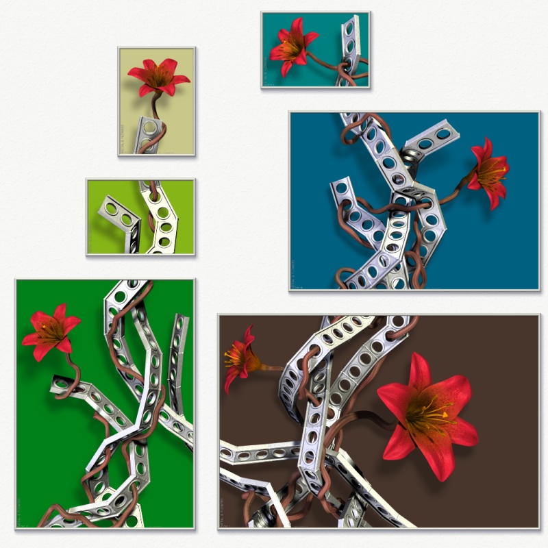
I've considered myself how this would look, though mostly as a curiosum.
I've only just tried it now (see attached), and it actually looks worse than
I thought. And that's even when I've tried to create a little balance rather
than choosing completely randomly. Ugh, it's so confusing to my eye...
Rune
--
http://runevision.com
Post a reply to this message
Attachments:
Download 'metal12_composition_1024_multicolored.jpg' (180 KB)
Preview of image 'metal12_composition_1024_multicolored.jpg'

|
|
| |
| |
|
|
|
|
| |
| |
|
|
I have to admit that I like the brown one....
Jim
Post a reply to this message
|
|
| |
| |
|
|
|
|
| |
|
|