|
 |
Simon wrote:
> Just to add my 2p - Blue for me with Teal a very close second. I like
> the white also, but less so. Black is _ok_ buy you don't see the
> shadows - which defeats the point a little?
Yes, somewhat. The drop shadow was not specifically part of my initial
vision, but I must say I like it very much. The black version is indeed my
least favorite, but I think it has its justification nonetheless -
particularly when looking at the image in the upper left corner isolated.
> Khaki works colour-sie but seems a little boring compared to the
> others. I find the green overpowering.
Agreed. I have tried a new lime green, which to my surprise I like. I still
want teal for my own room though.
> Whatever you go with, I think they're all great.
Thank you! :)
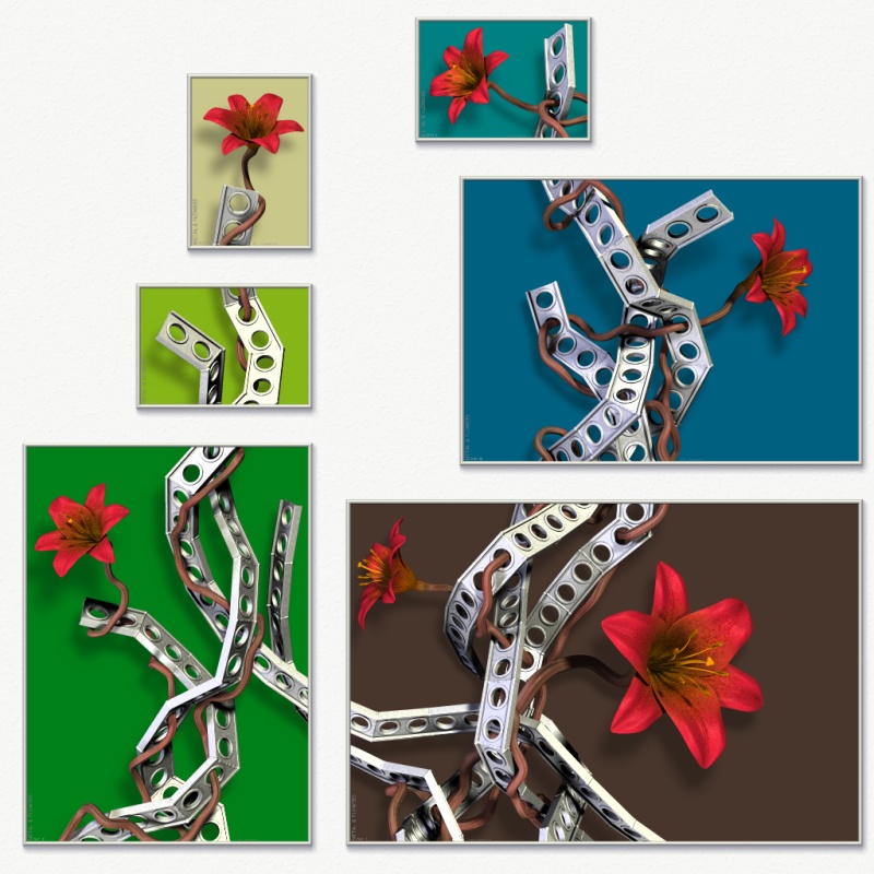
> the answer is probably "awful" but what do they look like with solid
> colours but different in each "frame"?
I've considered myself how this would look, though mostly as a curiosum.
I've only just tried it now (see attached), and it actually looks worse than
I thought. And that's even when I've tried to create a little balance rather
than choosing completely randomly. Ugh, it's so confusing to my eye...
Rune
--
http://runevision.com
Post a reply to this message
Attachments:
Download 'metal12_composition_1024_multicolored.jpg' (180 KB)
Preview of image 'metal12_composition_1024_multicolored.jpg'

|
|