|
|
|
|
|
|
| |
| |
|
|
|
|
| |
| |
|
|
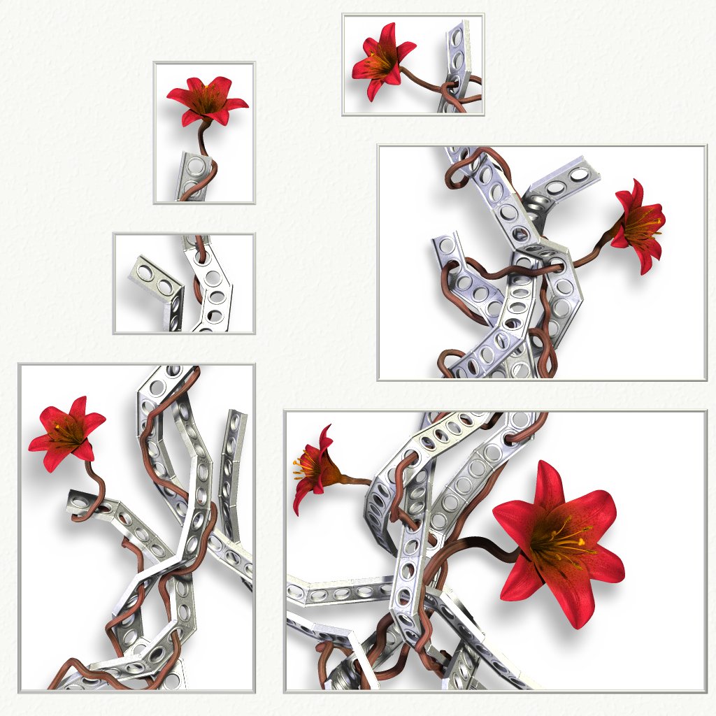
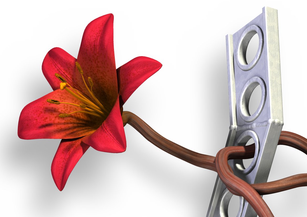
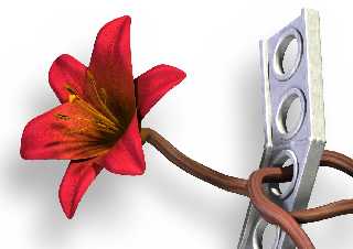
Not much may *seem* changed here, but I've worked a lot on the small
details.
First of all, the stems have a different color and texture. I hope they
don't look so unhealthy now?
The stems had some problems with intersecting with the metal quite a few
places. I started fixing that manually by moving control points in the
splines, but that turned out to be both very difficult and very boring. So I
wrote an algorithm that moves the stems out of the way of the metal, using a
lot of trace() calls. Once I got it tweaked, it did a lot better job at it
than I could ever have done myself. The image should be free of intersecting
objects now. If you spot any at all, please let me know!
I think I have decided not to have any leaves on the stems. It would look
odd with brown or red or gray leaves, which are really the only acceptable
colors in this image. Green is still not an option...
I have troubles deciding on a name for the image. Various ideas have been
"Broken Canvas" - focus perhaps too much on the form and not the content?
"Metal and Flowers" - the simple approach - I'm not so sure.
I've also toyed with several ideas trying to convey the theme of the image,
but none that I'm satisfied with.
"Organic Design" "Artificial Organics" "Organic Artifacts"
Maybe "Constructed Growth"? "Designed Growth"? "Grown Constructions"?
*sigh* I don't know...
Rune
--
http://runevision.com
Post a reply to this message
Attachments:
Download 'metal10.jpg' (164 KB)
Download 'metal_a4_6.jpg' (101 KB)
Preview of image 'metal10.jpg'
Preview of image 'metal_a4_6.jpg'
|
|
| |
| |
|
|
|
|
| |
| |
|
|
Rune nous apporta ses lumieres en ce 2007/08/01 19:08:
> Not much may *seem* changed here, but I've worked a lot on the small
> details.
>
> First of all, the stems have a different color and texture. I hope they
> don't look so unhealthy now?
>
> The stems had some problems with intersecting with the metal quite a few
> places. I started fixing that manually by moving control points in the
> splines, but that turned out to be both very difficult and very boring. So I
> wrote an algorithm that moves the stems out of the way of the metal, using a
> lot of trace() calls. Once I got it tweaked, it did a lot better job at it
> than I could ever have done myself. The image should be free of intersecting
> objects now. If you spot any at all, please let me know!
>
> I think I have decided not to have any leaves on the stems. It would look
> odd with brown or red or gray leaves, which are really the only acceptable
> colors in this image. Green is still not an option...
>
> I have troubles deciding on a name for the image. Various ideas have been
>
> "Broken Canvas" - focus perhaps too much on the form and not the content?
>
> "Metal and Flowers" - the simple approach - I'm not so sure.
>
> I've also toyed with several ideas trying to convey the theme of the image,
> but none that I'm satisfied with.
> "Organic Design" "Artificial Organics" "Organic Artifacts"
> Maybe "Constructed Growth"? "Designed Growth"? "Grown Constructions"?
>
> *sigh* I don't know...
>
> Rune
>
Metal Flowers?
Growing Metal?
What you did to make the connection of the aparently free floating piece, also
made the all metal look somewhat harder. It nicely increase the
organic/inorganic contrast.
--
Alain
-------------------------------------------------
I bet exercise equipment would be a lot more
expensive if we had evolved from starfish.
Post a reply to this message
|
|
| |
| |
|
|
|
|
| |
| |
|
|
"Floral Intersection"
Or summat like that. Calls attention to the to worlds uniting and the
positive/negative play inherent in multi-canvas form.
Looks good.
---
Sam Bleckley
Post a reply to this message
|
|
| |
| |
|
|
|
|
| |
| |
|
|
> I have troubles deciding on a name for the image.
rungs and posies?
:D
Post a reply to this message
|
|
| |
| |
|
|
|
|
| |
| |
|
|
"Rune" <new### [at] runevision com> wrote:
> Not much may *seem* changed here, but I've worked a lot on the small
> details...
It looks great. I really like the frames and the colours are good. I don't
think it matters that some people say the stems look unhealthy. I think
they look quite interesting and go well with the rest ...and I don't think
they come off as unhealthy anyway :) I agree with no leaves! Also that its
hard to come up with a good name. "Ladder" and "Trellis" are the words that
come to my mind.
Janet
parrotdolphin.deviantart.com com> wrote:
> Not much may *seem* changed here, but I've worked a lot on the small
> details...
It looks great. I really like the frames and the colours are good. I don't
think it matters that some people say the stems look unhealthy. I think
they look quite interesting and go well with the rest ...and I don't think
they come off as unhealthy anyway :) I agree with no leaves! Also that its
hard to come up with a good name. "Ladder" and "Trellis" are the words that
come to my mind.
Janet
parrotdolphin.deviantart.com
Post a reply to this message
|
|
| |
| |
|
|
|
|
| |
| |
|
|
A repost, not because it was a particularly good post, but just to see
if I can recreate part of the history that was lost in the crash.
It's my duty as a member of the Campaign for Real Time.
----------
Rune wrote:
[snip]
I like it.
> I have troubles deciding on a name for the image. Various ideas have been
>
> "Broken Canvas" - focus perhaps too much on the form and not the content?
>
> "Metal and Flowers" - the simple approach - I'm not so sure.
>
> I've also toyed with several ideas trying to convey the theme of the
image, but none that I'm satisfied with.
> "Organic Design" "Artificial Organics" "Organic Artifacts"
> Maybe "Constructed Growth"? "Designed Growth"? "Grown Constructions"?
>
"Distributed render no 1" (assuming more will follow).
"Put your petal through the metal"
Something with Iris in it. If you were Dutch I would suggest "Iris Copy"
but that might not translate (Iridology seems to be the english
translation of what this is supposed to be a pun of)
"iridium"
Post a reply to this message
|
|
| |
| |
|
|
|
|
| |
| |
|
|
"Rune" <new### [at] runevisioncom> wrote in message
news:46b1127d@news.povray.org...
> I've also toyed with several ideas trying to convey the theme of the
> image, but none that I'm satisfied with.
> "Organic Design" "Artificial Organics" "Organic Artifacts"
> Maybe "Constructed Growth"? "Designed Growth"? "Grown Constructions"?
>
> *sigh* I don't know...
Soft/Hard
Smooth/Rough
I don't know either, but good renders Rune!
~Steve~
>
> Rune
> --
> http://runevision.com
>
>
Post a reply to this message
|
|
| |
| |
|
|
|
|
| |
| |
|
|
Rune wrote:
> I have troubles deciding on a name for the image.
"Urban Renaissance" has some interesting conceptual shades.
Very nice model. Are you planning on printing this? Printing a papery
texture (the texture around the boxes) onto paper will produce a
cheapish-looking result in my opinion. Of course, building a real
thingwithholes would be best.
-Shay
Post a reply to this message
|
|
| |
| |
|
|
|
|
| |
| |
|
|
Shay wrote:
> Rune wrote:
>> I have troubles deciding on a name for the image.
>
> "Urban Renaissance" has some interesting conceptual shades.
That sounds interesting. Care to explain them? :)
> Very nice model. Are you planning on printing this?
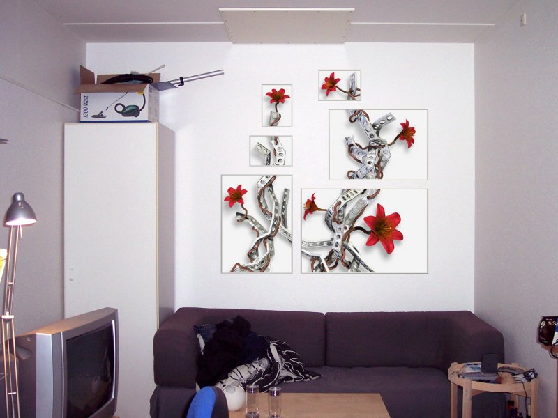
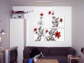
Yes, but not as one big poster. Rather as six posters, with each box being
one poster in an aluminium frame, the three smallest ones being in A4 format
and the biggest one being 60x90 cm.
> Printing a papery
> texture (the texture around the boxes) onto paper will produce a
> cheapish-looking result in my opinion.
The texture is supposed to be a wall texture - a simulation of the wall that
the six posters will be hung on.
> Of course, building a real thingwithholes would be best.
Though not the same, the idea here is quite similar. :)
Attached is a different simulation using a real photograph.
Rune
--
http://runevision.com
Post a reply to this message
Attachments:
Download 'metal_flowers_posters_small.jpg' (68 KB)
Preview of image 'metal_flowers_posters_small.jpg'
|
|
| |
| |
|
|
|
|
| |
| |
|
|
Rune wrote:
> Shay wrote:
>> Rune wrote:
>>> I have troubles deciding on a name for the image.
>> "Urban Renaissance" has some interesting conceptual shades.
>
> That sounds interesting. Care to explain them? :)
The metal looks like recycled industrial scrap, polished or painted
(reborn) for reuse?
The flower (nature) is returning to a once nature-less urban setting.
> Yes, but not as one big poster. Rather as six posters, with each box being
> one poster in an aluminium frame, the three smallest ones being in A4 format
> and the biggest one being 60x90 cm.
OK. I get it now. This will be very nice if not exactly cheap.
-Shay
Post a reply to this message
|
|
| |
| |
|
|
|
|
| |