|
|
|
|
|
|
| |
| |
|
|
|
|
| |
| |
|
|
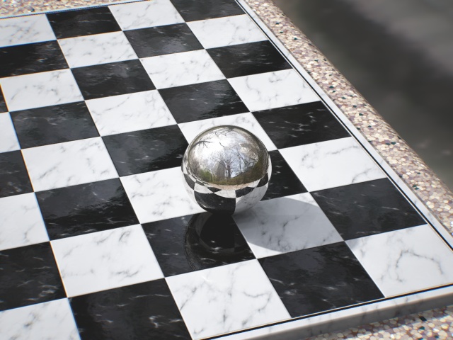
My reflective sphere over checkered plane didn't look this cool :(
--
Dan
GoofyGraffix.com
Post a reply to this message
|
|
| |
| |
|
|
|
|
| |
| |
|
|
"Sabrina Kilian" <ykg### [at] vt edu> wrote in message
news:461fea7c$1@news.povray.org...
> What my eyes first noticed was the 'noise' just below and to the left of
> the sphere.
Good point I hadn't noticed, I've upped my AA settings now.
> The background is very blurry. My camera seems to think that to get the
> background that faded would require a very narrow depth of field, if the
> table is normal height off the ground for an outdoor chess table. A
> little blur at the far side of the table would take care of that and
> might even convince the photographers that this is a real picture.
The picture actually has quite a zoomed lens so a real camera would need an
apeture of several centimetres to get that much blur, and that's just not
realistic! So I plan to build a detailed non-blurry floor to go there.
> Lastly, the table edge itself. I love the pigment, it looks just like
> the composite stone I would expect to find in a park. My eyes say that
> each chip in the stone seems too flat. I would suggest normals, but it's
> the shadow that gives it away. The shadow of the board on the lower
> right looks too crisp as it passes over each little chip. Similerly, the
> green on the far top right looks just as bright as the near green
> specks, something I wouldn't expect looking at that table. The little
> bit of lens effects you mentioned might take care of all of that without
> resorting to anything more complecated.
The table actually has a reflective sheen, though it's not obvious at this
angle, so it's supposed to be composite stone polished to a very smooth
finish. In any case I've added an area light which has now slightly softened
the edge of the shade so that should fix the problem. Do you think the green
specks are too bright or too dark? I put them in at the last minute and I'm
not sure I like them!
> I linked the picture to a friend, fellow computer geek but not into
> graphics. His response was, 'wow, wait, that's not real?' Personally,
> I'd want this as a desktop, or a poster as is. I can't wait to see it
> when you are finished.
Thanks for your comments!
--
Tek
http://evilsuperbrain.com edu> wrote in message
news:461fea7c$1@news.povray.org...
> What my eyes first noticed was the 'noise' just below and to the left of
> the sphere.
Good point I hadn't noticed, I've upped my AA settings now.
> The background is very blurry. My camera seems to think that to get the
> background that faded would require a very narrow depth of field, if the
> table is normal height off the ground for an outdoor chess table. A
> little blur at the far side of the table would take care of that and
> might even convince the photographers that this is a real picture.
The picture actually has quite a zoomed lens so a real camera would need an
apeture of several centimetres to get that much blur, and that's just not
realistic! So I plan to build a detailed non-blurry floor to go there.
> Lastly, the table edge itself. I love the pigment, it looks just like
> the composite stone I would expect to find in a park. My eyes say that
> each chip in the stone seems too flat. I would suggest normals, but it's
> the shadow that gives it away. The shadow of the board on the lower
> right looks too crisp as it passes over each little chip. Similerly, the
> green on the far top right looks just as bright as the near green
> specks, something I wouldn't expect looking at that table. The little
> bit of lens effects you mentioned might take care of all of that without
> resorting to anything more complecated.
The table actually has a reflective sheen, though it's not obvious at this
angle, so it's supposed to be composite stone polished to a very smooth
finish. In any case I've added an area light which has now slightly softened
the edge of the shade so that should fix the problem. Do you think the green
specks are too bright or too dark? I put them in at the last minute and I'm
not sure I like them!
> I linked the picture to a friend, fellow computer geek but not into
> graphics. His response was, 'wow, wait, that's not real?' Personally,
> I'd want this as a desktop, or a poster as is. I can't wait to see it
> when you are finished.
Thanks for your comments!
--
Tek
http://evilsuperbrain.com
Post a reply to this message
|
|
| |
| |
|
|
|
|
| |
| |
|
|
Tek wrote:
> "Sabrina Kilian" <ykg### [at] vtedu> wrote in message
> news:461fea7c$1@news.povray.org...
>> Lastly, the table edge itself. I love the pigment, it looks just like
>> the composite stone I would expect to find in a park. My eyes say that
>> each chip in the stone seems too flat. I would suggest normals, but it's
>> the shadow that gives it away. The shadow of the board on the lower
>> right looks too crisp as it passes over each little chip. Similerly, the
>> green on the far top right looks just as bright as the near green
>> specks, something I wouldn't expect looking at that table. The little
>> bit of lens effects you mentioned might take care of all of that without
>> resorting to anything more complecated.
>
> The table actually has a reflective sheen, though it's not obvious at this
> angle, so it's supposed to be composite stone polished to a very smooth
> finish. In any case I've added an area light which has now slightly softened
> the edge of the shade so that should fix the problem. Do you think the green
> specks are too bright or too dark? I put them in at the last minute and I'm
> not sure I like them!
>
You are right, the table looked matte almost and the sheen did not show
up like it did for the chess board. I'm not used to seeing composite
stone brand new, so I was expecting the small pieces to be slightly
varied in height or angle which would break up the near side's shadow.
With the sheen being more obvious, or the shadow being softer, I think
it will look great.
I don't think the green specks are too bright or dark, I just can't
reconcile that the chips on the top right look to be almost the same
color as the ones on the nearest edge. It looks great on the near edge,
but it seems too colorful on the far edge.
All of this could be because I am picturing how this would look from a
camera up close with a wide angle lens, not a far off zoom. I'll put a
marble on my desk again, and find a telephoto lens, and see what I think
then.
>> I linked the picture to a friend, fellow computer geek but not into
>> graphics. His response was, 'wow, wait, that's not real?' Personally,
>> I'd want this as a desktop, or a poster as is. I can't wait to see it
>> when you are finished.
>
> Thanks for your comments!
And thank you for another wonderful picture.
Post a reply to this message
|
|
| |
| |
|
|
|
|
| |
| |
|
|
I like it!
Florian
Post a reply to this message
|
|
| |
| |
|
|
|
|
| |
| |
|
|
Here's a version with some camera effects (subtle vignetting and
dispersion), improved anti-aliasing (actually rendered at 1600x1200 and
resized), an area_light, and a redesigned chess board.
The vignetting should help vary the colours across the image, so hopefully
those green specks will look better now.
--
Tek
http://evilsuperbrain.com
"Sabrina Kilian" <"ykgp <at> wrote in message
news:462052bc$1@news.povray.org...
> Tek wrote:
>> "Sabrina Kilian" <ykg### [at] vtedu> wrote in message
>> news:461fea7c$1@news.povray.org...
>>> Lastly, the table edge itself. I love the pigment, it looks just like
>>> the composite stone I would expect to find in a park. My eyes say that
>>> each chip in the stone seems too flat. I would suggest normals, but it's
>>> the shadow that gives it away. The shadow of the board on the lower
>>> right looks too crisp as it passes over each little chip. Similerly, the
>>> green on the far top right looks just as bright as the near green
>>> specks, something I wouldn't expect looking at that table. The little
>>> bit of lens effects you mentioned might take care of all of that without
>>> resorting to anything more complecated.
>>
>> The table actually has a reflective sheen, though it's not obvious at
>> this
>> angle, so it's supposed to be composite stone polished to a very smooth
>> finish. In any case I've added an area light which has now slightly
>> softened
>> the edge of the shade so that should fix the problem. Do you think the
>> green
>> specks are too bright or too dark? I put them in at the last minute and
>> I'm
>> not sure I like them!
>>
>
> You are right, the table looked matte almost and the sheen did not show
> up like it did for the chess board. I'm not used to seeing composite
> stone brand new, so I was expecting the small pieces to be slightly
> varied in height or angle which would break up the near side's shadow.
> With the sheen being more obvious, or the shadow being softer, I think
> it will look great.
>
> I don't think the green specks are too bright or dark, I just can't
> reconcile that the chips on the top right look to be almost the same
> color as the ones on the nearest edge. It looks great on the near edge,
> but it seems too colorful on the far edge.
>
> All of this could be because I am picturing how this would look from a
> camera up close with a wide angle lens, not a far off zoom. I'll put a
> marble on my desk again, and find a telephoto lens, and see what I think
> then.
>
>>> I linked the picture to a friend, fellow computer geek but not into
>>> graphics. His response was, 'wow, wait, that's not real?' Personally,
>>> I'd want this as a desktop, or a poster as is. I can't wait to see it
>>> when you are finished.
>>
>> Thanks for your comments!
>
> And thank you for another wonderful picture.
Post a reply to this message
Attachments:
Download 'before+after.1-pp.jpg' (103 KB)
Preview of image 'before+after.1-pp.jpg'
|
|
| |
| |
|
|
|
|
| |
| |
|
|
You should be forbidden to post such excellent wip images!!! :-)
Thomas
Post a reply to this message
|
|
| |
| |
|
|
|
|
| |
| |
|
|
-----BEGIN PGP SIGNED MESSAGE-----
Hash: SHA1
There's a problem with your photograph: it was taken by the
Invisible Man! Otherwise, he should be visible in the reflection on
the sphere ;)
Jerome
- --
+------------------------- Jerome M. BERGER ---------------------+
| mailto:jeb### [at] freefr | ICQ: 238062172 |
| http://jeberger.free.fr/ | Jabber: jeb### [at] jabberfr |
+---------------------------------+------------------------------+
-----BEGIN PGP SIGNATURE-----
Version: GnuPG v1.4.7 (GNU/Linux)
iD8DBQFGINY4d0kWM4JG3k8RApcGAJ9ekXG8sTpGNi7eWgKGDMSHulY0CQCfVwTB
eI2yZBYZPlxFw6AnwBOvzhA=
=pPWH
-----END PGP SIGNATURE-----
Post a reply to this message
|
|
| |
| |
|
|
|
|
| |
| |
|
|
Nice. However, I think the black border around the board looks
a bit artificial. Maybe there should be just a groove centered
in the white border. Also, the board seems to be too perfectly
aligned with the table.
Post a reply to this message
|
|
| |
| |
|
|
|
|
| |
| |
|
|
I am thinking of cheekily building a cameraman to be in the reflection!
--
Tek
http://evilsuperbrain.com
news:4620d638$1@news.povray.org...
> -----BEGIN PGP SIGNED MESSAGE-----
> Hash: SHA1
>
> There's a problem with your photograph: it was taken by the
> Invisible Man! Otherwise, he should be visible in the reflection on
> the sphere ;)
>
> Jerome
> - --
> +------------------------- Jerome M. BERGER ---------------------+
> | mailto:jeb### [at] freefr | ICQ: 238062172 |
> | http://jeberger.free.fr/ | Jabber: jeb### [at] jabberfr |
> +---------------------------------+------------------------------+
> -----BEGIN PGP SIGNATURE-----
> Version: GnuPG v1.4.7 (GNU/Linux)
>
> iD8DBQFGINY4d0kWM4JG3k8RApcGAJ9ekXG8sTpGNi7eWgKGDMSHulY0CQCfVwTB
> eI2yZBYZPlxFw6AnwBOvzhA=
> =pPWH
> -----END PGP SIGNATURE-----
Post a reply to this message
|
|
| |
| |
|
|
|
|
| |
| |
|
|
"Christian Froeschlin" <chr### [at] chrfrde> wrote in message
news:4620e2ee$1@news.povray.org...
> Nice. However, I think the black border around the board looks
> a bit artificial. Maybe there should be just a groove centered
> in the white border. Also, the board seems to be too perfectly
> aligned with the table.
2 good points. I can't make my mind up about the border so I'll try some
variations. The alignment to the table is perfect because I havent decided
if the board is built into the table or not. Though I think it's not (since
it looks like an expensive marble board on a cheap stone table) so I'll
shift the positions a little.
Very useful comments, thanks!
--
Tek
http://evilsuperbrain.com
Post a reply to this message
|
|
| |
| |
|
|
|
|
| |
|
|