|
 |
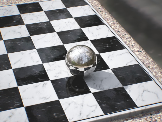
Here's a version with some camera effects (subtle vignetting and
dispersion), improved anti-aliasing (actually rendered at 1600x1200 and
resized), an area_light, and a redesigned chess board.
The vignetting should help vary the colours across the image, so hopefully
those green specks will look better now.
--
Tek
http://evilsuperbrain.com
"Sabrina Kilian" <"ykgp <at> wrote in message
news:462052bc$1@news.povray.org...
> Tek wrote:
>> "Sabrina Kilian" <ykg### [at] vt edu> wrote in message
>> news:461fea7c$1@news.povray.org...
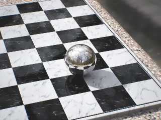
>>> Lastly, the table edge itself. I love the pigment, it looks just like
>>> the composite stone I would expect to find in a park. My eyes say that
>>> each chip in the stone seems too flat. I would suggest normals, but it's
>>> the shadow that gives it away. The shadow of the board on the lower
>>> right looks too crisp as it passes over each little chip. Similerly, the
>>> green on the far top right looks just as bright as the near green
>>> specks, something I wouldn't expect looking at that table. The little
>>> bit of lens effects you mentioned might take care of all of that without
>>> resorting to anything more complecated.
>>
>> The table actually has a reflective sheen, though it's not obvious at
>> this
>> angle, so it's supposed to be composite stone polished to a very smooth
>> finish. In any case I've added an area light which has now slightly
>> softened
>> the edge of the shade so that should fix the problem. Do you think the
>> green
>> specks are too bright or too dark? I put them in at the last minute and
>> I'm
>> not sure I like them!
>>
>
> You are right, the table looked matte almost and the sheen did not show
> up like it did for the chess board. I'm not used to seeing composite
> stone brand new, so I was expecting the small pieces to be slightly
> varied in height or angle which would break up the near side's shadow.
> With the sheen being more obvious, or the shadow being softer, I think
> it will look great.
>
> I don't think the green specks are too bright or dark, I just can't
> reconcile that the chips on the top right look to be almost the same
> color as the ones on the nearest edge. It looks great on the near edge,
> but it seems too colorful on the far edge.
>
> All of this could be because I am picturing how this would look from a
> camera up close with a wide angle lens, not a far off zoom. I'll put a
> marble on my desk again, and find a telephoto lens, and see what I think
> then.
>
>>> I linked the picture to a friend, fellow computer geek but not into
>>> graphics. His response was, 'wow, wait, that's not real?' Personally,
>>> I'd want this as a desktop, or a poster as is. I can't wait to see it
>>> when you are finished.
>>
>> Thanks for your comments!
>
> And thank you for another wonderful picture. edu> wrote in message
>> news:461fea7c$1@news.povray.org...
>>> Lastly, the table edge itself. I love the pigment, it looks just like
>>> the composite stone I would expect to find in a park. My eyes say that
>>> each chip in the stone seems too flat. I would suggest normals, but it's
>>> the shadow that gives it away. The shadow of the board on the lower
>>> right looks too crisp as it passes over each little chip. Similerly, the
>>> green on the far top right looks just as bright as the near green
>>> specks, something I wouldn't expect looking at that table. The little
>>> bit of lens effects you mentioned might take care of all of that without
>>> resorting to anything more complecated.
>>
>> The table actually has a reflective sheen, though it's not obvious at
>> this
>> angle, so it's supposed to be composite stone polished to a very smooth
>> finish. In any case I've added an area light which has now slightly
>> softened
>> the edge of the shade so that should fix the problem. Do you think the
>> green
>> specks are too bright or too dark? I put them in at the last minute and
>> I'm
>> not sure I like them!
>>
>
> You are right, the table looked matte almost and the sheen did not show
> up like it did for the chess board. I'm not used to seeing composite
> stone brand new, so I was expecting the small pieces to be slightly
> varied in height or angle which would break up the near side's shadow.
> With the sheen being more obvious, or the shadow being softer, I think
> it will look great.
>
> I don't think the green specks are too bright or dark, I just can't
> reconcile that the chips on the top right look to be almost the same
> color as the ones on the nearest edge. It looks great on the near edge,
> but it seems too colorful on the far edge.
>
> All of this could be because I am picturing how this would look from a
> camera up close with a wide angle lens, not a far off zoom. I'll put a
> marble on my desk again, and find a telephoto lens, and see what I think
> then.
>
>>> I linked the picture to a friend, fellow computer geek but not into
>>> graphics. His response was, 'wow, wait, that's not real?' Personally,
>>> I'd want this as a desktop, or a poster as is. I can't wait to see it
>>> when you are finished.
>>
>> Thanks for your comments!
>
> And thank you for another wonderful picture.
Post a reply to this message
Attachments:
Download 'before+after.1-pp.jpg' (103 KB)
Preview of image 'before+after.1-pp.jpg'
|
|