|
|
|
|
|
|
| |
| |
|
|
|
|
| |
| |
|
|
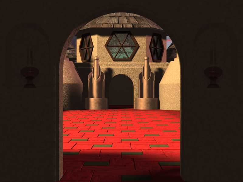
This started out as a barracks in some off world scene but ended up looking
a bit more
terrestrial ..... kind of like tudor meets bajoran.
Jim
Post a reply to this message
Attachments:
Download 'Courtyard.png' (605 KB)
Preview of image 'Courtyard.png'

|
|
| |
| |
|
|
|
|
| |
| |
|
|
"Jim Holsenback" <jho### [at] hotmail com> wrote in message
news:45b345b4@news.povray.org...
> This started out as a barracks in some off world scene but ended up
> looking a bit more
> terrestrial ..... kind of like tudor meets bajoran.
oh yeah .... forgot to add GO COLTS!!!!! com> wrote in message
news:45b345b4@news.povray.org...
> This started out as a barracks in some off world scene but ended up
> looking a bit more
> terrestrial ..... kind of like tudor meets bajoran.
oh yeah .... forgot to add GO COLTS!!!!!
Post a reply to this message
|
|
| |
| |
|
|
|
|
| |
| |
|
|
It's a bit odd... but it's certainly interesting all the same.
Post a reply to this message
|
|
| |
| |
|
|
|
|
| |
| |
|
|
I like it, except that the red bricks are way too bright. They really
stand out against all the other colors.
...Chambers
Post a reply to this message
|
|
| |
| |
|
|
|
|
| |
| |
|
|
> I like it, except that the red bricks are way too bright. They really
> stand out against all the other colors.
I agree. You have interesting architecture in the back, but the floor is too
loud to let you notice it.
Also, you need some light on the viewer's side of the archway. Maybe a soft
spotlight falling over the walls would be good. I can tell that you want the
archway to be a frame, but it's so dark that it looks flat and fake compared
to the rest.
Maybe you could move the camera closer to the door and increase the camera
angle, to let us see more of the outside? The roof and the sky beyond it,
for instance, as well as whatever's on the left and right. You could also
move the camera down some and have it look up, so we see less of the floor
and more of the sky. I feel like there's something interesting out there,
but I can't see it.
- Slime
[ http://www.slimeland.com/ ]
Post a reply to this message
|
|
| |
| |
|
|
|
|
| |
| |
|
|
"Slime" <fak### [at] emailaddress> wrote in message
news:45b3eeb1$1@news.povray.org...
>> I like it, except that the red bricks are way too bright. They really
>> stand out against all the other colors.
>
>
> I agree. You have interesting architecture in the back, but the floor is
> too
> loud to let you notice it.
yeah ... I had a more muted color scheme that I liked better .... changing
it back!
>
> Also, you need some light on the viewer's side of the archway. Maybe a
> soft
> spotlight falling over the walls would be good. I can tell that you want
> the
> archway to be a frame, but it's so dark that it looks flat and fake
> compared
> to the rest.
yep ... I'd agree with that .... I've since tried and area light that I
moved way back
so that it shows on the wall (it has two hurricance lamps in small alcoves
on each side of the doorway. It looks MUCH better as the light filters down
through the hex shaped windows in the top of the 2nd level of the room.
> Maybe you could move the camera closer to the door and increase the camera
> angle, to let us see more of the outside? The roof and the sky beyond it,
> for instance, as well as whatever's on the left and right. You could also
> move the camera down some and have it look up, so we see less of the floor
> and more of the sky. I feel like there's something interesting out there,
> but I can't see it.
>
I like the view looking through the doorway but the camera angle (up) is a
bit tricky .... I wanted to use the gid lines in the courtyard tiles to pull
the viewer into the scene .... some excellent feedback ..... thanks!
> - Slime
> [ http://www.slimeland.com/ ]
>
BTW: How 'bout them Colts (another shameless plug ;-)
Post a reply to this message
|
|
| |
| |
|
|
|
|
| |
| |
|
|
"Jim Holsenback" <jho### [at] hotmailcom> wrote:
> This started out as a barracks in some off world scene but ended up looking
> a bit more
> terrestrial ..... kind of like tudor meets bajoran.
>
>
>
> Jim
It looks interesting. I think those sculptural cylindrical things would make
good bishops in a chess set. As others have said, the floor distracts a bit
from the rest of the image. I like the bumpy hexagonal windows.
-Stefan
Post a reply to this message
|
|
| |
| |
|
|
|
|
| |
| |
|
|
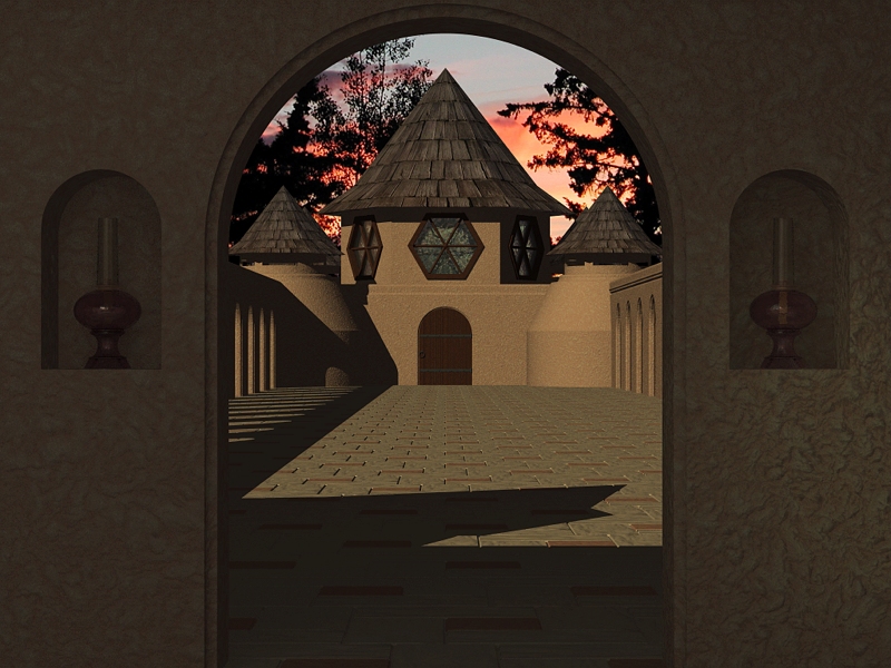
A much improved version if I do say so .....
In order to get a better view it took a combination of moving the camera
back and pushing the outside building out WAY farther in the "Z" axis. It
took a bit to get the camera angle so the image didn't have a pinchusioned
look to it. The close up view of the wall and the oil lamps has an area
light the size of and almost right up against the ceiling. I like this tile
color scheme MUCH better than the previous version ....
Thanks everyone who offered comments on previous version .... I was
suffering from POV version of writters block!
Post a reply to this message
Attachments:
Download 'Courtyard.jpg' (298 KB)
Preview of image 'Courtyard.jpg'
|
|
| |
| |
|
|
|
|
| |
| |
|
|
Very nice!!
Thomas
Post a reply to this message
|
|
| |
| |
|
|
|
|
| |
| |
|
|
"Jim Holsenback" <jho### [at] hotmailcom> wrote:
> A much improved version if I do say so .....
>
> In order to get a better view it took a combination of moving the camera
> back and pushing the outside building out WAY farther in the "Z" axis. It
> took a bit to get the camera angle so the image didn't have a pinchusioned
> look to it. The close up view of the wall and the oil lamps has an area
> light the size of and almost right up against the ceiling. I like this tile
> color scheme MUCH better than the previous version ....
>
> Thanks everyone who offered comments on previous version .... I was
> suffering from POV version of writters block!
Great job! The lamps and texture on the foreground wall are terrific. Only
two small comments. The texture on the far wall (looks like it's the same
texture as the foreground) is too uniform at that distance. It almost looks
like new stucco, so maybe some larger patterned texture would help. Also,
the roof on the tower is very smooth when outlined against the sky (image
mapped cone?) If you had a few tree branches coming out from behind just a
teensy bit it would break up the line to make it less noticeable.
I think a close up of the lamp in its alcove the way it's currently lit
would look awesome!
Mike
Post a reply to this message
|
|
| |
| |
|
|
|
|
| |