|
|
|
|
|
|
| |
| |
|
|
|
|
| |
| |
|
|
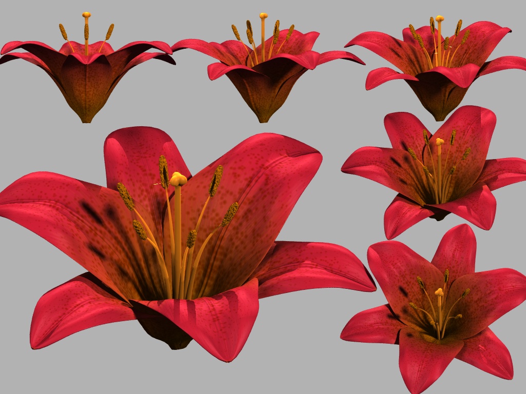
Here goes my first post in p.b.i for ages. It's a flower of some kind.
It's going to be a fictional flower. So far it's based a lot on various
different kinds of lilies, but none that are quite like mine. My goal is to
make a flower that looks dazzling, not to reproduce an actual existing
species. Existing species work nicely as inspiration though. The stem and
leaves of my plant will not be like a lily at all, but probably be inspired
by completely different plants instead.
I'm rather satisfied with the petals and sepals of the flower. They have the
shape and texture that I want.
However, I'm not so sure about the stamens (the six long thingies) and the
pistil (the long center thingy). Somehow they just don't look right to me,
and don't match the quality that I think the petals and sepals have. I can't
quite put my finger on what's wrong with them though. (Of course some
randomness should be introduced in their shapes, but that's to come.)
I don't know if they have the right color. (The right color is whatever
color will make the flower look best.) On one hand they should be clearly
visible. Preferably even more than on real lilies, where the stamens and
pistil often have the same color as the petals. I want them to stand out. On
the other hand it should look plausible and at the same time not cause a
color clash. I have tried to use an orange yellow, which seem to work
moderately nice. I use subsurface scattering (with scattering media) for the
stamens and pistil, since conventional texturing made them look too solid
and fake. (I still think they look too fake, but the SS helps a little.)
I'm also definitely not sure about the anthers (the brown thingies at the
ends of the six stamens). Anthers seem to almost always be some shade of
brown. I have seem a few images where they are more like red or yellow, but
I haven't got hi-res images of those, so it's difficult to see the details.
The anthers are what I like least about my flower. They are made with
isosurfaces in order to be able to get that fuzzy look, but it just makes
the lighting on them look horrible. They are in definite need of
improvement.
All kinds of comments, criticisms and suggestions are appreciated! :)
Rune
--
http://runevision.com
Post a reply to this message
Attachments:
Download 'flower_study_01.jpg' (204 KB)
Preview of image 'flower_study_01.jpg'
|
|
| |
| |
|
|
|
|
| |
| |
|
|
I forgot to mention: There are some bright pixel artifacts a few places in
the image. I don't know what is causing them. :(
Rune
--
http://runevision.com
Post a reply to this message
|
|
| |
| |
|
|
|
|
| |
| |
|
|
Excellent results. I think this is a huge achievement of modelling and
texturing, expecially the petals!
The pistil did indeed break the illusion for me. I think is is just too
regular in shape, the shaft in particular. It could look that way in
reality, closeups of organic shapes reveal some amazing realities, but
this contradicts our expectation a bit too much? It is, in a way, the
combination of texture and shape. The texture I find believable, but
not with quite so geometric a shape for the shaft. I think it is the
old problem. If this were really a photo we would say, "wow that's
amazing how precise and geometric the pistil of a flower is. But
knowing it is manufactured illusion, we say instead, "hmmm, the pistil
doesn't look 'right'" My suggestion is to give it a little more taper
towards the top. The texturing and irregularity of the tubular
crossection is good. Maybe it could be pushed a little more? You need
to establish the concept of 'celluous' in the viewer's mind.
The stamens are subtle and beautiful. I think the sss is very effective.
I think the antlers carry the illusion well enough. But there is
probably room for more experimentation there.
Post a reply to this message
|
|
| |
| |
|
|
|
|
| |
| |
|
|
Rune spake:
> Here goes my first post in p.b.i for ages. It's a flower of some kind.
>
> It's going to be a fictional flower. So far it's based a lot on various
> different kinds of lilies, but none that are quite like mine. My goal is
Yikes!
Why oh why do other ppl' WIP images -always- look better than mine?
Boo hoo...
Very nicely done, I think the petal texture is exactly right (looks pixel
for pixel like a flower I saw a while ago in my garden). Love the internal
structure you depicted (called the "stamen"?)
Will this be something you'll release later? Scrumptilicious!
--
Stefan Viljoen
Software Support Technician / Programmer
Polar Design Solutions
Post a reply to this message
|
|
| |
| |
|
|
|
|
| |
| |
|
|
"Jim Charter" <jrc### [at] msn com> wrote in message
news:443f0fff$1@news.povray.org...
> Excellent results. I think this is a huge achievement of modelling and
> texturing, expecially the petals!
Thank you!
> The texturing and irregularity of the tubular crossection is good. Maybe
> it could be pushed a little more? You need to establish the concept of
> 'celluous' in the viewer's mind.
I'm not sure what you're referring to with tubular cross section here. Is it
still the pistil, or are you talking about the "tube" that the petals form
together? The pistil has no irregularity nor any texturing, so...
> The stamens are subtle and beautiful. I think the sss is very effective. I
> think the antlers carry the illusion well enough. But there is probably
> room for more experimentation there.
I'll keep on experimenting...
Rune
--
http://runevision.com com> wrote in message
news:443f0fff$1@news.povray.org...
> Excellent results. I think this is a huge achievement of modelling and
> texturing, expecially the petals!
Thank you!
> The texturing and irregularity of the tubular crossection is good. Maybe
> it could be pushed a little more? You need to establish the concept of
> 'celluous' in the viewer's mind.
I'm not sure what you're referring to with tubular cross section here. Is it
still the pistil, or are you talking about the "tube" that the petals form
together? The pistil has no irregularity nor any texturing, so...
> The stamens are subtle and beautiful. I think the sss is very effective. I
> think the antlers carry the illusion well enough. But there is probably
> room for more experimentation there.
I'll keep on experimenting...
Rune
--
http://runevision.com
Post a reply to this message
|
|
| |
| |
|
|
|
|
| |
| |
|
|
"Stefan Viljoen polard.com>" <spamnot@<removethis> wrote:
> Yikes!
>
> Why oh why do other ppl' WIP images -always- look better than mine?
Hey, I liked The Reality Disfunction - although that wasn't a WIP...
> Will this be something you'll release later? Scrumptilicious!
Probably not the source code for entire image that this flower will be part
of, but I might release the code for just this flower head eventually.
Rune
--
http://runevision.com
Post a reply to this message
|
|
| |
| |
|
|
|
|
| |
| |
|
|
"Rune" <new### [at] runevisioncom> wrote in message
news:443ef46e$1@news.povray.org...
>I forgot to mention: There are some bright pixel artifacts a few places in
>the image. I don't know what is causing them. :(
Maybe similiar to a problem when sphere_sweep has a small diameter or short
bends between vectors?
Flower looks much like those silk and plastic fake ones; which is probably a
good thing since I'm always confusing the fakes for real flowers, especially
the ones with plastic(?) dew or raindrops added. But I'm getting better at
telling the difference.
I'm thinking the petals might be better if translucent. I've got some orange
tiger lillies here but they haven't bloomed yet or else I'd take a look at
them to check. Just seems to me that there should be light passing through
them.
Post a reply to this message
|
|
| |
| |
|
|
|
|
| |
| |
|
|
Rune wrote:
>
>
> I'm not sure what you're referring to with tubular cross section here. Is it
> still the pistil, or are you talking about the "tube" that the petals form
> together? The pistil has no irregularity nor any texturing, so...
>
I meant the shaft|stalk|tube of the pistil. Could have sworn that it
was not a perfect cylinder or cone but rather that if you took the
cross-section it would be revealed that it is more irregular. Could
swear I see some faint shadows or striations running lengthwise which
could either be texturing or actual form. But obviously my eyes are
decieved. Anyway that only reinforces my original comment. That the
straight texture is probably accurate but combined with the plain
geometry doesn't quite make us think this structure was the result of
organic growth.
Post a reply to this message
|
|
| |
| |
|
|
|
|
| |
| |
|
|
Really excellent work, Rune!
Everything has already been said, and better than I could, so just a smal
comment on the pistil. It seems to me that there should be a tiny
indentation at the top, and maybe very fine radial striation there too? It
should also be less shiny I believe. However, I have no example at hand, so
I write from memory...
Thomas
Post a reply to this message
|
|
| |
| |
|
|
|
|
| |
| |
|
|
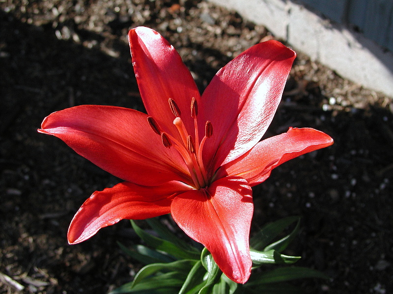
Here's a photo of a Day Lily growing (last year) in my front yard ....
Post a reply to this message
Attachments:
Download 'Day Lily Red.JPG' (228 KB)
Preview of image 'Day Lily Red.JPG'

|
|
| |
| |
|
|
|
|
| |