|
 |
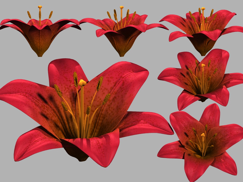
Here goes my first post in p.b.i for ages. It's a flower of some kind.
It's going to be a fictional flower. So far it's based a lot on various
different kinds of lilies, but none that are quite like mine. My goal is to
make a flower that looks dazzling, not to reproduce an actual existing
species. Existing species work nicely as inspiration though. The stem and
leaves of my plant will not be like a lily at all, but probably be inspired
by completely different plants instead.
I'm rather satisfied with the petals and sepals of the flower. They have the
shape and texture that I want.
However, I'm not so sure about the stamens (the six long thingies) and the
pistil (the long center thingy). Somehow they just don't look right to me,
and don't match the quality that I think the petals and sepals have. I can't
quite put my finger on what's wrong with them though. (Of course some
randomness should be introduced in their shapes, but that's to come.)
I don't know if they have the right color. (The right color is whatever
color will make the flower look best.) On one hand they should be clearly
visible. Preferably even more than on real lilies, where the stamens and
pistil often have the same color as the petals. I want them to stand out. On
the other hand it should look plausible and at the same time not cause a
color clash. I have tried to use an orange yellow, which seem to work
moderately nice. I use subsurface scattering (with scattering media) for the
stamens and pistil, since conventional texturing made them look too solid
and fake. (I still think they look too fake, but the SS helps a little.)
I'm also definitely not sure about the anthers (the brown thingies at the
ends of the six stamens). Anthers seem to almost always be some shade of
brown. I have seem a few images where they are more like red or yellow, but
I haven't got hi-res images of those, so it's difficult to see the details.
The anthers are what I like least about my flower. They are made with
isosurfaces in order to be able to get that fuzzy look, but it just makes
the lighting on them look horrible. They are in definite need of
improvement.
All kinds of comments, criticisms and suggestions are appreciated! :)
Rune
--
http://runevision.com
Post a reply to this message
Attachments:
Download 'flower_study_01.jpg' (204 KB)
Preview of image 'flower_study_01.jpg'
|
|