|
|
|
|
|
|
| |
| |
|
|
|
|
| |
| |
|
|
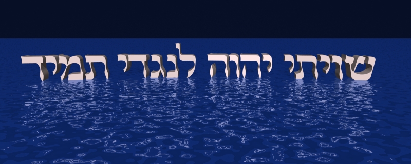
This image is supposed to be letters floating over the water looking very
mystical and mysterious. If you don't recognize them, they are Hebrew
letters.
Anyhow I am not happy with this image. The basic code was given to me (a
few years ago) by someone with the initials JRG. I have since forgotten who
he is.
If anyone can suggest any way to improve this image, I would be grateful.
The code can be found here:
http://galleryrobinson.com/shevisi.27.pov
Thank you,
Hershel Robinson
Israel
Post a reply to this message
Attachments:
Download 'Shevisi.jpg' (169 KB)
Preview of image 'Shevisi.jpg'
|
|
| |
| |
|
|
|
|
| |
| |
|
|
It looks nice! I like the saying from King David. It's something that
I should try to remember. I can't really find much fault with it.
Aaron
Post a reply to this message
|
|
| |
| |
|
|
|
|
| |
| |
|
|
Hershel Robinson wrote:
> This image is supposed to be letters floating over the water looking very
> mystical and mysterious. If you don't recognize them, they are Hebrew
> letters.
>
> Anyhow I am not happy with this image. The basic code was given to me (a
> few years ago) by someone with the initials JRG. I have since forgotten who
> he is.
>
> If anyone can suggest any way to improve this image, I would be grateful.
>
> The code can be found here:
>
> http://galleryrobinson.com/shevisi.27.pov
>
> Thank you,
> Hershel Robinson
> Israel
>
>
What makes you unhappy about the image?
Post a reply to this message
|
|
| |
| |
|
|
|
|
| |
| |
|
|
> What makes you unhappy about the image?
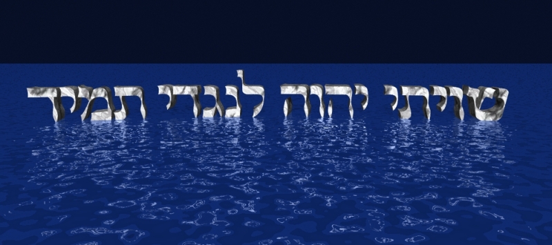
Good question, even if you sound like my shrink. ;)
The problem is that it looks a bit cheesy I think. The water is not
terribly realistic, the sky is not so dark and is sort of empty and boring,
the letters look a bit plastic whereas I suppose they would look better
with more of a rock finish.
Hmmm, I hadn't thought of that before. OK, here it is with a marbled
finish. Still looks a bit plastic.
The problem with the sky is that if I make it darker than the water becomes
flat-looking.
Oh, the woes of a newbie. :(
Anyone think this is any better?
Thanks,
Hershel
Post a reply to this message
Attachments:
Download 'Shevisi.2.jpg' (185 KB)
Preview of image 'Shevisi.2.jpg'
|
|
| |
| |
|
|
|
|
| |
| |
|
|
If you want it to be mysterious lift the letters out of the water so they
float above it. They currently look like the tide is receding. The lighting
is very flat and appears to originate near the view point, but does not
interact with the water. Perhaps the letters need to be luminous. A pitch
black sky with no stars does not help.
DLM
"Hershel Robinson" <her### [at] yahoo com> wrote in message
news:Xns95D28E441DB70HershelSR@203.29.75.35...
> This image is supposed to be letters floating over the water looking very
> mystical and mysterious. If you don't recognize them, they are Hebrew
> letters.
>
> Anyhow I am not happy with this image. The basic code was given to me (a
> few years ago) by someone with the initials JRG. I have since forgotten
> who
> he is.
>
> If anyone can suggest any way to improve this image, I would be grateful.
>
> The code can be found here:
>
> http://galleryrobinson.com/shevisi.27.pov
>
> Thank you,
> Hershel Robinson
> Israel
>
> com> wrote in message
news:Xns95D28E441DB70HershelSR@203.29.75.35...
> This image is supposed to be letters floating over the water looking very
> mystical and mysterious. If you don't recognize them, they are Hebrew
> letters.
>
> Anyhow I am not happy with this image. The basic code was given to me (a
> few years ago) by someone with the initials JRG. I have since forgotten
> who
> he is.
>
> If anyone can suggest any way to improve this image, I would be grateful.
>
> The code can be found here:
>
> http://galleryrobinson.com/shevisi.27.pov
>
> Thank you,
> Hershel Robinson
> Israel
>
>
Post a reply to this message
|
|
| |
| |
|
|
|
|
| |
| |
|
|
"Hershel Robinson" <her### [at] yahoocom> wrote in message
news:Xns95D349C9EECD6HershelSR@203.29.75.35...
> > What makes you unhappy about the image?
>
> Good question, even if you sound like my shrink. ;)
>
> The problem is that it looks a bit cheesy I think. The water is not
> terribly realistic, the sky is not so dark and is sort of empty and
boring,
> the letters look a bit plastic whereas I suppose they would look better
> with more of a rock finish.
>
> Hmmm, I hadn't thought of that before. OK, here it is with a marbled
> finish. Still looks a bit plastic.
>
> The problem with the sky is that if I make it darker than the water
becomes
> flat-looking.
>
> Oh, the woes of a newbie. :(
>
> Anyone think this is any better?
I think it looks better than the last version.
It might be worth making the sky a gradient, dark at the bottom and lighter
at the top. This will give the water something to reflect, and will reduce
the "flat" appearance of the water.
Adding focal blur may also help make the text stand out slightly more and
increase the interest of the image, though I'd only recommend slight focal
blur.
Lance.
thezone - thezone.firewave.com.au
thehandle - www.thehandle.com
Post a reply to this message
|
|
| |
| |
|
|
|
|
| |
| |
|
|
"Hershel Robinson" <her### [at] yahoocom> wrote in message
news:Xns95D28E441DB70HershelSR@203.29.75.35...
> This image is supposed to be letters floating over the water looking very
> mystical and mysterious. If you don't recognize them, they are Hebrew
> letters.
>
> Anyhow I am not happy with this image. The basic code was given to me (a
> few years ago) by someone with the initials JRG. I have since forgotten
who
> he is.
>
> If anyone can suggest any way to improve this image, I would be grateful.
>
> The code can be found here:
>
> http://galleryrobinson.com/shevisi.27.pov
>
> Thank you,
> Hershel Robinson
> Israel
>
>
i would make the water's texture less blue. water isn't blue really. try an
average of normals for the water. granite and ripples maybe? maybe scale the
ripples so the bands are more parallel to each other and move the center off
scene. for the sky, you could use a sky sphere maybe and use a gradient from
dusk color to night color. i think the letters look good, but if you want a
rock feel, maybe go with "normal {granite 0.1}" or something similar.
another thing for the sky, something i did in one of my images that i liked,
was to create little stars our of spheres, and as the position of the star
moved away from the horizon the pigment became a brighter white.
Post a reply to this message
|
|
| |
| |
|
|
|
|
| |