|
|
|
|
|
|
| |
| |
|
|
|
|
| |
| |
|
|
> in the uk, if you try to 'advise' / 'moan' / 'correct' in someway a
> teenager, the resonse is usually "Whatever"
>
> I wonder if you'd consider a title change as it seems to scream it.
Nah, the title is the destination. If the WIP isn't doing it's job, it gets
modified and altered until it does, not the other way round. :-)
> now, if you added a mirror behind him reflecting just the smile on his
> face, it would certainly get intrigueing (sp?)
Wouldn't fit the idea of the image I have in mind, but that sure is
intrigueing (not sure either if that is spelled correctly).
> I would also suggest you shorten her left thumb, and put in a slight (
> 15-20 degree) elbow bend. You can put your arm in that position, reminds
> me of a swimming strke gone awry.
I've already noticed that the arms don't seem to work in this position.
Finetuning was due for the end, it's just the general idea and composition
at the moment.
Regards,
Tim
--
"Tim Nikias v2.0"
Homepage: <http://www.nolights.de>
Post a reply to this message
|
|
| |
| |
|
|
|
|
| |
| |
|
|
> I preferred your first version, I found the structure more appealing,
there
> was more room to read your own story into it. Sorry.
Hm. I'll be making some changes, maybe that'll make it more versatile then.
Can't promise anything though! :-)
Regards,
Tim
--
"Tim Nikias v2.0"
Homepage: <http://www.nolights.de>
Post a reply to this message
|
|
| |
| |
|
|
|
|
| |
| |
|
|
I think the camera angle in the first version portrayed better the
feeling the man is feeling. It is seen from his angle, and thus
subjective. You see what he see and thus feel what he feel. The new
version looks more at the scene from a third-person point of view, and
even slightly closer to the woman than the man. I prefer the subjective
angle.
Rune
--
3D images and anims, include files, tutorials and more:
rune|vision: http://runevision.com **updated Apr 27**
POV-Ray Ring: http://webring.povray.co.uk
Post a reply to this message
|
|
| |
| |
|
|
|
|
| |
| |
|
|
> I think the camera angle in the first version portrayed better the
> feeling the man is feeling. It is seen from his angle, and thus
> subjective. You see what he see and thus feel what he feel. The new
> version looks more at the scene from a third-person point of view, and
> even slightly closer to the woman than the man. I prefer the subjective
> angle.
Good point. I was trying to get away from the straight-forward subjective
angle and went for a more broad, yet still subjective-tinted image. There's
the background which goes from light to dark and broadens from man to woman,
as she is leaving him behind. As a next step, I want to try switching the
sizes, e.g. its the woman that's getting smaller whilst leaving.
Regards,
Tim
--
"Tim Nikias v2.0"
Homepage: <http://www.nolights.de>
Post a reply to this message
|
|
| |
| |
|
|
|
|
| |
| |
|
|
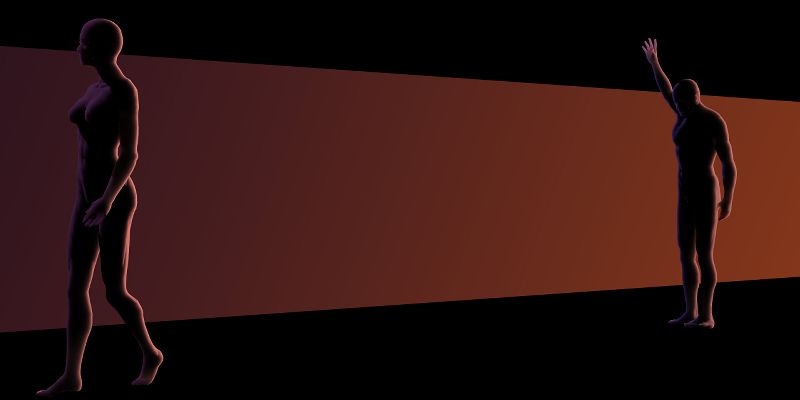
Here's a new version. As mentioned in a post to Rune, I'll try switching
their sizes and the angle of the background. That should focus more on the
man staying, rather than the leaving woman. I've also switched the waving
person, its now the man, sadly (looking downwards) waving at her, while she
is just going and not looking back.
Thanks for the comments and suggestions so far!
Regards,
Tim
--
"Tim Nikias v2.0"
Homepage: <http://www.nolights.de>
Post a reply to this message
Attachments:
Download 'goodbye_wip3.jpg' (16 KB)
Preview of image 'goodbye_wip3.jpg'
|
|
| |
| |
|
|
|
|
| |
| |
|
|
"Tim Nikias v2.0" <#macro timnikias (@) #local = "gmx.net" #end> wrote in
message news:408e536f@news.povray.org...
> Here's a new version. As mentioned in a post to Rune, I'll try switching
> their sizes and the angle of the background. That should focus more on the
> man staying, rather than the leaving woman. I've also switched the waving
> person, its now the man, sadly (looking downwards) waving at her, while
she
> is just going and not looking back.
>
> Thanks for the comments and suggestions so far!
>
> Regards,
> Tim
>
> --
> "Tim Nikias v2.0"
> Homepage: <http://www.nolights.de>
>
>
>
I like the color and lighting, but i think the composition in your first WIP
for this scene was the most interesting. it made me wonder who was waving to
whom, or if the perspective was that of the womans looking at herself waving
goodbye to someone unseen.
Post a reply to this message
|
|
| |
| |
|
|
|
|
| |
| |
|
|
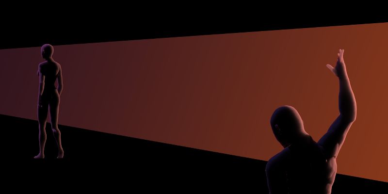
So, this is take Take #4. It's closer to the subjective perspective again,
but still shows his sadness and her plain and easy walking-away attitude. At
the least she isn't sad, she's looking straight ahead, be it because she's
just ignoring him and doing so on purpose or because she just doesn't
notice, I leave that open for interpretation (though I do have my own of
course).
I'm as of yet a little unsure of two things: the forced perspective on the
background gradient and his face. I'm thinking about putting his face
looking sideways to show profile, which would make the sadness even more
obvious, as that would seem like he can't even stand looking in her
direction.
In regards of the background gradient, I'm pondering if I should get it even
more out of perspective than what is given by the man's and woman's
appearance, sort of adding a slightly skewed background to it all. Once I
get decided on those things, I'll guess I'll put the image on my website.
As always, comments and suggestions appreciated! :-)
Regards,
Tim
--
"Tim Nikias v2.0"
Homepage: <http://www.nolights.de>
Post a reply to this message
Attachments:
Download 'goodbye_wip4.jpg' (14 KB)
Preview of image 'goodbye_wip4.jpg'
|
|
| |
| |
|
|
|
|
| |
| |
|
|
Tim Nikias v2.0 nous apporta ses lumieres ainsi en ce 2004/04/28 09:18... :
>So, this is take Take #4. It's closer to the subjective perspective again,
>but still shows his sadness and her plain and easy walking-away attitude. At
>the least she isn't sad, she's looking straight ahead, be it because she's
>just ignoring him and doing so on purpose or because she just doesn't
>notice, I leave that open for interpretation (though I do have my own of
>course).
>
>I'm as of yet a little unsure of two things: the forced perspective on the
>background gradient and his face. I'm thinking about putting his face
>looking sideways to show profile, which would make the sadness even more
>obvious, as that would seem like he can't even stand looking in her
>direction.
>
>In regards of the background gradient, I'm pondering if I should get it even
>more out of perspective than what is given by the man's and woman's
>appearance, sort of adding a slightly skewed background to it all. Once I
>get decided on those things, I'll guess I'll put the image on my website.
>
>As always, comments and suggestions appreciated! :-)
>
>Regards,
>Tim
>
>
>
>
I don't think that seeing the man's face would add anything, maybe, just
bend his head down a litle more... and also, lowering his harm like he's
lacking the energy to rise it higher. For me, this is more about
suggesting feelings than showing.
Alain
Post a reply to this message
|
|
| |
| |
|
|
|
|
| |
| |
|
|
Tim Nikias v2.0 wrote:
> As always, comments and suggestions appreciated! :-)
Hi Tim. I've been watching the progress of this piece, and I have to say
your second post was the best. It was in take #2 that you seemed to
convey the man's sorrow more clearly.
Take #4 makes the man look angry, as if he's saying, "Go on, get outta
here! I don't need you anyway!" Maybe if he beckoned to her with both
hands out, with his palms facing upward slightly he would look more
heartbroken? Another pose might be on one knee, with one of his hands
over his face and another pleading for her return. But then he might
look guilty of something....
-Samuel Benge
Post a reply to this message
|
|
| |
| |
|
|
|
|
| |
| |
|
|
> I don't think that seeing the man's face would add anything, maybe, just
> bend his head down a litle more... and also, lowering his harm like he's
> lacking the energy to rise it higher. For me, this is more about
> suggesting feelings than showing.
I liked the idea of his arm being not as much raised as it was. As for the
face, didn't lower it much more and it's showing a hint of outline, but just
subtle. Makes it noticeable that he's not looking after her.
Regards,
Tim
--
"Tim Nikias v2.0"
Homepage: <http://www.nolights.de>
Post a reply to this message
|
|
| |
| |
|
|
|
|
| |
|
|