|
|
|
|
|
|
| |
| |
|
|
|
|
| |
| |
|
|
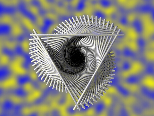
Try as I might, I *cannot* get this to look metallic... *sighs* Tried
playing with lighting, tried playing with different backgrounds, but I can't
make it look shiny, and I can't make it look reflective!
Any suggestions? (I'm looking for a very highly-polished, very brilliant
look.)
Thanks.
Andrew.
Post a reply to this message
Attachments:
Download 'Spins1.jpg' (202 KB)
Preview of image 'Spins1.jpg'
|
|
| |
| |
|
|
|
|
| |
| |
|
|
Andrew Coppin wrote:
> Any suggestions? (I'm looking for a very highly-polished, very brilliant
> look.)
Have you tried any of the chromes or silvers from the standard includes?
Remember that metals need somthing to reflect, to look metallic.
/Ib
Post a reply to this message
|
|
| |
| |
|
|
|
|
| |
| |
|
|
I had the same trouble the other day, but eventually got something I liked.
A few tips:
-make sure you've got a light source in a position where it will reflect, and
use a specular or phong highlight
-make it slightly reflective
-use a high brilliance value, I find a brilliance of 2 looks pretty good.
-try using "metallic" reflections and highlights, that sometimes helps (though
sometimes it looks totally wrong).
--
Tek
http://www.evilsuperbrain.com
"Andrew Coppin" <orp### [at] btinternet com> wrote in message
news:3ea584f1@news.povray.org...
> Try as I might, I *cannot* get this to look metallic... *sighs* Tried
> playing with lighting, tried playing with different backgrounds, but I can't
> make it look shiny, and I can't make it look reflective!
>
> Any suggestions? (I'm looking for a very highly-polished, very brilliant
> look.)
>
> Thanks.
> Andrew.
>
>
> com> wrote in message
news:3ea584f1@news.povray.org...
> Try as I might, I *cannot* get this to look metallic... *sighs* Tried
> playing with lighting, tried playing with different backgrounds, but I can't
> make it look shiny, and I can't make it look reflective!
>
> Any suggestions? (I'm looking for a very highly-polished, very brilliant
> look.)
>
> Thanks.
> Andrew.
>
>
>
Post a reply to this message
|
|
| |
| |
|
|
|
|
| |
| |
|
|
> Any suggestions? (I'm looking for a very highly-polished, very brilliant
> look.)
Try making the pigment darker and maybe the reflections brighter, so that it
relies more on reflected than diffused light.
Maybe try making the highlights sharper, also.
- Slime
[ http://www.slimeland.com/ ]
Post a reply to this message
|
|
| |
| |
|
|
|
|
| |
| |
|
|
> Have you tried any of the chromes or silvers from the standard includes?
Nope, not yet. I could do I suppose...
> Remember that metals need somthing to reflect, to look metallic.
That's the purpose of the daft blue/yellow background. Doesn't seem to help
much though... (Maybe it just needs more contrast, IDK)
Thanks.
Andrew.
Post a reply to this message
|
|
| |
| |
|
|
|
|
| |
| |
|
|
> I had the same trouble the other day, but eventually got something I
liked.
> A few tips:
> -make sure you've got a light source in a position where it will reflect,
and
> use a specular or phong highlight
It already has 80% specular highlight. Lighting might well need something
doing to it though...
> -make it slightly reflective
Already has constant 80% reflection. (Haven't tried variable reflection -
won't make much difference for such tiny objects.)
> -use a high brilliance value, I find a brilliance of 2 looks pretty good.
Brilliance is currently at 3. (Also roughness = 0.005.)
> -try using "metallic" reflections and highlights, that sometimes helps
(though
> sometimes it looks totally wrong).
Already switched on. (Of course, all that actually does is make the specular
highlights match the colour of the object; since these are WHITE anyway,
theoritically it won't make any difference.)
Thanks anyway.
Andrew.
Post a reply to this message
|
|
| |
| |
|
|
|
|
| |
| |
|
|
> Try making the pigment darker and maybe the reflections brighter, so that
it
> relies more on reflected than diffused light.
Yeah, that was my thinking... Tried it with no diffuse at all, but looked
like it was metal painted black or something... (Ooo, but maybe I should
turn off the "metallic" keyword - it's probably trying to give me black
highlights |-)
> Maybe try making the highlights sharper, also.
Yes, I think I agree with you there... Already tried fiddling with roughness
and brilliance, so maybe I need to move the light source around or
something...
Thanks.
Andrew.
Post a reply to this message
|
|
| |
| |
|
|
|
|
| |
| |
|
|
Well another idea is put a horizon line in the reflection, make the ground dark
and the sky bright.
If it's in an unrealistic setting it will tend to look unrealistic.
--
Tek
http://www.evilsuperbrain.com
"Andrew Coppin" <orp### [at] btinternetcom> wrote in message
news:3ea59f29@news.povray.org...
> > I had the same trouble the other day, but eventually got something I
> liked.
> > A few tips:
> > -make sure you've got a light source in a position where it will reflect,
> and
> > use a specular or phong highlight
>
> It already has 80% specular highlight. Lighting might well need something
> doing to it though...
>
> > -make it slightly reflective
>
> Already has constant 80% reflection. (Haven't tried variable reflection -
> won't make much difference for such tiny objects.)
>
> > -use a high brilliance value, I find a brilliance of 2 looks pretty good.
>
> Brilliance is currently at 3. (Also roughness = 0.005.)
>
> > -try using "metallic" reflections and highlights, that sometimes helps
> (though
> > sometimes it looks totally wrong).
>
> Already switched on. (Of course, all that actually does is make the specular
> highlights match the colour of the object; since these are WHITE anyway,
> theoritically it won't make any difference.)
>
> Thanks anyway.
> Andrew.
>
>
>
Post a reply to this message
|
|
| |
| |
|
|
|
|
| |
| |
|
|
> Well another idea is put a horizon line in the reflection, make the ground
dark
> and the sky bright.
Hey, that could would... Yes, that's how artists always seem to do it when
they paint by hand... [Sees visions of chrome bikes...]
> If it's in an unrealistic setting it will tend to look unrealistic.
Scientifically-correct and realistic appearence are two related but SEPERATE
concepts ;-)
Thanks for the hint!
Andrew.
Post a reply to this message
|
|
| |
| |
|
|
|
|
| |
| |
|
|
> Any suggestions? (I'm looking for a very highly-polished, very brilliant
> look.)
The best reflection I got with metals, was with a very highly scaled
black and white checker plane behind the camera.
(Black and white, makes the reflection extremely sharp and nice)
--
Dedicated to audio/visual and interactive artwork.
Author of The Primary Colors of CSound:
http://www.geocities.com/simonlemieux/PCCS/index.html
Post a reply to this message
|
|
| |
| |
|
|
|
|
| |