|
|
|
|
|
|
| |
| |
|
|
|
|
| |
| |
|
|
Hi Gail.
You have chosen a quite difficult "thing" to model,
but I like your idea.
Below is my suggestion for such an iso-surface.
Try to play around with the different constants.
--
Best regards,
Tor Olav
mailto:tor### [at] hotmail com
http://hjem.sol.no/t-o-k/tokpicts.html
http://www.crosswinds.net/~tok
Gail Shaw wrote:
>
> I decided I needed some atmospheric effects for my
> irtc entry (which I will post once it's more than a few cylinders
> and cones)
>
> This is supposed to be the aurora borealis. It's an isosurface
> containing media with a function used in the density.
>
> For those who live far enough north to see the real thing, does
> it look right?
>
> For the iso experts, is there any way I can randomly vary the
> distance between the peaks of a sine wave?
>
> Comments? suggestions?
// ===== 1 ======= 3 ======= 3 ======= 4 ======= 5 ======= 6 ======= 7 =
#version unofficial MegaPov 0.6;
#include "colors.inc"
// ===== 1 ======= 3 ======= 3 ======= 4 ======= 5 ======= 6 ======= 7 =
$ SinX = function { 0.5*sin(x) }
$ Noise =
function {
1.0*noise3d(x, 0, 2 + z/7)
+0.2*noise3d(x*1.7, 0, z/4)
}
$ NoisySin = function { SinX(5*Noise(x, y, z), 0, 0) }
$ SheetY = function { y^2 - 0.04 }
$ WavySheetY = function { SheetY(0, y + NoisySin(x, y, z), 0) }
$ Iso =
isosurface {
function { WavySheetY(x, y, z) }
max_gradient 5
method 2
contained_by { box { -5*<1, 1, 1>, 5*<1, 1, 1>} }
}
object {
Iso
pigment { color White }
no_shadow
}
// ===== 1 ======= 3 ======= 3 ======= 4 ======= 5 ======= 6 ======= 7 =
background { color Blue/3 }
light_source { <-3, 3, -2>*100 color White }
camera {
location <1, 1, -2>*5
look_at <-1, -1, 0>
}
// ===== 1 ======= 3 ======= 3 ======= 4 ======= 5 ======= 6 ======= 7 = com
http://hjem.sol.no/t-o-k/tokpicts.html
http://www.crosswinds.net/~tok
Gail Shaw wrote:
>
> I decided I needed some atmospheric effects for my
> irtc entry (which I will post once it's more than a few cylinders
> and cones)
>
> This is supposed to be the aurora borealis. It's an isosurface
> containing media with a function used in the density.
>
> For those who live far enough north to see the real thing, does
> it look right?
>
> For the iso experts, is there any way I can randomly vary the
> distance between the peaks of a sine wave?
>
> Comments? suggestions?
// ===== 1 ======= 3 ======= 3 ======= 4 ======= 5 ======= 6 ======= 7 =
#version unofficial MegaPov 0.6;
#include "colors.inc"
// ===== 1 ======= 3 ======= 3 ======= 4 ======= 5 ======= 6 ======= 7 =
$ SinX = function { 0.5*sin(x) }
$ Noise =
function {
1.0*noise3d(x, 0, 2 + z/7)
+0.2*noise3d(x*1.7, 0, z/4)
}
$ NoisySin = function { SinX(5*Noise(x, y, z), 0, 0) }
$ SheetY = function { y^2 - 0.04 }
$ WavySheetY = function { SheetY(0, y + NoisySin(x, y, z), 0) }
$ Iso =
isosurface {
function { WavySheetY(x, y, z) }
max_gradient 5
method 2
contained_by { box { -5*<1, 1, 1>, 5*<1, 1, 1>} }
}
object {
Iso
pigment { color White }
no_shadow
}
// ===== 1 ======= 3 ======= 3 ======= 4 ======= 5 ======= 6 ======= 7 =
background { color Blue/3 }
light_source { <-3, 3, -2>*100 color White }
camera {
location <1, 1, -2>*5
look_at <-1, -1, 0>
}
// ===== 1 ======= 3 ======= 3 ======= 4 ======= 5 ======= 6 ======= 7 =
Post a reply to this message
|
|
| |
| |
|
|
|
|
| |
| |
|
|
Gail Shaw <gsh### [at] monotixcoza> wrote:
> Now using multiple sine waves with different frequencies,
> amplitudes and phase. (Thanks Christoph)
> The color is also varied slightly.
Reminds me of the opening credits to Superman: The Movie. ;)
It looks too straight to me. The pictures I've seen are more like swirls of
lit up mist with tendrils all throughout. This looks more like a paint line
streaked upwards. Not sure what method would either fix this or to offer
that might work better, I'm afraid, but keep trying. It'll be really cool
if you get it to work.
Geoff
Post a reply to this message
|
|
| |
| |
|
|
|
|
| |
| |
|
|
The most common in our area are streaks of paint upwards on a pale green
background, but I certainly haven't seen all possible variations...
One thing struck me about the overall attempt to render an aurora: I bet
you could submit a photograph of the real thing and a lot of people would
say it didn't look very realistic... because it doesn't :-)
BTW, I spent a few minutes going over the site below to see *all* the
pictures. The animations (time-lapse photography, not rendered) are
awesome. Well worth the visit.
http://www.ptialaska.net/~hutch/aurora.html
"Geoff Wedig" <wed### [at] darwinepbicwruedu> wrote in message
news:3ac0d7b3@news.povray.org...
> Gail Shaw <gsh### [at] monotixcoza> wrote:
>
> > Now using multiple sine waves with different frequencies,
> > amplitudes and phase. (Thanks Christoph)
>
> > The color is also varied slightly.
>
> Reminds me of the opening credits to Superman: The Movie. ;)
>
> It looks too straight to me. The pictures I've seen are more like swirls
of
> lit up mist with tendrils all throughout. This looks more like a paint
line
> streaked upwards. Not sure what method would either fix this or to offer
> that might work better, I'm afraid, but keep trying. It'll be really cool
> if you get it to work.
>
> Geoff
Post a reply to this message
|
|
| |
| |
|
|
|
|
| |
| |
|
|
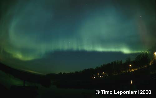
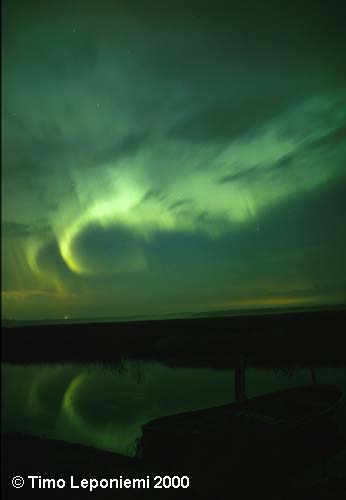
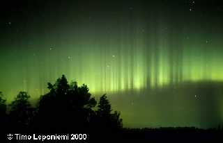
Gail Shaw wrote:
> For those who live far enough north to see the real thing, does
> it look right?
I personally live in city area, where those can't be seen, and a bit too
south, but I found some nice finnish photos about northern lights:
<http://www.sci.fi/~fmbb/astro/revontulet.htm#kuvat>. Page itself is in
finnish, but I think the pics itself talk some language you understand.
Almost all links in that section point to picture pages.
You have taken a challenging but wonderful task, I wish you luck.
--
/"\ | iki.
\ / ASCII Ribbon Campaign | fi/
X Against HTML Mail | zds
/ \
Post a reply to this message
Attachments:
Download 'aur32435.jpg' (11 KB)
Download 'aur32432.jpg' (12 KB)
Download 'aur29934.jpg' (15 KB)
Preview of image 'aur32435.jpg'
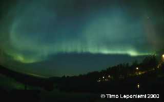
Preview of image 'aur32432.jpg'
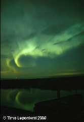
Preview of image 'aur29934.jpg'
|
|
| |
| |
|
|
|
|
| |
| |
|
|
"Gail Shaw" <gsh### [at] monotixcoza> wrote in message
news:3ac0a200@news.povray.org...
> Now using multiple sine waves with different frequencies,
> amplitudes and phase. (Thanks Christoph)
>
> The color is also varied slightly.
>
D'oh! I've been blind. You just gave me what I was looking for. A sine wae
isosurface would make a great corrogated iron roofing sheet.
The Aurora looks cool, too
Post a reply to this message
|
|
| |
| |
|
|
|
|
| |
| |
|
|
On Tue, 27 Mar 2001 12:52:13 +0200, Gail Shaw wrote:
>Comments? suggestions?
I love Aurora, but have only ever seen it on TV or in
photos. The stars had quite an impact, I put my hand
up and rubbed the screen thinking it was dusty:-)
--
Cheers
Steve email mailto:ste### [at] zeroppsuklinuxnet
%HAV-A-NICEDAY Error not enough coffee 0 pps.
web http://www.zeropps.uklinux.net/
or http://start.at/zero-pps
10:45pm up 53 days, 23:28, 2 users, load average: 1.12, 1.18, 1.09
Post a reply to this message
|
|
| |
| |
|
|
|
|
| |
| |
|
|
Gail Shaw wrote:
>
> I decided I needed some atmospheric effects for my
> irtc entry (which I will post once it's more than a few cylinders
> and cones)
>
> This is supposed to be the aurora borealis. It's an isosurface
> containing media with a function used in the density.
>
> For those who live far enough north to see the real thing, does
> it look right?
Here's a Norwegian "Northern-light picture of the month" page:
http://www.northern-lights.no/zope//Contest/Gallery/
The above link takes you to the photos of the current month, but
you can choose to view a lot of photos from prior months as well.
You'll probably notice that northern-lights comes in a great
variety of "shapes" and colours.
--
Best regards,
Tor Olav
mailto:tor### [at] hotmailcom
http://hjem.sol.no/t-o-k/tokpicts.html
http://www.crosswinds.net/~tok
Post a reply to this message
|
|
| |
| |
|
|
|
|
| |
| |
|
|
>
Impressive. Knowing what you're attempting, the effect is impressively
close. But I wonder if, in a scene, I would interpret it correctly. From
the photos others have posted, your result looks perfectly plausible, but too
regular perhaps to fit our idea of how the borealis looks. My memories of my
personal experience of them is the spooky speed and the awesome scale. It's
as if they make you realize how big the sky really is.
Post a reply to this message
|
|
| |
| |
|
|
|
|
| |
| |
|
|
In article <3ac07177@news.povray.org>, "Gail Shaw"
<gsh### [at] monotixcoza> wrote:
> For the iso experts, is there any way I can randomly vary the
> distance between the peaks of a sine wave?
It might be better to just drop the sine wave, and use a 1D or 2D noise
pattern. Like noise3d(x, 1, 1), noise3d(x, 1, z*3), or something.
--
Christopher James Huff
Personal: chr### [at] maccom, http://homepage.mac.com/chrishuff/
TAG: chr### [at] tagpovrayorg, http://tag.povray.org/
<><
Post a reply to this message
|
|
| |
| |
|
|
|
|
| |
| |
|
|
Hello. This is your friendly neighborhood Canadian here...
We see the northern lights all the time at home. First of all, what are
you wanting to use the northern light effect for? If you are going for
visual impact, it is alright to use the photos that have been linked to as
examples, but the extreme colors and brightness is not typical (at least
where I live) so you may want to tone it down and make it just a little bit
whiter and more transparent (although the coloring in the second image you
posted is a lot better).
I think the biggest problem with your image is the straight line on the
bottom. It should really be more of a flowing line (always reminded me of a
brush stroke with watercolors bleeding up into the sky). The other thing
that needs a bit of work is the bands of color that are very close together.
They don't really flow into each other the way they should, but if you
scaled the whole aurora borealis in the x direction by about 2, the effect
would be a lot more graceful. The other thing that I was going to mention
is that if you are looking for more pictures of this effect, you may note
that they have similar effects in the southern hemisphere (aurora
australialis, I believe) that may have links and photos on the internet.
Great job though. I still don't understand isosurfaces and media very well,
but it looks like quite the difficult project you've started. Good luck.
Stephen Bell
http://students.oc.edu/stephen.bell
"Gail Shaw" <gsh### [at] monotixcoza> wrote in message
news:3ac0a200@news.povray.org...
> Now using multiple sine waves with different frequencies,
> amplitudes and phase. (Thanks Christoph)
>
> The color is also varied slightly.
>
> Gail
> *************************************************************************
> * gsh### [at] monotixcoza * Step into the abyss, *
> * http://www.rucus.ru.ac.za/~gail/ * and let go. Babylon 5 *
> *************************************************************************
> * The difficult we do immediately, the impossible takes a little longer *
> *************************************************************************
>
>
>
Post a reply to this message
|
|
| |
| |
|
|
|
|
| |
|
|