|
|
|
|
|
|
| |
| |
|
|
From: Marc-Hendrik Bremer
Subject: Without extra light (Re: Another city-sight) (42,6 kbbu)
Date: 26 Feb 2001 14:55:18
Message: <3a9ab4a6@news.povray.org>
|
|
|
| |
| |
|
|
Christoph Hormann schrieb in Nachricht <3A9AA9E6.A6CCBDED@gmx.de>...
>
>A sample picture without the additional light sources might help.
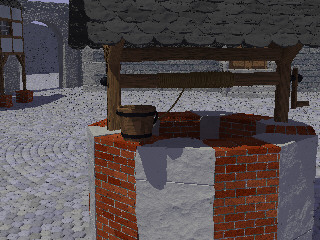
OK, here is a tiny picture without the extra light (and aa). I hope it's
enough to see what's going on. It is much better than I remembered, but I
changed some things since I tried it the last time without that additional
light. And the shadows are still of constant brightness.
I still have to try your other suggestions. I'll also try to replace
background {rgb <0.4,0.4,0.6>} with a big sphere with ambient 0.5 or
something like that.
Marc-Hendrik
Post a reply to this message
Attachments:
Download 'verwaltung-klein.jpg' (43 KB)
Preview of image 'verwaltung-klein.jpg'
|
|
| |
| |
|
|
From: Christoph Hormann
Subject: Re: Without extra light (Re: Another city-sight) (42,6 kbbu)
Date: 26 Feb 2001 16:44:03
Message: <3A9ACE1D.F3ED530D@gmx.de>
|
|
|
| |
| |
|
|
Marc-Hendrik Bremer wrote:
>
> OK, here is a tiny picture without the extra light (and aa). I hope it's
> enough to see what's going on. It is much better than I remembered, but I
> changed some things since I tried it the last time without that additional
> light. And the shadows are still of constant brightness.
It looks as i would have expected it, not too dark IMO. Maybe make the
main light slightly brighter.
>
> I still have to try your other suggestions. I'll also try to replace
> background {rgb <0.4,0.4,0.6>} with a big sphere with ambient 0.5 or
> something like that.
>
That's probably a good idea, ambient 1 diffuse 0 is usual finish. I never
tried radiosity with only background, even don't know if it has any
effect.
Christoph
--
Christoph Hormann <chr### [at] gmx de>
IsoWood include, radiosity tutorial, TransSkin and other
things on: http://www.schunter.etc.tu-bs.de/~chris/ de>
IsoWood include, radiosity tutorial, TransSkin and other
things on: http://www.schunter.etc.tu-bs.de/~chris/
Post a reply to this message
|
|
| |
| |
|
|
|
|
| |
| |
|
|
I think this is amazing. Thanks for sharing.
--
Cheers
Steve email mailto:ste### [at] zeroppsuklinuxnet
%HAV-A-NICEDAY Error not enough coffee 0 pps.
web http://www.zeropps.uklinux.net/
or http://start.at/zero-pps
9:47pm up 24 days, 23:28, 2 users, load average: 1.62, 1.20, 1.06
Post a reply to this message
|
|
| |
| |
|
|
From: Marc-Hendrik Bremer
Subject: Re: Another city-sight (93,7 kbbu)
Date: 27 Feb 2001 08:57:01
Message: <3a9bb22d@news.povray.org>
|
|
|
| |
| |
|
|
Steve schrieb ...
>I think this is amazing. Thanks for sharing.
>
Thank you!
I'm glad that I'm able to share it here, where people care to comment about
it. Without all the suggestions and the help from all this kind folk here, I
don't think that I would be able to make scenes like this. Take the
fibonacci tiling - I did not even know what's the name for this until Alf
and Tor posted there 'fibonacci series'.
Marc-Hendrik
Post a reply to this message
|
|
| |
| |
|
|
From: Geoff Wedig
Subject: Re: Without extra light (Re: Another city-sight) (42,6 kbbu)
Date: 27 Feb 2001 09:16:27
Message: <3a9bb6bb@news.povray.org>
|
|
|
| |
| |
|
|
Marc-Hendrik Bremer <Mar### [at] t-onlinede> wrote:
> [-- text/plain, encoding 7bit, 18 lines --]
> Christoph Hormann schrieb in Nachricht <3A9AA9E6.A6CCBDED@gmx.de>...
>>
>>A sample picture without the additional light sources might help.
> OK, here is a tiny picture without the extra light (and aa). I hope it's
> enough to see what's going on. It is much better than I remembered, but I
> changed some things since I tried it the last time without that additional
> light. And the shadows are still of constant brightness.
The shadows on the well look much better, though. They're not so dark that
you can't make out details. I like this a lot more than the previous shot.
It's got a lot more realism.
> I still have to try your other suggestions. I'll also try to replace
> background {rgb <0.4,0.4,0.6>} with a big sphere with ambient 0.5 or
> something like that.
Actually, the background color does affect radiosity (take a look at my Door
into Summer pics recently posted. The wall on the Summer side are blue,
despite the light being yellowish because of the sky) so I don't know that
that's necessary.
My one complaint, and this goes for many radiosity pics (including mine), is
that it looks a little plastic. Adding appropriate finishes will probably
fix that, though.
Geoff
Post a reply to this message
|
|
| |
| |
|
|
|
|
| |
| |
|
|
I love what you've done, but I think it looks a bit dead, sort of like a
ghost town or something. It needs more signs of life here and there. It
isn't necessary to add human figures, but just things that show signs of
habitation. The bucket does this to an extent, but it needs more. Tools
wagons, plants, clay jars, anything.
It is still very good though, those are really great wood textures, I love
the fibonacci stones. Keep up the great work.
--
Dan D.
Post a reply to this message
|
|
| |
| |
|
|
|
|
| |
| |
|
|
ddombrow <ddo### [at] vtedu> wrote:
> I love what you've done, but I think it looks a bit dead, sort of like a
> ghost town or something. It needs more signs of life here and there. It
> isn't necessary to add human figures, but just things that show signs of
> habitation. The bucket does this to an extent, but it needs more. Tools
> wagons, plants, clay jars, anything.
> It is still very good though, those are really great wood textures, I love
> the fibonacci stones. Keep up the great work.
Hmm, depending on where you want to go, a couple of sprouts of grass in some
of the corners of the stone, might do nice things. Then again, they might
add to the ghost town effect.
Geoff
Post a reply to this message
|
|
| |
| |
|
|
From: Marc-Hendrik Bremer
Subject: Re: Another city-sight (93,7 kbbu)
Date: 28 Feb 2001 06:27:54
Message: <3a9ce0ba@news.povray.org>
|
|
|
| |
| |
|
|
ddombrow schrieb in Nachricht <3a9bf161@news.povray.org>...
>I love what you've done, but I think it looks a bit dead, sort of like a
>ghost town or something.
You are right.
>It needs more signs of life here and there. It
>isn't necessary to add human figures, but just things that show signs of
>habitation. The bucket does this to an extent, but it needs more. Tools
>wagons, plants, clay jars, anything.
>
I'll see what I can do, I'm just working on a cart. I'm thinking about some
more things, but don't know which I'll do.
>It is still very good though, those are really great wood textures, I love
>the fibonacci stones.
The wood is just T_Wood8 - well not "just" it's first used as a
pigment-function for the iso. The fibonacci stones are superellipsoid-isos
(x^4+y^4+z^4-r^4) with a bit of noise3d and one of 20 pigments.
>Keep up the great work.
I'll try ...
Marc-Hendrik
Post a reply to this message
|
|
| |
| |
|
|
|
|
| |
| |
|
|
Have you ever played the game Summoner? When I saw this I thought for sure
you were recreating the inner city. The similarities are startling. Same
building style, same colors, same brick and stone patterns, same kind of
wells, everything.
Nice work.
- One of the problems is the distance from the camera to the well and the
level of perspective on the well. If the camera were far away, the well
would almost appear two-dimensional and it would be acceptable to not have
any focal blur. With the camera this close, though, one would not expect
everything to be in focus. Think of the difference between using a zoom
lense on a camera and just standing really close with a wide angle lense.
This image shares properties of both and the mind's eye doesn't like
that.(more on photograph stuff later, though)
- Radiosity if FAR overrated. Only use radiosity when you need an accurate
rendering, not when you want the image to look real. Two of the most
overlooked features for lights are the falloff and the falloff curve. These
create beautifully smooth radiosity-like affects. If you make several point
lights like this that don't cast shadows, and place them at choice
locations, you can create a fast, realistic looking, global illumination
solution.
In my opinion, people associate "realism" with looking like a photograph.
But photographs don't really look too real. The contrast is compressed and
then separated far too much and the perspective is usually distorted. People
are just used to using photographs as a basis for comparison and accepting
anything similar as "realistic." If you want a more accurate way to gauge
realism, pretend you are looking at your image through a mirror, or actually
look at it through a mirror. Mirrors are much better at portraying realism
than photographs. Your mind's eye will see the problems much more quickly
than just looking directly at what it expects to be a photograph.
So I guess what I'm saying is that your technical work is very high-class,
but I would wager that you're not looking at the image as a peice of art as
much as you are a modelling exercise. I don't mean to sound harsh, I'm just
trying to make you take a different perspective on the image to help fill in
the artistic gaps.
Again, your image is beautiful! Keep up the good work!
D.J.
"Marc-Hendrik Bremer" <Mar### [at] t-onlinede> wrote in message
news:3a997860@news.povray.org...
> Hi!
>
> I've been working on this scene for a while now, and I would like to know,
> what you think about it.
>
> Thanks go to Alf Peak for the fibonacci-pattern code, which I used in a
> modified way. Seems like some thinks are remembered at the same time from
> different people, as it was already part of the scene when Yooper posted
his
> nice Fib beads.
>
> The scene took some 3 hours at 640x480 aa 0.3 with radiosity.
>
> Marc-Hendrik
>
>
>
Post a reply to this message
|
|
| |
| |
|
|
From: Marc-Hendrik Bremer
Subject: Re: Another city-sight (93,7 kbbu)
Date: 1 Mar 2001 07:52:53
Message: <3a9e4625@news.povray.org>
|
|
|
| |
| |
|
|
D.J. Brown schrieb in Nachricht <3a9dbbc5$1@news.povray.org>...
>Have you ever played the game Summoner? When I saw this I thought for sure
>you were recreating the inner city. The similarities are startling. Same
>building style, same colors, same brick and stone patterns, same kind of
>wells, everything.
>
No, never - but if it looks like this image it might be worth trying. What
type of game is it?
>Nice work.
>
Thanks!
>- One of the problems is the distance from the camera to the well and the
>level of perspective on the well. If the camera were far away, the well
>would almost appear two-dimensional and it would be acceptable to not have
>any focal blur. With the camera this close, though, one would not expect
>everything to be in focus. Think of the difference between using a zoom
>lense on a camera and just standing really close with a wide angle lense.
>This image shares properties of both and the mind's eye doesn't like
>that.(more on photograph stuff later, though)
>
Well, it is not suposed to look like a photograph :-) In the fantasy world
this is made for, there are no cameras yet, so one should go and see for
oneself.
OTOH you are right, that it does not look as a "first-person" view either,
but I don't think that's a matter of focal blur, since I don't see things
blured some 20 or 30 meters away.
>- Radiosity if FAR overrated. Only use radiosity when you need an accurate
>rendering, not when you want the image to look real. Two of the most
>overlooked features for lights are the falloff and the falloff curve. These
>create beautifully smooth radiosity-like affects. If you make several point
>lights like this that don't cast shadows, and place them at choice
>locations, you can create a fast, realistic looking, global illumination
>solution.
>
In the posted pic, radiosity is probably not needed, since I used an extra
light. I droped that one now and use just one light_source and radiosity.
Perhaps I could achieve better results with more light_sources and using
falloff. But why should I try to position extra lights, if I can just use
radiosity? Rendertimes are not that bad (about an hour for the scene without
aa - 3 with aa). Are there any other disadvantages in radiosity?
>In my opinion, people associate "realism" with looking like a photograph.
>But photographs don't really look too real. The contrast is compressed and
>then separated far too much and the perspective is usually distorted.
People
>are just used to using photographs as a basis for comparison and accepting
>anything similar as "realistic."
You are right. If you have a look what photographs and the film-industrie do
to have there products look good and real, it is clear that what you see
there is not what you would see with your own eyes.
>If you want a more accurate way to gauge
>realism, pretend you are looking at your image through a mirror, or
actually
>look at it through a mirror. Mirrors are much better at portraying realism
>than photographs. Your mind's eye will see the problems much more quickly
>than just looking directly at what it expects to be a photograph.
>
I'll have to try that, but I don't think I can convince my mind that the
rendered image is real even if I use another medium (mirror) to look at it.
But I get your point here and I'll try.
But I don't get, what you want to tell me with these two points together. On
the one hand, you say "It has to have some focal blur due to the camera
angle", on the other hand yo say "make it more like you would see it in
nature". Don't get me wrong, I really appreciate that you tell me your
thoughts - I just don't get it here.
>So I guess what I'm saying is that your technical work is very high-class,
>but I would wager that you're not looking at the image as a peice of art as
>much as you are a modelling exercise. I don't mean to sound harsh, I'm just
>trying to make you take a different perspective on the image to help fill
in
>the artistic gaps.
Thanks a lot. I have to admit, though, that I'm not looking at it as a
modeling exercise either :-) It's my 5th serious scene IIRC, so a lot of
what's coming out is just luck or hard work with hundreds of testrenders. I
still see myself as a newuser - many things I never used or even read about
and everything still takes to long.
Is it art? Don't know. I tend to think that art is everythink someone looks
at as art. I made it to fit a special purpose (illustrate my realm in a
game, i'm playing), so I tend to think about it as "Gebrauchskunst" as we
say here. Something which is nice in a way, but it's not rare and it does
not want to deliver a message (or only very simple ones). My scenes do not
tell stories, which is a point I want to work on one day.
>
>Again, your image is beautiful! Keep up the good work!
Thank you for your comments. They were really helpful for me.
Marc-Hendrik
Post a reply to this message
|
|
| |
| |
|
|
|
|
| |
|
|