|
|
|
|
|
|
| |
| |
|
|
|
|
| |
| |
|
|
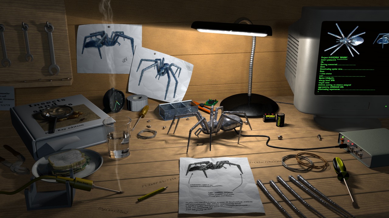
After a more or less satisfactory exam at University, I've made some other
little changes. I know the scene is far to be finished, but I'm quickly
getting bored of it...is there anyone who knows this pathology? After about
one month of work I use to leave my scenes incomplete, just when I should
add those little details that make a scene a good one... Anyway I completely
agree with Robert Becraft, we do have to be fussy in order to make a
realistic scene which tells a realistic story, the problem here is that I
have no eletronic tools as reference and my imagination is completely dry,
so I have no idea which other tools I could model.
I want to thank Tom Melly for donating me his sandwich (hoping he's not
starving now...): it looks great (the mayo macro which puts the mayonnaise
in the sandwich with the trace() function made me go crazy!).
Finally I have a couple of questions about some problems which puzzled me:
-I tried a radiosity version of the scene and I got very strange results:
even with high quality radiosity settings (incredibly slow even with a 1Ghz
machine...) the book looked completely yellow...I can post the image if
someone is interested in this mistery.
-when I add a new texture layer to make the surfaces look dirty the
surfaces theirselves look much brighter and the normals seem to disappear,
so that I have to darken the first layer colour and to increase the bump
size of the normals. The texture layer I'm talking about is something like
this: texture {pigment {wrinkles color_map {[0 rgbt <0,0,0,1>][1 rgbt
<0,0,0,0.5>]}} As you can see the color is always black, but with this
layer all my objects look brighter.
Does the diffuse value take into account the rgb values of all the visible
layers or just of the last?
p.s. Any suggestion about how to fill up the empty space in the desk and in
the walls will be really appreciated!
Thanks in advance,
JRG.
Post a reply to this message
Attachments:
Download 'irtc_big.jpg' (232 KB)
Preview of image 'irtc_big.jpg'

|
|
| |
| |
|
|
|
|
| |
| |
|
|
Personally I think the detail and "stuff" you have there is great.
The desk isn't scratched up enough, and maybe the bottom part of the
wall that touches the desk. The new sandwich is a great improvement.
The electronic equipment is fine, seems like a small time
non-professional basement type shop, nothing fancy.
If it were me I'd beat up the desk with scratches and some
dirt/smudge/grease.
if I take a broad view, the only things that don't look photorealistic
are the soldering iron, the PC screen, and the black/yellow handle of
the screwdriver (it's too clean).
Don't get me wrong, I could not do this in a month.
This is a really great pic, and I hope you get a really high score.
Is
JRG wrote:
> After a more or less satisfactory exam at University, I've made some other
> little changes. I know the scene is far to be finished, but I'm quickly
> getting bored of it...is there anyone who knows this pathology? After about
> one month of work I use to leave my scenes incomplete, just when I should
> add those little details that make a scene a good one... Anyway I completely
> agree with Robert Becraft, we do have to be fussy in order to make a
> realistic scene which tells a realistic story, the problem here is that I
> have no eletronic tools as reference and my imagination is completely dry,
> so I have no idea which other tools I could model.
> I want to thank Tom Melly for donating me his sandwich (hoping he's not
> starving now...): it looks great (the mayo macro which puts the mayonnaise
> in the sandwich with the trace() function made me go crazy!).
>
> Finally I have a couple of questions about some problems which puzzled me:
> -I tried a radiosity version of the scene and I got very strange results:
> even with high quality radiosity settings (incredibly slow even with a 1Ghz
> machine...) the book looked completely yellow...I can post the image if
> someone is interested in this mistery.
> -when I add a new texture layer to make the surfaces look dirty the
> surfaces theirselves look much brighter and the normals seem to disappear,
> so that I have to darken the first layer colour and to increase the bump
> size of the normals. The texture layer I'm talking about is something like
> this: texture {pigment {wrinkles color_map {[0 rgbt <0,0,0,1>][1 rgbt
> <0,0,0,0.5>]}} As you can see the color is always black, but with this
> layer all my objects look brighter.
> Does the diffuse value take into account the rgb values of all the visible
> layers or just of the last?
>
> p.s. Any suggestion about how to fill up the empty space in the desk and in
> the walls will be really appreciated!
> Thanks in advance,
>
> JRG.
>
>
>
>
>
> irtc_big.jpg
>
> Content-Type:
>
> image/jpeg
> Content-Encoding:
>
> x-uuencode
>
>
Post a reply to this message
|
|
| |
| |
|
|
|
|
| |
| |
|
|
Great detail on that clutter, and its positioning is realistic too.
I'd say it's very near completion. One suggestion, try using light
fading; fade_power and fade_distance.
About the radiosity question: what kind of yellow? Could it be coming
from the wood? IIRC you might try changing distance_maximum.
--
David Fontaine <dav### [at] faricy net> ICQ 55354965
My raytracing gallery: http://davidf.faricy.net/ net> ICQ 55354965
My raytracing gallery: http://davidf.faricy.net/
Post a reply to this message
|
|
| |
| |
|
|
|
|
| |
| |
|
|
"JRG" <jrg### [at] hotmailcom> wrote in message
news:3b291507@news.povray.org...
> After a more or less satisfactory exam at University, I've made some other
> little changes. I know the scene is far to be finished, but I'm quickly
> getting bored of it...is there anyone who knows this pathology? After
about
> one month of work I use to leave my scenes incomplete, just when I should
> add those little details that make a scene a good one... Anyway I
completely
> agree with Robert Becraft, we do have to be fussy in order to make a
> realistic scene which tells a realistic story, the problem here is that I
> have no eletronic tools as reference and my imagination is completely dry,
> so I have no idea which other tools I could model.
I find the lack of technical equipment/tools adds to the mystery of this
picture. The batteries, screws etc are all too big for the spider device.
Where did it come from ... how did it get built... how did the person get
it???
If you want to go the other way & imply that it is being built, then you
would need small screws, small precision (jewelers) screw drivers, small
pliers, perhaps a spare leg joint/hinge, small circuit board, small electric
motor, etc...
----
The main things that bother me about the picture is the was the top of the
computer monitor disappears but the screen display goes up into the
blackness. I think that the screen would be better without the spider
display, just the mysterious green character cell text.
----
Still a fantastic picture... I only wish that I could create something as
interesting.
Chris
Post a reply to this message
|
|
| |
| |
|
|
|
|
| |
| |
|
|
Connect the spider to an oscilloscope!
Post a reply to this message
|
|
| |
| |
|
|
|
|
| |
| |
|
|
Exceptional picture.
Oldstench................
Post a reply to this message
|
|
| |
| |
|
|
|
|
| |
| |
|
|
Very nice.. the only thing I would say is that I think the glass is a little
too big and looks out of proportion - the base doesn't appear that much
smaller than the sandwich! Apart from that and a bit of dirt and grime
you've got a top quality image.
Peter Cracknell
http://www.petercracknell.com
Post a reply to this message
|
|
| |
| |
|
|
|
|
| |
| |
|
|
"David Fontaine" <dav### [at] faricynet> ha scritto nel messaggio
news:3B2935F0.E5BA5AA9@faricy.net...
> Great detail on that clutter, and its positioning is realistic too.
>
> I'd say it's very near completion. One suggestion, try using light
> fading; fade_power and fade_distance.
My light has fade_power 4 and fade_distance 12...
Probably you are referring to the fill light.
> About the radiosity question: what kind of yellow? Could it be coming
> from the wood? IIRC you might try changing distance_maximum.
I thought distance_maximum was ignored by MegaPov radiosity, but I could be
wrong...
Post a reply to this message
|
|
| |
| |
|
|
|
|
| |
| |
|
|
Anyway, here's how it looked after one hour and twelve minutes of rendering:
Post a reply to this message
Attachments:
Download 'irtc_rad.jpg' (18 KB)
Preview of image 'irtc_rad.jpg'
|
|
| |
| |
|
|
|
|
| |
| |
|
|
I think it loks great! I don't have an answer for you about the 'dirt
layer' but I hope you figure it out. The only nitpick I have is that the
writing on the desk is too neat. There are a ton of free fonts on the
internet that have a scribbled scrawl look; one of two of these would make
the writing more realistic. Try changing font sizes as well as font types
too.
Rich
Post a reply to this message
|
|
| |
| |
|
|
|
|
| |