|
|
|
|
|
|
| |
| |
|
|
|
|
| |
| |
|
|
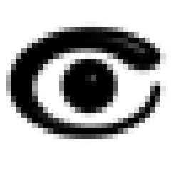
Here's the latest update to the eye logo, which I've so happily found that
you like. :)
I placed the pupil back where it was, and moved the camera back too. I made
the tail be in between the previous sizes, so it's not too small, and not
too fat. I also adjusted the yellow part, again at exactly halfway in
between the too dark and the too bright. I hope you like these changes.
Basically, the logo shouldn't look very changed. I also extended my source
to be able to render grayscale versions, which some prefer to the pure black
ones. I hope you like it. Forgive me for not providing 2 color versions, but
I don't like them without AA. I have provided them at 16x16, 32x32 and
128x128, in both 2D and 3D versions, for a total of 18 files. I hope this
helps you spot any problems with it, either when it's small, or in the
larger size, in one of the details.
I was also wondering: do you see any expression in the eye? Does it look
like it's the eye of a happy person, a calm person, or what? Please let me
know. Maybe we can figure out some way of adding emotion to it.
Post a reply to this message
Attachments:
Download 'black2d128.gif' (3 KB)
Download 'black2d16.gif' (1 KB)
Download 'black2d32.gif' (2 KB)
Download 'black3d128.gif' (4 KB)
Download 'black3d16.gif' (1 KB)
Download 'black3d32.gif' (2 KB)
Download 'color2d128.gif' (6 KB)
Download 'color2d16.gif' (1 KB)
Download 'color2d32.gif' (2 KB)
Download 'color3d128.gif' (6 KB)
Download 'color3d16.gif' (1 KB)
Download 'color3d32.gif' (2 KB)
Download 'gray2d128.gif' (5 KB)
Download 'gray2d16.gif' (1 KB)
Download 'gray2d32.gif' (2 KB)
Download 'gray3d128.gif' (7 KB)
Download 'gray3d16.gif' (1 KB)
Download 'gray3d32.gif' (2 KB)
Preview of image 'black2d128.gif'

Preview of image 'black2d16.gif'

Preview of image 'black2d32.gif'

Preview of image 'black3d128.gif'

Preview of image 'black3d16.gif'

Preview of image 'black3d32.gif'
Preview of image 'color2d128.gif'

Preview of image 'color2d16.gif'

Preview of image 'color2d32.gif'

Preview of image 'color3d128.gif'

Preview of image 'color3d16.gif'

Preview of image 'color3d32.gif'

Preview of image 'gray2d128.gif'

Preview of image 'gray2d16.gif'
Preview of image 'gray2d32.gif'

Preview of image 'gray3d128.gif'

Preview of image 'gray3d16.gif'
Preview of image 'gray3d32.gif'
|
|
| |
| |
|
|
|
|
| |
| |
|
|
Hey, it works pretty good at low resolution. That's a plus :-)
--
David Fontaine <dav### [at] faricy net> ICQ 55354965
Please visit my website: http://www.faricy.net/~davidf/ net> ICQ 55354965
Please visit my website: http://www.faricy.net/~davidf/
Post a reply to this message
|
|
| |
| |
|
|
|
|
| |
| |
|
|
Reminds me of something Egypty.
T
Post a reply to this message
|
|
| |
| |
|
|
|
|
| |
| |
|
|
In article <391b6669@news.povray.org>, "TonyB"
<ben### [at] panamac-comnet> wrote:
> I placed the pupil back where it was, and moved the camera back too.
This part looks good...though I won't comment on the absence of an iris
again...
> I made the tail be in between the previous sizes, so it's not too
> small, and not too fat. I also adjusted the yellow part, again at
> exactly halfway in between the too dark and the too bright. I hope
> you like these changes.
The tail looks better proportioned now, and the yellow color looks just
right.(it *was* a little bright in the previous version)
One suggestion: rotate it clockwise a couple degrees, it looks like it
is slowly rolling backward. Just enough to make the red part a bit
lower, I think.
> I was also wondering: do you see any expression in the eye? Does it
> look like it's the eye of a happy person, a calm person, or what?
> Please let me know. Maybe we can figure out some way of adding
> emotion to it.
Hmm, I think it looks like a slightly surprised hydroge...gack.....
Seriously, I don't think there is enough there to show emotion. If you
want it to have an emotion to it, you need to add more: a separate iris
and pupil, actual eyelids, and eyebrows. At which point you have much
more than a simple logo...
I mean, try imagining different expressions: anger, happyness, etc, but
only keeping a stylized outline of one eye in mind.(the sphere in the
middle gives practically no information) With a pupil and iris, the
relative size of the pupil indicates some of the degree of alertness,
fear, etc, but even that isn't much without an eyebrow and eyelids.
I don't think a logo really needs an expression though...leave that to
the POV-Mascot. :-)
--
Christopher James Huff - Personal e-mail: chr### [at] yahoocom
TAG(Technical Assistance Group) e-mail: chr### [at] tagpovrayorg
Personal Web page: http://chrishuff.dhs.org/
TAG Web page: http://tag.povray.org/
Post a reply to this message
|
|
| |
| |
|
|
|
|
| |
| |
|
|
TonyB wrote:
>
> Here's the latest update to the eye logo, which I've so happily found that
> you like. :)
>
> I was also wondering: do you see any expression in the eye? Does it look
> like it's the eye of a happy person, a calm person, or what? Please let me
> know. Maybe we can figure out some way of adding emotion to it.
What emotion would you add, if you could?
Personally, I don't see why POV-Ray needs a logo (or a mascot, or any of
the other shiny-glittery marketing-type crap people want to give it),
but I always thought this was a pretty cool one.. and ignore Chris Huff,
who has lots of good ideas but seems obsessed with making this thing
into a photorealistic human eye (yeah, THAT'D make a good logo.. not :P
) or insisting that it's a stylized hydrogen atom. He might have a point
about rotating the tail slightly clockwise, though.
One odd thing that I notice about the large color version: the colors
don't appear smooth, instead they seem slightly dithered. Is this image
24-bit? Did the JPEG compression do this, or is that the way it
originally appears? It's theoretically possible that 24 bits is too
granular to allow for smooth gradation (I've seen it happen before), but
I don't know if that's the case here...
--
Xplo Eristotle
http://start.at/xplosion/
"Error has no rights." - Tomas de Torquemada
Post a reply to this message
|
|
| |
| |
|
|
|
|
| |
| |
|
|
In article <391BB156.1C1C4959@unforgettable.com>,
inq### [at] unforgettablecom wrote:
> Personally, I don't see why POV-Ray needs a logo (or a mascot, or any of
> the other shiny-glittery marketing-type crap people want to give it),
Basically, something to add to web pages, images, etc to show they are
POV-Ray related.
> but I always thought this was a pretty cool one.. and ignore Chris Huff,
> who has lots of good ideas but seems obsessed with making this thing
> into a photorealistic human eye (yeah, THAT'D make a good logo.. not :P
Nonono...I think you misunderstood me. I think a nearly photorealistic
eye would be needed to really show emotion, but I don't think it would
make a good logo. I also don't think emotion is really that necessary in
a logo.
I *do* think it needs an iris, but that is definitely not enough to make
it "photorealistic".
> ) or insisting that it's a stylized hydrogen atom.
Well, it looks like one! :-)
--
Christopher James Huff - Personal e-mail: chr### [at] yahoocom
TAG(Technical Assistance Group) e-mail: chr### [at] tagpovrayorg
Personal Web page: http://chrishuff.dhs.org/
TAG Web page: http://tag.povray.org/
Post a reply to this message
|
|
| |
| |
|
|
|
|
| |
| |
|
|
>One odd thing that I notice about the large color version: the colors
>don't appear smooth, instead they seem slightly dithered.
Did you check the file extensions? These are GIFs.
Post a reply to this message
|
|
| |
| |
|
|
|
|
| |
| |
|
|
TonyB wrote:
>
> >One odd thing that I notice about the large color version: the colors
> >don't appear smooth, instead they seem slightly dithered.
>
> Did you check the file extensions? These are GIFs.
Um.. actually, no.
Those are GIFs? O.o
Well.. that would explain it then...
--
Xplo Eristotle
http://start.at/xplosion/
Post a reply to this message
|
|
| |
| |
|
|
|
|
| |
| |
|
|
To be honest.. I don't like it. As a shape it's too unbalanced. The
space between the blob and the sphere is distracting compared to the
objects, which are nice and round. I also think my brain has a problem with
the fat part being at the top; I'm probably expecting a shape like that to
tip over. Finally I'm not sure it makes a good eye either. Eyes don't
usually have white between the iris and the eyelid unless you're dead or
really, really scared. All this adds up to making me a bit uneasy when I see
this.
But hey, this is me. You seem to have plenty of adherents so this shouldn't
discourage you from developing this further.
sig
Post a reply to this message
|
|
| |
| |
|
|
|
|
| |
| |
|
|
"TonyB" wrote:
> Here's the latest update to the eye logo,
> which I've so happily found that you like. :)
Uhh, very close to perfect I think!
I prefer the more smooth gradient in my own version R1, and the slightly
more visible shading (your version looks more flat), but that really isn't
important. I don't think you need to change anything.
I think it would be great if you instead concentrated on making up
completely new logos. The more good logos we get, the better.
> Forgive me for not providing 2 color versions,
> but I don't like them without AA.
Nobody has said that you should provide 2-color versions without AA.
I consider your black and white versions without phong for 2-color versions.
> I was also wondering: do you see any
> expression in the eye?
No.
> Does it look like it's the eye of a happy
> person, a calm person, or what?
No, it's just an eye.
> Please let me know. Maybe we can figure
> out some way of adding emotion to it.
Please don't! Besides, it would require a completely changed version, and
that would be a shame after you done so much to make people satisfied with
the current version!
Greetings,
Rune
---
Updated April 25: http://rsj.mobilixnet.dk
Containing 3D images, stereograms, tutorials,
The POV Desktop Theme, 350+ raytracing jokes,
miscellaneous other things, and a lot of fun!
Post a reply to this message
|
|
| |
| |
|
|
|
|
| |
|
|