 |
 |
|
 |
|
 |
|  |
|  |
|
 |
From: Jaime Vives Piqueres
Subject: More Wings3D learning... (140Kb)
Date: 13 Aug 2004 05:01:21
Message: <411c8361@news.povray.org>
|
|
 |
|  |
|  |
|
 |
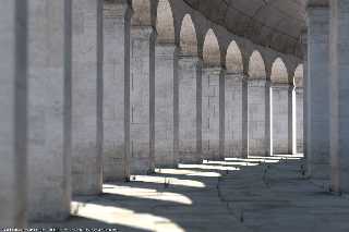
...this time for simple architectural elements. The composition is
inspired on a trueSpace render done by Craftwerk Graphics, found on the
galleries at lightworkdesign.com (I can only find two renders from this
artist, both really impressive). My skills at photographic texturing are
not that good, but Skylight and POV-Ray radiosity helped getting it more
photorealistic.
Regards..
--
Jaime
Post a reply to this message
Attachments:
Download 'columns-11.jpg' (137 KB)
Preview of image 'columns-11.jpg'

|
 |
|  |
|  |
|
 |
|
 |
|  |
|  |
|
 |
Jaime Vives Piqueres wrote:
> ...this time for simple architectural elements. The composition is
> inspired on a trueSpace render done by Craftwerk Graphics, found on the
> galleries at lightworkdesign.com (I can only find two renders from this
> artist, both really impressive). My skills at photographic texturing are
> not that good, but Skylight and POV-Ray radiosity helped getting it more
> photorealistic.
Looks good, are the textures all image maps? How did you generate them?
I assume you use UV-mapping generated in Wings. I have not yet
figured out how to do this (guess i need to have a look at the manual
after all - something i have not bothered to do until now...)
Christoph
--
POV-Ray tutorials, include files, Sim-POV,
HCR-Edit and more: http://www.tu-bs.de/~y0013390/
Last updated 06 Jul. 2004 _____./\/^>_*_<^\/\.______
Post a reply to this message
|
 |
|  |
|  |
|
 |
|
 |
|  |
|  |
|
 |
Nicely done, Jaime.
The plants add to it very well, but I wonder if it might make more sense to
have them grow better nearer the archways and less toward the interior?
Except it looks like daylight, or skylight, might be inward of there too
judging by the shadowy parts in front of the inside pillars. Unless that's
due to a unseen wall reflecting light back outward.
The texturing is realistic. Just that some pillars don't seem correct
because of the mortar lines disappearing, even in the blurry foreground I
thought it might show more of the darkened lines. Perhaps something to do
with either texturing, radiosity, normals, focal blur... or all combined?
Trying it as wallpaper here, it looks great even though stretched to
1600X1200.
Bob H.
Post a reply to this message
|
 |
|  |
|  |
|
 |
From: Jaime Vives Piqueres
Subject: Re: More Wings3D learning... (140Kb)
Date: 13 Aug 2004 06:23:38
Message: <411c96aa@news.povray.org>
|
|
 |
|  |
|  |
|
 |
Christoph Hormann wrote:
> Looks good, are the textures all image maps? How did you generate them?
Yes, all the textures are one image map, found with google at
http://www.fromthedirt.com/textures/concrete.jpg
but I've "proceduralized" it with several turbulent warps to avoid
pixelization. On the floor it is used with higher turbulence, and on the
walls it uses two layers with little but different turbulence values.
> I assume you use UV-mapping generated in Wings. I have not yet figured
> out how to do this (guess i need to have a look at the manual after all
> - something i have not bothered to do until now...)
No, I'm just on the same situation... but I don't even know how UV
mapping works in POV-Ray.
I just used the texturing capability of Wings3D to assign different
materials to groups of faces, so I can rotate them later with POV to
face the correct direction.
Also, I assigned different materials to the fictitious blocks/tiles,
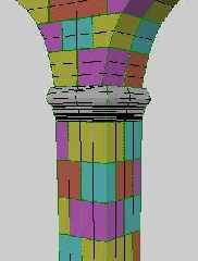
so the texturing is not continuous from tile to tile. In total, the set
of column+arch uses 12 different textures, 4 for each direction. The
mesh is contained on a macro to obtain a different texturing on each copy.
--
Jaime
Post a reply to this message
|
 |
|  |
|  |
|
 |
|
 |
|  |
|  |
|
 |
Hughes, B. wrote:
> The plants add to it very well, but I wonder if it might make more sense to
> have them grow better nearer the archways and less toward the interior?
Yes, I later noticed it... and it was not intentional, just the
random seed used for the placement.
> Except it looks like daylight, or skylight, might be inward of there too
> judging by the shadowy parts in front of the inside pillars. Unless that's
> due to a unseen wall reflecting light back outward.
Yes, there are some elements at the right, out of camera. But it's
also due to the stronger bounce of direct sun, on the floor at the left
side.
> The texturing is realistic. Just that some pillars don't seem correct
> because of the mortar lines disappearing, even in the blurry foreground I
> thought it might show more of the darkened lines. Perhaps something to do
> with either texturing, radiosity, normals, focal blur... or all combined?
No, it's just that I badly modeled one of the sides of the column on
Wings3D, and since there are many copies randomly rotated, some times it
appears this effect. I must have used too little depth on the mortar
extrusion...
> Trying it as wallpaper here, it looks great even though stretched to
> 1600X1200.
Thanks! I will do the final version bigger... :)
--
Jaime
Post a reply to this message
|
 |
|  |
|  |
|
 |
|
 |
|  |
|  |
|
 |
Jaime Vives Piqueres wrote:
>
> Also, I assigned different materials to the fictitious blocks/tiles,
> so the texturing is not continuous from tile to tile. In total, the set
> of column+arch uses 12 different textures, 4 for each direction. The
> mesh is contained on a macro to obtain a different texturing on each copy.
Ah, so the brick structure is not actually painted in the image map but
results from different textures assigned to the different parts of the
column?
Christoph
--
POV-Ray tutorials, include files, Sim-POV,
HCR-Edit and more: http://www.tu-bs.de/~y0013390/
Last updated 06 Jul. 2004 _____./\/^>_*_<^\/\.______
Post a reply to this message
|
 |
|  |
|  |
|
 |
From: Jaime Vives Piqueres
Subject: Re: More Wings3D learning... (140Kb)
Date: 13 Aug 2004 07:02:40
Message: <411c9fd0@news.povray.org>
|
|
 |
|  |
|  |
|
 |
Christoph Hormann wrote:
> Ah, so the brick structure is not actually painted in the image map but
> results from different textures assigned to the different parts of the
> column?
Yes, see the attached Wings3D screenshot. It's a bit tedious, but not
more than doing it with CSG.
--
Jaime
Post a reply to this message
Attachments:
Download 'wings-column.jpg' (15 KB)
Preview of image 'wings-column.jpg'

|
 |
|  |
|  |
|
 |
|
 |
|  |
|  |
|
 |
Jaime Vives Piqueres wrote:
>
>> Ah, so the brick structure is not actually painted in the image map
>> but results from different textures assigned to the different parts of
>> the column?
>
>
> Yes, see the attached Wings3D screenshot. It's a bit tedious, but not
> more than doing it with CSG.
And surely faster to render...
I just did some tries with the UV-Mapping feature of Wings and it seems
to work relatively well - you can probably get similar results this way
without subdividing your models like you did but you will have to paint
a high resolution map of course. The bad thing (and a general problem
about Wings) is that it gets really slow once you deal with models of
more than a few hundred faces.
Christoph
--
POV-Ray tutorials, include files, Sim-POV,
HCR-Edit and more: http://www.tu-bs.de/~y0013390/
Last updated 06 Jul. 2004 _____./\/^>_*_<^\/\.______
Post a reply to this message
|
 |
|  |
|  |
|
 |
|
 |
|  |
|  |
|
 |
jai### [at] ignorancia org news:411c8361@news.povray.org
> inspired on a trueSpace render done by Craftwerk Graphics, found on the
> galleries at lightworkdesign.com (I can only find two renders from this
Oh, oh, I worked there [for a moment] :) (couldn't resist, sorry ;)
Greate image, very photorealistic indeed
--
http://www.raf256.com/3d/
Rafal Maj 'Raf256', home page - http://www.raf256.com/me/
Computer Graphics org news:411c8361@news.povray.org
> inspired on a trueSpace render done by Craftwerk Graphics, found on the
> galleries at lightworkdesign.com (I can only find two renders from this
Oh, oh, I worked there [for a moment] :) (couldn't resist, sorry ;)
Greate image, very photorealistic indeed
--
http://www.raf256.com/3d/
Rafal Maj 'Raf256', home page - http://www.raf256.com/me/
Computer Graphics
Post a reply to this message
|
 |
|  |
|  |
|
 |
From: Fernando G del Cueto
Subject: Re: More Wings3D learning... (140Kb)
Date: 13 Aug 2004 10:52:51
Message: <411cd5c3@news.povray.org>
|
|
 |
|  |
|  |
|
 |
Beautiful and very realistic. Congratulations!
Are you going to post the code in your website?
Good job!
Fernando
Jaime Vives Piqueres wrote:
> ...this time for simple architectural elements. The composition is
> inspired on a trueSpace render done by Craftwerk Graphics, found on the
> galleries at lightworkdesign.com (I can only find two renders from this
> artist, both really impressive). My skills at photographic texturing are
> not that good, but Skylight and POV-Ray radiosity helped getting it more
> photorealistic.
>
> Regards..
>
> --
> Jaime
Post a reply to this message
|
 |
|  |
|  |
|
 |
|
 |
|  |


![]()