 |
 |
|
 |
|
 |
|  |
|  |
|
 |
|
 |
|  |
|  |
|
 |
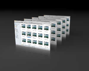
I just wanted to make a screenshot of a window in the style that Apple does -
with the reflection beneath that tapers off.
Since it's not physically based reflection, I mirrored the objects underneath
themselves for a fake reflection, then tried to make them fade out after a short
distance. It turned out that fade_distance, fade_color etc didn't work for me -
they don't fade towards <0,0,0> when in a transparent container, but rather
towards their color multiplied by the transmit parameter - which wasn't what I
expected.
But good old absorbing media worked great. And then I threw in some focal blur
for kicks. Looks OK for my purposes.
Cheers,
Edouard.
Post a reply to this message
Attachments:
Download 'screens.jpg' (74 KB)
Preview of image 'screens.jpg'

|
 |
|  |
|  |
|
 |
|
 |
|  |
|  |
|
 |
Cool!
Post a reply to this message
|
 |
|  |
|  |
|
 |
|
 |
|  |
|  |
|
 |
nemesis <nam### [at] gmail com> wrote:
> Cool!
Thank-you!
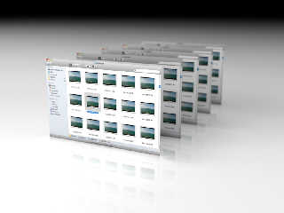
I also tried a lighter surface, and that was much trickier - I ended up using
nasty hacks like inverting the image for the "reflection" and giving it a high
negative ambient term. Crazy, but, again, it ended up looking OK for my
purposes...
Cheers,
Edouard. com> wrote:
> Cool!
Thank-you!
I also tried a lighter surface, and that was much trickier - I ended up using
nasty hacks like inverting the image for the "reflection" and giving it a high
negative ambient term. Crazy, but, again, it ended up looking OK for my
purposes...
Cheers,
Edouard.
Post a reply to this message
Attachments:
Download 'screens2.jpg' (75 KB)
Preview of image 'screens2.jpg'

|
 |
|  |
|  |
|
 |
|
 |
|  |
|  |
|
 |
Nice look! Darker one looks a bit better as the lighter first reflection looks
a bit overexposed. I don't even want to guess what hacks you had to use!
"Edouard" <pov### [at] edouard info> wrote:
> nemesis <nam### [at] gmail info> wrote:
> nemesis <nam### [at] gmail com> wrote:
> > Cool!
>
> Thank-you!
>
> I also tried a lighter surface, and that was much trickier - I ended up using
> nasty hacks like inverting the image for the "reflection" and giving it a high
> negative ambient term. Crazy, but, again, it ended up looking OK for my
> purposes...
>
> Cheers,
> Edouard. com> wrote:
> > Cool!
>
> Thank-you!
>
> I also tried a lighter surface, and that was much trickier - I ended up using
> nasty hacks like inverting the image for the "reflection" and giving it a high
> negative ambient term. Crazy, but, again, it ended up looking OK for my
> purposes...
>
> Cheers,
> Edouard.
Post a reply to this message
|
 |
|  |
|  |
|
 |
|
 |
|  |
|  |
|
 |
"Edouard" <pov### [at] edouard info> wrote:
> nemesis <nam### [at] gmail info> wrote:
> nemesis <nam### [at] gmail com> wrote:
> > Cool!
>
> Thank-you!
>
> I also tried a lighter surface, and that was much trickier - I ended up using
> nasty hacks like inverting the image for the "reflection" and giving it a high
> negative ambient term. Crazy, but, again, it ended up looking OK for my
> purposes...
>
> Cheers,
> Edouard.
Beautiful, especially the darker first.
;) com> wrote:
> > Cool!
>
> Thank-you!
>
> I also tried a lighter surface, and that was much trickier - I ended up using
> nasty hacks like inverting the image for the "reflection" and giving it a high
> negative ambient term. Crazy, but, again, it ended up looking OK for my
> purposes...
>
> Cheers,
> Edouard.
Beautiful, especially the darker first.
;)
Post a reply to this message
|
 |
|  |
|  |
|
 |
|
 |
|  |
|  |
|
 |
"Carlo C." <nomail@nomail> wrote:
>
> > I also tried a lighter surface, and that was much trickier - I ended up using
> > nasty hacks like inverting the image for the "reflection" and giving it a high
> > negative ambient term. Crazy, but, again, it ended up looking OK for my
> > purposes...
> >
> > Cheers,
> > Edouard.
>
> Beautiful, especially the darker first.
> ;)
Thank-you!
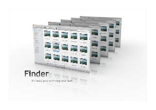
Last one (it's giving me what I want now). Border and text in Photoshop.
Cheers,
Edouard.
Post a reply to this message
Attachments:
Download 'screens3.jpg' (168 KB)
Preview of image 'screens3.jpg'

|
 |
|  |
|  |
|
 |
|
 |
|  |
|  |
|
 |
Among other things, Edouard saw fit to write:
> Since it's not physically based reflection, I mirrored the objects
> underneath themselves for a fake reflection, then tried to make them fade
> out after a short distance.
Wouldn't that effect be obtained with angle-dependent reflection?
--
light_source{9+9*x,1}camera{orthographic look_at(1-y)/4angle 30location
9/4-z*4}light_source{-9*z,1}union{box{.9-z.1+x clipped_by{plane{2+y-4*x
0}}}box{z-y-.1.1+z}box{-.1.1+x}box{.1z-.1}pigment{rgb<.8.2,1>}}//Jellby
Post a reply to this message
|
 |
|  |
|  |
|
 |
|
 |
|  |
|  |
|
 |
"Edouard" <pov### [at] edouard info> wrote:
> "Carlo C." <nomail@nomail> wrote:
> >
> > > I also tried a lighter surface, and that was much trickier - I ended up using
> > > nasty hacks like inverting the image for the "reflection" and giving it a high
> > > negative ambient term. Crazy, but, again, it ended up looking OK for my
> > > purposes...
> > >
> > > Cheers,
> > > Edouard.
> >
> > Beautiful, especially the darker first.
> > ;)
>
> Thank-you!
>
> Last one (it's giving me what I want now). Border and text in Photoshop.
>
> Cheers,
> Edouard.
Cool!
But perhaps Photoshop was not necessary... ;) info> wrote:
> "Carlo C." <nomail@nomail> wrote:
> >
> > > I also tried a lighter surface, and that was much trickier - I ended up using
> > > nasty hacks like inverting the image for the "reflection" and giving it a high
> > > negative ambient term. Crazy, but, again, it ended up looking OK for my
> > > purposes...
> > >
> > > Cheers,
> > > Edouard.
> >
> > Beautiful, especially the darker first.
> > ;)
>
> Thank-you!
>
> Last one (it's giving me what I want now). Border and text in Photoshop.
>
> Cheers,
> Edouard.
Cool!
But perhaps Photoshop was not necessary... ;)
Post a reply to this message
|
 |
|  |
|  |
|
 |
|
 |
|  |


![]()