"Carlo C." <nomail@nomail> wrote:
>
> > I also tried a lighter surface, and that was much trickier - I ended up using
> > nasty hacks like inverting the image for the "reflection" and giving it a high
> > negative ambient term. Crazy, but, again, it ended up looking OK for my
> > purposes...
> >
> > Cheers,
> > Edouard.
>
> Beautiful, especially the darker first.
> ;)
Thank-you!
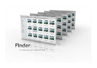
Last one (it's giving me what I want now). Border and text in Photoshop.
Cheers,
Edouard.
Post a reply to this message
Attachments:
Download 'screens3.jpg' (168 KB)
Preview of image 'screens3.jpg'

|


![]()