|
|
|
|
|
|
| |
| |
|
|
|
|
| |
| |
|
|
"clipka" <nomail@nomail> schreef in bericht
news:web.49a2dd86c45573b1accdd5660@news.povray.org...
>
> (Does anyone have an idea why the sand in the glass comes out so
> incredibly
> green- / yellowish?)
Must be the effect of the glass color? reddish+bluish=yellowish?? Don't ask
me about the physics... :-)
I have seen this effect too.
Thomas
Post a reply to this message
|
|
| |
| |
|
|
|
|
| |
| |
|
|
"Thomas de Groot" <tDOTdegroot@interDOTnlANOTHERDOTnet> wrote:
> "clipka" <nomail@nomail> schreef in bericht
> news:web.49a2dd86c45573b1accdd5660@news.povray.org...
> >
> > (Does anyone have an idea why the sand in the glass comes out so
> > incredibly
> > green- / yellowish?)
>
> Must be the effect of the glass color? reddish+bluish=yellowish?? Don't ask
> me about the physics... :-)
> I have seen this effect too.
>
> Thomas
There are times when I wish for a more realistic (viz: more "channels") color
model in POV...
*sigh*
Post a reply to this message
|
|
| |
| |
|
|
|
|
| |
| |
|
|
clipka wrote:
> Just a few old, weathered bricks.
>
> Genuine SDL, with area lighting, radiosity, focal blur and ground fog.
>
> 1h:14m on a P4 3.4GHz XP machine (MegaPOV 1.2.1)
>
> Not too happy with the look yet - I think those reddish boxes somehow fail to
> look like bricks for some unexplained reason.
>
> Maybe I should try the isosurface approach after all. But how can you define a
> box with rounded corners and holes in it as an isosurface?
>
> Comments / suggestions anyone?
Use six intersecting height fields to make the sides of the brick. Make
the round holes by differencing away three cylinders. Use texturing to
make the inside of the cylinders look rough, but don't worry about it
being too realistic.
Regards,
John
Post a reply to this message
|
|
| |
| |
|
|
|
|
| |
| |
|
|
"Thomas de Groot" <tDOTdegroot@interDOTnlANOTHERDOTnet> wrote:
> "clipka" <nomail@nomail> schreef in bericht
> news:web.49a2dd86c45573b1accdd5660@news.povray.org...
> >
> > (Does anyone have an idea why the sand in the glass comes out so
> > incredibly
> > green- / yellowish?)
>
> Must be the effect of the glass color? reddish+bluish=yellowish?? Don't ask
> me about the physics... :-)
> I have seen this effect too.
Christoph's glass appears to be greenish-gray, not blue. That would actually
make more sense (reddish-orangish + greenish = yellowish), but it doesn't
explain the color saturation.
Post a reply to this message
|
|
| |
| |
|
|
|
|
| |
| |
|
|
John VanSickle <evi### [at] hotmail com> wrote:
> Use six intersecting height fields to make the sides of the brick. Make
> the round holes by differencing away three cylinders.
Not a bad idea as it seems; however, this would probably leave me with sharp
edges of the holes, which is definitely not what I want. com> wrote:
> Use six intersecting height fields to make the sides of the brick. Make
> the round holes by differencing away three cylinders.
Not a bad idea as it seems; however, this would probably leave me with sharp
edges of the holes, which is definitely not what I want.
Post a reply to this message
|
|
| |
| |
|
|
|
|
| |
| |
|
|
"Cousin Ricky" <ric### [at] yahoocom> wrote:
> Christoph's glass appears to be greenish-gray, not blue. That would actually
> make more sense (reddish-orangish + greenish = yellowish), but it doesn't
> explain the color saturation.
I found that it must have something to do with my illumination using very
extreme colors for (a) the direct yellow-ish "sunlight" illumination (almost no
blue in there) and (b) the indirect (radiosity) blue-ish illumination from the
sky (almost nothing but blue), which makes objects' hues strongly
orientation-dependent.
shifting both illumination source colors a good deal towards white gives much
better results, e.g. the shadows don't look that bue-ish anymore and stuff like
that.
Post a reply to this message
|
|
| |
| |
|
|
|
|
| |
| |
|
|
On 23-2-2009 0:53, Mike Hough wrote:
> Yes, except now they look like they have been dusted with snow.
to me it look like remnants of plaster or the stuff you use to bind
bricks together.
Post a reply to this message
|
|
| |
| |
|
|
|
|
| |
| |
|
|
clipka nous illumina en ce 2009-02-24 16:06 -->
> John VanSickle <evi### [at] hotmailcom> wrote:
>> Use six intersecting height fields to make the sides of the brick. Make
>> the round holes by differencing away three cylinders.
>
> Not a bad idea as it seems; however, this would probably leave me with sharp
> edges of the holes, which is definitely not what I want.
>
>
You can model the holes in the hight fields forming the top and bottom of the
bricks. At least, part or the transitions into the holes, if not the whole depth.
--
Alain
-------------------------------------------------
I abhor war and view it as the greatest scourge of mankind.
Thomas Jefferson
Post a reply to this message
|
|
| |
| |
|
|
|
|
| |
| |
|
|
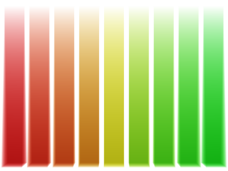
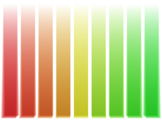
On Tue, 24 Feb 2009 06:16:06 -0400, clipka <nomail@nomail> wrote:
> There are times when I wish for a more realistic (viz: more "channels")
> color
> model in POV...
>*sigh*
I get that longing every time I use fade_color or absorption. Unless the
channels are balanced (not a realistic condition), these effects will
approach the most dominant primary color.
I first noticed this in simulating sea water: in the shallows, the color
looked surprisingly realistic, but as it got deeper, the sea turned a rich
phosphor blue. I later noticed a similar problem with colored grass: as
I attempted to saturate some colors that were washed-out, but of the
desired hue, golden-yellow became phosphor vermillion, and chartreuse
became phosphor green.
The capability of extra channels, or even a continuous spectrum, would be
welcome. However, I don't think this feature would be practical beyond a
few applications, such as transparent materials.
I created the attached images a few years ago to get a feel for the
problem, although I didn't feel that anything could be easily done about
it. I figured that when it became important enough for me, I'd poll here
for ideas. The images use media { absorption } and fade_color,
respectively.
--
<Insert witty .sig here>
Post a reply to this message
Attachments:
Download 'absorb_bias.png' (18 KB)
Download 'fade_bias.png' (17 KB)
Preview of image 'absorb_bias.png'
Preview of image 'fade_bias.png'
|
|
| |
| |
|
|
|
|
| |
| |
|
|
"Cousin Ricky" <ric### [at] yahoocom> wrote:
> On Tue, 24 Feb 2009 06:16:06 -0400, clipka <nomail@nomail> wrote:
> > There are times when I wish for a more realistic (viz: more "channels")
> > color
> > model in POV...
> >*sigh*
>
> I get that longing every time I use fade_color or absorption. Unless the
> channels are balanced (not a realistic condition), these effects will
> approach the most dominant primary color.
>
> I first noticed this in simulating sea water: in the shallows, the color
> looked surprisingly realistic, but as it got deeper, the sea turned a rich
> phosphor blue. I later noticed a similar problem with colored grass: as
> I attempted to saturate some colors that were washed-out, but of the
> desired hue, golden-yellow became phosphor vermillion, and chartreuse
> became phosphor green.
>
> The capability of extra channels, or even a continuous spectrum, would be
> welcome. However, I don't think this feature would be practical beyond a
> few applications, such as transparent materials.
>
> I created the attached images a few years ago to get a feel for the
> problem, although I didn't feel that anything could be easily done about
> it. I figured that when it became important enough for me, I'd poll here
> for ideas. The images use media { absorption } and fade_color,
> respectively.
>
I recently came up with a method (actually two) that takes an rgb color and
progressively changes its color saturation anywhere between 100% and 0%. Based
on POV's gray formula found in section "3.3.3.4 HF_Gray_16" in the docs. I
don't know if it has any relevance to the situations mentioned here, or how it
might be 'variably' applied across z-space, but I should probably post it
anyway. (Can ground fog take a color_map or pigment_map to change its color
across z-space? I've never tried that.)
Ken W.
Post a reply to this message
|
|
| |
| |
|
|
|
|
| |