|
 |
On Tue, 24 Feb 2009 06:16:06 -0400, clipka <nomail@nomail> wrote:
> There are times when I wish for a more realistic (viz: more "channels")
> color
> model in POV...
>*sigh*
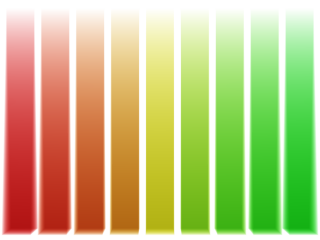
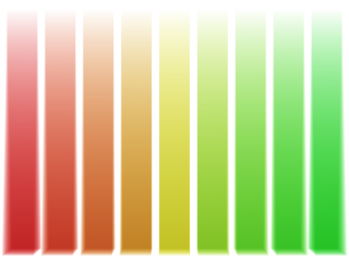
I get that longing every time I use fade_color or absorption. Unless the
channels are balanced (not a realistic condition), these effects will
approach the most dominant primary color.
I first noticed this in simulating sea water: in the shallows, the color
looked surprisingly realistic, but as it got deeper, the sea turned a rich
phosphor blue. I later noticed a similar problem with colored grass: as
I attempted to saturate some colors that were washed-out, but of the
desired hue, golden-yellow became phosphor vermillion, and chartreuse
became phosphor green.
The capability of extra channels, or even a continuous spectrum, would be
welcome. However, I don't think this feature would be practical beyond a
few applications, such as transparent materials.
I created the attached images a few years ago to get a feel for the
problem, although I didn't feel that anything could be easily done about
it. I figured that when it became important enough for me, I'd poll here
for ideas. The images use media { absorption } and fade_color,
respectively.
--
<Insert witty .sig here>
Post a reply to this message
Attachments:
Download 'absorb_bias.png' (18 KB)
Download 'fade_bias.png' (17 KB)
Preview of image 'absorb_bias.png'
Preview of image 'fade_bias.png'
|
|