|
|
|
|
|
|
| |
| |
|
|
|
|
| |
| |
|
|
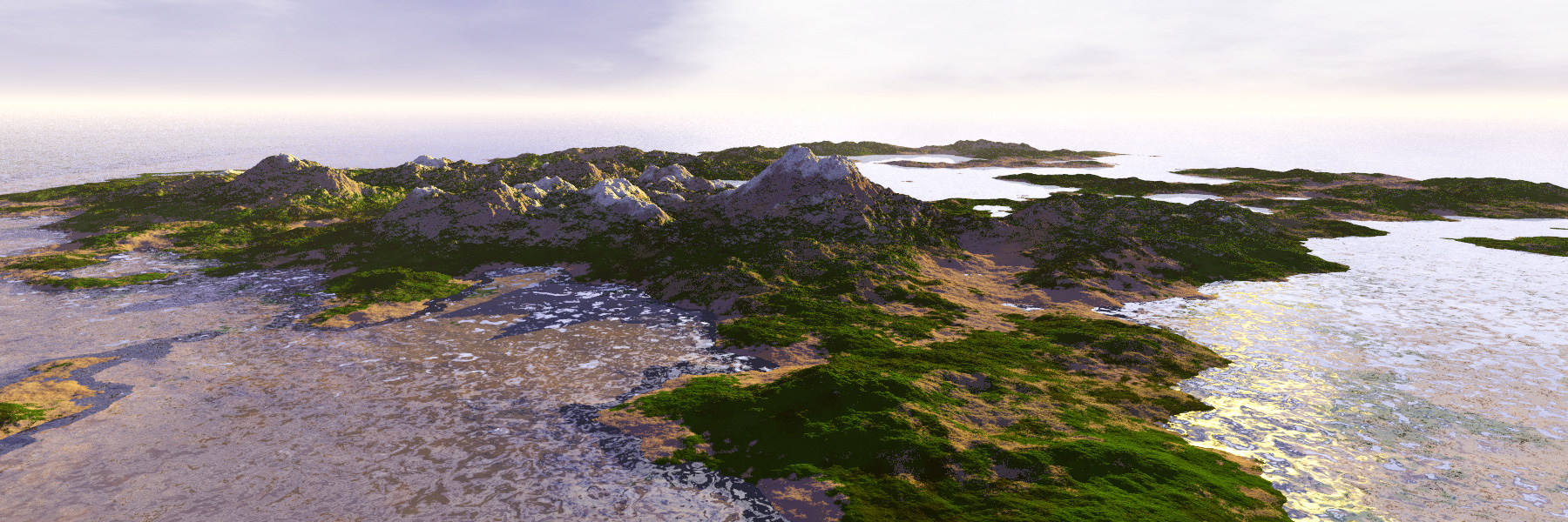
"Welcome to the Island. I hope you enjoy your stay. Please place lots of
suggestions for improvements in the box below..."
Island is isosurface with a wrinkles pattern. There are no actual trees or
vegetation on the Island for now, just textures. The sky is merely a sky
sphere at this point.
I'm having trouble with the water: I would like to get the effect of the
turquoise color around shallow waters and sandy beaches, so I'm using ior and
fade_power setting, but I can't seem to get them right. If someone has more
experience using the interior fade settings, I'd appreciate some
recommendations.
Post a reply to this message
Attachments:
Download 'mountains01.jpg' (560 KB)
Preview of image 'mountains01.jpg'
|
|
| |
| |
|
|
|
|
| |
| |
|
|
"Kirk Andrews" <kir### [at] tektonart com> wrote:
> "Welcome to the Island. I hope you enjoy your stay. Please place lots of
> suggestions for improvements in the box below..."
>
>
> Island is isosurface with a wrinkles pattern. There are no actual trees or
> vegetation on the Island for now, just textures. The sky is merely a sky
> sphere at this point.
>
> I'm having trouble with the water: I would like to get the effect of the
> turquoise color around shallow waters and sandy beaches, so I'm using ior and
> fade_power setting, but I can't seem to get them right. If someone has more
> experience using the interior fade settings, I'd appreciate some
> recommendations.
To get the water effect you are looking for, you really should use scattering
media. Light fading will only darken rays, which will not achieve the effect
you want as what you see in real life is actually scattered light. Have a look
at the water material below for example.
One alternative would be to use a negative filter
eg: rgbf <0.51373, 0.70588, 0.70588,-2>
But this would make all your water seem to glow unaturally.
-tgq
//START
#declare WCol=rgb <0.51373, 0.70588, 0.70588>;
#declare MWater=
material{
texture{
pigment{rgbt 1}
finish{conserve_energy diffuse 0.0 ambient 0 reflection{0 1 fresnel on
metallic 0}}
normal{P1}
}
#local FD=-(1000/(6*25.4))/ln(0.58);
interior{
ior 1.33
media{
absorption rgb 1-WCol //coastal
density{rgb 1/FD}
}
media{
method 3
//intervals 12
//samples 60,100
jitter 0.5
scattering{4,rgb <0.74118, 0.71765, 0.41961>}
density{
bozo
color_map {
[0.0 rgb 1/100]
[1.0 rgb 1/200]
}
scale 1/2
}
}
}
}
//END com> wrote:
> "Welcome to the Island. I hope you enjoy your stay. Please place lots of
> suggestions for improvements in the box below..."
>
>
> Island is isosurface with a wrinkles pattern. There are no actual trees or
> vegetation on the Island for now, just textures. The sky is merely a sky
> sphere at this point.
>
> I'm having trouble with the water: I would like to get the effect of the
> turquoise color around shallow waters and sandy beaches, so I'm using ior and
> fade_power setting, but I can't seem to get them right. If someone has more
> experience using the interior fade settings, I'd appreciate some
> recommendations.
To get the water effect you are looking for, you really should use scattering
media. Light fading will only darken rays, which will not achieve the effect
you want as what you see in real life is actually scattered light. Have a look
at the water material below for example.
One alternative would be to use a negative filter
eg: rgbf <0.51373, 0.70588, 0.70588,-2>
But this would make all your water seem to glow unaturally.
-tgq
//START
#declare WCol=rgb <0.51373, 0.70588, 0.70588>;
#declare MWater=
material{
texture{
pigment{rgbt 1}
finish{conserve_energy diffuse 0.0 ambient 0 reflection{0 1 fresnel on
metallic 0}}
normal{P1}
}
#local FD=-(1000/(6*25.4))/ln(0.58);
interior{
ior 1.33
media{
absorption rgb 1-WCol //coastal
density{rgb 1/FD}
}
media{
method 3
//intervals 12
//samples 60,100
jitter 0.5
scattering{4,rgb <0.74118, 0.71765, 0.41961>}
density{
bozo
color_map {
[0.0 rgb 1/100]
[1.0 rgb 1/200]
}
scale 1/2
}
}
}
}
//END
Post a reply to this message
|
|
| |
| |
|
|
|
|
| |
| |
|
|
I like it, nice colors and light.
For some reasons (I guess the foam-like pattern of the water is one of
them), I interpret this image with a small scale (a few meter across),
as if I was walking on a beach. The montains (?) with their white tops
then look at bit out of place...
Thibaut
> "Welcome to the Island. I hope you enjoy your stay. Please place lots of
> suggestions for improvements in the box below..."
>
>
> Island is isosurface with a wrinkles pattern. There are no actual trees or
> vegetation on the Island for now, just textures. The sky is merely a sky
> sphere at this point.
>
> I'm having trouble with the water: I would like to get the effect of the
> turquoise color around shallow waters and sandy beaches, so I'm using ior and
> fade_power setting, but I can't seem to get them right. If someone has more
> experience using the interior fade settings, I'd appreciate some
> recommendations.
>
>
> ------------------------------------------------------------------------
>
Post a reply to this message
|
|
| |
| |
|
|
|
|
| |
| |
|
|
-----BEGIN PGP SIGNED MESSAGE-----
Hash: SHA1
Thibaut Jonckheere wrote:
> I interpret this image with a small scale (a few meter across),
> as if I was walking on a beach. The montains (?) with their white tops
> then look at bit out of place...
That's exactly what I was thinking.
Actually, it looks like what we're interpreting as foam is actually
reflections on the water.
- --
William Tracy
afi### [at] gmailcom -- wtr### [at] calpolyedu
You know you've been raytracing too long when you watch the Making of
Mist video to see what modeler they use.
-----BEGIN PGP SIGNATURE-----
Version: GnuPG v1.4.6 (GNU/Linux)
Comment: Using GnuPG with Mozilla - http://enigmail.mozdev.org
iD8DBQFHOgjCKrVIcTMekC8RArV0AKCDStGt/ukGaKMv5NMF9vp2lmTQPACghq5K
yLbDjy5GPfLwdxKsEBqOFTI=
=O+bS
-----END PGP SIGNATURE-----
Post a reply to this message
|
|
| |
| |
|
|
|
|
| |
| |
|
|
The turquoise effect is usually with shallow water and white sand as well as
a very bright almost turquoise sky. The water reflects the blue of the sky
and the white sands below the water keeps it a light colour. I think you
will also need a small amount of scattering media.
--
Gerhard Oosthuizen
Graphic Designer
Dynamite Digital
012 - 327 1190 / 1 / 2
ger### [at] gmailcom
Post a reply to this message
|
|
| |
| |
|
|
|
|
| |
| |
|
|
William Tracy <wtr### [at] calpolyedu> wrote:
> -----BEGIN PGP SIGNED MESSAGE-----
> Hash: SHA1
>
> Thibaut Jonckheere wrote:
> > I interpret this image with a small scale (a few meter across),
> > as if I was walking on a beach. The montains (?) with their white tops
> > then look at bit out of place...
>
> That's exactly what I was thinking.
>
> Actually, it looks like what we're interpreting as foam is actually
> reflections on the water.
indeed. I think there's too much turbulence in that water. The waves are too
high relative to the scale of things.
other than that, it's an excellent image. Render times? antialiasing?
Post a reply to this message
|
|
| |
| |
|
|
|
|
| |
| |
|
|
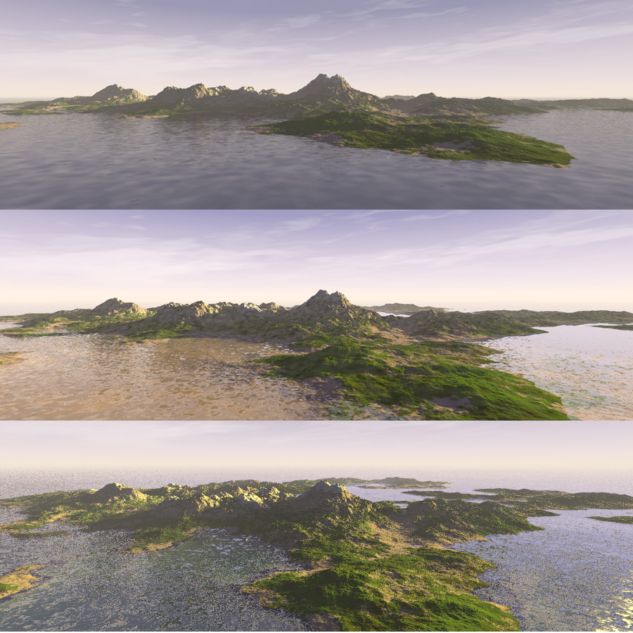
Thanks everyone for your comments and suggestions. Here some re-renders, but I
am not happy with any of them yet. After looking at some photographs of actual
island scenes, I realized the water is neither so reflective nor so transparent.
Or rater, it *is* reflective, but blurry like one might expect from dull metal.
The first image uses blurred reflection, the second is based on the water
material suggested by Trevor, and the third, well, I included it because it was
there.
Using media in the water multiplied render times by ten--I am wondering if I
could not get a sufficiently similar effect by using a ground fog translated
below the water surface...?
Post a reply to this message
Attachments:
Download 'viewsofwater.jpg' (300 KB)
Preview of image 'viewsofwater.jpg'
|
|
| |
| |
|
|
|
|
| |
| |
|
|
"Kirk Andrews" <kir### [at] tektonartcom> wrote:
> Using media in the water multiplied render times by ten--I am wondering if I
> could not get a sufficiently similar effect by using a ground fog translated
> below the water surface...?
Yes, media will tend to do that...
I don't think ground fog will do what you want for a few reasons. First you
need to limit it to below the water surface. Ground fog in POV doesn't have a
sharp upper limit, but rather continues to decrease as you go up. I suppose
you could manipulate the properties so that it is virtually invisible above the
water surface. Otherwise, you need to make the air above "solid" so that the
fog doesn't seep into it, this presents ior issues, plus having your camera
inside a non-hollow object. Fog doesn't simulate the scattering effect that
gives tropical water it's colour. It really neither scatters light nor absorbs
it, it just colours it. Given this fact and the problems above, if you simply
want coloured water, use the interior attenuation instead (fade_distance etc).
You could also use just absorption media instead if you want a varying density
of the attenuation effects (this is a lot faster than scattering media). If
you want actual added colour and not just absorption, use the negative filter
effect I stated before, or add emission media. This will add colour to the
water without necessarily making it darker (even can make it brighter). This
is a quick fix to simulate the real scattering effects, however, because it
isn't determined by it's actual interaction with light, it will appear
everywhere in the water giving it a glowing (or radioactive?) appearance.
You need to evaluate what effect you want, and which simulates it best in
cordination with acceptable render times.
-tgq
Post a reply to this message
|
|
| |
| |
|
|
|
|
| |
| |
|
|
More!
One thing I noticed is that your water is a little brown. This is because, the
material as I posted it was for a pond which was to be a little muddy. You can
change the scatterign colour to get a different effect and remove the muddiness.
Try using either the water colour (WCol) or even white (the absorption media
included will also affect the colour).
Also, have a look at some of the water comments under the "water" thread by
Woland (p.b.i)
From my most recent post:
Another little trick to try is adding premapped caustics. Have a look at the
ones found here:
http://www.dgp.toronto.edu/~stam/reality/Research/PeriodicCaustics/index.html
I like #8 best (there are several files in each zip that are periodic for
animating, all the maps all tileable too.
You apply it by mapping it to a plane (make sure it is hollow for media effects)
or flat box just above or below the water surface with no_reflection and
no_image and using it as a filter map and it produces filtered shadows that
look like proper caustics. I find the best way is to convert it to a function
pattern, then you have better control of the filtering properties:
//START
#declare PIMAGE = function {pigment{image_map {sys "Caus.bmp" interpolate 2}
rotate x*90}}
#declare CausMap= pigment{function{PIMAGE(x,y,z).gray} colour_map{[0 rgbt 0][1
rgbt 2]}}
plane{y,0 hollow pigment{CausMap scale 300} hollow no_image no_reflection}
//END
Notes:
Make sure you reorient the map to the same plane as the water (i.e. image map on
x-y plane, rotate it to x-z plane!)
Black areas have 0 transparency - opaque
White areas get 2 transparency - actually increases the colour intensity
This should be approximately how real caustics are with brighter and darker
areas, but the average brightness still approximately 1.
-tgq
Post a reply to this message
|
|
| |
| |
|
|
|
|
| |
| |
|
|
"Trevor G Quayle" <Tin### [at] hotmailcom> wrote:
> More!
>
> One thing I noticed is that your water is a little brown. This is because, the
> material as I posted it was for a pond which was to be a little muddy. You can
> change the scatterign colour to get a different effect and remove the muddiness.
> Try using either the water colour (WCol) or even white (the absorption media
> included will also affect the colour).
>
>
And a little more...
I found this page very useful for water and light information, especially
regarding scattering efffects, absorption and colour:
http://www.seafriends.org.nz/phgraph/water.htm
The water colour I used in the example I had posted is realtional to coastal
type water and has more greenish to it. Have alook at the difference with
oceanic water, which should be similar to what you want. A better colour based
on the link above would be perhaps:
rgb <0.4, 0.85882, 0.90196>
-tgq
Post a reply to this message
|
|
| |
| |
|
|
|
|
| |