|
|
|
|
|
|
| |
| |
|
|
|
|
| |
| |
|
|
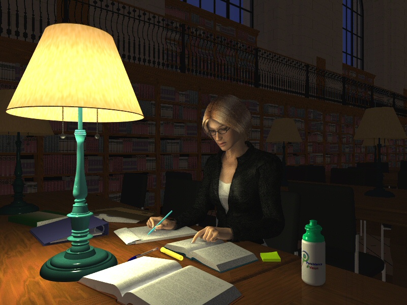
Thanks for all the great feedback. Here is a new (too-dark) version with
better poses for hands, some improved textures and different lighting.
Still working on the lighting..............
Comments/criticism welcomed.
Rob.
---
http://www.fitzel.ca/dart/index.html
Post a reply to this message
Attachments:
Download 'library.0608.jpg' (168 KB)
Preview of image 'library.0608.jpg'
|
|
| |
| |
|
|
|
|
| |
| |
|
|
"RobF" <nomail@nomail> wrote:
> I had some issues using an area light, perhaps you can help.
>
> 2) The light shade texture is opaque and uses double_illuminate. The area
> light is actually below the shade. Are you suggesting using a rgbf based
> texture to let the light through?
>
You can try using an rgbf texture.
If you can't get that to work properly, have a look at "projected_through"
for light sources, i.e., duplicate the lights but with the colour you want
to result from the shade and have them projected throught the shade.
One problem that you will need to address either way is that the lighting
from the shade shouldn't produce as sharp of shadows as from the bulb
directly as well as dimming/colouring it. Using projected_through, you can
make the shade light larger (i.e. approximately the size of the shade) to
simulate this.
-tgq
Post a reply to this message
|
|
| |
| |
|
|
|
|
| |
| |
|
|
Excellent work and better than the first version.
But now the background looks too flat. Perhaps another lamp far behind of
the woman would give contrasting shadows.
Norbert kern
Post a reply to this message
|
|
| |
| |
|
|
|
|
| |
| |
|
|
"RobF" <nomail@nomail> wrote:
> I'm looking for constructive criticism to improve this image.
Cleavage. ;-)
Post a reply to this message
|
|
| |
| |
|
|
|
|
| |
| |
|
|
RobF wrote:
> Thanks for all the great feedback. Here is a new (too-dark) version with
> better poses for hands, some improved textures and different lighting.
> Still working on the lighting..............
> Comments/criticism welcomed.
>
> Rob.
Excellent improvement! I would only suggest reducing the ambient light
(perhaps even setting it to 0?) and using radiosity to light the rest of
the library.
Also, in the first image it seemed there was another light source
further back (there's an area which is brighter towards the back) which
seems to be missing in the new. This helped break up the uniformity of
the background, without drawing too much attention to itself.
...Chambers
Post a reply to this message
|
|
| |
| |
|
|
|
|
| |
| |
|
|
"RobF" <nomail@nomail> wrote:
> Hi,
>
> I'm looking for constructive criticism to improve this image.
> I'd like to improve the radiosity (currently using Radiosity_IndoorLQ), but
> not clear on which settings to tweak.
>
> Thanks in advance,
>
> Rob.
> ---
> http://www.fitzel.ca/dart/index.html
WOW!
The hair doesn't look right.... instead of flowing naturally, it seems glued
to her ears. Not sure how to advise you on this.. so I'll upload a sample
image.
Looking at parts of her skin and her books, the white is too bright. I
think if you reduce the gamma slightly and reduce the source light, it will
look better... and if you are using any phong (or simlar) function on her
skin, she will look real if you turn it off.
If light is based on <r, g, b>, decrease the B by some subtle amount....
hmm...
Post a reply to this message
|
|
| |
| |
|
|
|
|
| |
| |
|
|
"RobF" <nomail@nomail> wrote:
> Hi,
>
> I'm looking for constructive criticism to improve this image.
> I'd like to improve the radiosity (currently using Radiosity_IndoorLQ), but
> not clear on which settings to tweak.
>
> Thanks in advance,
>
> Rob.
> ---
> http://www.fitzel.ca/dart/index.html
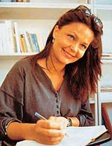
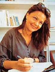
OOPS! Here's the photo...
And I also suggest to look up the color for light temperature 5000K, which I
think is D50. Try also D54.
Post a reply to this message
Attachments:
Download 'woman.jpg' (11 KB)
Preview of image 'woman.jpg'
|
|
| |
| |
|
|
|
|
| |
| |
|
|
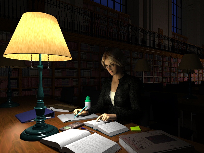
Thanks for all the feedback so far; it's really helped me improve this
image.
I'm still not 100% happy with the hair, I posed it as such to look like it's
tied back in a pony tail. Hopefully the darkness hides the modelling
problems with the back of the hair. Will continue to work on it.
I opted for a physics theme, as that was the first book I grabbed off the
shelf to model/scan. Realism demanded a calculator, so a quick round_box
and a photo of my Sharp EL-9200 suffice for now.
Textures need some work, too.
Please feel free to comment/critique...
Rob.
Post a reply to this message
Attachments:
Download 'library.0613.jpg' (161 KB)
Preview of image 'library.0613.jpg'

|
|
| |
| |
|
|
|
|
| |
| |
|
|
"RobF" <nomail@nomail> wrote:
> I had some issues using an area light, perhaps you can help.
>
> 1) I seem to get lots of grey speckles when I used an area light. I had to
> go up to adaptive 3 to get rid of them.
>
That's usually a result of not having enough light sources in the area
light. Strangely, I find that "speckled" look to be useful at times
(lighting snow, for example.) But inappropriate here, of course. If you
haven't already done so, you might try an area spotlight, which will render
faster than an "unconstrained" area light.
About lighting in general: Being a fan of good cinematography (and having
done theater lighting for plays), I prefer to use "dramatic" lighting in
most of my own POV scenes...whatever "looks" good, from whatever directions
(and with whatever colors) seem appropriate...as opposed to always making
the light match the positions and colors of any "practical" sources in the
scene. A matter of taste, I suppose. To me, dramatic lighting just looks
"more real" than reality. Otherwise-drab scenes can take on a magical
quality.
Ken W.
Post a reply to this message
|
|
| |
| |
|
|
|
|
| |
| |
|
|
"RobF" <nomail@nomail> wrote in message
news:web.448e3d8c779fe2529c50a910@news.povray.org...
> I opted for a physics theme, as that was the first book I grabbed off the
> shelf to model/scan. Realism demanded a calculator, so a quick round_box
> and a photo of my Sharp EL-9200 suffice for now.
She must be taking the course from an older professor - this looks like the
second edition instead of the more recent third edition of Giancoli's text.
:)
Seriously, though, it appears the words on the open book closest to the lamp
are 'missing'. I recognize this is probably just the way the lighting
turned out, but it tends to catch my eye.
I like your lampshade texture!
- How
Post a reply to this message
|
|
| |
| |
|
|
|
|
| |