|
|
|
|
|
|
| |
| |
|
|
|
|
| |
| |
|
|
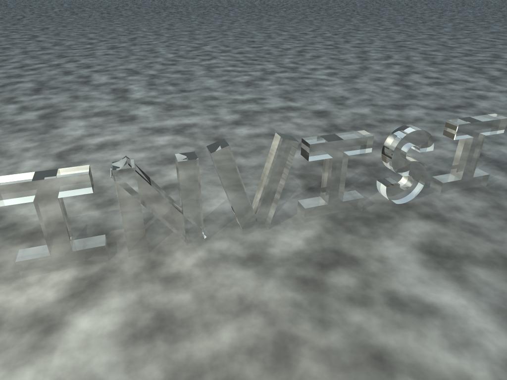
How can I make this look cool?
(Text = CSG. The S in particular was very hard; it involves 4 cylinders
and 2 cubes. (?!) Lighting is radiosity (bluish) + 1 light sournce
("sun", yellowish). Hmm...)
Post a reply to this message
Attachments:
Download 'invisible03.jpg' (62 KB)
Preview of image 'invisible03.jpg'
|
|
| |
| |
|
|
|
|
| |
| |
|
|
A touch of color would help. And so would cleaning up the edges of the
letters. N is horrible. V is dodgy. The S is good.
DLM
"Orchid XP v2" <voi### [at] dev null> wrote in message
news:446c54de@news.povray.org...
> How can I make this look cool?
>
> (Text = CSG. The S in particular was very hard; it involves 4 cylinders
> and 2 cubes. (?!) Lighting is radiosity (bluish) + 1 light sournce
> ("sun", yellowish). Hmm...)
> null> wrote in message
news:446c54de@news.povray.org...
> How can I make this look cool?
>
> (Text = CSG. The S in particular was very hard; it involves 4 cylinders
> and 2 cubes. (?!) Lighting is radiosity (bluish) + 1 light sournce
> ("sun", yellowish). Hmm...)
>
Post a reply to this message
|
|
| |
| |
|
|
|
|
| |
| |
|
|
Orchid XP v2 <voi### [at] devnull> wrote:
> How can I make this look cool?
>
> (Text = CSG. The S in particular was very hard; it involves 4 cylinders
> and 2 cubes. (?!) Lighting is radiosity (bluish) + 1 light sournce
> ("sun", yellowish). Hmm...)
Instead of using boxes, use prisms with linear_spline to make the letters.
This will make it easier to clean up the 'N'.
The 'S' could be done with a prism using bezier_spline to get both flat &
curved surfaces, but you need to know a thing or two about where to put the
control points. If you post the code for the 'S' I can do a bezier
version...
Beyond that, using photons & dispersion could make quite a difference.
Radiosity won't have much effect on the 'glass' letters. Unless you plan to
put more plain-coloured (not transparent or too reflective) objects in the
scene it would be quicker to leave it out.
Post a reply to this message
|
|
| |
| |
|
|
|
|
| |
| |
|
|
"Mark Birch" <las### [at] hotmailcom> wrote:
> Orchid XP v2 <voi### [at] devnull> wrote:
> > How can I make this look cool?
> >
> > (Text = CSG. The S in particular was very hard; it involves 4 cylinders
> > and 2 cubes. (?!) Lighting is radiosity (bluish) + 1 light sournce
> > ("sun", yellowish). Hmm...)
>
> Instead of using boxes, use prisms with linear_spline to make the letters.
> This will make it easier to clean up the 'N'.
>
> The 'S' could be done with a prism using bezier_spline to get both flat &
> curved surfaces, but you need to know a thing or two about where to put the
> control points. If you post the code for the 'S' I can do a bezier
> version...
Gaaarrhhh! What am I talking about?
Just use the text{} object in Povray.
Come to think of it, why aren't you using it?
Post a reply to this message
|
|
| |
| |
|
|
|
|
| |
| |
|
|
Orchid XP v2 nous apporta ses lumieres en ce 18/05/2006 07:05:
> How can I make this look cool?
>
> (Text = CSG. The S in particular was very hard; it involves 4 cylinders
> and 2 cubes. (?!) Lighting is radiosity (bluish) + 1 light sournce
> ("sun", yellowish). Hmm...)
>
> ------------------------------------------------------------------------
>
Ever considered using a text object?
That apart, you may want to intersect your leters with a box. It will help removing
the extra edges
on the "N".
Use a merge instead of an union for the "N" and "V" to remove those internal surfaces.
Try to change the camera position so that we can see the whole thing.
As is, radiosity looks like it's a waste of time. Using photons can have a dramatic
effect. Set your
transparent objects as target with refraction on, reflection on may not be useful. Add
some dispersion.
Adding a faint coloration to the substance of your leters may help, use fade_color
color
fade_distance 4 to 10 times the thickness of the leters to keep it faint and
fade_power some value
to control it. It's place is in the interior{...} block.
--
Alain
-------------------------------------------------
Don't take life too seriously, you won't get out alive.
Post a reply to this message
|
|
| |
| |
|
|
|
|
| |
| |
|
|
> Instead of using boxes, use prisms with linear_spline to make the letters.
> This will make it easier to clean up the 'N'.
Hmm... that could work.
> The 'S' could be done with a prism using bezier_spline to get both flat &
> curved surfaces
Nah. I'm already quite happy with the S.
> Beyond that, using photons & dispersion could make quite a difference.
> Radiosity won't have much effect on the 'glass' letters. Unless you plan to
> put more plain-coloured (not transparent or too reflective) objects in the
> scene it would be quicker to leave it out.
Quicker without radiosity, certinaly. But then the scene is vastly too
dark...
I was thinking about adding some photos.
Post a reply to this message
|
|
| |
| |
|
|
|
|
| |
| |
|
|
> Gaaarrhhh! What am I talking about?
>
> Just use the text{} object in Povray.
>
> Come to think of it, why aren't you using it?
Well, I was *planning* to bevel all the letters in 3D... but I never got
round to it. :-\
Post a reply to this message
|
|
| |
| |
|
|
|
|
| |
| |
|
|
> Ever considered using a text object?
Yes, but I *was* going to make all the edges curved. (In fact, I still
hope to. It's just that doing it requires about 12x as many objects...)
> That apart, you may want to intersect your leters with a box. It will
> help removing the extra edges on the "N".
Yeah, I think you might be right there. Either that or use a prism...
> Use a merge instead of an union for the "N" and "V" to remove those
> internal surfaces.
Already using merge.
> Try to change the camera position so that we can see the whole thing.
Technically, you already can. (I haven't moddled the remaining letters yet!)
> As is, radiosity looks like it's a waste of time.
Image is far too dark without it.
> Using photons can have a dramatic effect.
Yeah. As I say, the original plan was to curve all the corners. If I
manage to do that, photons are really gonna be good!
> Add some dispersion.
Sounds slow... LOL!
> Adding a faint coloration to the substance of your leters may help, use
> fade_color color fade_distance 4 to 10 times the thickness of the leters
> to keep it faint and fade_power some value to control it. It's place is
> in the interior{...} block.
Mmm, OK. I'll try that...
Post a reply to this message
|
|
| |
| |
|
|
|
|
| |
| |
|
|
Orchid XP v2 wrote:
> How can I make this look cool?
Use a fading light (fade_power 2) close to the text.
Make it an area light. Use photons.
Just those, and it will look a lot better.
Post a reply to this message
|
|
| |
| |
|
|
|
|
| |
| |
|
|
"Orchid XP v2" <voi### [at] devnull> wrote in message
news:446d7faf$1@news.povray.org...
>> Come to think of it, why aren't you using it?
>
> Well, I was *planning* to bevel all the letters in 3D... but I never got
> round to it. :-\
Hmm, doesn't Elefont bevel text for you?
http://www.armanisoft.ch/webdesign/elefont/Elefont.html
- How
Post a reply to this message
|
|
| |
| |
|
|
|
|
| |