|
|
|
|
|
|
| |
| |
|
|
|
|
| |
| |
|
|
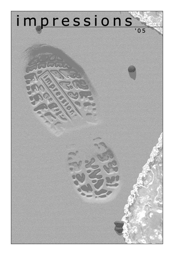
I edit a school literary/art magazine, and this is this years cover. Yay
heightfields! The water isn't perfect, but I'm not unhappy with it. Any
thoughts?
-S
5TF!
Post a reply to this message
Attachments:
Download 'coversm.jpg' (81 KB)
Preview of image 'coversm.jpg'
|
|
| |
| |
|
|
|
|
| |
| |
|
|
> I edit a school literary/art magazine, and this is this years cover. Yay
> heightfields! The water isn't perfect, but I'm not unhappy with it. Any
> thoughts?
Nice!
Perhaps less regularity on the sand
;-)
Paolo
Post a reply to this message
|
|
| |
| |
|
|
|
|
| |
| |
|
|
The concept is excellent and I wouldn't change the footprint at all.
You might consider using small shells instead of rocks (or some of each).
The biggest problem with the water isn't the texture, it's the shape. I
would suggest a straight line or a gentle curve. The strong 'S' shape
you have just doesn't feel right. To me at least.
From the beaches I have walked on I also remember some sort of debris
line at the most recent high water mark. Sometimes it's just a line of
pebbles, sometimes it contains organic matter, but the texture of the
sand changes with each wave... smoother where it was just covered and
rougher above the line.
I'm babbling. You've obviously seen beaches too :-)
Nice work overall.
stm31415 wrote:
> I edit a school literary/art magazine, and this is this years cover. Yay
> heightfields! The water isn't perfect, but I'm not unhappy with it. Any
> thoughts?
>
> -S
> 5TF!
>
>
> ------------------------------------------------------------------------
>
Post a reply to this message
|
|
| |
| |
|
|
|
|
| |
| |
|
|
Spock <Spo### [at] nospam com> wrote:
> The concept is excellent and I wouldn't change the footprint at all.
>
> You might consider using small shells instead of rocks (or some of each).
>
> The biggest problem with the water isn't the texture, it's the shape. I
> would suggest a straight line or a gentle curve. The strong 'S' shape
> you have just doesn't feel right. To me at least.
>
> From the beaches I have walked on I also remember some sort of debris
> line at the most recent high water mark. Sometimes it's just a line of
> pebbles, sometimes it contains organic matter, but the texture of the
> sand changes with each wave... smoother where it was just covered and
> rougher above the line.
>
> I'm babbling. You've obviously seen beaches too :-)
>
I would agree with you on all counts, the problem is that compositionally,
the water looks bad when it's straight or too gently curved. If I have
time, I'd like to play with the shape more (it's just a spline, so it isn't
too hard), because I agree that it still isn't right.
I couldn't find or model shells I was happy with, so I left it like this. If
anyone knows a good way to texture an iso shell, I'd love to hear about it.
I can't add the waterline because the situation I'm implying would never
happen. To have the water still foaming at the front here would imply that
the previous waves have passed the print, but I want it to look like this
one will wash it away.
-S
5TF! com> wrote:
> The concept is excellent and I wouldn't change the footprint at all.
>
> You might consider using small shells instead of rocks (or some of each).
>
> The biggest problem with the water isn't the texture, it's the shape. I
> would suggest a straight line or a gentle curve. The strong 'S' shape
> you have just doesn't feel right. To me at least.
>
> From the beaches I have walked on I also remember some sort of debris
> line at the most recent high water mark. Sometimes it's just a line of
> pebbles, sometimes it contains organic matter, but the texture of the
> sand changes with each wave... smoother where it was just covered and
> rougher above the line.
>
> I'm babbling. You've obviously seen beaches too :-)
>
I would agree with you on all counts, the problem is that compositionally,
the water looks bad when it's straight or too gently curved. If I have
time, I'd like to play with the shape more (it's just a spline, so it isn't
too hard), because I agree that it still isn't right.
I couldn't find or model shells I was happy with, so I left it like this. If
anyone knows a good way to texture an iso shell, I'd love to hear about it.
I can't add the waterline because the situation I'm implying would never
happen. To have the water still foaming at the front here would imply that
the previous waves have passed the print, but I want it to look like this
one will wash it away.
-S
5TF!
Post a reply to this message
|
|
| |
| |
|
|
|
|
| |
| |
|
|
"stm31415" <sam### [at] cscom> wrote:
> If
> anyone knows a good way to texture an iso shell, I'd love to hear about it.
uv-mapping is the trick. A good example (not textured) is included in Ingo
Janssen's MMMM include files (http://members.home.nl/seedseven/) for
param.inc. This makes a Mesh2 shell from a parametric surface, so it's
easier to texture with uv-mapping. There's also a plug-in for Moray (I've
never used Moray, myself), see:
http://news.povray.org/moray.win/thread/%3C3efd78fe%241%40news.povray.org%3E/
Only one other comment: Wouldn't the word in the footprint be backwards? Or
is it backwards on the tread? (More likely, artistic license....)
I like the composition and the idea!
Post a reply to this message
|
|
| |
| |
|
|
|
|
| |
| |
|
|
"Dave Matthews" <dma### [at] wrmnwestmnscuedu> wrote:
>
> Only one other comment: Wouldn't the word in the footprint be backwards? Or
> is it backwards on the tread? (More likely, artistic license....)
>
Well, see, here's the thing about that. What you overlooked is HEY LOOK! A
DISTRACTION! *runs*
Yeah, I can't frankly say I was thinking about that, because I don't want it
backwards.
Now the thing I'm playing with is water profiles, but while before I was
using a spline (sphere_sweeped and then randome points selected inside),
now I am using a random walk fractal:
#declare whitewater =
blob { // blob the sucker
threshold 0.6
#declare loc = <0, 0, 0>; // initialize point location
#declare runs = 0; // initialize iteration variable
#declare waterseed = seed(143); // random seed
#while(i<1000) // begin random walk
#declare die = rand(s)*2; // roll a 'die' to transform
#if(die>=1)
#declare loc = vaxis_rotate(loc*.5, y, -10); // the
#end
#if(die <1)
#declare loc = vaxis_rotate((loc*.5+<0, 0, .5>), y, 10);
#end
sphere{ //element
<0, -.0125, 0>, .025, 1
pigment{rgbf <1, 1, 1, .1>}
finish{specular .765 reflection .25 phong .5}
translate loc
} //element
#declare i = i+1; // increase iterant
#end
}
The problem is, while that gives me excellent whitewater, I can't find a way
to make the clear water fit this profile. Any ideas?
-S
5TF!
Post a reply to this message
|
|
| |
| |
|
|
|
|
| |
| |
|
|
"stm31415" <sam### [at] cscom> wrote in message
news:web.4267a633b90e9946f7c284360@news.povray.org...
>I edit a school literary/art magazine, and this is this years cover. Yay
> heightfields! The water isn't perfect, but I'm not unhappy with it. Any
> thoughts?
>
> -S
> 5TF!
>
Nice concept!
I find the edge of the water disturbing. Its way too jaggy for the scale.
The edge should be smoothed out - water has more cohesion.
The shadows in the top portion suggest a sheet of water flying over the
surface - not bonded to it.
The foam floating on the surface is nice. It gives it a sense of life.
It just that leading bleeding edge which is overdone.
DLM
Post a reply to this message
|
|
| |
| |
|
|
|
|
| |
|
|