|
|
|
|
|
|
| |
| |
|
|
|
|
| |
| |
|
|
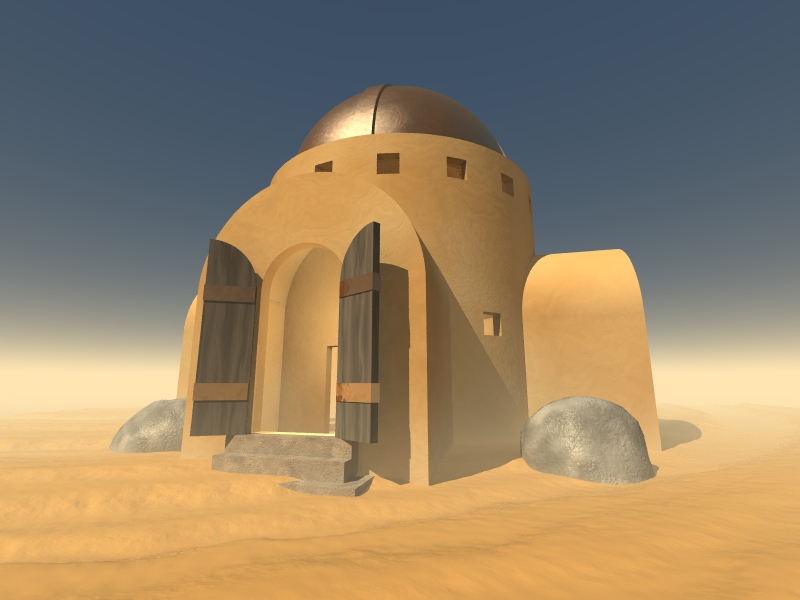
Well ...
First post of the day.
I feel guilty for monopolizing the mailing list over the last couple of
days, but this is the first time in about a year that I have actually
had the personal bandwidth to work with POV-Ray and I am really just
becoming familiar again now with the tool.
This scene is another one from the world of my Myst-like game.
In this scene, the subject is a house in the desert, just as the
previous scene was the ocean and the next will be snow.
Thanks to Slime, I learned how to use light_groups!
One thing that I discovered in creating this image is the following rule
of ray-tracing nature:
The more "pretty" you make an image, the less "photorealistic" it becomes.
I guess nothing in nature is perfect. This particular scene has a
"cartoon-like" quality that I do not especially like. But other than
that, I'm pretty happy with it.
Any feedback is much appreciated.
Post a reply to this message
Attachments:
Download 'desert_house.jpg' (151 KB)
Preview of image 'desert_house.jpg'
|
|
| |
| |
|
|
|
|
| |
| |
|
|
Aaron Gillies wrote:
> The more "pretty" you make an image, the less "photorealistic" it becomes.
I'll take pretty over photorealistic any day.
Oskar
Post a reply to this message
|
|
| |
| |
|
|
|
|
| |
| |
|
|
"Darren New" <dne### [at] san rrcom> wrote in message
news:41d72b3a$1@news.povray.org...
> Oskar Bertrand wrote:
>> I'll take pretty over photorealistic any day.
>
> Part of "photorealistic" includes "not bizarrely surreal" methinks. It's
> hard to call something "photorealistic" that is intentionally designed to
> also be impossible. :-)
>
I have to disagree. Some of the best textures I've made were created using
unrealistic (and thus impossible) conditions. I have found, as I have often
said before, that attempting to 'break' the rules of proper code sometimes
makes things better.
- Grim rrcom> wrote in message
news:41d72b3a$1@news.povray.org...
> Oskar Bertrand wrote:
>> I'll take pretty over photorealistic any day.
>
> Part of "photorealistic" includes "not bizarrely surreal" methinks. It's
> hard to call something "photorealistic" that is intentionally designed to
> also be impossible. :-)
>
I have to disagree. Some of the best textures I've made were created using
unrealistic (and thus impossible) conditions. I have found, as I have often
said before, that attempting to 'break' the rules of proper code sometimes
makes things better.
- Grim
Post a reply to this message
|
|
| |
| |
|
|
|
|
| |
| |
|
|
Aaron Gillies <no### [at] nospamorg> wrote:
> Well ...
>
> First post of the day.
>
> I feel guilty for monopolizing the mailing list over the last couple of
> days, but this is the first time in about a year that I have actually
> had the personal bandwidth to work with POV-Ray and I am really just
> becoming familiar again now with the tool.
>
> This scene is another one from the world of my Myst-like game.
>
> In this scene, the subject is a house in the desert, just as the
> previous scene was the ocean and the next will be snow.
>
> Thanks to Slime, I learned how to use light_groups!
>
> One thing that I discovered in creating this image is the following rule
> of ray-tracing nature:
>
> The more "pretty" you make an image, the less "photorealistic" it becomes.
>
> I guess nothing in nature is perfect. This particular scene has a
> "cartoon-like" quality that I do not especially like. But other than
> that, I'm pretty happy with it.
>
> Any feedback is much appreciated.
Aaron,
Very nice, I like it! Are you using radiosity in this scene? As far as
'realism' goes, I think that would give you what your looking for.
Post a reply to this message
|
|
| |
| |
|
|
|
|
| |
| |
|
|
Yep. I'm using radiosity.
The effect is somewhat obscured, though, because I'm also using a
shadowless fill-in light source. Just using radiosity, it seemed like
the gray component in the shadows was just a touch too high. Adding in
another light source to dimly illuminate the shadowed areas restored
some of the original pigment to those regions ... But also added to the
"cartoonish," or "illustration" look.
Hrm.
Post a reply to this message
|
|
| |
| |
|
|
|
|
| |
| |
|
|
Aaron Gillies wrote:
> The more "pretty" you make an image, the less "photorealistic" it becomes.
I thought it was the inverse: the more "photorealistic" you make an
image, the less "pretty" it becomes. :)
Very nice image, I like the point of view, and you really got the
desert-architecture look. But seems to me the interior light is too
bright (as bright as the sunlight outside and with similar coloration).
--
Jaime
Post a reply to this message
|
|
| |
| |
|
|
|
|
| |