|
|
|
|
|
|
| |
| |
|
|
|
|
| |
| |
|
|
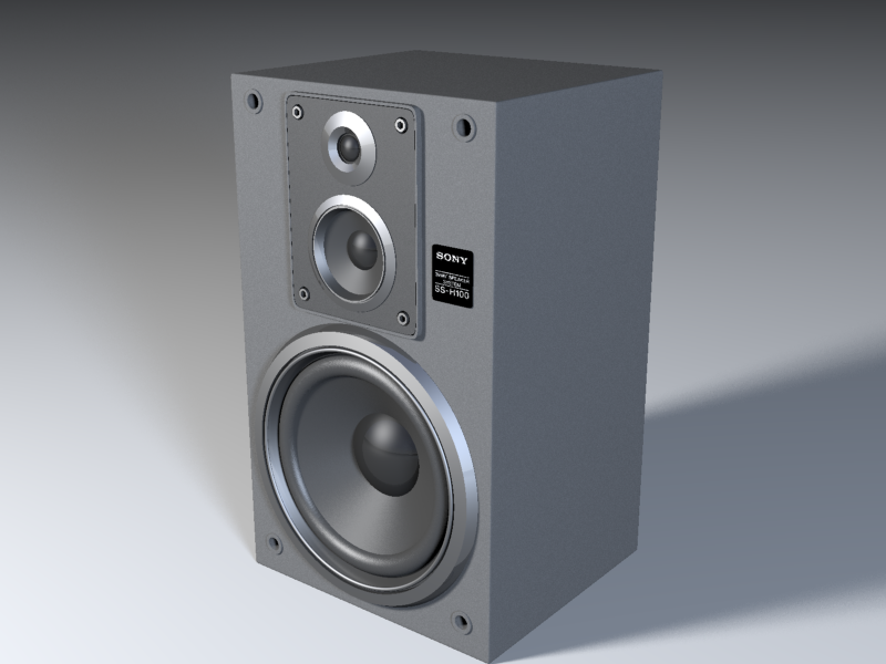
well, well... I made some progress since my last shot, I wasn't going to
post until I had something decent, but I got all excited and couldn't
resist :)
I added a few more details to the speaker, tuned all the textures, set
assumed_gamma to 1.0, put some area lights, remove radiosity, tweaked the
fade values of lights, and suddenly this image appeared on my screen. Hehe
it's way too bright with fancy contrast.
but there's something about the image texture that looks nice, it's almost
black & white, grainy and overburned. you can see all the details in it
you know, it's nice to play with lights without radiosity, it gives me more
control over the look of the image... once I get something nice without
radiosity, I'll start playing with it.. but for now I like the way it's
going...
still no luck with blurred reflections, it took a lot of time to render and
it didn't look metallic :(
woops, I forgot to set the sticker's final settings. it's pure black.
thank you all for the suggestions, it really helped.
I'll keep posting later...
Post a reply to this message
Attachments:
Download 'testing sony no radiosity gamma 1.png' (334 KB)
Preview of image 'testing sony no radiosity gamma 1.png'
|
|
| |
| |
|
|
|
|
| |
| |
|
|
Hi Lance,
Perhaps you can clarify something for me: When you say, your LCD is
calibrated with a 2.2 gamma response curve, does that mean your
software/hardware adjusts the gamma automatically? If so, you do not
represent the majority of people who, like myself, uses a system that does
not feature automatic gamma correction, and therefore needs pictures that
have the gamma correction "built in".
I know it isn't possible for my images to look good on all monitors but I
try to accomodate most people.
> I was talking about *just* the speaker -
> there's good luminance range even when
> excluding all areas of the blue backdrop,
> in fact from 0% to nearly 100%
>(around 250/255 - i.e. ~98% luminance).
If you say so. I believe you, but it still doesn't look good here. And most
professional work DO look good on my monitor, so I assume this image has a
way to go. Besides there is a difference between histograms and "the minds
eye". Maybe that is part of the reason. I have distinct ideas about, what
this speaker could look like, and should look like, in a good lighting
enviroment.
> Removing radiosity would lose this subtly
> and make the image not seem as realistic
Yes, true. I've had much fun playing with radiosity, and with scenes that
are solely lit by radiosity, so they behave more like the real world. But
sooner or later we always run into the barrier of extremely slow renders,
and we realise that even those renderings are miles away from complexity of
the real world. Even if the light bounces around correctly, it doesn't
respond well to our faked and always very simplistic textures / materials.
So I encourage people to try and achieve good lighting conditions with
oldfashioned pointlights / spotlights, because it teaches us some important
lessons. If a scene looks great without radiosity, it means we have done a
good job setting up light, and radiosity will add the final touch. On the
other hand, if we have done a poor job setting up light, radiosity will not
help much.
It has come to my knowledge that lots of professional work today does not
use radiosity, or any other kind of advanced algoritm for solving
global-illumination... In movies, G.I. are often faked with fill-lights or
painted into the bitmap textures (eventually baked into them). For example,
there is a new movie out called "Troi". I haven't seen it, but I have read
about the CG sequences of the city Troi and some battles on the fields. It
looks pretty realistic but does not use G.I.! The artists explain that G.I.
would have been impractical. For one thing, it would have been much slower,
but even the large studios and render-farms run into problems with memory
capacity, and even the most expensive render-engines cannot always handle
an animation without G.I. artifacts. (They should've used POV-Ray instead,
hehe... well)
I don't discourage the use of G.I. either! Especially in complex indoor
enviroments with walls, and detailed objects with many holes and creases
where the light creeps in, radiosity is certainly the best solution. And in
still-images it's often not much of a speed issue, provided it's used in
conjunction with pointlights. But radiosity is only an aid; it does not
replace the need for good, manual lighting.
Regards,
Hugo
Post a reply to this message
|
|
| |
| |
|
|
|
|
| |
| |
|
|
Hi,
> I made some progress since my last shot
You certainly did! :-) You're right it's too bright for a "black" cabinet
but I must say, I like it anyway.
> still no luck with blurred reflections,
> it took a lot of time to render and
> it didn't look metallic :(
Some metal gives clean and sharp reflections. This isn't unrealistic. But
it's difficult to guide you in any direction when I don't know what "look"
you're after...
> woops, I forgot to set the sticker's
> final settings. it's pure black.
Reminds me of a glassy material. Adds nice contrast. Looks good! By the way,
this rendering suffers a little from low-quality Anti-Alias. Are you going
to bump-up the settings for the next render?
For example: +AM2 +A0.1 +R2 -J
Or if you want perfection that will guarantee smooth, thin lines: +AM2 +A0.0
+R2 -J
Regards,
Hugo
Post a reply to this message
|
|
| |
| |
|
|
|
|
| |
| |
|
|
"Hugo Asm" <nomail@nomail> wrote in message
news:web.41bcd27917a60fa4ba17f4dc0@news.povray.org...
> Hi Lance,
>
> Perhaps you can clarify something for me: When you say, your LCD is
> calibrated with a 2.2 gamma response curve, does that mean your
> software/hardware adjusts the gamma automatically? If so, you do not
> represent the majority of people who, like myself, uses a system that does
> not feature automatic gamma correction, and therefore needs pictures that
> have the gamma correction "built in".
Hi Hugo, no it doesn't happen automatically. Because LCDs have nothing like
a 2.2 gamma curve (in fact, the curve is somewhat S-shaped), trying to do
any kind of graphic design or print media work on an uncalibrated LCD causes
all kinds of problems - the result is nothing like it should be. So the
LCDs need to have ICC profiles generated for them specifically (since even
two LCDs/CRTs of the same brand are different in their response curve out of
the box, and especially in the case of LCDs, tend to have a green/blue
colour cast on black). Because I have two LCDs this is even more important,
as you want something on one monitor to look the same as it does on the
other monitor. So I use a GretagMacbeth colorimeter (the i1 model) to
measure the LCDs. It's a two step process of first configuring the LCDs
using the colorimeter to ensure the whitepoint is correct, the
brightness/contrast settings are optimal, and the individual RGB channels
are as close as possible to even. This is done by having the colorimeter
measure the output of a 100% white screen while you adjust the RGB controls,
etc, until they're within certain ranges that the software displays. Then
you let the colorimeter measure the LCDs (it does this by showing panes of
various colours and measuring the results) and then generating appropriate
ICC profiles. These profiles are then loaded when Windows starts and they
affect the output at the video card level to compensate for whatever cast
the LCDs have. This means that you end up with LCDs that don't have a
colour cast and which match each other, and that are set for whatever
whitepoint you're designing for (6500K in my case - a "neutral" white,
rather than the cool/cold white that most monitors are set for by default).
And, you end up with a response curve that emulates a standard 2.2 gamma CRT
(or whatever gamma you want to replicate).
So basically it doesn't automatically adjust, I have to get out the
colorimeter and profile them - the idea is simply to convert LCDs that have
very non-standard response curves (when compared to CRTs) to act like an
average 2.2 gamma CRT (while also removing any colour casts and
irregularities in the different colour channels).
It really makes a huge difference when you can print something and it comes
out identical to what you have on screen (of course, you need to profile the
output device as well for this to work - that's another story in itself),
and to know that what you're designing on screen will also look right on the
majority of average CRT monitors.
> I know it isn't possible for my images to look good on all monitors but I
> try to accomodate most people.
Yup.
> > I was talking about *just* the speaker -
> > there's good luminance range even when
> > excluding all areas of the blue backdrop,
> > in fact from 0% to nearly 100%
> >(around 250/255 - i.e. ~98% luminance).
>
> If you say so. I believe you, but it still doesn't look good here. And
most
> professional work DO look good on my monitor, so I assume this image has a
> way to go. Besides there is a difference between histograms and "the minds
> eye". Maybe that is part of the reason. I have distinct ideas about, what
> this speaker could look like, and should look like, in a good lighting
> enviroment.
I agree - but the image looked "right" to me - it looks exactly like my
Sony speakers do. I was only looking at a histogram to see if there was a
particular reason why it might not be looking very good on Alex's work
monitor - I don't make a habit of looking at histograms unless I'm doing
colour correction work or matching a series of photos to each other :)
(although Photoshop's new Histogram flyout can be quite handy as it always
performs a histogram on the current selection and shows each channel
separately)
> > Removing radiosity would lose this subtly
> > and make the image not seem as realistic
>
> Yes, true. I've had much fun playing with radiosity, and with scenes that
> are solely lit by radiosity, so they behave more like the real world. But
> sooner or later we always run into the barrier of extremely slow renders,
> and we realise that even those renderings are miles away from complexity
of
> the real world. Even if the light bounces around correctly, it doesn't
> respond well to our faked and always very simplistic textures / materials.
>
> So I encourage people to try and achieve good lighting conditions with
> oldfashioned pointlights / spotlights, because it teaches us some
important
> lessons. If a scene looks great without radiosity, it means we have done a
> good job setting up light, and radiosity will add the final touch. On the
> other hand, if we have done a poor job setting up light, radiosity will
not
> help much.
Yes that's true - it's certainly always nice to reduce render time by
avoiding radiosity if possible, by use of clever lighting. I've been
experimenting with radiosity recently, using Tim's two-pass method as a
starting point, and the render times are already becoming tedious (although
before I was using the two-pass method it was taking exponentially longer to
get good results!). The only reason I suggested keeping radiosity was
because it was looking, in my opinion, exceptionally realistic already.
> It has come to my knowledge that lots of professional work today does not
> use radiosity, or any other kind of advanced algoritm for solving
> global-illumination... In movies, G.I. are often faked with fill-lights or
> painted into the bitmap textures (eventually baked into them). For
example,
> there is a new movie out called "Troi". I haven't seen it, but I have read
> about the CG sequences of the city Troi and some battles on the fields. It
> looks pretty realistic but does not use G.I.! The artists explain that
G.I.
> would have been impractical. For one thing, it would have been much
slower,
> but even the large studios and render-farms run into problems with memory
> capacity, and even the most expensive render-engines cannot always handle
> an animation without G.I. artifacts. (They should've used POV-Ray instead,
> hehe... well)
Heh. Yes a lot of movies can skip the use of radiosity simply because they
use scanline renderers, which allow you to implement a lot of tricky
lighting and shader techniques without a large hit in rendering performance,
thus it doesn't really make sense to use radiosity unless you really have
to. There's a great new renderer called Maxwell that does an exceptionally
good job of global illumination - the advantage of Maxwell is that you can
set the amount of time you want the render to take, and it'll do the best it
can in that time (the longer you leave it go, the less grainy the end result
is - grain and artefacts are always the problem with using global
illumination in animations, as you mention).
However, in renderers like POV-Ray it's much more difficult to simulate the
effects of radiosity by just using area lights because it quickly becomes
slow again anyway (unless you want a lot of artefacts), so my personal
preference is usually to wear the extra rendering time and use radiosity :)
> I don't discourage the use of G.I. either! Especially in complex indoor
> enviroments with walls, and detailed objects with many holes and creases
> where the light creeps in, radiosity is certainly the best solution. And
in
> still-images it's often not much of a speed issue, provided it's used in
> conjunction with pointlights. But radiosity is only an aid; it does not
> replace the need for good, manual lighting.
I agree :)
Lance.
thezone - thezone.firewave.com.au
thehandle - www.thehandle.com
Post a reply to this message
|
|
| |
| |
|
|
|
|
| |
| |
|
|
> Or if you want perfection that will guarantee smooth, thin lines: +AM2 +A0.0
> +R2 -J
Hey Hugo,
that image I posted was rendered with +AM2 +A0.0 +R1 -J
I can only eliminate the AA problem with a +R3 (I've tried 2 and the
aliasing is still visible) does the "scale" of the model affect the
anti-aliasing or rendering in any way? I think I'm using a quite big scale
here.. the cabinet is around 13x8x7 pov units. does that affect anything?
thanks again,
Alex Verstraeten.
Post a reply to this message
|
|
| |
| |
|
|
|
|
| |
| |
|
|
Hi Alex,
The scale of your scene does not affect anti-aliasing, and the scale you're
using is perfectly normal.
I use +R3 for most of my final renders. It's a pretty good setting, but +R2
is also enough in some cases.
Sometimes +A0.0 is not needed, and will just slow down the rendering for no
good reason. But in this case, it's probably the only way to avoid "broken"
lines.
What was the render-time for the above image? (and your CPU speed?)
Regards,
Hugo
Post a reply to this message
|
|
| |
| |
|
|
|
|
| |
|
|