|
|
|
|
|
|
| |
| |
|
|
|
|
| |
| |
|
|
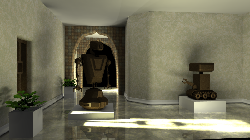
Hello All,
I've been chugging away at this for the current IRTC round, and call it "The
museum of old robots" (or something like that). Anyway, I'd like to know
what could be improved, etc..
Thanks,
Sean
Post a reply to this message
Attachments:
Download 'oldrobot_museum_v4.png' (437 KB)
Preview of image 'oldrobot_museum_v4.png'
|
|
| |
| |
|
|
|
|
| |
| |
|
|
Salty wrote:
> Hello All,
>
> I've been chugging away at this for the current IRTC round, and call it "The
> museum of old robots" (or something like that). Anyway, I'd like to know
> what could be improved, etc..
>
> Thanks,
> Sean
>
>
> ------------------------------------------------------------------------
>
Find helps with Isaac... ;-)
Post a reply to this message
|
|
| |
| |
|
|
|
|
| |
| |
|
|
On Wed, 24 Nov 2004 06:47:31 -0500, Salty wrote:
> Hello All,
>
> I've been chugging away at this for the current IRTC round, and call it
> "The museum of old robots" (or something like that). Anyway, I'd like to
> know what could be improved, etc..
>
> Thanks,
> Sean
Well, it would be nice to have enough light to actually see the exhibits ;)...
Post a reply to this message
|
|
| |
| |
|
|
|
|
| |
| |
|
|
Very cool image. I like the idea, and I think you are well on your way to a
great image. I noticed a couple of things. It is very dark. I assume you
are using a Mac, because I needed to correct the image bafore I could see
much of anything. Even then, the robots are almost indistigushable. I can
see that you put some work into detailing the 'bots, so why not add some
track lighting like many museums have, to light up the exhibits? Maybe you
are going for the silhoette look, but it just seems hard to see to me.
Also, is there a normal on that stucco texture it looks really good, but a
little bit flat. Again, that may just be a factor of the lighting.
I do like the shadow/light patterns on the floor! Nothing like a bit of
unseen detail to make a scene feel real.
Good work. I can't wait to see the finished product.
(Speaking of which, I am WAY behind on my own IRTC entry. Stop distracting
me! ;))
-S
5TF!
Post a reply to this message
|
|
| |
| |
|
|
|
|
| |
| |
|
|
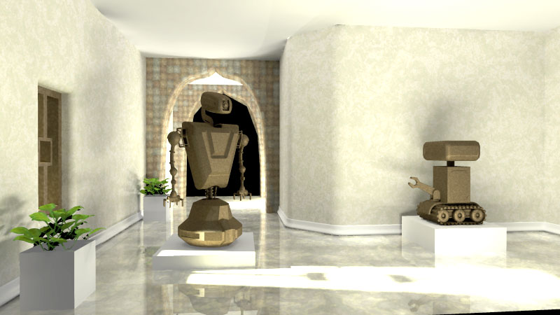
Hmm. It may be that we all speak too soon as far as light levels. Assuming
you areon a mac, this might be more what you are seeing (not having an
apple lying around at the moment, I can't be sure):
With this adjustment, all I see is a bit of artifacting on the ceiling.
-S
5TF!
Post a reply to this message
Attachments:
Download 'robomuse.jpg' (59 KB)
Preview of image 'robomuse.jpg'
|
|
| |
| |
|
|
|
|
| |
| |
|
|
stm31415 wrote:
> Hmm. It may be that we all speak too soon as far as light levels. Assuming
> you areon a mac, this might be more what you are seeing (not having an
> apple lying around at the moment, I can't be sure):
>
> With this adjustment, all I see is a bit of artifacting on the ceiling.
Wow, that helps.
I really like this scene and can only make a few comments:
The simple pedestals for the robots are good, but the flowerboxes seems
a little bare. Even just some texture would really improve that.
The black doorway in the back was a little distracting once I noticed
it. Maybe some focal blur would help on that (though I hesitate to
recommend a feature that will double or triple your render time). Maybe
some recursive loops of the hall behind the robot on the left would work.
The window seems a little disconnected from the floor light spot (which
could be reduced just a tiny bit IMO - the detail of the windowpane is
all but lost). I know what's displayed is the correct thing, but it took
me a while to figure out where the light was coming from. Maybe a little
tiny light just whiting up the side of the window a bit would help (a
light_group or something so it doesn't mess up the excellent lighting
everywhere else in the scene).
I'm just curious...how many lights are you lighting this with? I really
like the lighting.
~Mike
Post a reply to this message
|
|
| |
| |
|
|
|
|
| |
| |
|
|
Salty wrote:
> Hello All,
>
> I've been chugging away at this for the current IRTC round, and call it
> "The museum of old robots" (or something like that). Anyway, I'd like to
> know what could be improved, etc..
>
> Thanks,
> Sean
A little brighter? But VERY nice otherwise!
--
Stefan Viljoen
Software Support Technician
Polar Design Solutions
Post a reply to this message
|
|
| |
| |
|
|
|
|
| |
| |
|
|
I'm actually using a PC, but with a very bright LCD (ViewSonic). When I view
the same image at work on a CRT I can barely distinguish anything. I like
your track lighting idea and will experiment with that.
The stucco texture is just Agate with some turbulance (made in Moray):
#declare Stucco =
material // Stucco
{
texture
{
pigment
{
agate
agate_turb 1.0
color_map
{
[ 0.0 rgbft <0.870588, 0.870588, 0.737255, 0.0, 0.0> ]
[ 0.501779 rgbft <0.935294, 0.935294, 0.868627, 0.0, 0.0> ]
[ 0.75089 rgbft <0.967647, 0.8854, 0.718733, 0.0, 0.0> ]
[ 1.0 rgbft <1.0, 1.0, 1.0, 0.0, 0.0> ]
}
turbulence 0.3
octaves 10
omega 0.7
ramp_wave
}
normal
{
agate , 0.2
agate_turb 1.0
turbulence 0.3
octaves 10
omega 0.7
ramp_wave
}
finish
{
ambient 0.0
diffuse 0.913667
}
scale 3.0
}
}
I will try increasing the bump depth on the normal and see what that gets
me.
Thanks for your input!
Sean
"stm31415" <sam### [at] cs com> wrote:
> Very cool image. I like the idea, and I think you are well on your way to a
> great image. I noticed a couple of things. It is very dark. I assume you
> are using a Mac, because I needed to correct the image bafore I could see
> much of anything. Even then, the robots are almost indistigushable. I can
> see that you put some work into detailing the 'bots, so why not add some
> track lighting like many museums have, to light up the exhibits? Maybe you
> are going for the silhoette look, but it just seems hard to see to me.
>
> Also, is there a normal on that stucco texture it looks really good, but a
> little bit flat. Again, that may just be a factor of the lighting.
>
> I do like the shadow/light patterns on the floor! Nothing like a bit of
> unseen detail to make a scene feel real.
> > Good work. I can't wait to see the finished product.
>
> (Speaking of which, I am WAY behind on my own IRTC entry. Stop distracting
> me! ;))
>
> -S
> 5TF! com> wrote:
> Very cool image. I like the idea, and I think you are well on your way to a
> great image. I noticed a couple of things. It is very dark. I assume you
> are using a Mac, because I needed to correct the image bafore I could see
> much of anything. Even then, the robots are almost indistigushable. I can
> see that you put some work into detailing the 'bots, so why not add some
> track lighting like many museums have, to light up the exhibits? Maybe you
> are going for the silhoette look, but it just seems hard to see to me.
>
> Also, is there a normal on that stucco texture it looks really good, but a
> little bit flat. Again, that may just be a factor of the lighting.
>
> I do like the shadow/light patterns on the floor! Nothing like a bit of
> unseen detail to make a scene feel real.
> > Good work. I can't wait to see the finished product.
>
> (Speaking of which, I am WAY behind on my own IRTC entry. Stop distracting
> me! ;))
>
> -S
> 5TF!
Post a reply to this message
|
|
| |
| |
|
|
|
|
| |
| |
|
|
Mike,
Yeah, the flower pots are pretty basic. I'll try and add some details in.
The black door is actually just an opening into space at the moment, I
haven't decided what to put back there. I don't want to really put too much
work into something ambitious for the background. Maybe a door, maybe I'll
extend the hallway, I dunno.
I could try the light trick for the window or maybe tilt the camera bit to
reveal a little more detail.
I'm using one area light outside the scene, and then two smaller area lights
low on the floor on the spots where the light hits the floor so
I can get some defined shadowing and specular, and, of course, radiosity
(brightness at 3.0).
Thanks for your comments!
sean
Mike Thorn <mik### [at] realitycheckmultimediacom> wrote:
> stm31415 wrote:
> > Hmm. It may be that we all speak too soon as far as light levels. Assuming
> > you areon a mac, this might be more what you are seeing (not having an
> > apple lying around at the moment, I can't be sure):
> >
> > With this adjustment, all I see is a bit of artifacting on the ceiling.
>
> Wow, that helps.
>
> I really like this scene and can only make a few comments:
>
> The simple pedestals for the robots are good, but the flowerboxes seems
> a little bare. Even just some texture would really improve that.
>
> The black doorway in the back was a little distracting once I noticed
> it. Maybe some focal blur would help on that (though I hesitate to
> recommend a feature that will double or triple your render time). Maybe
> some recursive loops of the hall behind the robot on the left would work.
>
> The window seems a little disconnected from the floor light spot (which
> could be reduced just a tiny bit IMO - the detail of the windowpane is
> all but lost). I know what's displayed is the correct thing, but it took
> me a while to figure out where the light was coming from. Maybe a little
> tiny light just whiting up the side of the window a bit would help (a
> light_group or something so it doesn't mess up the excellent lighting
> everywhere else in the scene).
>
> I'm just curious...how many lights are you lighting this with? I really
> like the lighting.
>
> ~Mike
Post a reply to this message
|
|
| |
| |
|
|
|
|
| |
|
|